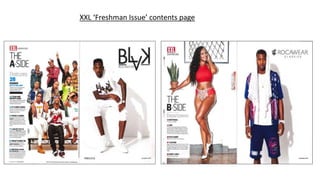
2. Masthead
The masthead is placed in the primary optical area
so it’s easily noticed. Especially due to the red box
it’s in.
Main image
The main image here looks very similar to the front cover’s main
image. Here however the artists are posing differently. They look
a bit more fun in this picture. This is done because now that the
reader has opened the magazine the artists want to give off a fun
vibe which so the readers look forward to the magazine.
Page numbers
The page numbers are in a cyan blue so
they stand out, also so the page doesn’t
look so plain. XXL have defied codes and
conventions here as they have put the page
numbers before the title of the article.
Usually they are put after.
Heading
The heading ‘features’ is the same
colour as the text under the sub-
headings. The font and colours directly
around it are different. This is so it’s
clearly noticed.
Columns
All the text and headings are in one
column down the left hand side. This is so
it can appear very simplistic, typical of a
hip hop magazines. In terms of a hip hop
magazine, the simplicity follows codes
and conventions.
Sub-headings
The sub-headings are in bold to stand out. It’s also to differ it to
the little information about the article given underneath.
Mise-en-scene
The mise-en-scene here is a large
variety of everyone having a style
that represents their own
style/personality. Their pose
whether it’s still, waving etc. is also
to represent their artist
personality. The majority definitely
look hip hop (genre) artists due to
the style and poses. (e.g. chains,
arms crossed, bandana etc.)
Layout
The layout is very simplistic which is
expected of a hip hop magazine, following
codes and conventions. The text down the
left third and the picture taking up the
middle and right third. This highlights the
importance of the artists. The freshman
issue is an annual issue so it’s very
importance, hence the focus on the artists.
Advertisement
There is actual a continued contents on the
next page, so that the fact the contents is
separated by an ad is unusual. They aren’t
following codes and conventions. XXL
features a lot of ads, usually promoting artist
endorsed products like this one.
Main article
It’s clear this is the main article as it is placed first
and it states it’s the cover story in the black box
above it. The text is in cyan blue, the page
number is bigger and its separated from the rest
by a thick black line. This also indicates it’s the
main article.
3. Main Image
Due to this side of the contents being less musically focused
the model isn’t an artist. She is the male gaze to keep the
clear male audience entertained. It’s also in relation to one
of the articles ‘eye candy’. This is a long shot.
Heading
The heading ‘departments’ is the same
colour as the text under the sub-
headings. The font and colours directly
around it are different. This is so it’s
clearly noticed.
Sub-headings
The sub-headings are in bold to stand
out. It’s also to differ it to the little
information about the article given
underneath.
Page numbers
The page numbers are in a burgundy colour
so they stand out, also so the page doesn’t
look so plain. XXL have defied codes and
conventions here as they have put the page
numbers before the title of the article.
Usually they are put after.
Advertisement
Again XXL are promoted artist endorsed
products. Dedicating a whole page to it.
However there ads still fit in with the
magazine due to the style of the add and the
colour scheme.
Mise-en-scene
The mise-en-scene looks very similar to an
advertisement picture. The model is very
posed and trying to look sexy through her
body language and clothes. The little
clothing and tall stilettos is a very common
outfit to wear to look sexy. The painting and
plant are there to add some decoration so it
doesn’t seem like its solely just white
throughout the magazine.
Columns
The column is again down the left
hand side to look simplistic and also
to keep all the articles together in
one place.