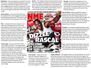
1. Masthead – (title of magazine) is situated in the top
left corner, it is bright and bold following codes and
conventions. Being in the top left corner means
when staggered on the shelf the masthead is clearly
seen. The masthead is outlined making it dominate
the top of the page and becomes memorable to the
reader.
Direct address – (the artist looks directly at
the audience) The artist engages the audience
by looking directly at them. This follows codes
and conventions and so appeals to the reader.
Font – (style of text) the text follows codes and
conventions as it sticks to the colour scheme of
the cover page. The fonts are large and loud
making them stand out, fitting with the genre.
Title – (related to the main image or main
topic) The title advertises the main artist,
attracting the artists fan base. There is also a
quote from the artist, this engages the
audience as it is something a notable person
has said. The quote links to the main article
inside, making the audience want to read on.
The title is larger than the cover lines and
names the artist in the main image, this
follows codes and conventions. This will
immediately catch the eye of the reader.
Main image – (picture which dominates
cover page) The picture is of rapper Dizzee
Rascal. He squats down smiling which shows
this is a fun magazine, not formal. The long
shot does not conform to codes and
conventions as the image is usually a
medium close up. This is quite rebellious as
it doesn’t follow the ‘norm’. This fits with the
rap genre as the artists of this genre are
stereotypically rebellious. The background of
graffiti is also informal and the act of
somebody rebellious which links with the
main image.
Barcode – (featured on magazine so it is
available for purchase) This is located in the
bottom right corner, following codes and
conventions. Its location means it is out of the
way and does not distract the reader from
important features.
Price & date – (shows price and
how up to date the magazine is)
The price is in clear view and on the
cover page, following codes and
conventions. The date is also in
clear view so the reader can easily
see if the magazine is recent.
Strapline – (a subsidiary heading) follows codes
and conventions as it is located at the bottom of
the page. It gives an idea of what will feature
inside. The strapline names other artists
attracting a wider audience base, if a reader
doesn’t like one of the artists, there are more to
read about. The names of the artists also clearly
show the genre as they are all rap artists.
Rule of thirds – (gives a guideline to where
certain features should be placed) The rule is
followed as the main image is placed in the
centre with coverlines on both left and right. Also
the masthead in the top left and barcode in
bottom right also follows the rule. The audience
focus on the important features because of
where they are located.
Target audience – The target audience are clearly listeners of rap. All
the artists featured are all famous rap artists. Also the imagery, for
example the graffiti, shows rebellion, something stereotypically linked
with rap. The target audience are young. This is followed by the colour
scheme which is very simple and informal, also the artists named are
current and in the charts. The ethnicity of the target audience are both
black and white. This is shown in the choice of artists named. For
example Dizzee Rascal is black, however, The Big Pink are white.
Genre – The magazine clearly shows the genre of rap.
The main image and strapline are famous rap artists.
The colour scheme and graffiti also show the genre.
Black, red and white are typically associated with rap.
The rebellious act of graffiti is also linked to rap as it
is stereotypically seen as a rebellious genre.
2. Date – (shows how up to date the magazine is)
Below main title. This follows codes and conventions
as it allows the audience to see if the magazine is
recent.
Anchorage text – (text below an
image) Links to the main image. This
follows codes and conventions as the
anchorage text provides more
information on the main image. There
is a drop capital which introduces the
paragraph. This makes the paragraph
stand out and shows importance.
Page numbers – (numbers beside
page titles) These are placed on both
left and right. They are both red and
black which follows the house colour.
The title and page numbers are both
the same font which follows codes and
conventions and shows they’re both
linked.
Font – (style of text) The masthead,
title and sub-title are the largest and
show dominance on the page. This
follows codes and conventions as this
is the most important text on the
page.
Layout – (how features on the page are
laid out) The rule of thirds is followed as
there are three distinctive columns. The
middle features the main image and
anchorage text. The page titles then
feature on the right and left. This
follows codes and conventions as the
most important information is in the
centre of the page.
Main image – (picture which dominates
contents page) The image is in the
centre column making it the first thing
you see. It is clearly important and
something the magazine wants the
reader to take note of. The purpose of
the image is to advertise a tour. The
word ‘touring’ connotes being on the
move or a vehicle, this is clearly shown
in the image. The image is bordered
which follows codes and conventions as
this separates image and text. There is a
medium close up with the model
wearing casual clothing. The mise en
scene gives a very chilled out feeling and
suggests the tour itself may also have a
chilled atmosphere. The colours match
the house colour of red, black and
white. This links all elements of the
magazine together.
Articles – (piece of writing) The article are all music based and some link with the
front cover artist. The titles are short and snappy so the reader can quickly decide
whether they want to read this page. They are all the same size, font and colour
making the contents page look consistent and organised. This follows codes and
conventions as it doesn’t make the page look random and difficult to read.
Rule of thirds – (gives a guideline to
where certain features should be
placed) The rule is followed as the main
image is placed in the centre with
anchorage text below explaining image.
Titles are on both left and right. Also
the masthead in the top left with
‘contents’ beside it also follows the
rule. The audience focus on the
important features because of where
they are located.
3. Main image – (picture which dominates page) This is of the artist on
the cover so follows codes and conventions. The artist is this time
contributing to the graffiti and is not showing direct address. This
makes the artist look mischievous and rebellious. He is looking around
to make sure no body sees him. Again, the mise en scene of the image
makes the genre of the magazine, which is rap, look rebellious.
Advertisement of the artist –
(how artist is shown on page)
The artists name features
throughout the article and in
the top right corner. This
follows codes and
conventions as the main focus
of this page is the artist
himself. A sense of repetition
is created to make the reader
remember this artist.
Props – (portable object used
on page) These include
bottles, a bomber jacket and
music box. These props create
the sense of a party and show
this is a music artist. The
empty bottles knocked over
also show a care free
attitude. The colours of the
artists clothes follow the
colour scheme of red, black
and white following codes
and conventions. This gives
the magazine its unique
identity as the reader
associates these colours with
the magazine itself.
Logo/date/page no – These are placed in
the corner of the page. This follows codes
and conventions as it allows the reader to
become familiar with the logo and magazine
number. The use of the date also allows the
reader to make sure they are reading the
most recent issue.
Layout – (how features
on the page are laid out)
The interview is placed
within four columns. This
follows codes and
conventions as this is a
typical magazine feature.
The main image
dominates the left page.
The title is the largest text
with the sub-heading
second. These introduce
the reader to the page so
are large to show their
importance. A by-line is
also present. This follows
codes and conventions as
the magazine tells the
reader who created the
page.
Colour scheme – (arrangement of colours on page) The
house style is followed as the colours used are the same
colours used on the front cover. This makes the magazine
familiar and sets its distinctive look. It also shows how
the pages are all linked, following codes and conventions.
Language – (the language of the text) ‘From tags to riches’ suggests
the interview is about how the artist has found fame. Using tags
instead of rags is clearly done on purpose. Tags are a type of
necklace typically worn by black males and so the title suggests that
the artist is now able to buy more tan tags because of his new
status.