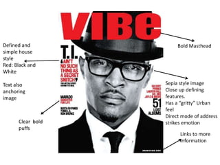
1. Bold Masthead
Links to more
information
Sepia style image
Close up defining
features.
Has a “gritty” Urban
feel
Direct mode of address
strikes emotion
Defined and
simple house
style
Red: Black and
White
Text also
anchoring
image
Clear bold
puffs
2. This is a front cover from the well known magazine VIBE(A well known hip hop/rap
periodical) . The cover has a well defined house style with Red: Black and White which
is simple but effective. The bold masthead is a generic convention of magazine of this
genre as this genre is known as a leading yet bold type of music known across the
world. The puffs used are also simple but effective is a clear and bold font, the use of
capital letters yet again suggests importance and grabs readers attention on the
different features within the magazine.
The image is of “T.I” an internationally known artist who is very much controversial
which is possibly why he is at the forefront of the magazine especially when this cover
was published T.I came under much scrutiny. The effect placed on the image
(Sepia/Black and white) gives an “urban”, “street” feel, heavily associated with artists
within my chosen genre. “T.I” is wearing smart, stylish clothing and is not wearing the
type of clothing a rapper would usually wear subverting stereotypes of rappers.
3. Canting image
of popular
artist Mavado
Image
continues
house style
established on
front cover
Sepia with
Red, Black and
White.
Organised content
in columns with
small mastheads
defining points
Image of front
cover
Generic
convention of
magazines.
Creative use of
masthead
4. The contents page seems to be simple and clear with the information in the top right
hand corner and the masthead in the top left hand corner.
The font of the masthead is in block capitals and it is bold, it is also in black, this draws
attention to it as it the biggest font on the page. The writing is also fragmented in a way
which creates a stylish and up to date masthead, I also believe this masthead on the
contents page is the same throughout all the issues of Vibe magazine showing
continuity.
The main image shows a well known artist Mavado shown in his local area. The
connotations of this picture are: Natural, Tough and ghetto, as the picture shows the
artist in an unknown environment. The environment is much different too which you
would normally expect to see a well known artist in. The picture shows that the
positioning in frame has been chosen to give off a particular meaning because the
artist is the forefront of the image whilst the things behind him are slightly blurred. The
picture also uses a wide angle shot to incorporate the scenery behind the focus of the
artist. The artist is also canting as his head is to one side, this gives off a more informal
look. The picture is also black and white which reflects the environment the image was
taken in and the artist is almost directly looking at the reader, this is known as mode of
address.
The contents page includes a snapshot of the front cover which anchors the text on the
contents page, the snapshot also stands out as the color scheme is different. The image
shows another well known rap artist which would appeal to the magazines
demographic.
5. Shows change
in house style
as before it did
not consist of
Green
Continuity of
sepia images
Shows artist with
family/ friends
suggesting him to
be an emotional
and gives us a
personal in look
of his own life
Human
interest story
Use of columns, shows the
article to be well organised
Direct mode of
address anchors
the emotion of
the human
interest story
6. This double page spread is also from the well known magazine VIBE. The grey
effect on the whole spread is continued from the Magazine cover and contents
page. The text is once again well organised into columns showing professionalism
as newspaper and magazine articles are organised into columns. The image is
particularly striking as it anchors with the human interest story, the direct mode
of address from the artist Mavado signals that he is an emotional character with
a troubled background story especially since he is pictured with friends and
family, a lot like other Urban artists.
The change in the house style displaces continuity , but this is possibly is used to
effect possibly highlighting the significance of this article.