
Recommended
More Related Content
What's hot
What's hot (20)
Viewers also liked
Viewers also liked (16)
Similar to The Inspiration Behind 'EDGE' Magazine
Similar to The Inspiration Behind 'EDGE' Magazine (20)
Recently uploaded
Recently uploaded (20)
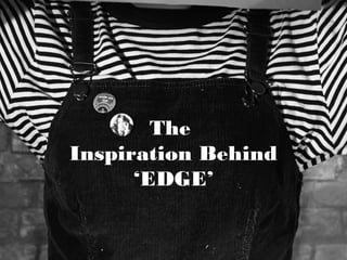
The Inspiration Behind 'EDGE' Magazine
- 2. ‘EDGE’ Logo • My logo was created by studying a range of other music magazine’s logos. I knew that I wanted something which would fit the style of my magazine so I went with a square design to look like a record cover, but also I went with a stamp kind of look to mimic the old, pre-decimal-world values of the magazine. • The NME logo and the Q logo also influenced my magazine logo: I liked the shape of the Q logo because I thought that it was striking and unusual, going against the conventions of most magazines due to the fact that it wasn’t a traditional masthead across the top fifth of the page. Nevertheless, I liked the NME logo, specifically the one used on the inkie copies, because of it’s bold appearance, hence the way I have used the same effect on my text by splitting the letters up into rectangles.
- 3. LP Image • To achieve this image I took inspiration from The Velvet Underground’s music video, ‘After Hours’. I did this so that the music being promoted by the magazine fits in with the pre-existing music it promotes.
- 4. Contents Image • This image was mostly based on the same image, taken from the Urban Outfitters catalogue, which inspired my front cover. Nevertheless, I also gained inspiration from the issue of MOJO magazine that I deconstructed earlier in the year. I knew that I wanted my contents image to be a headshot from this and additionally I acquired my design for the contents bar, with the ‘Cover Story’, ‘Features’ and ‘Reg- ulars’ headlines relie- ved from the main body of the text bar.
- 5. Front Cover Image• My front cover was mainly based on this copy of NME which instantly struck me from the first time I saw it. I loved the simplicity of the image used, so I decided that I wanted to take a similar, but more modern image which conveyed the same relaxed, mysterious and introverted mood as this would appeal to my target audience. • To modernize the image I took inspiration from this image from the Urban Outfitters website as I liked the quirky and playful style it had to it, not to mention it fit perfectly with the contents of my magazine. QuickTime™ and a decompressor are needed to see this picture. QuickTime™ and a decompressor are needed to see this picture.
- 6. LOLA BLACK DPS• For this double page spread, I took inspiration from the three images below. I knew that I wanted this image to be mysterious, dark and alluring, whilst simultaneously mimicking the look of a performer taking a break on stage. Heavily based on the image of Bob Dylan, my image of Lola Black develops this cool sense of relaxation and mystery. The image makes her look enticing and secretive, therefore making the reader want to read the article. QuickTime™ and a decompressor are needed to see this picture. QuickTime™ and a decompressor are needed to see this picture. QuickTime™ and a decompressor are needed to see this picture.
- 7. LOLA BLACK DPS• I had little inspiration for this double page spread as I came up with the idea very early on, nevertheless, there are a few elements which I carried over from this copy of NME with Nicki Minaj. Despite the fact that the two articles have very different target audiences, I liked some of the design ideas the spread uses. For example, this spread gave me the idea to wrap my text around the subject in the image. Additionally, this spread gave me the idea to use different shades of the deep red that is in my magazine’s colour scheme. I feel like this gave my article a sophisticated feel, as well as working to let the reader know they are reading EDGE magazine. QuickTime™ and a decompressor are needed to see this picture.