
Recommended
More Related Content
What's hot
What's hot (20)
Viewers also liked
Similar to Task five
Similar to Task five (20)
Recently uploaded
Recently uploaded (20)
Task five
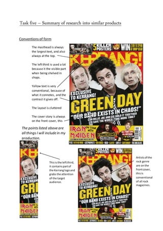
- 1. Task five – Summary of research into similar products Frontcover The masthead is always the largest text, and also always at the top. The left third is used a lot because it the visible part when being shelved in shops. Yellow text is very conventional, because of what it connotes, and the contrast it gives off. The layout is cluttered The cover story is always on the front cover, this shows contents of the magazine. Thisis the leftthird, it containspartof the Kerranglogoand grabs the attention of the target audience. The points listed above are all things I will include in my production. Artistsof the rock genre are on the frontcover, thisis conventional of all rock magazines. Conventions of form
- 2. Contentspage I will include all of these in my final production piece Mid shots of artists are very conventional of the rock genre The contents page is tidier than the front cover, however it’s still a messy layout Name of the magazine Listed pages and their contents Subscriptions The word “contents”
- 3. Double page spread These conventions will all be included in the finale piece that I create. Main image, this is of the artist which the article is about Dropped capital Bands name in a large font The text is arranged in columns Pull quote, grabs the audience’s attention
- 4. Conventions of genre Conventional rocker look Clothing - Dark colours mostly black and greys Hair - Most artists/groups from the rock genre have long chopped hair, both males and females Body modifications - The majority of people in the rock genre have body modifications these include tattoos, piercing and tapers Instruments - Artists/Bands have photos in rock magazines with them and the instruments that they are associated with Lighting - strobe and LED lighting is used in photos of rock bands to give a concert feel Band Positioning - The main vocalist is always at the front and the drummer is always at the back, in the middle is normally a series of other instruments including guitars, this is the conventional order for a rock band to appear in a magazine
- 5. Mode of address Mode of address – The mode of address in rock magazines appears as informal. The image below is a page from a Kerrang magazine. Explicit/vulgarhand gesture showsthe informal mode of address The dark background instantlyshows to the audience that the genre is rock Fontwithcracks on it givesarock feel to it andrelatesto music Facial expressions showsthat she doesn’tcare that she’sswearingto the whole world, thisshow that she doesnotconform to normal social norms Mid-shootof Hayley Williamsattractsthe target audience because she isin the rock genreYoung feel to the whole magazine
- 6. Use of technical elements Fonts used – The fonts used in rock magazines are sans serif, this is to create a masculine and modern look. The fonts are also likely to appear aggressive and power to reflect the rock genre and to go with the appearance of the artists. Colour schemes – The most popular colour schemes on Kerrang magazines are black and white, with a contrast of brighter colours. The colours that are often chosen to contrast against the dark backgrounds are reds, yellows and greens, these colours are mostly used for short pieces of text.
- 7. Representations How artists are represented – The artists are represented as dark people, who will often break the social norms to show what they really are. Rockers are shown as bold people with big personalities, a famous quote from lead singer of Nirvana, Kurt Cobain is "I would rather be hated for who I am, than loved who I'm not". AndySix the leadsinger of BlackVeil Bridesis wearinga lotof make- up thisisnot a norm for malestodo this showsthat rockersare not afraidof what people think Long hairis not as popularin othergenres such as Hip-Hop The dark clothing and blackhair show the manor of the music,thislinksin to the harsh sounds withinrockmusic Rock artistscare abouthow they look.Theyare showninMid-shots and lowangled shotsthismakes themlookpowerful and dominate