
Recommended
More Related Content
What's hot
What's hot (20)
Viewers also liked
Viewers also liked (16)
Similar to Getting from Preliminary to Final Product
Similar to Getting from Preliminary to Final Product (20)
Recently uploaded
Recently uploaded (20)
Getting from Preliminary to Final Product
- 1. Preliminary Task to Final Product
- 3. To this:
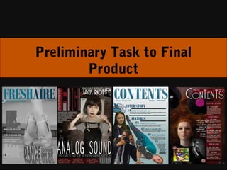
- 4. Front Page My ability to create a front page of a magazine has progressed massively since my preliminary task. In my preliminary task magazine ‘FreshAire’, I had already grasped the understanding of the importance of a colour scheme, using the colours light blue, dark blue and grey (tying into the colours used in the school logo). Moreover, it is clear that I understood the conventions of a school based magazine, labeling the magazine with an issue number, but leaving off a barcode because school based magazines are rarely purchased, but simply handed out tot the students for free. Even more prominently, I have taken a well composed image which has left copy space for the headline, masthead, bleeds and coverlines. Nevertheless, even though I did produce a decent preliminary magazine, I believe my final product shows vast improvement in my ability to compose a magazine cover. Firstly, my final product is much more eye-catching due to the use of the red and the bright white which contrasts effectively against a dark background, this means it is more likely to attract a buyer’s attention. Secondly, I have included more coverlines, making the magazine look more interesting, vibrant and good quality. Nevertheless, I think the most important factor of why my final product appears to be so much more successful, when compared to my preliminary task, is it’s ability to appeal to it’s intended target audience. The elements of mise-en-scene in the image, along with the type of language used in the copy, all come together to appeal to an musical ‘indie’ audience. This is not achieved in my ‘FreshAire’ magazine because the image of the ballet shoes and the idea of dancing will not appeal to the entire demographic of students, it is too vast and vague. Therefore, it is my choice to appeal to a more niche bracket of the market that makes my product so successful. In the forms of improvements in photography, I can see this too… I don’t necessarily think there is anything wrong with the image of the ballet shoes, I have used depth of focus successfully in order to place emphasis on the foreground of the shoes, nonetheless, the image is rather linear and dull. I have not used any form of propping to heighten the intention or tone of the image an the soft greys appear somewhat dull when used as a front cover image. The image that I used for my final product is much more interesting, with the slightly distorted, psychedelic kind of look that we get from the artist holding up an LP of her face in front of her real face, the grungy connotations that come from a red brick wall and the intensity that the reader gets from the directness in Lola Black’s eyes. All of these things force the reader’s brain to work harder to process the image, therefore capturing their engagement for a longer amount of time and hopefully ending in a sale of the product.
- 5. Contents Page My final product’s contents page is much more mature and sophisticated looking when compared to my school based magazine’s contents page. I think the reason why it looks so much more sophisticated is down to the layout of the contents bar. The guideline of this bar adds system and order to the page, making it fit into the style of the magazine through it’s continuity of three columns per page. On the other hand, this sophisticated layout of columns can not be seen in my school based magazine contents page, causing it to look immature and weak in appearance. Just like I did on the front cover, the EDGE magazine contents page has far more article references listed than ‘FreshAire’ does. This makes the magazine seem more full, making audiences want to read/buy the it more because they feel like they are getting a higher quality and valued product for their money. Moreover, the bleed images that I have placed on my school based magazine contents page look relevant, however they are not labeled so we don’t know how they are relevant to, or where they feature in, the magazine. I have progressed from this in my final product as I have labeled the bleed images with a number in a circle to direct the reader to the page which it features on. Furthermore, to show that it is the second most important article in the magazine, I have used a picture of Cat Sparks as the main image on the contents page, a quote from her and a brief description of her article (placed at the top of the features column) to let the reader know instantly that they can read about this artist in the magazine. On my final product, I have even shown evidence of the variety of music which is covered in this magazine, due to the fact that ‘Indie’ music can range further than just alt-rock. I have created the look of an bohemian-folk duo in the bottom left hand corner of my contents page. I achieved this look by taking the image outside, dressing the models in colorful, ‘flower-power’ wardrobe, using a slow shutter speed so that the background blurred in the wind, but the models appeared sharp and increasing the saturation to develop a retro, 70s feel to the image. Moreover, this look is contrasted by the image next to it where I have used an older male model, dressed in a leather jacket, dark sunglasses and holding an electric guitar, to develop the stereotypical look of an alternative-rocker, somewhat like Bob Dylan, who is regarded as a ‘classic’ but is making a resurgence later in life. This is a convention in music magazines, seen in many of the MOJO editions which I deconstructed. The contrast in these images reflect the diversity of the magazine and the target audience I am aiming at.
- 6. Double Page Spread Although I didn’t create a double page spread for my school based magazine, I will still deconstruct the ones which I created for my music magazine, focusing mostly on my Vinyl Revival spread. These spreads, as well as my contents page, show the elements of continuity which I have used in my magazine to ensure the reader is constantly aware of which magazine they are reading. This is done through the subtle elements of style which are carried across the pages: • The fonts used; I used a variation of fonts and font sizes within the headline ‘Vinyl Revival’ to give it it’s own unique look, hereby avoiding the page from looking amateurishly made through recognizable fonts. Furthermore, the fonts *********, ****** and ********** are carried across onto the ‘Lola Black’ double page spread to make sure there are elements of similarity between the pages • The columns; I have kept to a layout of three columns per page to heighten this continuity across the magazine • The dropped capital; both spreads have the same font and size of dropped capital • The use of the same dark red throughout the magazine On my ‘Vinyl Revival' spread, I have included side bars full of bursts of information; facts, descriptions, recommendations, quotes. These bars are useful in magazines as people who are just flicking through will be more inclined to read these small bars of text because they don’t look overbearing or strenuous to read. Therefore, because both bars link to the content of the main body of text, the reader is likely to get hooked on one of these pieces of information and get pulled in to reading the main article itself. Additionally, the way that it recommends Lola Black’s new album, in the bar on the right hand side, hooks the reader further into the magazine as they are then more likely to follow the page’s instructions and turn to page 20 to read the article on Lola Black. Furthermore, the enlarged quotes on this page work in exactly the same way to try and hook readers into reading the main body of text. I have chosen to use brighter colours on this spread because it is only a regular in the magazine. This means that it doesn’t have the same appeal to read, as many other articles in the magazine would, due to it’s lack of celebrity marketing. The use of brighter colours will help the article gain attention and interest from the reader.
- 7. Double Page Spread Although I didn’t create a double page spread for my school based magazine, I will still deconstruct the ones which I created for my music magazine, focusing mostly on my Vinyl Revival spread. These spreads, as well as my contents page, show the elements of continuity which I have used in my magazine to ensure the reader is constantly aware of which magazine they are reading. This is done through the subtle elements of style which are carried across the pages: • The fonts used; I used a variation of fonts and font sizes within the headline ‘Vinyl Revival’ to give it it’s own unique look, hereby avoiding the page from looking amateurishly made through recognizable fonts. Furthermore, the fonts *********, ****** and ********** are carried across onto the ‘Lola Black’ double page spread to make sure there are elements of similarity between the pages • The columns; I have kept to a layout of three columns per page to heighten this continuity across the magazine • The dropped capital; both spreads have the same font and size of dropped capital • The use of the same dark red throughout the magazine On my ‘Vinyl Revival' spread, I have included side bars full of bursts of information; facts, descriptions, recommendations, quotes. These bars are useful in magazines as people who are just flicking through will be more inclined to read these small bars of text because they don’t look overbearing or strenuous to read. Therefore, because both bars link to the content of the main body of text, the reader is likely to get hooked on one of these pieces of information and get pulled in to reading the main article itself. Additionally, the way that it recommends Lola Black’s new album, in the bar on the right hand side, hooks the reader further into the magazine as they are then more likely to follow the page’s instructions and turn to page 20 to read the article on Lola Black. Furthermore, the enlarged quotes on this page work in exactly the same way to try and hook readers into reading the main body of text. I have chosen to use brighter colours on this spread because it is only a regular in the magazine. This means that it doesn’t have the same appeal to read, as many other articles in the magazine would, due to it’s lack of celebrity marketing. The use of brighter colours will help the article gain attention and interest from the reader.