
Recommended
More Related Content
What's hot
Viewers also liked
Viewers also liked (20)
Similar to Ancillary Product analysis
Similar to Ancillary Product analysis (20)
More from lkirkland123
More from lkirkland123 (14)
Recently uploaded
Recently uploaded (20)
Ancillary Product analysis
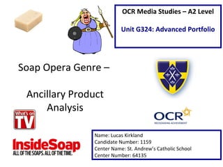
- 1. Soap Opera Genre – Ancillary Product Analysis Name: Lucas Kirkland Candidate Number: 1159 Center Name: St. Andrew’s Catholic School Center Number: 64135 OCR Media Studies – A2 Level Unit G324: Advanced Portfolio
- 2. Masthead- Reading “What’s on TV” the masthead of the magazine is bold and eye-catching to the readership. The color red ‘signifies’ (De Saussure) the dangerous and evil themes that are often featured in soap operas. Web address (Cross media convergence) forces readers to take on further reading into the programs that are featured within the magazine across the e-media platform. Verbal codes such as “Shock”, “Horror”, “Crash” and “Dies” are utilized to attract the target audience of the programs featured in the magazine. The language used is very emotive. This is because it makes the audience want to find out more about the latest plots. The date at the top of the magazine is very prominent. This convention is made clear to the readership who are considered ‘Survivors’ (Maslow) who feel the need to always be up to date with the latest soaps. The non verbal code of the main image, depicts three characters who could be linked to the “crash” talked about in the main headline. The images of the three characters are positioned, as hanging over the headline which further illustrates the importance of these characters. Eye contact (mode of address) of all three characters represents the anger and suspicion that surrounds the plot of the story. The verbal code of the main headline stretched across the middle of the page, conveys the main story that will feature in this magazine. The colour yellow is very eye-catching and entices the reader to take the magazine of the shelf. Additionally the distressed lines cutting through the verbal code “crash” signify the destruction that will happen in this “Crash”. In addition to the main headline the subline, provides readers with even more clues to the story featured within. The verbal code “who dies?” ‘informs’ (Katz) the reader that there will be a death, therefore hooking them into buying the magazine to find out more. Cover lines are featured in bubbles at the bottom of the page. Each features a different soap to cover a broad range of audiences preference. Images from the soaps are utilized to attract audiences to the ‘Star Appeal’ (Richard Dyer) that the characters might have. The verbal code “New” will entice audiences to watch the soaps.
- 3. The strapline of this magazine, located directly underneath the masthead features bold statements to hook in buyers. “Every Story! Every Story, Every Week!” This ‘signifies’ to the reader that this magazine prides itself on producing a magazine that is consistent in its distribution. A bold masthead connotes the importance of soap for many audiences, Additionally there is no space between the two words which could signify the collation of soaps featured within this magazine. The non verbal code of the main image features main characters within Eastenders, perhaps the most popular soap. The technical code of the medium close of Vonnie, placed behind a male creates a stereotype. The male gender is pictured as being more dominant because of this positioning. The main headline is positioned across the center of the magazine. Printed in a vibrant orange color the text reads “Revenge”. This connotes to the audience that this is the main story. The verbal code “killer” written in bold red and black, ‘signifies’ the evil that will feature within the text. The price of the magazine comes in at £1.65, which is very cheap compared to other genre of magazines. For a working class reader this is very affordable. Plus section features extended sublines, that will lure magazine fans into wanting to buy the A subline quotation featured at the top left hand side of the page, include never seen before quotes that will entice readers to buy the magazine to find out more about up coming episodes.
- 4. Conclusion and From completing this task I will be able to ‘repeat’ (Steve Neale – 1980) certain areas of the magazines I have analyzed. First of all from both magazines I can establish that bright colours are a must have convention for soap opera magazines, as it is very eye catching. In addition I will utilize large text and bold images that really catch readers eyes. I would also like to ‘repeat’ loads of cover stories. Controversial language in the straplines will be a convention that I would like to include in my own magazine. I would like to do this because It attracts audiences with shock. Finally I feel that lots of images are needed to create busy layout that is typical for the genre. Overall I prefer ‘Whats on TV’s” , magazine as it is very bright and bold and presents all of the subline effectively. I really like the cracked masthead as it has multiple connotations.