
Recommended
More Related Content
What's hot
What's hot (20)
Similar to Ancillary product analysis - magazine
Similar to Ancillary product analysis - magazine (20)
More from ewalker1252
More from ewalker1252 (16)
Recently uploaded
Recently uploaded (20)
Ancillary product analysis - magazine
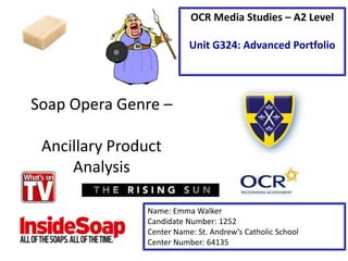
- 1. Soap Opera Genre – Ancillary Product Analysis Name: Emma Walker Candidate Number: 1252 Center Name: St. Andrew’s Catholic School Center Number: 64135 OCR Media Studies – A2 Level Unit G324: Advanced Portfolio
- 2. The masthead is very bright and bold which makes it stand out. This means the audience will know what the name of the magazine is called. The web address is placed underneath the masthead. This is use of cross media convergence. This allows the audience to connect with the magazine on a more personal level as they can find out behind the scenes information online. The main image is not the only image on the front cover. This gives the audience visuals to assist alongside the subheadings in order to help reveal the story. The front cover has many different sub- stories covering it to ensure they cover a larger amount of shows.
- 3. Analysis of ‘What’s on TV’ Magazine • I would ‘repeat’ (Steve Neale – 1980) the element of the masthead being in large text and a bold colour. I feel that this helps the audience to know what the name of the magazine is as it is eye catching. • I would also ‘repeat’ (Steve Neale – 1980) the use of sub-stories throughout the front cover. This allows the magazine to cover a lot of shows and therefore have a wider audience as it caters for more people’s interests.
- 4. The magazine cover uses a theme of bright colours throughout to stand out. This makes the magazine more eye-catching for the reader. Also the colour red is used throughout, this colour represents danger so could indicate the plot of soap operas as dangerous and negative. The front cover uses short sentences which entice the reader. This also allows more emotion to be passed through the sub- headings. The price is featured at the top of the page, this allows the audience to know how much it costs. There is a variety of secondary images used on the front cover, this may attract the audience as it is not just filled with writing.
- 5. Analysis of ‘TV Choice’ Magazine • I would ‘repeat’ (Steve Neale – 1980) the use of multiple pictures on the front cover as it makes the page look less intimidating as it is not just covered with writing it is broken down with pictures. • I would also ‘repeat’ (Steve Neale – 1980) the use of bright colours as it makes the page stand out and become eye catching meaning passersby are more drawn towards it.