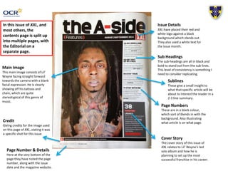
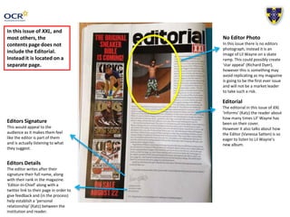
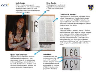
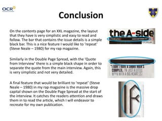
This document analyzes the layout and design of an issue of XXL magazine. It discusses features of the contents page like the logo, main image, subheadings, and page numbers. It also examines aspects of article pages like the editor's signature and details, main images, quotes, drop caps, and Q&A format. The conclusion notes simple design elements that could be replicated for a rap magazine, such as black bars, quote boxes, and large drop caps to draw readers in.
1. Music Magazine –
Contents Page and DPS
Textual Analysis
OCR Media Studies – AS Level
Unit G321: Advanced Portfolio
Name: Zakary Winsall
Candidate Number: 2144
Center Name: St. Andrew’s Catholic School
Center Number: 64135
2. Issue Details
XXL have placed their red and
white logo against a black
background which stands out.
They also used a white text for
the issue month.
Main Image
This main image consists of Lil’
Wayne facing straight forward
towards the camera with a blank
facial expression. He is clearly
showing off his tattoos and
chain, which are quite
stereotypical of this genre of
music.
Sub Headings
The sub-headings are all in black and
bold to stand out from the sub-lines.
This level of consistency is something I
need to consider replicating.
Sublines
These give a small insight to
what that specific article will be
about to interest the reader in a
2-3 line summary.
Page Numbers
These are in a black colour,
which sort of blends in with the
background. Also illustrating
what article is on what page.
Credit
Giving credits for the image used
on this page of XXL, stating it was
a specific shot for this issue.
Page Number & Details
Here at the very bottom of the
page they have noted the page
number, along with the issue
date and the magazine website.
Cover Story
The cover story of this issue of
XXL relates to Lil’ Wayne’s last
solo album and how he is
planning to set up the most
successful franchise in his career.
In this issue of XXL, and
most others, the
contents page is split up
into multiple pages, with
the Editorial on a
separate page.
3. Editors Signature
This would appeal to the
audience as it makes them feel
like the editor is part of them
and is actually listening to what
they suggest.
Editors Details
The editor writes after their
signature their full name, along
with their rank in the magazine.
‘Editor-In-Chief’ along with a
twitter link to their page in order to
give feedback and (in the process)
help establish a ‘personal
relationship’ (Katz) between the
institution and reader.
No Editor Photo
In this issue there is no editors
photograph, instead it is an
image of Lil Wayne on a skate
ramp. This could possibly create
‘star appeal’ (Richard Dyer),
however this is something may
avoid replicating as my magazine
is going to be the first ever issue
and will not be a market leader
to take such a risk.
In this issue of XXL, and
most others, the
contents page does not
include the Editorial.
Instead it is located on a
separate page.
Editorial
The editorial in this issue of XXL
‘informs’ (Katz) the reader about
how many times Lil’ Wayne has
been on their cover.
However it also talks about how
the Editor (Vanessa Satten) is so
eager to listen to Lil Wayne’s
new album.
4. Main Image
This is a medium-close up shot.
Lil’ Wayne has his arms crossed and he is
showing his teeth in which he has a
diamond grill. He is illustrating his power
and wealth by doing so.
Quote from Interview
The quote was taken from the interview.
By enlarging it and presenting it in its
separate box shows off the artists values.
In this case Lil Wayne states that he has ‘a
big heart’. Expletives have also been used
to censor an offensive word. However, this
was not censored in the actual article.
Drop Capital
The drop capital is used in order
to grab the readers attention as
it is very easy to read on the
page.
Questions & Answers
The questions are asked by the interviewer and are
in bold. The answers are given by the interviewee
which are in plain text. The Q&A article allows for a
rapport to be made between the interviewee and
the reader as they feel like they are getting to know
the artist better than before.
Mode of Address
The way in which it is written is in quite a informal
and friendly tone, as this would be in order to appeal
to the audience and feel as if you are talking with
them instead. A few examples of this informal
language written on the page is “He rocks a blue-and-
white striped shirt, board shorts covered in
weed leaves and lit joints” and “I don’t have a short
man’s complex. I’m just a little n$!@a with a big
heart.”
Stand First
This is an article of text
that summarises what the
main article is actually
about. It also gives credits
to the interviewer and the
photographer. In this issue
of XXL it is located on the
page before the article.
5. Conclusion
On the contents page for an XXL magazine, the layout
that they have is very simplistic and easy to read and
follow. The bar that contains the issue details is a simple
black bar. This is a nice feature I would like to ‘repeat’
(Steve Neale – 1980) for my rap magazine.
Similarly in the Double Page Spread, with the ‘Quote
from Interview’ there is a simple black shape in order to
separate the quote from the main interview. Again, this
is very simplistic and not very detailed.
A final feature that would be brilliant to ‘repeat’ (Steve
Neale – 1980) in my rap magazine is the massive drop
capital shown on the Double Page Spread at the start of
the interview. It catches the readers attention and draws
them in to read the article, which I will endeavor to
recreate for my own publication.