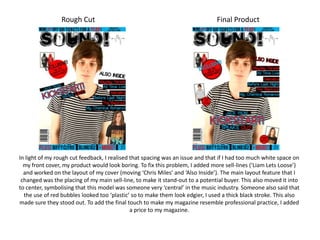
1. Rough Cut Final Product In light of my rough cut feedback, I realised that spacing was an issue and that if I had too much white space on my front cover, my product would look boring. To fix this problem, I added more sell-lines (‘Liam Lets Loose’) and worked on the layout of my cover (moving ‘Chris Miles’ and ‘Also Inside’). The main layout feature that I changed was the placing of my main sell-line, to make it stand-out to a potential buyer. This also moved it into to center, symbolising that this model was someone very ‘central’ in the music industry. Someone also said that the use of red bubbles looked too ‘plastic’ so to make them look edgier, I used a thick black stroke. This also made sure they stood out. To add the final touch to make my magazine resemble professional practice, I added a price to my magazine.
2. Rough Cut Final Product Due to my rough cut feedback, I realised that my whole contents page had to be reworked. The layout was said to not fit my genre and it looked too ‘bare’. To fix this, I chose to use a lot more black to make it seem edgy in the borders of my work. I used mostly the same images, but added another to weigh out the image to text ratio. I kept the titles of each ‘section’ of my list of contents the same but added another to make my magazine seem like real value for money. I also added a lot more comment to make sure my final product reflected the whole of my magazine. The feedback also showed me that having subscription information at the top seemed un-necessary if I wasn’t going to include past issues of my magazine. So I changed this skyline to show my issue number and the date that it went on sale, and then added additional information at the bottom right hand corner of my page.
3. Rough Cut Final Product After my rough cut feedback, I made a lot of changes to my double page spread to make it more appealing to my reader. First, I added paint splashes to my image page to make the model seem messy and edgy, like my genre of magazine. I then removed the yellow tints around the image and added page numbers to make my magazine seem more professional. I made the name of the artist bolder because a few people pointed out that it wasn’t very clear. I also moved one quote over to the second page in order to break up the writing and make it seem like there’s less than there actually is. On the second page, I swapped the colour scheme around because my feedback showed the rough cut to be too bland and therefore it seemed boring. I also added a page number to this page and I changed the border around my secondary images to a shade of red used in my models shirt.