Download to read offline
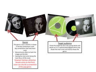
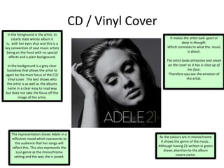

Adele's second studio album 21 explores themes of heartbreak through soul music. Released in 2011, the album topped charts in over 30 countries and had three worldwide number-one singles. The album packaging utilizes conventions of the soul music genre like monochrome colors and close-ups of Adele's expressive face, while also including elements of pop music like a bright green color on the CD. These conventions are consistently represented across the vinyl, CD, and digital packaging to clearly identify the artist and emotion of the music.


![Analysis albums[1]](https://cdn.slidesharecdn.com/ss_thumbnails/analysisalbums1-130315093507-phpapp01-thumbnail.jpg?width=640&height=640&fit=bounds)


