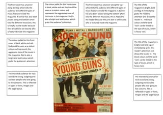
1. The front cover has a banner The colour pallet for this front cover The front cover has a banner along the top The title of the
along the top which tells the is black, white and red. Red could be which tells the audience the different types of magazine is bright, bold
audience the different types of seen as a violent colour and music featured inside the magazine. A banner and big; it immediately
music featured inside the represents the aggressive tone of has also been placed along the bottom which grabs the reader’s
magazine. A banner has also been the music in the magazine. Red is lists the different musicians; this is helpful to attention and draws the
placed along the bottom which also a bright and bold colour which the reader because they are able to see exactly reader in. The block
lists the different musicians; this grabs the audience’s attention. who is featured inside the magazine. colour and the word
is helpful to the reader because ‘rock’ can be linked to
they are able to see exactly who the type of music, which
is featured inside the magazine. is heavy rock.
The colour pallet for this front
The title of the magazine is
cover is black, white and red.
bright, bold and big; it
Red could be seen as a violent
immediately grabs the
colour and represents the
reader’s attention and
aggressive tone of the music in
draws the reader in. The
the magazine. Red is also a
block colour and the word
bright and bold colour which
‘rock’ can be linked to the
grabs the audience’s attention.
type of music, which is
heavy rock.
The intended audience for rock
sound are young, outgoing and The intended audience for
sociable people who love going rock sound are young,
to live concerts. This is reflected outgoing and sociable
in types of fonts, images and people who love going to
the page layout. live concerts. This is
reflected in types of fonts,
images and the page layout.
2. The intended audience are around the ages of On this content page, there isn’t The magazine have chosen to have The page layout has been split
nineteen, the bright colours reflect their a heading. The magazine has large page numbers to make is clear into segments, this is to help
personalities, and stereotypically the intended chosen not to have a heading to the audience that this is a content guide the reader around the
audience are out going, enjoyable and sociable because they have every other page, the font size used for the page and to make sure they see
people. The bright colours create a energetic tone key content page feature in numbers is the largest on the page every aspect of what is in the
which mirrors the music represented in the bold, making it clear that the indicating that the page numbers is magazine. This has been done
magazine, which is upbeat and lively. page is a content page. the most important thing to look at. by using images to create
sections; also the magazine uses
sub headings to split the copy
The set of images consist of some live shot and
into various segmentations,
some from photo shoots. The images
such as reviews, exposure, and
purposely taken for the magazine have the
features excreta.
model looking straight into the camera
engaging the audience where as the live
images show the musician having fun and The colour pallet used is red,
looking away from the camera. This promotes yellow, black and white. Even
live music and creates a lively atmosphere and though there are a lot of
gives the reader an insight into what a live colours they are only used a few
concert can look like. times on the page. The colour
pallet has been used on
important text, such as
Even though there is a small
musician’s names to draws the
amount of structure the overall
reader’s attention. Also the
layout is disorganized, there are
words in red help the reader to
six different images and a lot of
pick out the information they
text on the same page, this
are most interested in and helps
make the page look clustered
the reader to find the page of
and caused the reader to
their desired musician.
become overwhelmed. The
page also looks messy because
there is no central image for the
Only one image has a quote
reader to focus on; none of the
attached to it, this may be
images are seen to be the main
indicating that it’s the main
focus which causes the
article however it’s unclear
audience scan each image.
because of the size of the
image.
3. the intended audience for this magazine are young music lovers who the colour pallet used is black, white and yellow. the black and white make the text easy to read
enjoying going to watch live music. The page layout reflect this by using making the magazine more approachable because the story is more clear, also the yellow reflect
lot of different images that are live shots, this is attracting to the the vibrate atmosphere that live music creates. the colour yellow has been chosen for the word
audience because they can relate to the images. Stereotypically young, ‘live’ because the magazine what the audience to see live music as lively, energetic and enjoyable.
indie music lovers are sociable and unorganised, the page layout mirrors The font used looks like it have been written in the style of graffiti, this font represents youth, and
this by using pictures that overlap in a messy pattern, also the high this has been done to attract their intended audience.
amount of images used reflects how sociable the audience are.
in all of the live images,
the musicians are looking
away from the camera
The proportion between lenses, this creates a
images and text is quite exciting atmosphere
high; the large amount of because the audience feel
images could show the like they are watching a
intended audience as live concert. Also in the
image conscious and images of the musicians
fashion savvy. also the off stage they are looking
small amount of text at the camera to engage
could show the audience the audience and to make
to be uninterested in facts the audience feel a
and more interested in connection towards the
looking at images. musicians. All of the
images are either mid-
shots or three quarter
shots, this is to show the
audience what the band
looks like and it is also
used to show to show the
reader the musicians stage
particularly in bands there is a lead singer, in this double page spread who we presence, for example
presume is the lead singer has the largest image. In this double page spread what instruments they
there is one large image, which is the main focus and there are lots of small have. The mid shots are
images. this indicates that the music involves around the one person. all of the used so the audience can
images are in black and white, this makes the overall page quite dark which see the emotions on the
represents the music as dark and malevolence. musician’s faces.