call girls inMahavir Nagar (delhi) call me [🔝9953056974🔝] escort service 24X7
Magazine Research
1. Media AS Media Production November 2011
Hannah Penton
Front Cover Magazine 1 This magazine is a subscriber only, suggesting that they are wanting to
appeal to a specific target audience and a certain type of music fan will
buy this magazine.
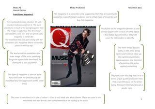
The masthead denotes a broken ‘Q’ with
chunks breaking away from it. The burst
pieces are a result of the swinging guitar that The skyline on the magazine denotes a bold
the image is capturing. Also this image printed slogan with a black on white effect
connotes the iconic rock and roll which is the – this makes it prominent on the front
magazine is known for.
cover for the readers to identify.
The masthead has also gone along with the
convention of a magazine where is normally
placed in the top left.
The main image focuses
solely on the artist being
The lead article re-establishes the centre and medium close up.
main image of the artist smashing His expression connotes
his guitar against the masthead. By aggressiveness and intention
stating he is ‘out of control’. of smashing the guitar
against something.
This type of magazine is seen as quite
The front cover has very little on it in
masculine with the smashing of the
terms of pull quotes and cover lines.
masthead and the aggression on the cover
This keeps the focus on the artist
artist.
being featured. Otherwise known a
poster style.
The cover is consistent in its use of colour – it has a red, black and white theme. These are used in the
1
masthead and lead article; then complimented in the styling of the artist.
2. Media AS Media Production November 2011
Hannah Penton
Contents Magazine 1
The contents page is quite simplistic as they
only have a few pictures and limited writing.
However the pictures that are shown are
The skyline illiterates what
noticeable with their corresponding page
magazine is called. This will go
numbers, this helps the readers to quickly
along with the forms and
identify where they will be situated. The
conventions of the layout in every
largest image being that of the lead artist from
addition of the magazine
the front cover. The artist is dressed in smart
and rocker clothes connoting that he is
important and stylish with the shine on the
jackets could symbolise that of lights on stage
where he is always performing on.
The lead image of the artist on
the front over connotes a
complete opposite to how he is
captured in the contents, this The layout of the contents page and
suggest that he has control and the list of the articles featured
the magazine will show that inside are situated on the left third.
there may be another side of This is important because
him that the readers don’t subconsciously readers will look to
know – this can attract readers the left of pages when flicking
to find out more. through- so by positioning the list of
pages on the left readers will
become more aware of what they
see and then pick up of particular
pages of interesting articles.
2
3. Media AS Media Production November 2011
Hannah Penton
Double Page Spread Magazine 1
The tone and register
of the descriptive The DPS is consistent in its layout and design The images uses caption the help the
language used with the Contents page, these include the use readers understand what is going on –
compliments the style of red banners and black coloured font as it is and what the camera has captured in
of the magazine. E.g. easier to read on top of the white background. that moment.
“heavy” and
“madness” all
symbolise the feeling
of rock. As it is denoted The skyline provided
in bold these appeals extra information about
to the magazines what is coming up in
target audience the next few pages –
because it blatantly this helps to give the
seen. readers a preview and
makes it easier to
navigate if they are
With this double page looking for something
spread there isn’t one specific to read. By
lead image. By using using pictures it makes
various articles the the skyline more
readers can pick and noticeable and alluring.
choose with ones they
find more appealing.
3
4. Media AS Media Production November 2011
Hannah Penton
Front Cover Magazine 2 The type of artists that are identified of the front cover (MIA/Rolling Stones) showed what
The main image and thethe magazine are Denotedthe focusfrontdirect quote
particular audience wanting on the is a cover is a
The lead article on e.g. Pop/Rock
masthead, lead article as medium close up of the artist
from the artist- in addition the main
well as the cover lines all holding shows the artist a surly
image a flare. She has wearing
coincide with each other expression on her face which be a be
black gloves which can can
as they all denote a connotation ofdominance.
connoted as what a criminal
yellow, red and white might wear when committing a
theme. However the crime. These then illiterates the
colouring connotes quote that the artist said about
hotness or fire possibly being able to get someone ‘killed’.
suggesting that the
contents of the magazine
has hot topics inside it,
this could attract readers.
As the magazine is well
known, despite the fact The front cover of this particular
the main image is covering magazine uses of surveillance and
part of the masthead, the information suggested by ‘Bulmer & Katz’
most regular buyers are – the readers are able to learn about how
able to distinguish that it is the cover artist is known globally.
NME. Therefore creating curiosity for the
readers.
4
5. Media AS Media Production November 2011
Hannah Penton
The Under the main images
pictures used in this contents
emphasis is a direct quotemusic
there the theme of a Contents
magazine. The images denoted are Maga The idea of a contents page is to help the reader navigate the magazine. Therefore to zine 2
form the artist. This gives
those of a musician and hisof help achieve this NME has made the contents page clear and easy to use.
the readers a preview piano, a
moshwhat they can look other
pit at a concert and
individuals thatto reading
forward have something in
common with music. It is effective that the main stories have
inside.
been made prominent by making then
enlarged along with the page numbers
they are situated on. The connotation of
this may show that the most interesting
and important stories that the magazine
thinks will then appeal to potential
readers.
The images used denote particularly
attractive, up to date and popular
artists, this helps magazine be a
magnet for specific readers they are
aim towards, this then make readers
appreciate the magazine more.
The font used is black and bold on top of a white background this
makes it easier to read and the writing becomes more perceptible.
5
6. Media AS Media Production November 2011
Hannah Penton
Double Page Spread Magazine 2 The layout and design of the
The headline used is a direct quote from the singer positioned in article is simply set out making it
the main image. The font used is continuous from the front over. easy to read and it more
The lead image is consistent This is consistent with the house style of the magazine. attractive for readers – this will
in the colouring and style.
keep their attention for longer.
This is an additional photo
from the same photo shoot
shown on the font cover. The The columns are laid out in two
artist is position in a way that blocks on the bottom of the right
shows she in charge and page. They are quite short because
rebellious. This is a they don’t want to bore the readers
representation of her image with lots of writing, making them
in music and how provocative lose interest.
she can be. The writing used it quite informal
which is good because they don’t
want to confuse the readers or make
them feel inferior. The writing is also
The standfirst is introduced in a full
popular to how the target audience
on description on how the interview
may speak.
took place and how the meeting
started out. It is a personal
expression of what M.I.A looks like The highlighted colour in
and the first impressions that the standfirst correlates
journalist see’s. Yet this helps the with the colouring of the
readers to create an image of how house style in the imagery,
the interview looked like. this helps to pull together
the theme of the article.
The magazine has used some Photoshop effects – for instance the use of multiply in the Pull quote The colours red, yellow and purple denoted all symbolise
allows the reader to see another image behind it but still able to read the quote. The connotation of that of fire and heat. Also purple symbolises wealth,
this may seem that the imagery of the artist in the photo is like she doesn’t want to be seen what she which can be related back to the quote M.I.A said on 6the
is doing because it could be frowned upon or provocation (also stated in the standfirst) – therefore she font cover about how ‘rich’ she is now.
is hiding behind the writing.