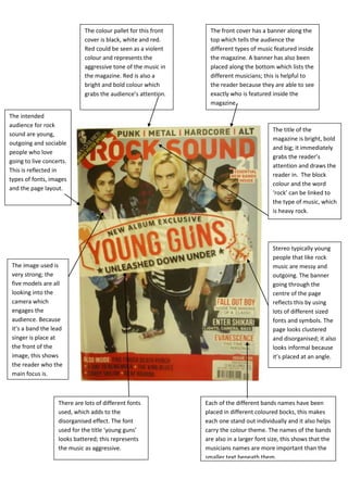
1. The colour pallet for this front The front cover has a banner along the
cover is black, white and red. top which tells the audience the
Red could be seen as a violent different types of music featured inside
colour and represents the the magazine. A banner has also been
aggressive tone of the music in placed along the bottom which lists the
the magazine. Red is also a different musicians; this is helpful to
bright and bold colour which the reader because they are able to see
grabs the audience’s attention. exactly who is featured inside the
magazine.
The intended
audience for rock
The title of the
sound are young,
magazine is bright, bold
outgoing and sociable
and big; it immediately
people who love
grabs the reader’s
going to live concerts.
attention and draws the
This is reflected in
reader in. The block
types of fonts, images
colour and the word
and the page layout.
‘rock’ can be linked to
the type of music, which
is heavy rock.
Stereo typically young
people that like rock
The image used is music are messy and
very strong; the outgoing. The banner
five models are all going through the
looking into the centre of the page
camera which reflects this by using
engages the lots of different sized
audience. Because fonts and symbols. The
it’s a band the lead page looks clustered
singer is place at and disorganised; it also
the front of the looks informal because
image, this shows it’s placed at an angle.
the reader who the
main focus is.
There are lots of different fonts Each of the different bands names have been
used, which adds to the placed in different coloured bocks, this makes
disorganised effect. The font each one stand out individually and it also helps
used for the title ‘young guns’ carry the colour theme. The names of the bands
looks battered; this represents are also in a larger font size, this shows that the
the music as aggressive. musicians names are more important than the
smaller text beneath them.