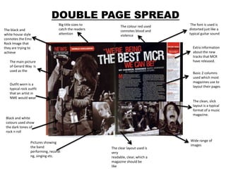
1. DOUBLE PAGE SPREAD
Big title sizes to The colour red used The font is used is
The black and catch the readers connotes blood and distorted just like a
white house style attention violence typical guitar sound
connotes the Emo
Rock Image that
they are trying to Extra information
achieve about the new
tracks that MCR
The main picture have released.
of Gerard Way is
used as the
Basic 2 columns
used which most
magazines use to
Outfit worn is a
layout their pages
typical rock outfit
that an artist in
NME would wear
The clean, slick
layout is a typical
format of a music
magazine.
Black and white
colours used show
the dark tones of
rock n roll
Wide range of
Pictures showing
images
the band The clear layout used is
performing, recordi very
ng, singing etc. readable, clear, which a
magazine should be
like
2. CONTENTS PAGE
The contrast from the black to
Font used is consistent
the white background makes The title is big and bold
and the colours used
it stand out. which connotes the
are attractive and eye- magazine name as it is
catching, this is a good called ‘Billboard’ which
feature that billboard is big and flashy.
uses.
Pictures used to give
The page is laid out
the readers insight in
in grids and
what will be featured
sections, this is
in the magazine.
good as it makes
the page clear and
readable. A main image of the
contents page of
Billboard has a feature which the cover star is
no other music magazines have made bigger to
on their contents page, this is draw attention to it
the music top charts, this
shows that it is a music
magazine and therefore makes
it stand out from the rest
Extra features
The colourfulcolours included which
used connotes that makes the readers
the magazine is know exactly what
vibrant and else is in the
young, which is the magazine
target audience they
are aiming at