High Profile Call Girls Sodepur - 8250192130 Escorts Service with Real Photos...
Magazine front cover analysis 2
1. Imebvore Aigbochie AS Media
Magazine Front Cover Analysis 2
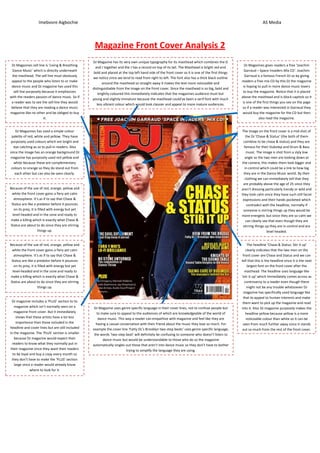
DJ Magazine has its very own unique typography for its masthead which combines the D
DJ Magazines sell line is ‘Living & Breathing DJ Magazines gives readers a free ‘Joachim
and J together and the J has a record on top of its tail. The Masthead is bright red and
Dance Music’ which is directly underneath Garraud – Space Invaders Mix CD’. Joachim
bold and placed at the top left hand side of the front cover so it is one of the first things
the masthead. The sell line must obviously Garraud is a famous French DJ so by giving
we notice since we tend to read from right to left. The font also has a thick black outline
appeal to the people who listen to or make readers a free mix CD by this DJ the magazine
around the masthead so straight away it makes the text more noticeable and
dance music and DJ magazine has used this is hoping to pull in more dance music lovers
distinguishable from the image on the front cover. Since the masthead is so big, bold and
sell line purposely because it emphasizes to buy the magazine. Notice that it is placed
brightly coloured this immediately indicates that the magazines audience must but
with the readers passion of dance music. So if above the masthead and is block capitols so it
young and slightly immature because the masthead could’ve been a serif font with much
a reader was to see the sell line they would is one of the first things you see on the page
less vibrant colour which would look classier and appeal to more mature audiences.
believe that they are reading a dance music so if a reader was interested in Garraud they
magazine like no other and be obliged to buy would buy the magazine for the CD but then
it. also read the magazine.
DJ Magazines has used a simple colour The image on the front cover is a mid shot of
palette of red, white and yellow. They have the DJ ‘Chase & Status’ (the both of them
purposely used colours which are bright and combine to be chase & status) and they are
eye catching as so to pull in readers. Also famous for their Dubstep and Drum & Bass
since the image has an orange background DJ music. The image is shot from a slyly low
magazine has purposely used red yellow and angle so the two men are looking down at
white because these are complementary the camera, this makes them look bigger and
colours to orange so they do stand out from in control which could be a link to how big
each other but can also be seen clearly. they are in the Dance Music world. By their
clothing we can immediately tell that they
are probably above the age of 25 since they
Because of the use of red, orange, yellow and aren’t dressing particularly trendy or wild and
white the front cover gains a fiery yet calm they look calm since they have such still facial
atmosphere. It’s as if to say that Chase & expressions and their hands pocketed which
Status are like a predator before it pounces contradict with the headline, normally if
on its prey, it is filled with energy but yet someone is stirring things up they would be
level-headed and in the zone and ready to more energetic but since they are so calm we
make a killing which is exactly what Chase & can clearly see that even though they are
Status are about to do since they are stirring stirring things up they are in control and are
things up. level headed.
Because of the use of red, orange, yellow and The headline ‘Chase & Status: Stir it up’
white the front cover gains a fiery yet calm clearly indicates that the two men on the
atmosphere. It’s as if to say that Chase & front cover are Chase and Status and we can
Status are like a predator before it pounces tell that this is the headline since it is the next
on its prey, it is filled with energy but yet largest font on the front cover after the
level-headed and in the zone and ready to masthead. The headline uses language like
make a killing which is exactly what Chase & ‘stir it up’ which immediately comes across as
Status are about to do since they are stirring controversy to a reader even though there
things up. might not be any trouble whatsoever DJ
magazine has specifically used language like
that to appeal to human interests and make
DJ magazine includes a ‘PLUS’ section to its them want to pick up the magazine and read
magazine which isn’t normally seen on a DJ Magazine uses genre specific language in their cover lines, not to confuse people but into it. Also DJ magazine purposely makes the
magazine front cover. But it immediately to make sure to appeal to the audiences of which are knowledgeable of the world of headline yellow because yellow is a more
shows that these artists have a lot less dance music. This way a reader can empathize with magazine and feel like they are noticeable colour than white so it can be
importance than those included in the having a casual conversation with their friend about the music they love so much. For seen from much further away since it stands
headline and cover lines but are still included example the cover line ‘Fatty DL’s Brooklyn two-step beats’ uses genre specific language, out so much from the rest of the front cover.
in the magazine. The ‘PLUS’ section is smaller the words ‘two-step beat’ will definitely be confusing to someone who doesn’t listen to
because DJ magazine would expect their dance music but would be understandable to those who do so the magazine
readers to know what they normally put in automatically singles out those that aren’t into dance music so they don’t have to bother
their magazine since they want their readers trying to simplify the language they are using.
to be loyal and buy a copy every month so
they don’t have to make the ‘PLUS’ section
large since a reader would already know
where to look for it.