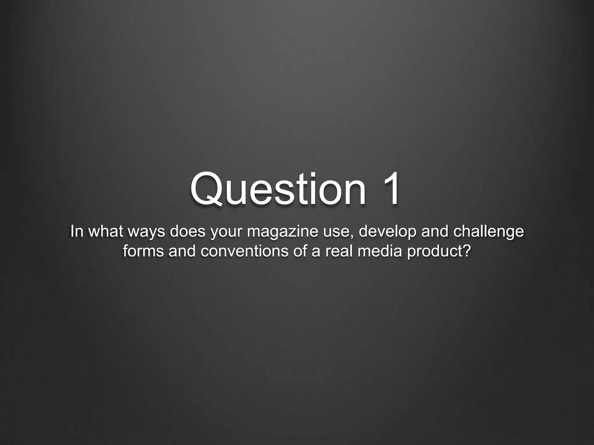
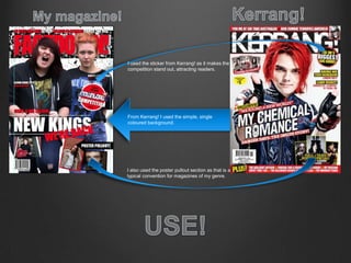
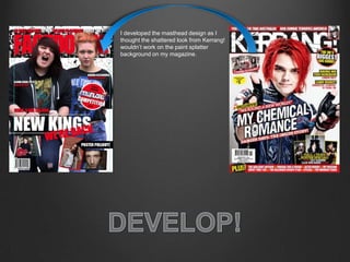
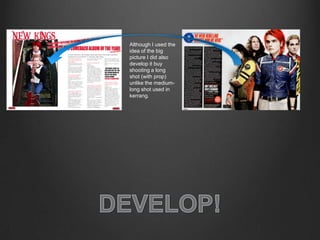
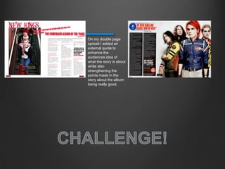
The document discusses how the magazine uses, develops, and challenges conventions from the real media product Kerrang!. It uses conventions like single-colored backgrounds, stickers to attract readers, and poster pullouts. Some elements were developed, like the shattered masthead design to fit the paint splatter background. Lines around cover text were challenged as an indie magazine style. Large feature photos and sectioned smaller photos were used and developed further with long shots. Quotes were used from bands' perspectives and mid-column as a story convention. A double page spread added an external quote to enhance the story.