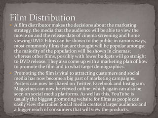
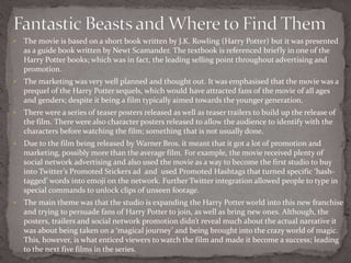
The document discusses how a film distributor determines the marketing strategy, release dates, and platforms for releasing a film. It notes that popular films are typically released in cinemas first, while lower budget films may go straight to DVD. Promoting films through social media, posters, trailers, and magazines is seen as vital for attracting customers.
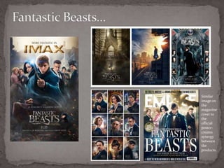
The document then analyzes the marketing of the film Fantastic Beasts and Where to Find Them. It details how the film was promoted as a prequel to the Harry Potter franchise to attract existing fans. Teaser posters, trailers, and character posters were released to build anticipation. Warner Bros. invested heavily in social media promotion. The overarching theme was


![Evaluation -powerpoint_presentation[1]](https://cdn.slidesharecdn.com/ss_thumbnails/evaluation-powerpointpresentation1-110408181158-phpapp02-thumbnail.jpg?width=640&height=640&fit=bounds)