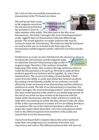
Q2. How effective is the combination of your main product
and ancillary texts? Soffia Farmer
Creating a brand identity is a key element to having successful
productsin my opinion. Wehad a discussion about how wewere
going to do this across all our three productsand that wewere going
to use the same fontfor the documentary and magazinedoublepage
spread to try and continuea colour scheme. I wanted to make all our
productsto appealto the same target audience (12-19 year olds). It
was also essential to have the productsrelate to the channels or
magazines they would beappearingon. The three productswerethe
documentary alongsidethe radio trailer and magazinedoublepage
spread.
For the documentary, wehad the same font across all
the titles; this helped to create continuity and a brand identity. This
meansthat the font will be familiar to the audienceand recognisable,
as we have used this across two products. Black writingis what
is used in most articles in magazinesso we conformed to this
convention because it would have stuck to the theme of the
entire magazine (What’s on TV). Weused a very similar fonton
both productsto makethem moresimilar. The boxes we used
for the background of the images on the background were
matching to the main font of the title, as it has a school style
aesthetic. It is more appealingand memorable to the audience
to have familiarity. Wealso had white text on our titles in the
documentary and weused this in our magazinedoublepage
spread where appropriate, however wecould not usethis for
the majority of the text, as it would notbe clear to see on the
light background weused. To incorporatethe white aspect of
the colour scheme, we used a white background for the title and also
one of our statistics.
Our magazine doublepage spread will appeal to the
audiencebecause of the smaller images we used of
screenshots of the documentary. Thescreenshots used are from the
documentary, and thishelps to create a brand identity by
having peoplewho werein the documentary on the
magazinedoublepage spread. It wasappealingbecause of
the large title that wedecided to use, as it standsout. The
fontthat weused is clear and harsh and this is
representativeof the topic we chose. The fontof the title of
the documentary is the same fontthat Channel4
famously uses, it is for that reason, and it will be
easily recognisable that our documentary willbe
shown on Channel4.
I was pleased that I decided to do this as it helps to
identify the channelthe documentary willbe
premieringon. This is used for their website also
which helps uscreate a link between our magazine
doublepage spread and the website which has a catch
up service. Wehad the title of the documentary ‘Are
today’steenagers the moststressed generation?’
across all three products, wemadesure to include
this, as it is a fundamental partof promotingthe
documentary. Additionally, wewanted to create an
obviouslink between our documentary and our double
page spread. To do this, we decided to usea screenshot
from our documentary asthe background for the
magazine. This helped us to create brand identity by
usingthe same colours and scene from our documentary.
Audio
In the documentary, weused a musicbeat
across the entire video, and we used the same
beat in the radio trailer and this helped usto create a brand identity.
Using the same musicwould have appealed to the audience as they
may have listened to the trailer on the radio and then saw the
documentary on the television, usingthe same musicmadeit more
Documentary clip
Channel 4 font
recognisable. I think that if the audiencerecognises the musicto the
same products, they are more likely to watch the entire
documentary. Themusicis not very upbeatand we did this
deliberately as our topic is serious, and the radio trailer features
statistics on serious issues that teenagers deal with. Therefore, I
think this is effective because wecan create a sense of familiarity
within both products. The narrator used in the documentary isalso
used in our radio trailer; we decided to do this because the audience
can feel connected to the same presenter.
In addition, the narrator (myself) is a teenager and I think that the
audiencewould be able to tell so this will highlight our target
audience. To make our radio trailer more interesting, we used short
clips from our voxpop interviewsto promotewhat our documentary
entails, these included teenagers and older (middleaged people). The
majority of the voxpop interviewsare from teenagers and so this, in
term, links with our target audienceand will appealto our audience.
This links with the images we have used in our magazine doublepage
spread, as they are from vox pop interviews shown in the
documentary. Weincluded differentopinionsto get the listener’s
attention along with differentages and this would then create
interest in differentage groups alongside our target audience to
watch the documentary. Furthermore, this connectswith our title
‘Are today’steenagers the most stressed generation?’.
As weare broadcasting our radio trailer on Capital FM, a popular
musicradio station, we decided to use a musicalunderlay to go with
the natureof the radio station. As we chose our radio station to be
Capital FM, a station run by advertisements, wecould promote
the documentary to be watched on Channel4. To create synergy
between the radio trailer and the magazine doublepage spread,
we used the same date and time of the documentary. This is a
necessity as the purposeof the trailer and magazinedoublespread is
to advertise the documentary. Thelink between Channel
4 and Capital is that they both have advertisementsand
so we used an ‘after the break’ scene which showed what
was going to be comingup, not only doesthis help the audience
become more informed aboutwhat is going to come up, it entices
them to continuewatching through the advertisementbreak. If we
were broadcasting on BBC, then wewouldn’thavedonethis, as they
do not have advertisementsduringthe programme. Throughdoing
this I feel we have successfully connected our
documentary to the TV channel we chose.
The pullquotes that I used
in the magazinewerefrom
the documentary itself and
the quotation is from an
older member of the public. This links back to the title of our
documentary, ‘Aretoday’steenagers the most stressed generation?’
as this suggests that our documentary looks into differentage
groups. This would appealto our target audiencewho may be
curiousto watch the documentary. Wemadesurethat the pullquote
we used wasthe one weincluded in the final copy of the
documentary and themagazine article; otherwise it would notmake
sense.
Furthermore, to create an extra link between the channel we chose to
broadcast the documentary and themagazine page,
we added the Channel4 Documentary logo on the
magazinepage. Therefore, if the audiencemissed the
beginning of the article, they could see the logo and know where to
watch the documentary or to catch up. Wetried to makeall three
productsappealto our audience and tie together, by waysI have
explained here. The success of creating a brand identity, I think
comes from the ability to easily spotsimilarities between products.
By creating a brand identity suitable for our audience, wecould
effectively create awarenessof our documentary and thusinfluence
audiences to watch. The title of our documentary isa question ‘Are
today’steenagers the moststressed generation?’ and we have linked
this open-ended question to the article in our doublepage spread. At
the end of our article we have written in the interview with the
maker of the documentary, that the reader will have to watch and
make their own mind up on which side they choose to take, the effect
of this is that a personaltone is created as if weare talking directly to
our audience. The use of the rhetorical question is effective as it
makes the readersthink about their own viewsand opinionswhich
links to the differentopinionsfrom membersof the publicand
experts that are in the documentary.
I know from Stuart Hall’s reception theory that active audiences
make their own judgementson a mediatext from their own
experiences and culture. The differentaudiencesthat will view our
documentary would takedifferentreadings and comeup with their
own conclusion to whether they think teenagers are the most
stressed generation. Teenagers are likely to take our preferred
reading, which is what we aim to get the audienceto think after
watching our documentary. Our preferred readingis teenagers are
under alot of stress from many differentthings and wewant the
audienceto sympathise with them. On the other hand, our
oppositionalreadingwould be that teenagers are struggling for no
reason when adultshave it muchharder in life.

Q2 brand identity new

  • 1.
    Q2. How effectiveis the combination of your main product and ancillary texts? Soffia Farmer Creating a brand identity is a key element to having successful productsin my opinion. Wehad a discussion about how wewere going to do this across all our three productsand that wewere going to use the same fontfor the documentary and magazinedoublepage spread to try and continuea colour scheme. I wanted to make all our productsto appealto the same target audience (12-19 year olds). It was also essential to have the productsrelate to the channels or magazines they would beappearingon. The three productswerethe documentary alongsidethe radio trailer and magazinedoublepage spread. For the documentary, wehad the same font across all the titles; this helped to create continuity and a brand identity. This meansthat the font will be familiar to the audienceand recognisable, as we have used this across two products. Black writingis what is used in most articles in magazinesso we conformed to this convention because it would have stuck to the theme of the entire magazine (What’s on TV). Weused a very similar fonton both productsto makethem moresimilar. The boxes we used for the background of the images on the background were matching to the main font of the title, as it has a school style aesthetic. It is more appealingand memorable to the audience to have familiarity. Wealso had white text on our titles in the documentary and weused this in our magazinedoublepage spread where appropriate, however wecould not usethis for the majority of the text, as it would notbe clear to see on the light background weused. To incorporatethe white aspect of the colour scheme, we used a white background for the title and also one of our statistics.
  • 2.
    Our magazine doublepagespread will appeal to the audiencebecause of the smaller images we used of screenshots of the documentary. Thescreenshots used are from the documentary, and thishelps to create a brand identity by having peoplewho werein the documentary on the magazinedoublepage spread. It wasappealingbecause of the large title that wedecided to use, as it standsout. The fontthat weused is clear and harsh and this is representativeof the topic we chose. The fontof the title of the documentary is the same fontthat Channel4 famously uses, it is for that reason, and it will be easily recognisable that our documentary willbe shown on Channel4. I was pleased that I decided to do this as it helps to identify the channelthe documentary willbe premieringon. This is used for their website also which helps uscreate a link between our magazine doublepage spread and the website which has a catch up service. Wehad the title of the documentary ‘Are today’steenagers the moststressed generation?’ across all three products, wemadesure to include this, as it is a fundamental partof promotingthe documentary. Additionally, wewanted to create an obviouslink between our documentary and our double page spread. To do this, we decided to usea screenshot from our documentary asthe background for the magazine. This helped us to create brand identity by usingthe same colours and scene from our documentary. Audio In the documentary, weused a musicbeat across the entire video, and we used the same beat in the radio trailer and this helped usto create a brand identity. Using the same musicwould have appealed to the audience as they may have listened to the trailer on the radio and then saw the documentary on the television, usingthe same musicmadeit more Documentary clip Channel 4 font
  • 3.
    recognisable. I thinkthat if the audiencerecognises the musicto the same products, they are more likely to watch the entire documentary. Themusicis not very upbeatand we did this deliberately as our topic is serious, and the radio trailer features statistics on serious issues that teenagers deal with. Therefore, I think this is effective because wecan create a sense of familiarity within both products. The narrator used in the documentary isalso used in our radio trailer; we decided to do this because the audience can feel connected to the same presenter. In addition, the narrator (myself) is a teenager and I think that the audiencewould be able to tell so this will highlight our target audience. To make our radio trailer more interesting, we used short clips from our voxpop interviewsto promotewhat our documentary entails, these included teenagers and older (middleaged people). The majority of the voxpop interviewsare from teenagers and so this, in term, links with our target audienceand will appealto our audience. This links with the images we have used in our magazine doublepage spread, as they are from vox pop interviews shown in the documentary. Weincluded differentopinionsto get the listener’s attention along with differentages and this would then create interest in differentage groups alongside our target audience to watch the documentary. Furthermore, this connectswith our title ‘Are today’steenagers the most stressed generation?’. As weare broadcasting our radio trailer on Capital FM, a popular musicradio station, we decided to use a musicalunderlay to go with the natureof the radio station. As we chose our radio station to be Capital FM, a station run by advertisements, wecould promote the documentary to be watched on Channel4. To create synergy between the radio trailer and the magazine doublepage spread, we used the same date and time of the documentary. This is a necessity as the purposeof the trailer and magazinedoublespread is to advertise the documentary. Thelink between Channel 4 and Capital is that they both have advertisementsand so we used an ‘after the break’ scene which showed what was going to be comingup, not only doesthis help the audience become more informed aboutwhat is going to come up, it entices them to continuewatching through the advertisementbreak. If we were broadcasting on BBC, then wewouldn’thavedonethis, as they do not have advertisementsduringthe programme. Throughdoing
  • 4.
    this I feelwe have successfully connected our documentary to the TV channel we chose. The pullquotes that I used in the magazinewerefrom the documentary itself and the quotation is from an older member of the public. This links back to the title of our documentary, ‘Aretoday’steenagers the most stressed generation?’ as this suggests that our documentary looks into differentage groups. This would appealto our target audiencewho may be curiousto watch the documentary. Wemadesurethat the pullquote we used wasthe one weincluded in the final copy of the documentary and themagazine article; otherwise it would notmake sense. Furthermore, to create an extra link between the channel we chose to broadcast the documentary and themagazine page, we added the Channel4 Documentary logo on the magazinepage. Therefore, if the audiencemissed the beginning of the article, they could see the logo and know where to watch the documentary or to catch up. Wetried to makeall three productsappealto our audience and tie together, by waysI have explained here. The success of creating a brand identity, I think comes from the ability to easily spotsimilarities between products. By creating a brand identity suitable for our audience, wecould effectively create awarenessof our documentary and thusinfluence audiences to watch. The title of our documentary isa question ‘Are today’steenagers the moststressed generation?’ and we have linked this open-ended question to the article in our doublepage spread. At the end of our article we have written in the interview with the maker of the documentary, that the reader will have to watch and make their own mind up on which side they choose to take, the effect of this is that a personaltone is created as if weare talking directly to our audience. The use of the rhetorical question is effective as it makes the readersthink about their own viewsand opinionswhich links to the differentopinionsfrom membersof the publicand experts that are in the documentary. I know from Stuart Hall’s reception theory that active audiences make their own judgementson a mediatext from their own experiences and culture. The differentaudiencesthat will view our
  • 5.
    documentary would takedifferentreadingsand comeup with their own conclusion to whether they think teenagers are the most stressed generation. Teenagers are likely to take our preferred reading, which is what we aim to get the audienceto think after watching our documentary. Our preferred readingis teenagers are under alot of stress from many differentthings and wewant the audienceto sympathise with them. On the other hand, our oppositionalreadingwould be that teenagers are struggling for no reason when adultshave it muchharder in life.