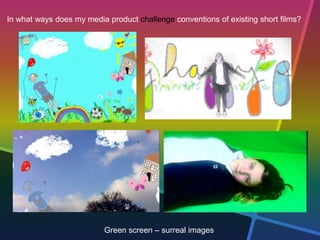
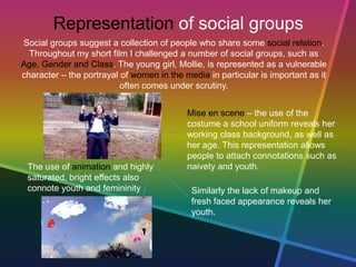
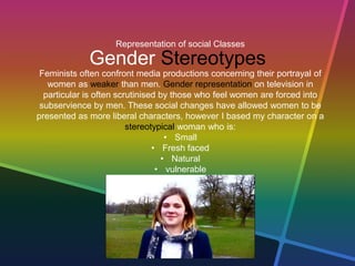
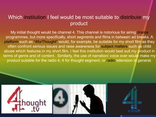
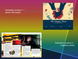
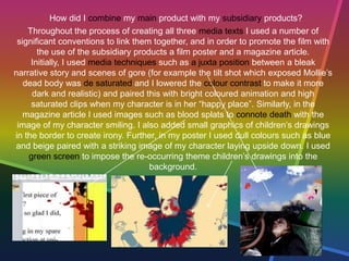
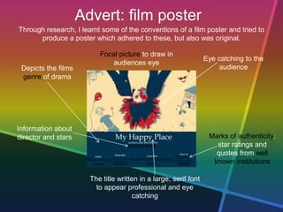
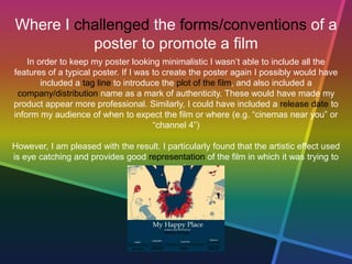
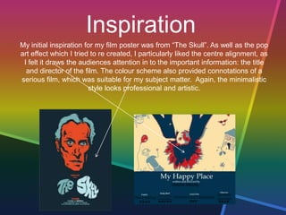
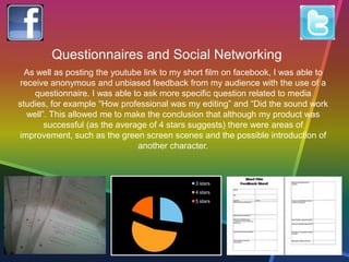
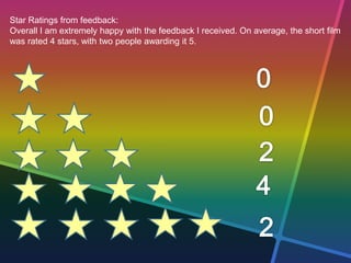
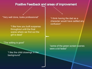
How did my media
product use, develop
and challenge forms
and conventions of real
media products?
In what ways does my media product use/develop conventions of existing short films?
Characters:
Short films tend to stick to minimal characters. I decided to adhere to this convention so
that I could develop a back story behind the one character, so that the audiences felt
they could relate to her more.
Twist:
Most short films include a twist or a disequilibrium (Todorov’s theory of equilibrium) to
make the storyline more interesting. Mt twist is when the audience discovers that the girl
is dead through the use of mise en scene such as makeup to make her appear beaten
up as she lays motionless in the shed.
Budget:
Most short films are created by independent directors, so their budget is very low. I used
no budget atall as my short film was free to create.
Location:
Similarly to characters, short films tend to have minimal locations, so as to keep the
audience focused on the narrative. I used only two locations for this reason.
Duration:
As the name suggests, short films tend to be short – approx. 5-10 minutes long. Any
longer than this would have made my product a feature length film.
In what ways does my media product use/develop conventions of existing short films?
Location 1: Hylands Park
Location 2: shed
Mise en scene reveals plot twist
In what ways does my media product challenge conventions of existing short films?
Situation:
Short films tend to fall under the genre “drama” which means they take place in every
day situations. This usually allows the viewer to relate to the situation more, however I
decided to stray from this convention as I wanted to attract my younger audience with
the use of colourful graphics and surreal green screen locations.
Camera Movement:
I again strayed from the genre of drama which is attatched to most short films by using
a number of fast paced edits and skewed hand held shots towards the end. I used
these to create tension.
Sound:
Typically short films will feature dialogue between minimal characters. I decided to
challenge this convention by using non diegetic sound only – such as voice over and
music. I feel that this allowed my audience to focus on the frame as well as the sound.
I also used a number of sound effects to make my product more professional and
authentic.
In what ways does my media product challenge conventions of existing short films?
Green screen – surreal images
Representation of social groups
Social groups suggest a collection of people who share some social relation.
Throughout my short film I challenged a number of social groups, such as
Age, Gender and Class. The young girl, Mollie, is represented as a vulnerable
character – the portrayal of women in the media in particular is important as it
often comes under scrutiny.
Mise en scene – the use of the
costume a school uniform reveals her
working class background, as well as
her age. This representation allows
people to attach connotations such as
naivety and youth.
Similarly the lack of makeup and
fresh faced appearance reveals her
youth.
The use of animation and highly
saturated, bright effects also
connote youth and femininity .
Representation of social Classes
Gender Stereotypes
Feminists often confront media productions concerning their portrayal of
women as weaker than men. Gender representation on television in
particular is often scrutinised by those who feel women are forced into
subservience by men. These social changes have allowed women to be
presented as more liberal characters, however I based my character on a
stereotypical woman who is:
• Small
• Fresh faced
• Natural
• vulnerable
How did I attract my audience?
• My core target audience was children of an age similar to the actress –
12-14. In order to make my product suitable for my target audience, I
made sure the images of child abuse were not too graphic, but instead
helped to educate. Other than to educate my purpose was to, of
course, entertain, so I used fast paced edits, colourful images and
graphics and a disequilibrium to ensure my product was entertaining for
my audiences.
• My peripheral audience was far most vast: adults that will sympathise
with the young girl. This could be people in professions such as
teaching or social workers, but applies to all potential groups who
would feel empathetic towards the child. In order to attract these
audience I used a number of close ups to reveal expression and also
high angle shots to connote vulnerability. I also used my subsidiary
products in a similar way to attract this particular audience.
Which institution I feel would be most suitable to distribute my
product
My initial thought would be channel 4. This channel is notorious for airing drama
programmes, but more specifically, short segments and films in between ad breaks. A
platform such as “4forThought” would, for example, be suitable for my short film as they
often confront serious issues and raise awareness for subject matters such as child
abuse which features in my short film. I feel this institution would best suit my product in
terms of genre and of content. Similarly, the use of narration/ voice over would make my
product suitable for the radio 4, 4 for thought segment, or radio television in general.
How effective is the
combination of your
main product and
subsidiary products?
Subsidiary product 1 –
advert: film poster
Subsidiary product 2 –
magazine article
How did I combine my main product with my subsidiary products?
Throughout the process of creating all three media texts I used a number of
significant conventions to link them together, and in order to promote the film with
the use of the subsidiary products a film poster and a magazine article.
Initially, I used media techniques such as a juxta position between a bleak
narrative story and scenes of gore (for example the tilt shot which exposed Mollie’s
dead body was de saturated and I lowered the colour contrast to make it more
dark and realistic) and paired this with bright coloured animation and high
saturated clips when my character is in her “happy place”. Similarly, in the
magazine article I used images such as blood splats to connote death with the
image of my character smiling. I also added small graphics of children’s drawings
in the border to create irony. Further, in my poster I used dull colours such as blue
and beige paired with a striking image of my character laying upside down. I used
green screen to impose the re-occurring theme children’s drawings into the
background.
Advert: film poster
Through research, I learnt some of the conventions of a film poster and tried to
produce a poster which adhered to these, but also was original.
Eye catching to the
audience
Focal picture to draw in
audiences eye
The title written in a large, serif font
to appear professional and eye
catching
Marks of authenticity:
star ratings and
quotes from well
known institutions
Depicts the films
genre of drama
Information about
director and stars
Where I challenged the forms/conventions of a
poster to promote a film
In order to keep my poster looking minimalistic I wasn’t able to include all the
features of a typical poster. If I was to create the poster again I possibly would have
included a tag line to introduce the plot of the film, and also included a
company/distribution name as a mark of authenticity. These would have made my
product appear more professional. Similarly, I could have included a release date to
inform my audience of when to expect the film or where (e.g. “cinemas near you” or
“channel 4”)
However, I am pleased with the result. I particularly found that the artistic effect used
is eye catching and provides good representation of the film in which it was trying to
promote.
Inspiration
My initial inspiration for my film poster was from “The Skull”. As well as the pop
art effect which I tried to re created, I particularly liked the centre alignment, as
I felt it draws the audiences attention in to the important information: the title
and director of the film. The colour scheme also provided connotations of a
serious film, which was suitable for my subject matter. Again, the minimalistic
style looks professional and artistic.
Magazine Article
The house style is
continued throughout
article (double page
spread, EMPIRE LOGO)
etc.
One dominant image
which is eye
catching, then
smaller ones
Through research, I learnt some of the conventions of a magazine article and tried
to produce an article which adhered to these, but also was original.
Headings and sub
headings
Text grabs to
attract the
audience
The title/masthead appears
on every page
Mode of address – directed at
the audience. Easy to follow and
written in a serif font face to
appear more formal.
Where I challenged the forms/conventions of
a magazine article
EMPIRE magazine articles tend to include a lot of negative/white space.
I, however, wanted to make the article appear busy and quite crowded for
aesthetic purposes but also to connote a child. If I was to do my article again, I
would have included more anchorage to explain the photographs and possibly
referred to the film and its release date towards the end as this is typical for
magazine such as EMPIRE which promote films and actors.
3 stars
4 stars
5 stars
Questionnaires and Social Networking
As well as posting the youtube link to my short film on facebook, I was able to
receive anonymous and unbiased feedback from my audience with the use of a
questionnaire. I was able to ask more specific question related to media
studies, for example “How professional was my editing” and “Did the sound work
well”. This allowed me to make the conclusion that although my product was
successful (as the average of 4 stars suggests) there were areas of
improvement, such as the green screen scenes and the possible introduction of
another character.
Star Ratings from feedback:
Overall I am extremely happy with the feedback I received. On average, the short film
was rated 4 stars, with two people awarding it 5.
“Very well done, looks professional”
“I like how you built suspense
throughout until the final
scene where we find out the
girl is dead”
“The editing is good”
“I like the child drawings in the
background”
“I think having the dad as a
character would have settled any
confusion”
“some of the green screen scenes
were a bit faded”
Media technologies:
construction and
research, planning and
evaluation stages
Throughout the process of both construction and research I continuously used
the search engine Google and the social media site YouTube. I was able to type
in key words into YouTube such as “short film” to discover some of the forms and
conventions which I should apply to my product. Similarly, when finding my
music, I typed in key words such as “slow” and “atmospheric” to find a piece of
music which suited the tone of my text.
Technology
Throughout the process of creating all three media texts a number of programmes
have stood out for me as vital in the creating of my products. The first being
wordpress: the blogging site allowed me to keep all of my research in one place, as
well as allowing me to keep documents such as production schedules.
The Macs were essential for my short film, especially the programme iMovie. I had
used this before so found it fairly easy and it allowed me to use media techniques
such as green screening and flash transitions between my abrubt cuts.
In creating my subsidiary products I used Microsoft programmes. For my magazine
article I used Microsoft publisher, as it allowed me to create a double page spread
template and easily insert columns and titles, as well as images and decorations.
For my film poster I used prepro to make my own pop art effect, I then used paint to
add details such as writing. If I were to re do the process I would have used a more
advanced photo editing software, as I feel that paint limited how creative I could be.
Technology
In terms of both still and video footage, I used a Canon 1000D and a SONY HD
camera for all images and clips. I found the SONY HD camera to be very easy to
use and found that it produced a high quality film. Although the Canon was of
excellent quality, I found it very hard to use as it was my first time using a camera
with an adjustable lenses and so many settings! I did, however, manage to product a
number of location shots, as well as the stills I used for my magazine and film poster.
Both cameras worked well in front of the green screen, I believe the problem in fact
occurred in the editing stages.
Thank you

Final evaluation

  • 2.
    How did mymedia product use, develop and challenge forms and conventions of real media products?
  • 3.
    In what waysdoes my media product use/develop conventions of existing short films? Characters: Short films tend to stick to minimal characters. I decided to adhere to this convention so that I could develop a back story behind the one character, so that the audiences felt they could relate to her more. Twist: Most short films include a twist or a disequilibrium (Todorov’s theory of equilibrium) to make the storyline more interesting. Mt twist is when the audience discovers that the girl is dead through the use of mise en scene such as makeup to make her appear beaten up as she lays motionless in the shed. Budget: Most short films are created by independent directors, so their budget is very low. I used no budget atall as my short film was free to create. Location: Similarly to characters, short films tend to have minimal locations, so as to keep the audience focused on the narrative. I used only two locations for this reason. Duration: As the name suggests, short films tend to be short – approx. 5-10 minutes long. Any longer than this would have made my product a feature length film.
  • 4.
    In what waysdoes my media product use/develop conventions of existing short films? Location 1: Hylands Park Location 2: shed Mise en scene reveals plot twist
  • 5.
    In what waysdoes my media product challenge conventions of existing short films? Situation: Short films tend to fall under the genre “drama” which means they take place in every day situations. This usually allows the viewer to relate to the situation more, however I decided to stray from this convention as I wanted to attract my younger audience with the use of colourful graphics and surreal green screen locations. Camera Movement: I again strayed from the genre of drama which is attatched to most short films by using a number of fast paced edits and skewed hand held shots towards the end. I used these to create tension. Sound: Typically short films will feature dialogue between minimal characters. I decided to challenge this convention by using non diegetic sound only – such as voice over and music. I feel that this allowed my audience to focus on the frame as well as the sound. I also used a number of sound effects to make my product more professional and authentic.
  • 6.
    In what waysdoes my media product challenge conventions of existing short films? Green screen – surreal images
  • 7.
    Representation of socialgroups Social groups suggest a collection of people who share some social relation. Throughout my short film I challenged a number of social groups, such as Age, Gender and Class. The young girl, Mollie, is represented as a vulnerable character – the portrayal of women in the media in particular is important as it often comes under scrutiny. Mise en scene – the use of the costume a school uniform reveals her working class background, as well as her age. This representation allows people to attach connotations such as naivety and youth. Similarly the lack of makeup and fresh faced appearance reveals her youth. The use of animation and highly saturated, bright effects also connote youth and femininity .
  • 8.
    Representation of socialClasses Gender Stereotypes Feminists often confront media productions concerning their portrayal of women as weaker than men. Gender representation on television in particular is often scrutinised by those who feel women are forced into subservience by men. These social changes have allowed women to be presented as more liberal characters, however I based my character on a stereotypical woman who is: • Small • Fresh faced • Natural • vulnerable
  • 9.
    How did Iattract my audience? • My core target audience was children of an age similar to the actress – 12-14. In order to make my product suitable for my target audience, I made sure the images of child abuse were not too graphic, but instead helped to educate. Other than to educate my purpose was to, of course, entertain, so I used fast paced edits, colourful images and graphics and a disequilibrium to ensure my product was entertaining for my audiences. • My peripheral audience was far most vast: adults that will sympathise with the young girl. This could be people in professions such as teaching or social workers, but applies to all potential groups who would feel empathetic towards the child. In order to attract these audience I used a number of close ups to reveal expression and also high angle shots to connote vulnerability. I also used my subsidiary products in a similar way to attract this particular audience.
  • 10.
    Which institution Ifeel would be most suitable to distribute my product My initial thought would be channel 4. This channel is notorious for airing drama programmes, but more specifically, short segments and films in between ad breaks. A platform such as “4forThought” would, for example, be suitable for my short film as they often confront serious issues and raise awareness for subject matters such as child abuse which features in my short film. I feel this institution would best suit my product in terms of genre and of content. Similarly, the use of narration/ voice over would make my product suitable for the radio 4, 4 for thought segment, or radio television in general.
  • 11.
    How effective isthe combination of your main product and subsidiary products?
  • 12.
    Subsidiary product 1– advert: film poster Subsidiary product 2 – magazine article
  • 13.
    How did Icombine my main product with my subsidiary products? Throughout the process of creating all three media texts I used a number of significant conventions to link them together, and in order to promote the film with the use of the subsidiary products a film poster and a magazine article. Initially, I used media techniques such as a juxta position between a bleak narrative story and scenes of gore (for example the tilt shot which exposed Mollie’s dead body was de saturated and I lowered the colour contrast to make it more dark and realistic) and paired this with bright coloured animation and high saturated clips when my character is in her “happy place”. Similarly, in the magazine article I used images such as blood splats to connote death with the image of my character smiling. I also added small graphics of children’s drawings in the border to create irony. Further, in my poster I used dull colours such as blue and beige paired with a striking image of my character laying upside down. I used green screen to impose the re-occurring theme children’s drawings into the background.
  • 14.
    Advert: film poster Throughresearch, I learnt some of the conventions of a film poster and tried to produce a poster which adhered to these, but also was original. Eye catching to the audience Focal picture to draw in audiences eye The title written in a large, serif font to appear professional and eye catching Marks of authenticity: star ratings and quotes from well known institutions Depicts the films genre of drama Information about director and stars
  • 15.
    Where I challengedthe forms/conventions of a poster to promote a film In order to keep my poster looking minimalistic I wasn’t able to include all the features of a typical poster. If I was to create the poster again I possibly would have included a tag line to introduce the plot of the film, and also included a company/distribution name as a mark of authenticity. These would have made my product appear more professional. Similarly, I could have included a release date to inform my audience of when to expect the film or where (e.g. “cinemas near you” or “channel 4”) However, I am pleased with the result. I particularly found that the artistic effect used is eye catching and provides good representation of the film in which it was trying to promote.
  • 16.
    Inspiration My initial inspirationfor my film poster was from “The Skull”. As well as the pop art effect which I tried to re created, I particularly liked the centre alignment, as I felt it draws the audiences attention in to the important information: the title and director of the film. The colour scheme also provided connotations of a serious film, which was suitable for my subject matter. Again, the minimalistic style looks professional and artistic.
  • 17.
    Magazine Article The housestyle is continued throughout article (double page spread, EMPIRE LOGO) etc. One dominant image which is eye catching, then smaller ones Through research, I learnt some of the conventions of a magazine article and tried to produce an article which adhered to these, but also was original. Headings and sub headings Text grabs to attract the audience The title/masthead appears on every page Mode of address – directed at the audience. Easy to follow and written in a serif font face to appear more formal.
  • 18.
    Where I challengedthe forms/conventions of a magazine article EMPIRE magazine articles tend to include a lot of negative/white space. I, however, wanted to make the article appear busy and quite crowded for aesthetic purposes but also to connote a child. If I was to do my article again, I would have included more anchorage to explain the photographs and possibly referred to the film and its release date towards the end as this is typical for magazine such as EMPIRE which promote films and actors.
  • 20.
    3 stars 4 stars 5stars Questionnaires and Social Networking As well as posting the youtube link to my short film on facebook, I was able to receive anonymous and unbiased feedback from my audience with the use of a questionnaire. I was able to ask more specific question related to media studies, for example “How professional was my editing” and “Did the sound work well”. This allowed me to make the conclusion that although my product was successful (as the average of 4 stars suggests) there were areas of improvement, such as the green screen scenes and the possible introduction of another character.
  • 21.
    Star Ratings fromfeedback: Overall I am extremely happy with the feedback I received. On average, the short film was rated 4 stars, with two people awarding it 5.
  • 22.
    “Very well done,looks professional” “I like how you built suspense throughout until the final scene where we find out the girl is dead” “The editing is good” “I like the child drawings in the background” “I think having the dad as a character would have settled any confusion” “some of the green screen scenes were a bit faded”
  • 23.
    Media technologies: construction and research,planning and evaluation stages
  • 24.
    Throughout the processof both construction and research I continuously used the search engine Google and the social media site YouTube. I was able to type in key words into YouTube such as “short film” to discover some of the forms and conventions which I should apply to my product. Similarly, when finding my music, I typed in key words such as “slow” and “atmospheric” to find a piece of music which suited the tone of my text.
  • 25.
    Technology Throughout the processof creating all three media texts a number of programmes have stood out for me as vital in the creating of my products. The first being wordpress: the blogging site allowed me to keep all of my research in one place, as well as allowing me to keep documents such as production schedules. The Macs were essential for my short film, especially the programme iMovie. I had used this before so found it fairly easy and it allowed me to use media techniques such as green screening and flash transitions between my abrubt cuts. In creating my subsidiary products I used Microsoft programmes. For my magazine article I used Microsoft publisher, as it allowed me to create a double page spread template and easily insert columns and titles, as well as images and decorations. For my film poster I used prepro to make my own pop art effect, I then used paint to add details such as writing. If I were to re do the process I would have used a more advanced photo editing software, as I feel that paint limited how creative I could be.
  • 26.
    Technology In terms ofboth still and video footage, I used a Canon 1000D and a SONY HD camera for all images and clips. I found the SONY HD camera to be very easy to use and found that it produced a high quality film. Although the Canon was of excellent quality, I found it very hard to use as it was my first time using a camera with an adjustable lenses and so many settings! I did, however, manage to product a number of location shots, as well as the stills I used for my magazine and film poster. Both cameras worked well in front of the green screen, I believe the problem in fact occurred in the editing stages.
  • 27.