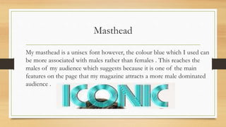
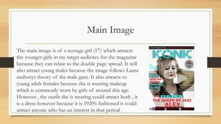
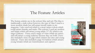
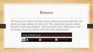
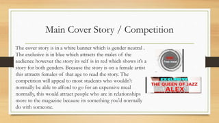
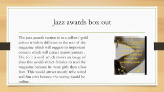
Kisan Call Centre - To harness potential of ICT in Agriculture by answer farm...
Front cover question 5
1. How did you attract /
address your audience?
Question 5
Front cover
2. Masthead
My masthead is a unisex font however, the colour blue which I used can
be more associated with males rather than females . This reaches the
males of my audience which suggests because it is one of the main
features on the page that my magazine attracts a more male dominated
audience .
3. Main Image
The main image is of a teenage girl (17) which attracts
the younger girls in my target audience for the magazine
because they can relate to the double page spread. It will
also attract young males because the image follows Laura
mulverys theory of the male gaze. It also attracts to
young adult females because she is wearing makeup
which is commonly worn by girls of around this age.
However , the outfit she is wearing could attract both , it
is a dress however because it is 1920’s fashioned it could
attract anyone who has an interest in that period .
4. The Feature Articles
The feature articles are in the colours blue and red. The blue is
traditionally a male colour however, the type of blue I used is a
more modern shade but will attract mostly males to my
magazine. I also used red which is a more unisex colour which
could attract females and males. The colours I used are modern
and bright which will attract young adults (17-21) which is my
target audience . I have used a range of fonts which are unisex
and will attract a young audience because they are bold. I have
also included a story for gigs which attracts fun atics and young
induvial . I have also included a page for fashion which attracts
young females which are mainstreamers and aspirers .
5. Banners
The banners are in black, they both contain websites and social media links, this
attracts my target audience of tribe wired . The social media icons also attract
this part of main target audience . They are neutral colour which attracts male
and females. It also as a sell line which will attract mainstreamers.
6. Main Cover Story / Competition
The cover story is in a white banner which is gender neutral .
The exclusive is in blue which attracts the males of the
audience however the story its self is in red which shows it’s a
story for both genders. Because the story is on a female artist
this attracts females of that age to read the story. The
competition will appeal to most students who wouldn’t
normally be able to afford to go for an expensive meal
normally, this would attract people who are in relationships
more to the magazine because its something you'd normally
do with someone.
7. Jazz awards box out
The jazz awards section is in a yellow/ gold
colour which is different to the rest of the
magazine which will suggest its important
content which will attract mainstreamers .
The font is serif which shows an image of
class this would attract females to read the
magazine because its more girly than a box
font. This would attract mostly tribe wired
and fun atics because the voting would be
online .