The document discusses how the media product both follows and challenges conventions of real magazines. It follows conventions such as using different fonts and page numbers to guide readers. However, it also challenges conventions by using a simple three-color scheme rather than bright colors, and including reader submissions rather than just professional content. Overall, the document aims to create a magazine that feels sophisticated while still appealing to a younger audience.
Francesca Gottschalk - How can education support child empowerment.pptxEduSkills OECD
Francesca Gottschalk from the OECD’s Centre for Educational Research and Innovation presents at the Ask an Expert Webinar: How can education support child empowerment?
Read| The latest issue of The Challenger is here! We are thrilled to announce that our school paper has qualified for the NATIONAL SCHOOLS PRESS CONFERENCE (NSPC) 2024. Thank you for your unwavering support and trust. Dive into the stories that made us stand out!
Model Attribute Check Company Auto PropertyCeline George
In Odoo, the multi-company feature allows you to manage multiple companies within a single Odoo database instance. Each company can have its own configurations while still sharing common resources such as products, customers, and suppliers.
Operation “Blue Star” is the only event in the history of Independent India where the state went into war with its own people. Even after about 40 years it is not clear if it was culmination of states anger over people of the region, a political game of power or start of dictatorial chapter in the democratic setup.
The people of Punjab felt alienated from main stream due to denial of their just demands during a long democratic struggle since independence. As it happen all over the word, it led to militant struggle with great loss of lives of military, police and civilian personnel. Killing of Indira Gandhi and massacre of innocent Sikhs in Delhi and other India cities was also associated with this movement.
Introduction to AI for Nonprofits with Tapp NetworkTechSoup
Dive into the world of AI! Experts Jon Hill and Tareq Monaur will guide you through AI's role in enhancing nonprofit websites and basic marketing strategies, making it easy to understand and apply.
Unit 8 - Information and Communication Technology (Paper I).pdfThiyagu K
This slides describes the basic concepts of ICT, basics of Email, Emerging Technology and Digital Initiatives in Education. This presentations aligns with the UGC Paper I syllabus.
Macroeconomics- Movie Location
This will be used as part of your Personal Professional Portfolio once graded.
Objective:
Prepare a presentation or a paper using research, basic comparative analysis, data organization and application of economic information. You will make an informed assessment of an economic climate outside of the United States to accomplish an entertainment industry objective.
Palestine last event orientationfvgnh .pptxRaedMohamed3
An EFL lesson about the current events in Palestine. It is intended to be for intermediate students who wish to increase their listening skills through a short lesson in power point.
Acetabularia Information For Class 9 .docxvaibhavrinwa19
Acetabularia acetabulum is a single-celled green alga that in its vegetative state is morphologically differentiated into a basal rhizoid and an axially elongated stalk, which bears whorls of branching hairs. The single diploid nucleus resides in the rhizoid.
Home assignment II on Spectroscopy 2024 Answers.pdf
Question 1
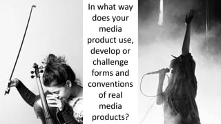
1. In what way
does your
media
product use,
develop or
challenge
forms and
conventions
of real
media
products?
2. I followed many typical media magazine conventions by having a large masterhead but unlike magazines such as
top of the pops and Kerrang! Rather than having the masterhead span across the full width of the magazine I
decided to have it much smaller and encased within a red square to attract the readers attention. This does still go
along with magazine conventions as it follows the rule of thirds. On the other hand I defied many magazine
conventions by having my tagline intertwined with my magazine title. This keeps the audience attention on the
magazine title and also saves space by including it within the same space as the title. I used the colour red as it
contrasts against the black and white theme but also to represent urgency and grab the audiences attention.
A convention that I used was a pull
quote on the magazine cover. This
draws in the reader as is gives them
a preview of what is in store within
the magazine. I developed this
convention by including it in a
exclusive interview this also give the
reader a fell that there getting a
sneak peak of the magazines
content before others enticing them
in and increasing the possibility of
them purchasing this magazine over
other.
I challenged many media conventions by having my
magazine cover in a simple 3 tone colour scheme.
By having the majority of my cover in black and
white I defied many modern magazine conventions
as bright colours are generally used to attract the
eye of the reader and also to appeal to a certain
demographic. Where as is only used black, white
and red. I picked this simple colour scheme to add a
mature look to the magazine as my target audience
is primarily aged between 16 and 24 to the
magazine had to still appeal to the older end. Also
due to the feedback I got in my interviews my target
audience will still be sophisticated participating in
events such as meals. Also the black and white is
different to many magazines focusing on this same
genre as mine attracting the target audience to my
cover other than any other brand. The red adds that
vibrant and eye catching element that the magazine
needs to attract the attention of the audience and it
really pops due the to monotones surrounding.
I followed many magazine
conventions by using different
fonts to indicate important
pieces of text and also to draw
the attention of the audience.
By using different fonts it also
becomes clear of what
information and artists will be
included inside without the
audience having to look at the
content. This is an important
media convention as in
attracts a wider audience as it
will appeal also to fans of the
artists included and as my
magazine is a muliti genre
magazine the artists on the
cover will attract a different
demographic weekly.
3. Another media convention I used was by including a footer to my magazine cover this
expands on my point of including featured artists to widen the magazines demographic.
Theses artists are also in this magazine addition. I developed this convention on the other
hand by also including footers and headers with included artists on the magazine content
page.
On my contents page I followed
the rule of thirds which is a
media convention by I developed
this by having one of these
columns dedicated to audience
input. One of my columns is
dedicated to having the readers
images that they have sent in in
the magazine. By using audience
participation I creates a bond
between the reader and the
magazine as the reader fells like
they have input and a chance to
feature in the magazine. This
ensures that the reader will
frequently buy the magazine
with the hopes that they will
feature in it and as it is a
monthly addition this is a great
asset as the magazines are more
expensive to buy. By including
images of concerts that apply to
some of the genres featured in
my magazine it will also give a
chance for reader unable to
attend the concert a sneak peak
of what it looked like.
My double page spread followed many media magazine conventions.
Firstly I used the rule of thirds as used in many magazines such as NME
and Q but I developed this idea by having a short introduction to the
interview that span across the length of all three columns. This was
firstly to make it clear to the target audience that it was separate
information but also to give reader that may not be familiar with that
artist a chance to learn some more about her. When producing my
double page spread I decided that instead of having the image span
across both pages I decide that I would create a clear divide between
the two pages by having a simply layout, one side an A4 image and a
pull quote and one page all text. I developed the concept of colour
schemes by having just the one colour scheme for all three pages.
Instead of giving the double page spread a separate colour scheme I left
it red, black and white. This creates flow in my magazine giving it a
sophisticated edge.
Another convention I followed closely was on my contents page
having the pages numbers in a bigger size to the page summary
this is so that the reader could easily see that page numbers and
navigate there way around the magazine. i developed this
convention by also having my subheadings is even bigger fonts
so that the target audience could also see the topic of the pages.
4. All the images in the contact sheets were taken in the college studio using a basic white paper
back drop, in some images a stool and lighting. The lighting was set up using just key and fill
lighting. I first considered using standard three point lighting to lessen shadowing around my main
subject and have a very bright image but then when I took into consideration the fact that my
cover would be in back and white I eliminated the back lighting and just used key and fill. By using
two lights in this set up I was able to still control the shadows but use it to cast a basic shadow
across one side of the subject to give the piece dimension as the black and whit editing will
flatten the piece. The simple white backing helped still brighten the image mainly due to its harsh
bright colour but also to reflect the key and fill lighting back onto the subject.