1. Progression for Final Product
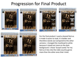
For the final product I used a cleared font as
it made it easier to read, it is bolder and
therefore stands out compared to the other
versions. I changed the masthead to white
because it stood out more on the dark
background. I chose ‘Surpal Lovely’ for my
font as it ties into the indie-country genre
more than the other ones that I tried.
2. Progressions for double page spread
I changed the background colour from white
to black because it ties into the colors of the
models outfits and that is also why I used red
fonts to tie it all together. The white
background didn’t look as effective either
because it clashed with the cream colour in
the images. The change of the font type from
‘Surpal lovely’ to ‘Prisma’ was because it
stood out more and made it easier to read. It
also tied into the font used on the front cover
for the subheadings.
3. Progressions for front cover mock up
For these I explored a range of
different fonts to see which ones
looked good and which were
most effective. I tried to
incorporate the treble clef logo
into my masthead to link with the
title but decided with my final
font type that it didn’t fit and
therefore didn’t use it.
4. FRONT COVER
Why did you make these changes?
I changed the colour from normal to Sepia because it
made it look more country which tied into the genre
being indie-country. This also enabled the masthead
and sub-headings to stand out more on the darker
background.