
Recommended
More Related Content
What's hot
What's hot (20)
Similar to Double Page Spread process
Similar to Double Page Spread process (20)
More from nataliestephenson97
More from nataliestephenson97 (10)
Recently uploaded
Recently uploaded (20)
Double Page Spread process
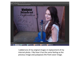
- 1. I added one of my original images in replacement of my internet photo. I like how it has the same feeling as the previous image and juxtaposes the front cover image.
- 2. I adjusted the brightness and contrast of the image. I did this to enhance all of the colours and to make the image look more eye catching.
- 3. I used the polygon lasso tool to create a copy of the model. This will allow me to layer the body above other objects, but it will also allow me to have the background a different colour to the model. This will make the model stand out.
- 4. I created a copy of the picture and added a black and white effect to it. I then reduced the opacity to 50%. This resulted in the background becoming faded with only a slight hint of colour. I moved the cut out of the model above both layers of the image so the model had the original colouring. I used the same technique on the front cover. This makes the model the main focus in the image.
- 5. I used the spot healing tool to remove any imperfections on her face. This makes the image appear more seamless and smooth.
- 6. I selected the blur tool. I ran this around the edge of the cut out image to reduce the harshness of the contrast between the cut out image and the background. This makes the image look more professional.
- 7. I changed the writing at the top to make it look more professional and simple. I tool the inspiration from another classical music magazine.
- 8. I began experimenting with different fonts for my article.
- 9. I used the brush tool to make the teeth whiter. I then reduced the opacity to make them look natural. I repeated this step on the eyebrows and the eyelashes to add definition.
- 10. I increased the space between the columns to make it look more professional easier and to make it easier to read.
- 11. I reduced the size of the font and added more text. This made it look more professional as most magazine fonts are small. I also didn’t want to fill up all of the space as I wanted the main focus to be on the image and the heading.