1. Fonts
Experimenting with fonts
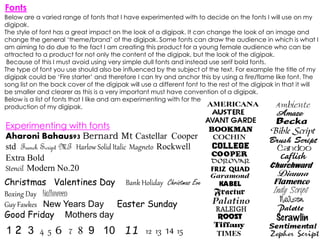
Aharoni Bahaus93 Bernard Mt Castellar Cooper
std French Script MT Harlow Solid Italic Magneto Rockwell
Extra Bold
Stencil Modern No.20
Christmas Valentines Day Bank Holiday Christmas Eve
Boxing Day Halloween
Guy Fawkes New Years Day Easter Sunday
Good Friday Mothers day
1 2 3 4 5 6 7 8 9 10 11 12 13 14 15
Below are a varied range of fonts that I have experimented with to decide on the fonts I will use on my
digipak.
The style of font has a great impact on the look of a digipak. It can change the look of an image and
change the general ‘theme/brand’ of the digipak. Some fonts can draw the audience in which is what I
am aiming to do due to the fact I am creating this product for a young female audience who can be
attracted to a product for not only the content of the digipak, but the look of the digipak.
Because of this I must avoid using very simple dull fonts and instead use serif bold fonts.
The type of font you use should also be influenced by the subject of the text. For example the title of my
digipak could be ‘Fire starter’ and therefore I can try and anchor this by using a fire/flame like font. The
song list on the back cover of the digipak will use a different font to the rest of the digipak in that it will
be smaller and clearer as this is a very important must have convention of a digipak.
Below is a list of fonts that I like and am experimenting with for the
production of my digipak.