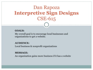
1. GOALS: My overall goal is to encourage local businesses and organizations to get a website. AUDIENCE: Local business & nonprofit organizations MESSAGE: An organization gains more business if it has a website Dan Rapoza Interpretive Sign Designs CSE-615
2.
3.
4.
5. This next revision adds a bit of contrast. The layout was changed a bit and has some repetition added.
6.
7. For this next one, I went a completely different direction. I wanted to play with color, and the previous design didn’t work well with different color schemes. I used a Fresco filter on each of the pictures and altered the coloring for each a little. Then I styled the text a bit and introduced a dirty phonebook for a background. I tried to give the whole thing a even color scheme. I thought the result was… different. I was surprised that I liked the way it turned out.
8.
9. These next two slides are some of my experiments with type. Neither went well with the phonebook background, so I dropped that.
10.
11.
12. In the end, I went back to the design with contrast. I tweaked the font a little from the contrast design, and added a small picture of a globe to give the type in the title a little extra flavor.
13.
Editor's Notes
On this one, I tried to play with size, weights and color. I was pretty into it when I was first putting it together, but I wasn’t really crazy with how it turned out.
For this one, I played with form, mostly. I got distracted with how the feel of it didn’t go with the Earth background, so I enlarged the “people on computers” pic and made it a background. The design had a café / coffee shop feel at that point, so I tried to find a font to match that feel.