1. The font I used for my masthead was the
‘Brannboll Ny’ font, taken from a
website called, ‘Dafont.com’. I chose this
font because it looked very elegant and
caught my eye immediately. I initially
decided to use the colour blue as my
masthead as it would resemble the
colour of my models’ jeans and student
pass. However, when I applied the colour
on my masthead, it looked quite dull and
not at all professional. I thereafter
experimented with colours and finally
came to a conclusion of using 3 main
colours which I know will look good
together when incorporated; black, white
and red. These colours, in my opinion,
will make my magazine cover stand out
and grab attention of the reader, as well
as making my magazine name look
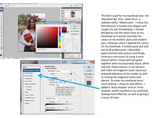
vibrant. To make my masthead seem
more striking, I chose to add effects . I
added a ‘drop shadow’ and an ‘inner
shadow’, which resulted in my masthead
looking more effective, as well as giving it
a more 3D look.
2. The main theme for my magazine is to make
sixth form students aim to get themselves
settled and organised, and aspire to get the
best grades they possibly can. As my
magazine cover also includes ways of
balancing out social life with college life, I
decided to include this on my front cover as
well, just below the masthead. For this, I
used the font, ‘Napa Heavy SP’. I also
experimented with what colours I should use
for these 3 subtitles. I started off with the
colour black, as I thought it would look classy
and would intrigue the reader, however, it
did not result in the way I was hoping for and
made my front cover seem like it was aimed
at the lower years. Taking this into
consideration, I decided to change the font
colour to white which I felt worked well with
the main image. It stood out and was clear
to see and read. I also included straight lines
in between the texts, in order to separate
them. This was effective as it made my
magazine front cover look more professional
and appealing. However, the text looked like
it was lacking something, in order to make it
more prominent. Therefore, I included
effects, such as ‘drop shadow’ and ‘bevel
and emboss’. By doing this, the text seemed
to pop out and look effective.
3. To make my magazine cover look more realistic, I
intended to include a graphic. I used a star shape
which I copied and pasted from Microsoft
PowerPoint. I edited the star shape before pasting it
onto my front cover, by making the shape outline red,
to match the colour of my masthead. However, when
I pasted this graphic on the magazine, it did not look
as apparent as I would have liked it to be and also, it
did not seem attention-grabbing. I then planned to
edit the graphic on PowerPoint, by making the outline
thicker and bolder, so that it would intrigue the
reader. I then included a text in the graphic, which
read ‘exclusive’. I used the font ‘Napa Heavy SP’ for
this text and planned to use the colour black, for the
text. This made the graphic stand out, as the red
outline and black text complimented each other.
Although the graphic looked good as a whole, I felt
there was something else I needed to include to
make the graphic and the text in it, to look
distinguished. Taking this into consideration, I
thought of changing the ‘shape fill’ colour from
transparent, to white, which resulted in the graphic
looking bolder and the text in it, looking more
obvious. I also included another graphic on my front
cover; a black circle. I chose to use this because I
thought it would be eye-catching and would intrigue
the reader. I also included a text in the graphic which
read, ‘Free timetable inside’. I planned to use this text
because I feel that it is a good selling point and an
excellent way to grab the attention of the reader.
4. For the pull quote, I used the font ‘Undercurrent
BTN’ and initially came up with the idea of using the
colour black for this text. I placed it diagonally,
towards the bottom of the magazine, where model’s
hands were. I decided to go for the colour black,
because I thought it would look fancy , and also
because o f the background I had put the text in
front; the model’s white T-shirt would help to ‘bring
out’ the text. However, this did not go according to
plan, as it became difficult to see and read. I then
added effects to the pull quote, in order to make it
more visible. The effects I used were the same as the
effects I had used for the 3 subtitles; ‘drop shadow’
and ‘bevel and emboss’. I came up with the decision
of continuing to use the same effects because this
would make my magazine cover look cohesive, as
well as attractive. Despite this change, the pull quote
was still very hard to read. I then thought of adding
a coloured box behind the text, and changing the
colour of the text. I first added a black box behind
the text and changed the colour of the text to white.
This did not work well together because the black
background overpowered the whole front cover,
resulting in the reader losing focus from the main
image. Therefore, I decided to change the box colour
to red and also lowered the opacity, which created
the transparent effect.
5. I decided to include an issue number on my
magazine cover, in order to make it look
more professional and realistic. The font I
used for this was ‘Hobo Std’ and the initial
colour I planned to use was black. The
reason being was because I thought that as
my main scheme included 3 main colours, I
should use all of them evenly, and not use
one more than the others. However, when I
experimented with this colour, it was quite
hard to see, due to the background and
therefore, it could not be read. Taking this
into consideration, I changed the font to
red, to match it to my masthead. To make
the font look even better, I chose to add the
effects ‘drop shadow’ and ‘bevel and
emboss’. This was effective because it stood
out more and was much clearer and easier
to read. I used the same font, colour and
effects for my main coverline as it helped it
to become prominent and also to grab the
attention of the reader. The model’s name
was typed in the colour red to make it bold,
and the rest of the text was in black. I chose
to go with these two colours because I
thought that both these colours are very
daring and vibrant.
6. To make my magazine cover look more
professional, I intended to include a puff,
as it would help engage the reader. In this
coverline, the ‘Top 10’ has been typed in
the same colour as the masthead, to
make it look cohesive. However, the font I
have used is ‘Napa Heavy SP’ and also
added some effects to make it stand out.
The effects used are ‘drop shadow’ and
‘inner shadow’ as these help to create the
text more visible and 3D. The rest of the
coverline consists of the font ‘Hobo Std’
and uses the colour white. My initial idea
was to make the rest of the coverline
black, however, this made it difficult to
read the font and was not as prominent
as I thought it would have been.
Therefore, I changed the font colour to
white, which made the text seem more
noticeable. I did not add any effects to
this because it would have started to
overpower the puff, and would not look
too good together.
7. Another coverline I have included on my
magazine cover consists of the 3 colours I had
chosen, to be used. In this coverline, I used
two different fonts as I thought that it would
make the coverline look unique and help to
attract the audience. The fonts included in
this coverline are ‘Hobo Std’ and ‘Napa Heavy
SP’. I decided to use these fonts because I did
not want all my coverlines to use the same
font and appear identical to each other. The
use of different fonts made my magazine look
efficient and would help to intrigue the
reader. I also played around with the font sizes
to see which one would fit in with my
magazine cover, overall. I came to a
conclusion that I should make the word ‘quiz’
bigger than the rest of the words, as including
a quiz in my magazine would be a good selling
point and would immediately grab the
attention of the reader. I also changed the
colour of this word to black, in order to make
it more prominent and easy to be read. On my
magazine front cover, I have also included a
barcode to make my magazine look the same
quality as some of the well-known magazines.