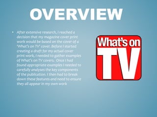
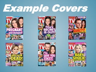
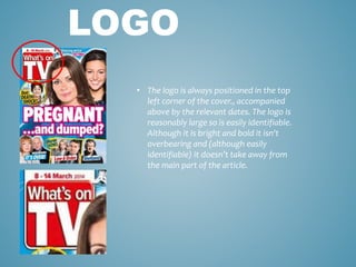
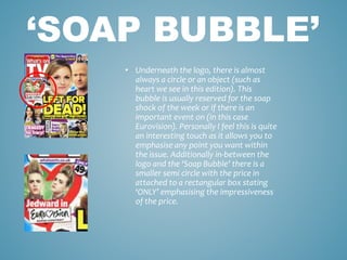
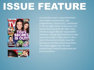
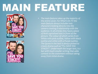
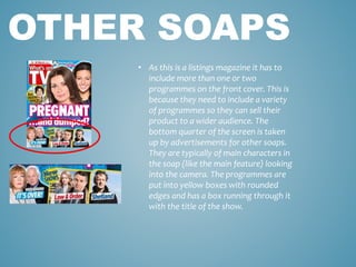
WHAT’S ON TV COVER
RESEARCH & ANALYSIS
• After extensive research, I reached a
decision that my magazine cover print
work would be based on the cover of a
‘What’s on TV’ cover. Before I started
creating a draft for my actual cover
print work, I needed to gather examples
of What’s on TV covers. Once I had
found appropriate examples I needed to
carefully analyses the key components
of the publication. I then had to break
down these features and need to ensure
they all appear in my own work
OVERVIEW
Example Covers
• The logo is always positioned in the top
left corner of the cover., accompanied
above by the relevant dates. The logo is
reasonably large so is easily identifiable.
Although it is bright and bold it isn't
overbearing and (although easily
identifiable) it doesn’t take away from
the main part of the article.
LOGO
• Underneath the logo, there is almost
always a circle or an object (such as
heart we see in this edition). This
bubble is usually reserved for the soap
shock of the week or if there is an
important event on (in this case
Eurovision). Personally I feel this is quite
an interesting touch as it allows you to
emphasise any point you want within
the issue. Additionally in-between the
logo and the ‘Soap Bubble’ there is a
smaller semi circle with the price in
attached to a rectangular box stating
‘ONLY’ emphasising the impressiveness
of the price.
‘SOAP BUBBLE’
• On all of the covers I researched there
was a either a series finale, new
programme or ‘shock story’ positioned
in the top right corner of the cover. It is
positioned away from the other main
articles so (again like the ‘soap bubble’
whatever is being advertised here jumps
out at the reader. In this case it is the x
factor final and on a similar issue the
dancing on ice final is advertised there.
This could suggest only the most
popular/most viewed programmes are
positioned here.
ISSUE FEATURE
• The main feature takes up the majority of
the entire cover. For What’s On TV the
main feature always includes two
characters looking directly into the
camera creating a relationship with the
audience. In all articles they have a piece
of Bold capitalised text in front of the
picture. The colour of which varies from
White with pink outline, Yellow with black
outline and white with a Purple outline.
The Quote in the text is always picked to
create drama such as “I’LL SAVE YOU
STACEY!”. Underneath the larger text, is a
bar with much smaller writing that adds
context to the statement without taking
away from initial drama.
MAIN FEATURE
• As this is a listings magazine it has to
include more than one or two
programmes on the front cover. This is
because they need to include a variety
of programmes so they can sell their
product to a wider audience. The
bottom quarter of the screen is taken
up by advertisements for other soaps.
They are typically of main characters in
the soap (like the main feature) looking
into the camera. The programmes are
put into yellow boxes with rounded
edges and has a box running through it
with the title of the show.
OTHER SOAPS

What’s on tv cover research & analysis

  • 1.
    WHAT’S ON TVCOVER RESEARCH & ANALYSIS
  • 2.
    • After extensiveresearch, I reached a decision that my magazine cover print work would be based on the cover of a ‘What’s on TV’ cover. Before I started creating a draft for my actual cover print work, I needed to gather examples of What’s on TV covers. Once I had found appropriate examples I needed to carefully analyses the key components of the publication. I then had to break down these features and need to ensure they all appear in my own work OVERVIEW
  • 3.
  • 4.
    • The logois always positioned in the top left corner of the cover., accompanied above by the relevant dates. The logo is reasonably large so is easily identifiable. Although it is bright and bold it isn't overbearing and (although easily identifiable) it doesn’t take away from the main part of the article. LOGO
  • 5.
    • Underneath thelogo, there is almost always a circle or an object (such as heart we see in this edition). This bubble is usually reserved for the soap shock of the week or if there is an important event on (in this case Eurovision). Personally I feel this is quite an interesting touch as it allows you to emphasise any point you want within the issue. Additionally in-between the logo and the ‘Soap Bubble’ there is a smaller semi circle with the price in attached to a rectangular box stating ‘ONLY’ emphasising the impressiveness of the price. ‘SOAP BUBBLE’
  • 6.
    • On allof the covers I researched there was a either a series finale, new programme or ‘shock story’ positioned in the top right corner of the cover. It is positioned away from the other main articles so (again like the ‘soap bubble’ whatever is being advertised here jumps out at the reader. In this case it is the x factor final and on a similar issue the dancing on ice final is advertised there. This could suggest only the most popular/most viewed programmes are positioned here. ISSUE FEATURE
  • 7.
    • The mainfeature takes up the majority of the entire cover. For What’s On TV the main feature always includes two characters looking directly into the camera creating a relationship with the audience. In all articles they have a piece of Bold capitalised text in front of the picture. The colour of which varies from White with pink outline, Yellow with black outline and white with a Purple outline. The Quote in the text is always picked to create drama such as “I’LL SAVE YOU STACEY!”. Underneath the larger text, is a bar with much smaller writing that adds context to the statement without taking away from initial drama. MAIN FEATURE
  • 8.
    • As thisis a listings magazine it has to include more than one or two programmes on the front cover. This is because they need to include a variety of programmes so they can sell their product to a wider audience. The bottom quarter of the screen is taken up by advertisements for other soaps. They are typically of main characters in the soap (like the main feature) looking into the camera. The programmes are put into yellow boxes with rounded edges and has a box running through it with the title of the show. OTHER SOAPS