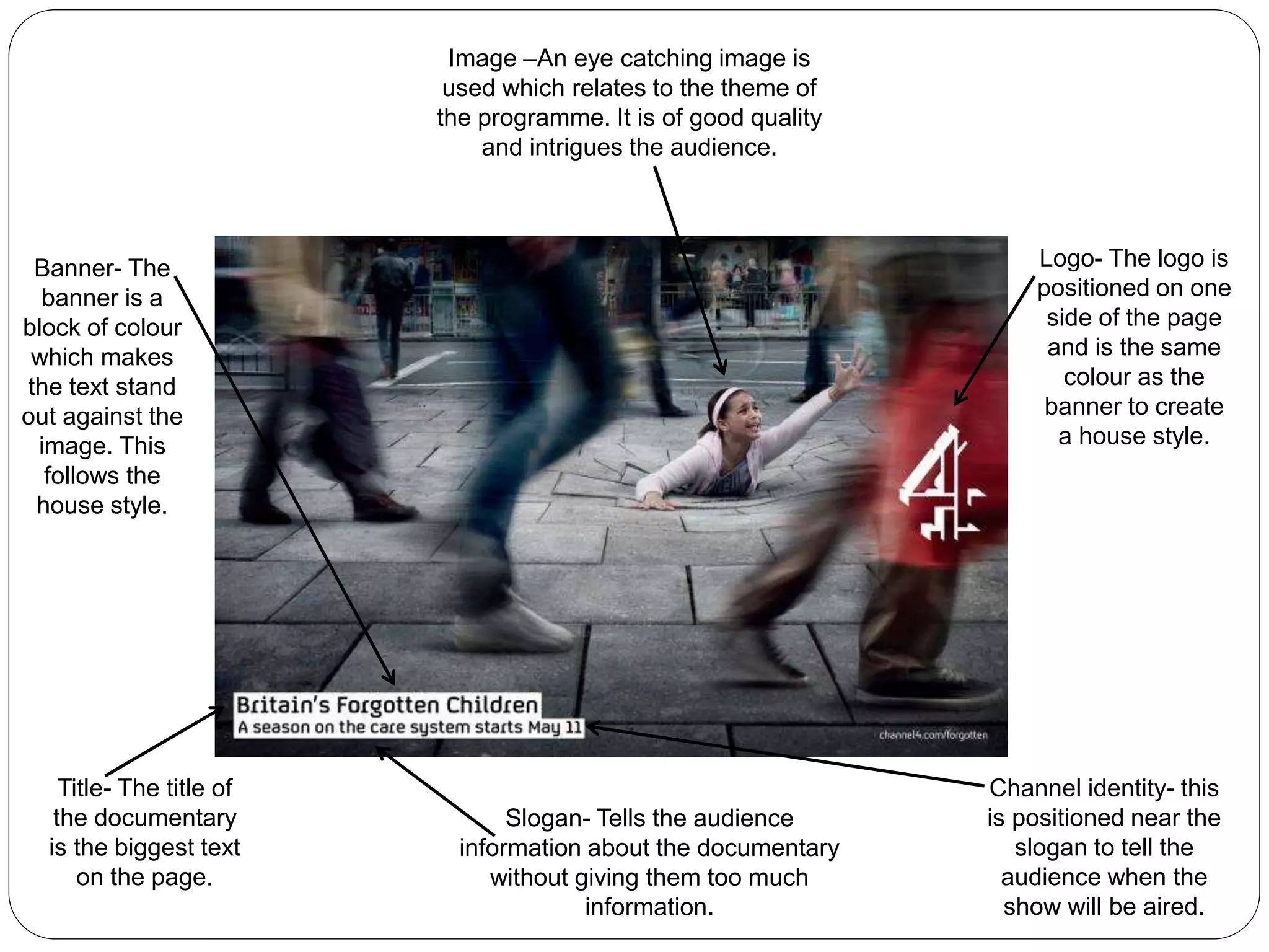
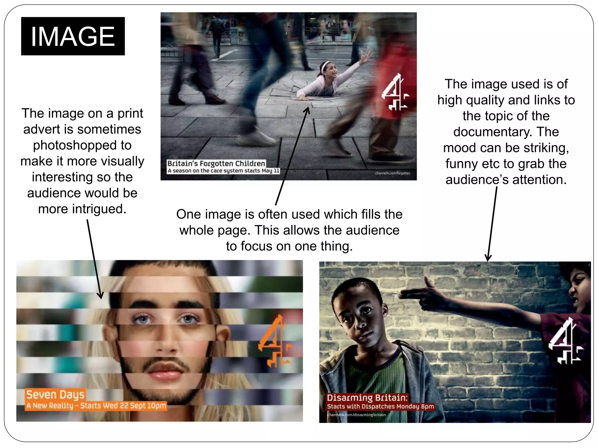
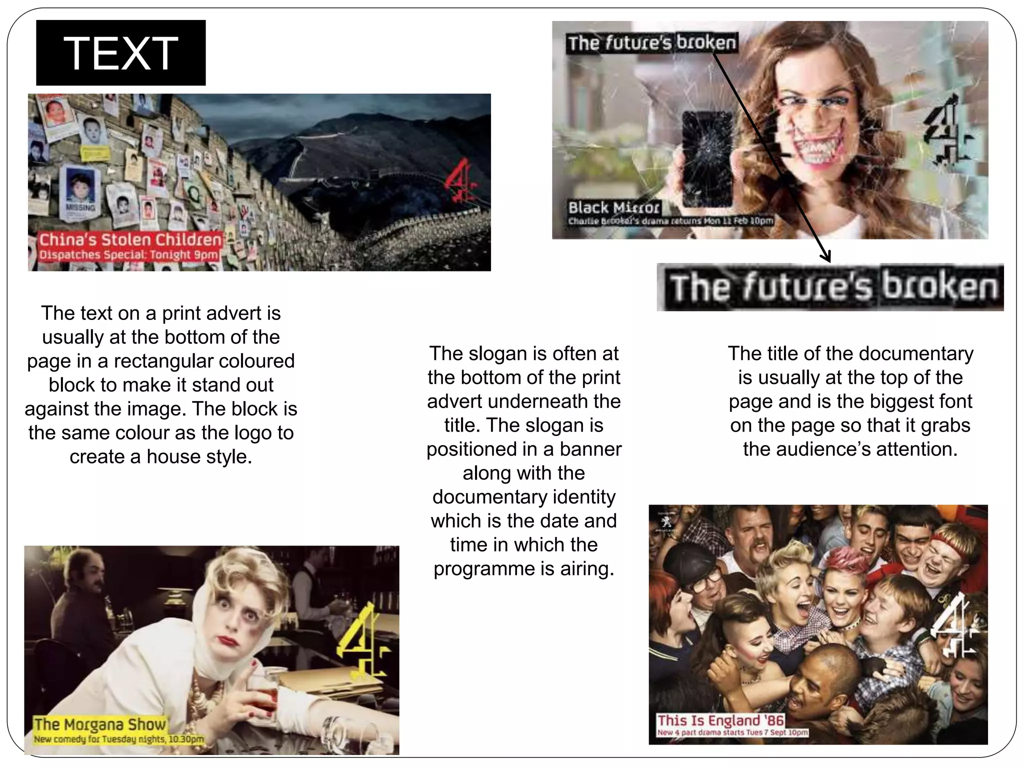
Lucy Ollier
Codes & Conventions of Print
Adverts
Image –An eye catching image is
used which relates to the theme of
the programme. It is of good quality
and intrigues the audience.
Logo- The logo is
positioned on one
side of the page
and is the same
colour as the
banner to create
a house style.
Channel identity- this
is positioned near the
slogan to tell the
audience when the
show will be aired.
Slogan- Tells the audience
information about the documentary
without giving them too much
information.
Banner- The
banner is a
block of colour
which makes
the text stand
out against the
image. This
follows the
house style.
Title- The title of
the documentary
is the biggest text
on the page.
IMAGE
The image on a print
advert is sometimes
photoshopped to
make it more visually
interesting so the
audience would be
more intrigued. One image is often used which fills the
whole page. This allows the audience
to focus on one thing.
The image used is of
high quality and links to
the topic of the
documentary. The
mood can be striking,
funny etc to grab the
audience’s attention.
TEXT
The text on a print advert is
usually at the bottom of the
page in a rectangular coloured
block to make it stand out
against the image. The block is
the same colour as the logo to
create a house style.
The title of the documentary
is usually at the top of the
page and is the biggest font
on the page so that it grabs
the audience’s attention.
The slogan is often at
the bottom of the print
advert underneath the
title. The slogan is
positioned in a banner
along with the
documentary identity
which is the date and
time in which the
programme is airing.
LOGO
The channel logo is
positioned to the side of
the page.
The logo follows a house style as the
colour of the logo is the same colour as
the banner. This links the whole advert
together.

Codes & conventions of print adverts

  • 1.
    Lucy Ollier Codes &Conventions of Print Adverts
  • 2.
    Image –An eyecatching image is used which relates to the theme of the programme. It is of good quality and intrigues the audience. Logo- The logo is positioned on one side of the page and is the same colour as the banner to create a house style. Channel identity- this is positioned near the slogan to tell the audience when the show will be aired. Slogan- Tells the audience information about the documentary without giving them too much information. Banner- The banner is a block of colour which makes the text stand out against the image. This follows the house style. Title- The title of the documentary is the biggest text on the page.
  • 3.
    IMAGE The image ona print advert is sometimes photoshopped to make it more visually interesting so the audience would be more intrigued. One image is often used which fills the whole page. This allows the audience to focus on one thing. The image used is of high quality and links to the topic of the documentary. The mood can be striking, funny etc to grab the audience’s attention.
  • 4.
    TEXT The text ona print advert is usually at the bottom of the page in a rectangular coloured block to make it stand out against the image. The block is the same colour as the logo to create a house style. The title of the documentary is usually at the top of the page and is the biggest font on the page so that it grabs the audience’s attention. The slogan is often at the bottom of the print advert underneath the title. The slogan is positioned in a banner along with the documentary identity which is the date and time in which the programme is airing.
  • 5.
    LOGO The channel logois positioned to the side of the page. The logo follows a house style as the colour of the logo is the same colour as the banner. This links the whole advert together.