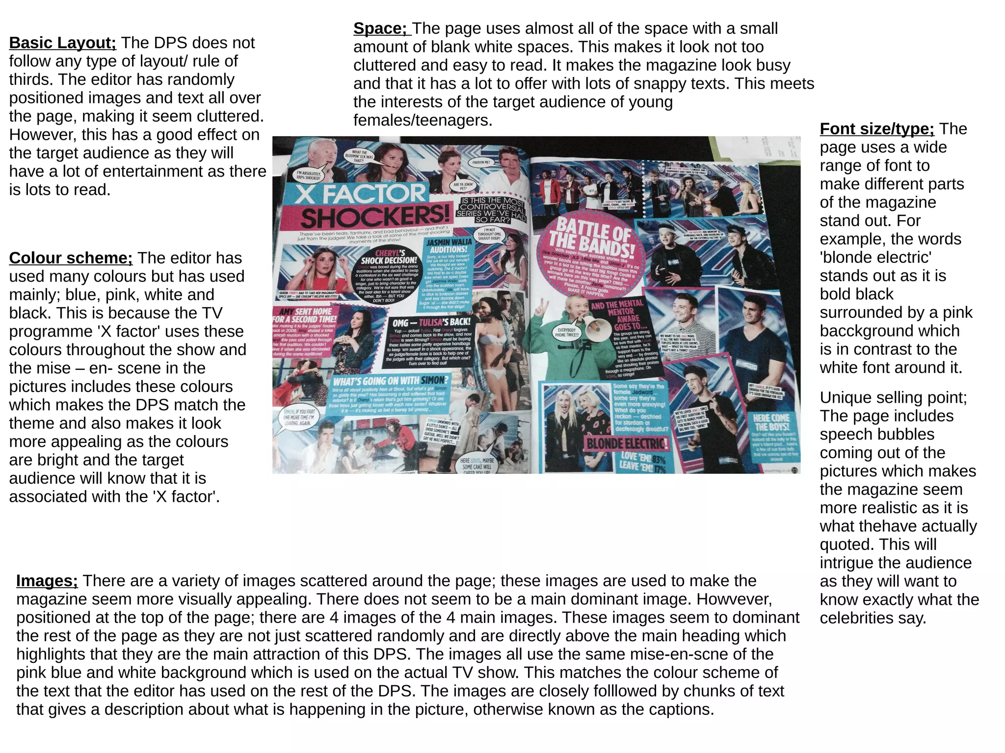
Basic Layout; The DPS does not
follow any type of layout/ rule of
thirds. The editor has randomly
positioned images and text all over
the page, making it seem cluttered.
However, this has a good effect on
the target audience as they will
have a lot of entertainment as there
is lots to read.
Colour scheme; The editor has
used many colours but has used
mainly; blue, pink, white and
black. This is because the TV
programme 'X factor' uses these
colours throughout the show and
the mise – en- scene in the
pictures includes these colours
which makes the DPS match the
theme and also makes it look
more appealing as the colours
are bright and the target
audience will know that it is
associated with the 'X factor'.
Images; There are a variety of images scattered around the page; these images are used to make the
magazine seem more visually appealing. There does not seem to be a main dominant image. Howvever,
positioned at the top of the page; there are 4 images of the 4 main images. These images seem to dominant
the rest of the page as they are not just scattered randomly and are directly above the main heading which
highlights that they are the main attraction of this DPS. The images all use the same mise-en-scne of the
pink blue and white background which is used on the actual TV show. This matches the colour scheme of
the text that the editor has used on the rest of the DPS. The images are closely folllowed by chunks of text
that gives a description about what is happening in the picture, otherwise known as the captions.
Space; The page uses almost all of the space with a small
amount of blank white spaces. This makes it look not too
cluttered and easy to read. It makes the magazine look busy
and that it has a lot to offer with lots of snappy texts. This meets
the interests of the target audience of young
females/teenagers.
Font size/type; The
page uses a wide
range of font to
make different parts
of the magazine
stand out. For
example, the words
'blonde electric'
stands out as it is
bold black
surrounded by a pink
bacckground which
is in contrast to the
white font around it.
Unique selling point;
The page includes
speech bubbles
coming out of the
pictures which makes
the magazine seem
more realistic as it is
what thehave actually
quoted. This will
intrigue the audience
as they will want to
know exactly what the
celebrities say.

Dps analysis of shout

  • 1.
    Basic Layout; TheDPS does not follow any type of layout/ rule of thirds. The editor has randomly positioned images and text all over the page, making it seem cluttered. However, this has a good effect on the target audience as they will have a lot of entertainment as there is lots to read. Colour scheme; The editor has used many colours but has used mainly; blue, pink, white and black. This is because the TV programme 'X factor' uses these colours throughout the show and the mise – en- scene in the pictures includes these colours which makes the DPS match the theme and also makes it look more appealing as the colours are bright and the target audience will know that it is associated with the 'X factor'. Images; There are a variety of images scattered around the page; these images are used to make the magazine seem more visually appealing. There does not seem to be a main dominant image. Howvever, positioned at the top of the page; there are 4 images of the 4 main images. These images seem to dominant the rest of the page as they are not just scattered randomly and are directly above the main heading which highlights that they are the main attraction of this DPS. The images all use the same mise-en-scne of the pink blue and white background which is used on the actual TV show. This matches the colour scheme of the text that the editor has used on the rest of the DPS. The images are closely folllowed by chunks of text that gives a description about what is happening in the picture, otherwise known as the captions. Space; The page uses almost all of the space with a small amount of blank white spaces. This makes it look not too cluttered and easy to read. It makes the magazine look busy and that it has a lot to offer with lots of snappy texts. This meets the interests of the target audience of young females/teenagers. Font size/type; The page uses a wide range of font to make different parts of the magazine stand out. For example, the words 'blonde electric' stands out as it is bold black surrounded by a pink bacckground which is in contrast to the white font around it. Unique selling point; The page includes speech bubbles coming out of the pictures which makes the magazine seem more realistic as it is what thehave actually quoted. This will intrigue the audience as they will want to know exactly what the celebrities say.