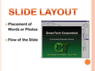
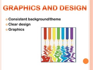
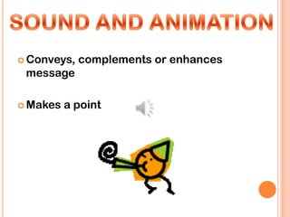
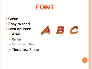
An informative how-to presentation created by:
Hannah Schaper, Shelby Dutton, Anna Ebert, Paige
Lewis and Elyse Ramirez
1) Slide Layout
2) Amount of text
3) Graphics and Design
4) Sound and Animation
5) Transitions
6) Colors
7) Font
8) Consistency
9) Design
10) General Presentation
 Placementof
 Words or Photos

 Flow   of the Slide
 Consistent background/theme
 Clear design

 Graphics
 Conveys,   complements or enhances
 message

 Makes   a point
 Keep  to a minimum
 Use same transition

 Avoid transitions that

  distract from content
 Useeasy to read font color (usually
 black on a light background and
 white on a dark background )

 Simple
       background- Should focus the
 audience, not distract them
 Clear

 Easy  to read
 Best options:

   Arial
   Calibri
   Courier New
     Times New Roman
 Font

 Background

 Colors

 INFORMATION


 Everything on slide helps convey
  information
 Unorganized slide = confused audience
 Designshould compliment your
 presentation, not take away from it

 Should be in accordance
 with what it is you are
 trying to convey
 Spellingand grammar
 Presentation

 Overview and recap

 Audience
 SlideLayout
 Amount of text
 Graphics and Design
 Sound and Animation
 Transitions
 Colors
 Font
 Consistency
 Design
 General Presentation

10thingsyou should do

  • 1.
    An informative how-topresentation created by: Hannah Schaper, Shelby Dutton, Anna Ebert, Paige Lewis and Elyse Ramirez
  • 2.
    1) Slide Layout 2)Amount of text 3) Graphics and Design 4) Sound and Animation 5) Transitions 6) Colors 7) Font 8) Consistency 9) Design 10) General Presentation
  • 3.
     Placementof Wordsor Photos  Flow of the Slide
  • 4.
     Consistent background/theme Clear design  Graphics
  • 5.
     Conveys, complements or enhances message  Makes a point
  • 6.
     Keep to a minimum  Use same transition  Avoid transitions that distract from content
  • 7.
     Useeasy toread font color (usually black on a light background and white on a dark background )  Simple background- Should focus the audience, not distract them
  • 8.
     Clear  Easy to read  Best options:  Arial  Calibri  Courier New  Times New Roman
  • 9.
     Font  Background Colors  INFORMATION  Everything on slide helps convey information  Unorganized slide = confused audience
  • 10.
     Designshould complimentyour presentation, not take away from it  Should be in accordance with what it is you are trying to convey
  • 11.
     Spellingand grammar Presentation  Overview and recap  Audience
  • 12.
     SlideLayout  Amountof text  Graphics and Design  Sound and Animation  Transitions  Colors  Font  Consistency  Design  General Presentation