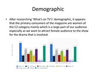
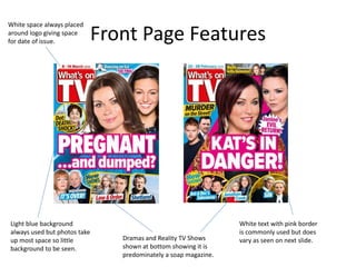
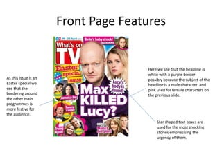
2. What’s On TV
• I have decided to use ‘What’s On TV’ as a
primary influence and use it’s branding for my
print work.
• The front covers of this magazine always
feature a shocking story happening in a soap
which is why this is appropriate for my print
work.
3. What’s On TV
• What’s On TV is a weekly magazine which
publishes all TV listings including non-soaps
which allows me to include a wider variety
other stories to contain at the bottom of the
front page.
4. Demographic
• After researching ‘What’s on TV’s’ demographic, it appears
that the primary consumers of the magazine are women of
the C2 category mainly which is a large part of our audience
especially as we want to attract female audience to the show
for the drama that is involved.
5. Front Page Features
Light blue background
always used but photos take
up most space so little
background to be seen.
White text with pink border
is commonly used but does
vary as seen on next slide.
White space always placed
around logo giving space
for date of issue.
Dramas and Reality TV Shows
shown at bottom showing it is
predominately a soap magazine.
6. Front Page Features
Here we see that the headline is
white with a purple border
possibly because the subject of the
headline is a male character and
pink used for female characters on
the previous slide.
As this issue is an
Easter special we
see that the
bordering around
the other main
programmes is
more festive for
the audience.
Star shaped text boxes are
used for the most shocking
stories emphasising the
urgency of them.