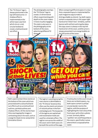
The ‘TV Choice’logois
alwayspositionedinthe
top lefthandcorner.A
shadoweffectis
implementedonthe
white lowercase font
whichsitson a red,
circulartextbox to
create a boldandstand-
out effect.
Both copiescontainthree storiesat
the bottomof the coverwhichare
presentedwithacolourful/stand-
out effectsuchascurvedoutlined
outlines, pointedoutlinesand
shadoweffects.All the stories have
titlesoverlappingthe imagesin
contrastingcoloursforeach,such as
orange for blackmirror andpinkfor
CoronationStreet.
The photography overlaps
the ‘TV Choice’logoto
create a 3-dimensional
effect;experimentingwith
depthonthe covermakes
it more visuallyengaging.
Thisstyle isalsoseenin
the photographyat the
bottomof the cover,
advertisingdifferentTV
shows.
The tagline’saccompanyingthe
mainstoriesisidentifiable as
the ‘TV Choice’brandasthey
oftenuse the stand-outcolours
of redand yellow inthe font
and background. The keywords
of the tagline are capitalised
and exclamationmarksare
usedfora dramaticeffect. The
tagline runsacrossthe widthof
the cover andin bothcasessits
beneaththe centre of the page.
Final touchestothe cover ensure
there are no blankspaces,e.g.
bothcopies containa yellow
circularbordernextto the
tagline,withthe purpose of
highlightingthe mainstoryof the
frontcover witheitheraphoto
or text.Similarly,White
‘sparkles’are usedfrequentlyon
the covers,specificallyinareas
where there isexposedwhite
space.
Whencomparingdifferentcopiesitisclear
that a repeatedlayoutisimplementedfor
each magazine copytomake it
distinguishable asabrand. E.g.both copies
containa separate storyin the upperright
handcorner titled‘new’.Similarly,awhite
bannerwithredfontoutliningthe dates
the copy coversisalwaysinthe topleft
handcorner of the cover,andthe price is
alwayspresentedinanorange bubble on
the leftcentre of the cover.

Mag analysis

  • 1.
    The ‘TV Choice’logois alwayspositionedinthe toplefthandcorner.A shadoweffectis implementedonthe white lowercase font whichsitson a red, circulartextbox to create a boldandstand- out effect. Both copiescontainthree storiesat the bottomof the coverwhichare presentedwithacolourful/stand- out effectsuchascurvedoutlined outlines, pointedoutlinesand shadoweffects.All the stories have titlesoverlappingthe imagesin contrastingcoloursforeach,such as orange for blackmirror andpinkfor CoronationStreet. The photography overlaps the ‘TV Choice’logoto create a 3-dimensional effect;experimentingwith depthonthe covermakes it more visuallyengaging. Thisstyle isalsoseenin the photographyat the bottomof the cover, advertisingdifferentTV shows. The tagline’saccompanyingthe mainstoriesisidentifiable as the ‘TV Choice’brandasthey oftenuse the stand-outcolours of redand yellow inthe font and background. The keywords of the tagline are capitalised and exclamationmarksare usedfora dramaticeffect. The tagline runsacrossthe widthof the cover andin bothcasessits beneaththe centre of the page. Final touchestothe cover ensure there are no blankspaces,e.g. bothcopies containa yellow circularbordernextto the tagline,withthe purpose of highlightingthe mainstoryof the frontcover witheitheraphoto or text.Similarly,White ‘sparkles’are usedfrequentlyon the covers,specificallyinareas where there isexposedwhite space. Whencomparingdifferentcopiesitisclear that a repeatedlayoutisimplementedfor each magazine copytomake it distinguishable asabrand. E.g.both copies containa separate storyin the upperright handcorner titled‘new’.Similarly,awhite bannerwithredfontoutliningthe dates the copy coversisalwaysinthe topleft handcorner of the cover,andthe price is alwayspresentedinanorange bubble on the leftcentre of the cover.