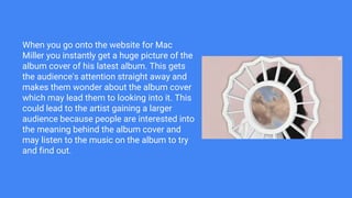
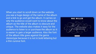
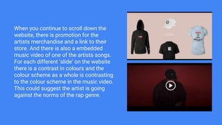
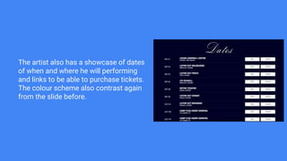
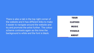
Mac Miller Website
Media Research
When you go onto the website for Mac
Miller you instantly get a huge picture of the
album cover of his latest album. This gets
the audience's attention straight away and
makes them wonder about the album cover
which may lead them to looking into it. This
could lead to the artist gaining a larger
audience because people are interested into
the meaning behind the album cover and
may listen to the music on the album to try
and find out.
When you start to scroll down on the website
you see a huge design of the name of the album
and a link to go and get the album. It carries on
why the audience would want to know about the
album as the title of the album is obscure and
unique. The website also makes it easy for the
audience to listen to or purchase the album so it
is easier to gain a larger audience. Also the font
of the album title goes against the genre
stereotype because it is not in bold lettering but
a thin cursive font.
When you continue to scroll down the
website, there is promotion for the
artists merchandise and a link to their
store. And there is also a embedded
music video of one of the artists songs.
For each different ‘slide’ on the website
there is a contrast in colours and the
colour scheme as a whole is contrasting
to the colour scheme in the music video.
This could suggest the artist is going
against the norms of the rap genre.
The artist also has a showcase of dates
of when and where he will performing
and links to be able to purchase tickets.
The colour scheme also contrast again
from the slide before.
There is also a tab in the top right corner of
the website and it has different links to make
it easier to navigate around the website and
try and promote the artist further. The colour
scheme contrasts again as this time the
background is white and the font is black.

Mac Miller Website

  • 1.
  • 2.
    When you goonto the website for Mac Miller you instantly get a huge picture of the album cover of his latest album. This gets the audience's attention straight away and makes them wonder about the album cover which may lead them to looking into it. This could lead to the artist gaining a larger audience because people are interested into the meaning behind the album cover and may listen to the music on the album to try and find out.
  • 3.
    When you startto scroll down on the website you see a huge design of the name of the album and a link to go and get the album. It carries on why the audience would want to know about the album as the title of the album is obscure and unique. The website also makes it easy for the audience to listen to or purchase the album so it is easier to gain a larger audience. Also the font of the album title goes against the genre stereotype because it is not in bold lettering but a thin cursive font.
  • 4.
    When you continueto scroll down the website, there is promotion for the artists merchandise and a link to their store. And there is also a embedded music video of one of the artists songs. For each different ‘slide’ on the website there is a contrast in colours and the colour scheme as a whole is contrasting to the colour scheme in the music video. This could suggest the artist is going against the norms of the rap genre.
  • 5.
    The artist alsohas a showcase of dates of when and where he will performing and links to be able to purchase tickets. The colour scheme also contrast again from the slide before.
  • 6.
    There is alsoa tab in the top right corner of the website and it has different links to make it easier to navigate around the website and try and promote the artist further. The colour scheme contrasts again as this time the background is white and the font is black.