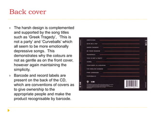
The Wombats Glitterbug
Digipack analysis
Front Cover
 The text is extremely minimal yet
effective, the red against deep
blue/black makes it stand out and
appeal to the ‘indie/alternative’
conventions of effortlessness and
minimalism.
 The bands name is far bigger than
that of the album, suggesting the
band know that the fans will be
expecting this release and will buy
into them regardless of what
they’re selling.
 The name of the band also is
displaying a synergetic quality, the
character ‘o’ is written in a different
way, just as it is frequently done
throughout all their merchandising
etc.
Front Cover
 The main picture of the girl is done
using double exposure, creating
an intriguing album cover. The
combination of harsh edges and
bokeh lights and colour scheme
instantly draws the audience into
the cover, being incredibly creative
and different to that of other covers
on the market.
 The colour scheme on the cover
again reflects the genre and the
band as pastel colours are
frequently used across both the
indie genre and the wombats other
albums and merchandise, creating
a connection between this and
additional products.
Back cover
 The text is in the same font as
seen on the front however, it is not
in the same colour, as to not
distract attention from the front
cover.
 The writing is in white against this
black background, creating a stark
contrast that does make it stand
out to some extent.
 The cover is fairly traditionally
styled, it has all the common
conventions of a cover such as
band name, album title, song titles
etc. However there is no picture
on the cover of the band
themselves, meaning that they
rely on fans already knowing who
they are, this is also something
they do throughout all their albums.
Back cover
 The harsh design is complemented
and supported by the song titles
such as ‘Greek Tragedy’, ‘This is
not a party’ and ‘Curveballs’ which
all seem to be more emotionally
depressive songs. This
demonstrates why the colours are
not as gentle as on the front cover,
however again maintaining the
simplicity.
 Barcode and record labels are
present on the back of the CD,
which are conventions of covers as
to give ownership to the
appropriate people and make the
product recognisable by barcode.

The Wombats Digipack

  • 1.
  • 2.
    Front Cover  Thetext is extremely minimal yet effective, the red against deep blue/black makes it stand out and appeal to the ‘indie/alternative’ conventions of effortlessness and minimalism.  The bands name is far bigger than that of the album, suggesting the band know that the fans will be expecting this release and will buy into them regardless of what they’re selling.  The name of the band also is displaying a synergetic quality, the character ‘o’ is written in a different way, just as it is frequently done throughout all their merchandising etc.
  • 3.
    Front Cover  Themain picture of the girl is done using double exposure, creating an intriguing album cover. The combination of harsh edges and bokeh lights and colour scheme instantly draws the audience into the cover, being incredibly creative and different to that of other covers on the market.  The colour scheme on the cover again reflects the genre and the band as pastel colours are frequently used across both the indie genre and the wombats other albums and merchandise, creating a connection between this and additional products.
  • 4.
    Back cover  Thetext is in the same font as seen on the front however, it is not in the same colour, as to not distract attention from the front cover.  The writing is in white against this black background, creating a stark contrast that does make it stand out to some extent.  The cover is fairly traditionally styled, it has all the common conventions of a cover such as band name, album title, song titles etc. However there is no picture on the cover of the band themselves, meaning that they rely on fans already knowing who they are, this is also something they do throughout all their albums.
  • 5.
    Back cover  Theharsh design is complemented and supported by the song titles such as ‘Greek Tragedy’, ‘This is not a party’ and ‘Curveballs’ which all seem to be more emotionally depressive songs. This demonstrates why the colours are not as gentle as on the front cover, however again maintaining the simplicity.  Barcode and record labels are present on the back of the CD, which are conventions of covers as to give ownership to the appropriate people and make the product recognisable by barcode.