Website of Savannah
•Download as DOCX, PDF•
0 likes•159 views
A little update of what the website of Savannah will look like including photos, merchandise, tour dates and contact details.
Report
Share
Report
Share

Recommended
Website
The website for indie artist Savannah Salt contains different sections for fans to learn about her and enjoy her music. The "About" section shares tweets from fans and biographical information about Savannah's timid personality. Fans can listen to her latest single "Breathe Me" and purchase her album from the "Music" section. Additional videos, production credits, and tour dates are also provided. Photos of Savannah are featured, with her typically looking away from the camera. Merchandise with Savannah's logo is available for purchase. Contact information is given for Savannah's management team, record label, and ways for fans to stay updated on her career.
Evaluation task 1 website
For their website, the student used a basic layout with monochromatic colors and bold fonts to draw attention. They included a background image combining natural and technological elements to represent their music. On the homepage, the artist is positioned off-center to seem relaxed. Throughout the site, the same font and color scheme create consistency while hints of color draw attention to content. Tour dates are easy to scan and purchase tickets from. Pages include related images and links to promote the artist's products and personal image in line with their genre.
Music advert moodboard
The document discusses music advertisements that were helpful for planning the layout and design of the author's own music production. It focuses on Rihanna's "Loud" album advertisement, which featured two central images of Rihanna relevant to the album. The advertisement had a simple, clear, and large font with minimal text information. This simplicity reflected Rihanna's fame and success without needing additional promotion.
Evaluation Task One - Digipak and Website
The document provides an analysis of the design choices made for the digipak and website of the artist Nand.C's album "Hallucinations".
For the digipak cover, a mid-shot was used to convey the artist's power and confidence while still connecting with audiences on a personal level. A golden glow and removal of blemishes enhanced the artist's star image and perfection. On the back, the artist is shown mysteriously from behind to spark curiosity.
The website design matches those of R&B artists Kelly Rowland and Mary J. Blige for simplicity. A slideshow promotes the artist's star image and collaborations. Central placement of the new album draws attention to generate
Digipak and Website Evaluation Task 1
The document discusses the design choices made for the digipak, website, and biography of an artist named Nand.C. For the digipak cover, a mid-shot was used to present the artist as confident while still connecting with audiences. On the website, a simple and comfortable design was used matching other R&B artists. Images and videos were overlaid on the biography page to make it more fun and give insights into the artist's life. The biography was also written in first person to personally connect with fans in an intimate way.
Evaluation Task 1- CD DigiPak
This is part three of Evaluation task 1, where I analyse the conventions of CD DigiPaks. Closely looking at which conventions I adhered to or which I challenged within the product.
Magazine advert analysis
The document analyzes magazine advertisements for the R&B artist Jhene Aiko. It notes that the large, bold text of her name stands out and identifies her as a solo artist. The artist is depicted standing alone on a beach wearing casual attire, signaling that she performs R&B music. Details like the date and time are included to provide relevant event information to potential attendees. The natural hair and heavy makeup used in the image make Aiko unique and draw interest from the target audience.
Katy perry website analysis
The document describes an artist's website that is promoting her new album and tour. The main page features a bright picture from her new album and informs visitors about the album and upcoming tour dates. Other pages allow fans to listen to music, view tour dates and ticket information, watch videos, see photos, and access merchandise and social media links. Bright colors and a consistent style are used throughout to draw attention and connect with fans.
Analysis Of Digipaks
This document summarizes and analyzes the design elements of several album Digipaks:
1) The Bastille "Bad Blood" Digipak features an unusual image of the lead singer running from a car, signifying he does not want fame but is iconic to the band. The cover allows the audience to see the car from two perspectives.
2) The 1975 Digipak has a simple yet eye-catching white illuminated design that makes the band name stand out against the black background.
3) The Lana Del Rey "Born to Die" Digipak uses a medium close-up of the artist's vintage style and symmetrical photo, reflecting her younger target audience and personal style.
Digipack
This document analyzes and compares the branding techniques used in digital packaging (digipaks) for albums by Rihanna, Lana Del Rey, and The Script. It finds that all three digipaks effectively reflect the genre of music and mood through use of photography, colors, fonts, and consistency with the album artwork. Specifically, Rihanna's digipak uses red tones and makeup to portray her music as sexy and feminine. Lana Del Rey's digipak features a facial expression contradicting a bright background to match her album's title "Born To Die." The Script's digipak stands out with a negative color scheme signaling an emotional and masculine genre. Overall, the document observes that digipaks
Music Advert Analysis
The document analyzes a magazine advertisement for an artist's new album. It takes up two thirds of the page with a close-up shot of the artist making direct eye contact to draw attention. Her defiant expression and rebellious style with black and gold lipstick and accessories suggests the album will focus more on her personal attitudes. While black often has depressing connotations, the bright gold writing and accessories make the ad more appealing and catch the eye.
CD COVER DESIGNS
The document discusses and analyzes the cover designs of several CDs and what they convey about the music. It notes that Script's simple cover depicts the band members looking in different directions to suggest an emotional song. Devlin's cover shows him in front of graffiti to portray his "gangster" image and hint that his lyrics will be personal. Rihanna's self-portrait cover risks only appealing to existing fans rather than gaining new audiences. Rizzle Kicks' casual photo implies their music will be fun and upbeat rather than emotional.
Analysing album covers
The document analyzes and summarizes several album covers:
- The Lady Gaga album cover uses a close-up black and white portrait that draws attention to her red lips and allows fans to idolize her style.
- The Jay-Z album cover portrays him as a criminal through his clothing and accessories, relating to the album title "Classic Gangster" and intended audience.
- The Martina McBride cover matches her dress and pose to the background furniture, making her look sexy and appealing to younger female fans.
Cd cover designs
The document discusses several CD covers and how they convey information about the music to the target audience. It explains that the Scripts' simple cover shows the band members looking in different directions, conveying their music has calm and emotional songs. Rihanna's self-portrait cover allows her fans to easily recognize her but may not attract new fans. Devlin's cover depicts him near graffiti of his name, suggesting his music will have a "gangster" style reflecting his background. Rizzle Kicks' natural photo shows them playing casually to indicate their music will be upbeat and fun rather than emotional.
Mise en-scene of Music Video
We will use mise-en-scene elements like costumes, props, lighting, color, location, and makeup to enhance our music video without being over-the-top. Everyday props like phones, makeup, and cars will be incorporated subtly to seem normal and relatable to our target audience. Colorful lighting and decorations in the bedrooms will create a fun, teenage atmosphere. Locations will include two bedrooms, outside a house, and a party scene, where bold makeup and colorful lighting will be used to match the energetic pop genre.
Ancillary task
The document analyzes the websites, posters, and videos of several artists including The Chainsmokers, Zedd, Nelly, and Jon Bellion. Some key points made in the analysis include:
1) Websites and posters prominently feature the artist's name in bold, large font to promote brand recognition. Visual elements like fonts and color schemes are consistent across materials.
2) Photos or images of the artist help connect the name to a person and target the appropriate demographic.
3) Links to latest songs, tours, and social media promote new work and foster fan connections.
4) Posters keep language simple with clear event details while focusing on the artist's name and image
Music video magazine adverts examples
This advert uses a close-up shot of Rihanna's face to promote her music video and concert dates. The gold, black, and white colors contrast well and draw attention to her facial features. While the main heading and subheadings blend into the background, making the reader look closer. The sophisticated makeup, hair, and posture suggest the video targets older female audiences. Logos in the corners keep the reader's eyes moving around the page. The white text contrasts with the gold and black, conveying mixed emotions that intrigue readers about the video's content and style.
Final pitch
The group chose R&B as their genre because it is diverse with different styles of songs. They selected solo artist Jasper Vo to draw on personal experiences. The song "Nirvana" by Sam Smith was chosen for its meaningful lyrics about a fleeting relationship. The music video will show the couple arguing then going separate ways, with hints they have other partners, to illustrate how the relationship is coming to an end despite their desire to enjoy the moment.
Our Pitch
The group chose R&B as their genre because it is diverse with different styles of songs. They selected the solo artist Jasper Vo to draw from personal experiences. The song "Nirvana" by Sam Smith was chosen because it has meaningful lyrics and no existing music video. In the proposed video, Jasper Vo and his romantic interest are shown arguing and spending time together while hints are given that they each have other partners. Their outfits will transition throughout to indicate time passing and changing levels of comfort.
Music Magazine Advert Review: Rihanna
The document discusses the design elements of an album poster that effectively promote the album. It notes that the simplistic font and placement of the title against a black line helps the title stand out to attract people. Including the hit songs of the album brings value by showing what the product offers. Listing the song titles in red also makes them more visible. Using the same image from the album connects the poster to the real product and gives customers a preview to assure them of the quality. While aimed at a wide audience, a label warns of explicit content for adult audiences. Crediting the supporting record label provides information on the type of music it produces.
Nadine Ancillary research
The document analyzes and summarizes various aspects of artists' websites and promotional materials, including August Alsina, Omarion, Trey Songz, and PartyNextDoor. Key findings include:
- August Alsina's website uses consistent black and white colors and fonts to portray his melancholic music style and create a recognizable brand image.
- Omarion's website homepage features a photo that presents him as masculine and tough to appeal to younger audiences.
- Trey Songz' website collage shows consistency in black and white and red themes, representing him as dangerous or romantic.
- PartyNextDoor's minimalist website uses a landscape photo rather than his image to seem less self
Posters
Rihanna's concert and album posters typically feature close-up images of her with red as the main color, emphasizing her hair and name. Katy Perry's posters always include an image of her with her name in bold to identify the artist and use unique props and settings. Beyoncé's posters employ mid shots and close ups to convey emotion and beauty, as well as long shots to showcase her figure, with some in black and white to suit themes of love and heartbreak.
Se7en Studios - Pitch
The document discusses plans for an R&B music video featuring the artist "Elijah". It will tell a romantic narrative story through lyrics and visuals. Scenes will include the couple walking together in autumn with Christmas lights and decorations to set a nostalgic, romantic tone. Close ups and slow motion will be used. Promotional materials like posters and a website will portray Elijah as having a soulful, romantic style that stands out from typical R&B artists.
Website analysis for dance pop genre media
The document describes and compares the homepages of Kylie Minogue and Cher's websites. Both websites are designed to primarily promote and advertise their upcoming albums or tours. They use similar design techniques such as large central images of the artists, prominent display of social media links and tour/album purchase options, and color schemes matching the artists' brands. The minimal text and focus on multimedia aims to create an interactive community of fans through advertising, communication, and commerce opportunities on the websites.
Media
The document discusses how album artwork has changed with new media technology. It notes that as most music is now downloaded online, the front cover is often the only part of the album artwork people see. This means album covers must be carefully designed to look appealing at small sizes online. Artists who are very popular may not need their photo on the cover, as their audience will already recognize their music. Overall, the document emphasizes that effective album artwork needs to be visually striking and representative of the artist when viewed online.
Digipak analysis
The document analyzes the album packaging and design of albums by Rihanna and Beyoncé. For Rihanna's album "Loud", the front cover uses contrasting colors like red lips and hair to catch attention, while the CD cover has a floral theme showing a softer side. Beyoncé's album "I Am Sasha Fierce" uses a black and white contrast on the front cover to show two sides of herself, and promotional posters with close-ups to create connections with audiences. Overall, the document examines how the album packaging presents different images of the artists and draws in audiences visually.
Product research 2
The document summarizes a magazine advertisement for an artist's new album:
- The image is a close-up of the artist's face with a glittery outline, conveying her as mystical and enigmatic. The full-page image emphasizes her importance as an artist.
- The color scheme of gold and black signifies royalty/wealth and mystery, respectively.
- Reviews and ratings from respected publications like The Independent and Q Magazine featuring 4-5 star ratings promote the album's credibility.
- A quote from a music magazine calls the album "a staggering achievement."
Final Influences Of Style
Beyonce's album "I am Sasha Fierce" influenced the music video's style in several ways. Many of Beyonce's music videos from this album used a black and white color scheme, which gives videos a narrative feel by emphasizing negative or deep emotions. Specifically, the videos for "If I were a boy", "Single Ladies", "Sweet Dreams", and "Broken-Hearted girl" used black and white backgrounds along with filters and mixtures of color to further the narrative and focus on dance moves or significant objects. The video for "Broken-Hearted girl" also used reverse action effectively.
Market and promotion
Promotion is a key element of marketing that aims to raise awareness of products and brands to generate sales and loyalty. It refers to activities like advertising, market research, and selling products or services. Over time from the 1960s to today, music promotion and marketing through music videos has evolved significantly with technology. Early videos focused on performances to promote songs on TV when bands weren't available, but now high production value videos are artistic experiences in themselves that cultivate the image of the artist across media platforms to sell records, merchandise, and build their brand.
Blog website gallery
The document discusses 9 photos for an artist's website gallery. 3 outdoor photos show the artist smiling to portray her as happy and youthful. These are in bright environments to create a cheerful atmosphere. 3 studio photos contrast the outdoor shots by showing a more natural, intimidating side of the artist's personality. The remaining 3 diagonal shots portray the artist's genre of emotional pop music through dull, eerie scenes with dying flowers representing numbness. The 9 photos together aim to give viewers a realistic understanding of the artist.
More Related Content
What's hot
Analysis Of Digipaks
This document summarizes and analyzes the design elements of several album Digipaks:
1) The Bastille "Bad Blood" Digipak features an unusual image of the lead singer running from a car, signifying he does not want fame but is iconic to the band. The cover allows the audience to see the car from two perspectives.
2) The 1975 Digipak has a simple yet eye-catching white illuminated design that makes the band name stand out against the black background.
3) The Lana Del Rey "Born to Die" Digipak uses a medium close-up of the artist's vintage style and symmetrical photo, reflecting her younger target audience and personal style.
Digipack
This document analyzes and compares the branding techniques used in digital packaging (digipaks) for albums by Rihanna, Lana Del Rey, and The Script. It finds that all three digipaks effectively reflect the genre of music and mood through use of photography, colors, fonts, and consistency with the album artwork. Specifically, Rihanna's digipak uses red tones and makeup to portray her music as sexy and feminine. Lana Del Rey's digipak features a facial expression contradicting a bright background to match her album's title "Born To Die." The Script's digipak stands out with a negative color scheme signaling an emotional and masculine genre. Overall, the document observes that digipaks
Music Advert Analysis
The document analyzes a magazine advertisement for an artist's new album. It takes up two thirds of the page with a close-up shot of the artist making direct eye contact to draw attention. Her defiant expression and rebellious style with black and gold lipstick and accessories suggests the album will focus more on her personal attitudes. While black often has depressing connotations, the bright gold writing and accessories make the ad more appealing and catch the eye.
CD COVER DESIGNS
The document discusses and analyzes the cover designs of several CDs and what they convey about the music. It notes that Script's simple cover depicts the band members looking in different directions to suggest an emotional song. Devlin's cover shows him in front of graffiti to portray his "gangster" image and hint that his lyrics will be personal. Rihanna's self-portrait cover risks only appealing to existing fans rather than gaining new audiences. Rizzle Kicks' casual photo implies their music will be fun and upbeat rather than emotional.
Analysing album covers
The document analyzes and summarizes several album covers:
- The Lady Gaga album cover uses a close-up black and white portrait that draws attention to her red lips and allows fans to idolize her style.
- The Jay-Z album cover portrays him as a criminal through his clothing and accessories, relating to the album title "Classic Gangster" and intended audience.
- The Martina McBride cover matches her dress and pose to the background furniture, making her look sexy and appealing to younger female fans.
Cd cover designs
The document discusses several CD covers and how they convey information about the music to the target audience. It explains that the Scripts' simple cover shows the band members looking in different directions, conveying their music has calm and emotional songs. Rihanna's self-portrait cover allows her fans to easily recognize her but may not attract new fans. Devlin's cover depicts him near graffiti of his name, suggesting his music will have a "gangster" style reflecting his background. Rizzle Kicks' natural photo shows them playing casually to indicate their music will be upbeat and fun rather than emotional.
Mise en-scene of Music Video
We will use mise-en-scene elements like costumes, props, lighting, color, location, and makeup to enhance our music video without being over-the-top. Everyday props like phones, makeup, and cars will be incorporated subtly to seem normal and relatable to our target audience. Colorful lighting and decorations in the bedrooms will create a fun, teenage atmosphere. Locations will include two bedrooms, outside a house, and a party scene, where bold makeup and colorful lighting will be used to match the energetic pop genre.
Ancillary task
The document analyzes the websites, posters, and videos of several artists including The Chainsmokers, Zedd, Nelly, and Jon Bellion. Some key points made in the analysis include:
1) Websites and posters prominently feature the artist's name in bold, large font to promote brand recognition. Visual elements like fonts and color schemes are consistent across materials.
2) Photos or images of the artist help connect the name to a person and target the appropriate demographic.
3) Links to latest songs, tours, and social media promote new work and foster fan connections.
4) Posters keep language simple with clear event details while focusing on the artist's name and image
Music video magazine adverts examples
This advert uses a close-up shot of Rihanna's face to promote her music video and concert dates. The gold, black, and white colors contrast well and draw attention to her facial features. While the main heading and subheadings blend into the background, making the reader look closer. The sophisticated makeup, hair, and posture suggest the video targets older female audiences. Logos in the corners keep the reader's eyes moving around the page. The white text contrasts with the gold and black, conveying mixed emotions that intrigue readers about the video's content and style.
Final pitch
The group chose R&B as their genre because it is diverse with different styles of songs. They selected solo artist Jasper Vo to draw on personal experiences. The song "Nirvana" by Sam Smith was chosen for its meaningful lyrics about a fleeting relationship. The music video will show the couple arguing then going separate ways, with hints they have other partners, to illustrate how the relationship is coming to an end despite their desire to enjoy the moment.
Our Pitch
The group chose R&B as their genre because it is diverse with different styles of songs. They selected the solo artist Jasper Vo to draw from personal experiences. The song "Nirvana" by Sam Smith was chosen because it has meaningful lyrics and no existing music video. In the proposed video, Jasper Vo and his romantic interest are shown arguing and spending time together while hints are given that they each have other partners. Their outfits will transition throughout to indicate time passing and changing levels of comfort.
Music Magazine Advert Review: Rihanna
The document discusses the design elements of an album poster that effectively promote the album. It notes that the simplistic font and placement of the title against a black line helps the title stand out to attract people. Including the hit songs of the album brings value by showing what the product offers. Listing the song titles in red also makes them more visible. Using the same image from the album connects the poster to the real product and gives customers a preview to assure them of the quality. While aimed at a wide audience, a label warns of explicit content for adult audiences. Crediting the supporting record label provides information on the type of music it produces.
Nadine Ancillary research
The document analyzes and summarizes various aspects of artists' websites and promotional materials, including August Alsina, Omarion, Trey Songz, and PartyNextDoor. Key findings include:
- August Alsina's website uses consistent black and white colors and fonts to portray his melancholic music style and create a recognizable brand image.
- Omarion's website homepage features a photo that presents him as masculine and tough to appeal to younger audiences.
- Trey Songz' website collage shows consistency in black and white and red themes, representing him as dangerous or romantic.
- PartyNextDoor's minimalist website uses a landscape photo rather than his image to seem less self
Posters
Rihanna's concert and album posters typically feature close-up images of her with red as the main color, emphasizing her hair and name. Katy Perry's posters always include an image of her with her name in bold to identify the artist and use unique props and settings. Beyoncé's posters employ mid shots and close ups to convey emotion and beauty, as well as long shots to showcase her figure, with some in black and white to suit themes of love and heartbreak.
Se7en Studios - Pitch
The document discusses plans for an R&B music video featuring the artist "Elijah". It will tell a romantic narrative story through lyrics and visuals. Scenes will include the couple walking together in autumn with Christmas lights and decorations to set a nostalgic, romantic tone. Close ups and slow motion will be used. Promotional materials like posters and a website will portray Elijah as having a soulful, romantic style that stands out from typical R&B artists.
Website analysis for dance pop genre media
The document describes and compares the homepages of Kylie Minogue and Cher's websites. Both websites are designed to primarily promote and advertise their upcoming albums or tours. They use similar design techniques such as large central images of the artists, prominent display of social media links and tour/album purchase options, and color schemes matching the artists' brands. The minimal text and focus on multimedia aims to create an interactive community of fans through advertising, communication, and commerce opportunities on the websites.
Media
The document discusses how album artwork has changed with new media technology. It notes that as most music is now downloaded online, the front cover is often the only part of the album artwork people see. This means album covers must be carefully designed to look appealing at small sizes online. Artists who are very popular may not need their photo on the cover, as their audience will already recognize their music. Overall, the document emphasizes that effective album artwork needs to be visually striking and representative of the artist when viewed online.
Digipak analysis
The document analyzes the album packaging and design of albums by Rihanna and Beyoncé. For Rihanna's album "Loud", the front cover uses contrasting colors like red lips and hair to catch attention, while the CD cover has a floral theme showing a softer side. Beyoncé's album "I Am Sasha Fierce" uses a black and white contrast on the front cover to show two sides of herself, and promotional posters with close-ups to create connections with audiences. Overall, the document examines how the album packaging presents different images of the artists and draws in audiences visually.
Product research 2
The document summarizes a magazine advertisement for an artist's new album:
- The image is a close-up of the artist's face with a glittery outline, conveying her as mystical and enigmatic. The full-page image emphasizes her importance as an artist.
- The color scheme of gold and black signifies royalty/wealth and mystery, respectively.
- Reviews and ratings from respected publications like The Independent and Q Magazine featuring 4-5 star ratings promote the album's credibility.
- A quote from a music magazine calls the album "a staggering achievement."
Final Influences Of Style
Beyonce's album "I am Sasha Fierce" influenced the music video's style in several ways. Many of Beyonce's music videos from this album used a black and white color scheme, which gives videos a narrative feel by emphasizing negative or deep emotions. Specifically, the videos for "If I were a boy", "Single Ladies", "Sweet Dreams", and "Broken-Hearted girl" used black and white backgrounds along with filters and mixtures of color to further the narrative and focus on dance moves or significant objects. The video for "Broken-Hearted girl" also used reverse action effectively.
What's hot (20)
Viewers also liked
Market and promotion
Promotion is a key element of marketing that aims to raise awareness of products and brands to generate sales and loyalty. It refers to activities like advertising, market research, and selling products or services. Over time from the 1960s to today, music promotion and marketing through music videos has evolved significantly with technology. Early videos focused on performances to promote songs on TV when bands weren't available, but now high production value videos are artistic experiences in themselves that cultivate the image of the artist across media platforms to sell records, merchandise, and build their brand.
Blog website gallery
The document discusses 9 photos for an artist's website gallery. 3 outdoor photos show the artist smiling to portray her as happy and youthful. These are in bright environments to create a cheerful atmosphere. 3 studio photos contrast the outdoor shots by showing a more natural, intimidating side of the artist's personality. The remaining 3 diagonal shots portray the artist's genre of emotional pop music through dull, eerie scenes with dying flowers representing numbness. The 9 photos together aim to give viewers a realistic understanding of the artist.
Stream age kicks
This document discusses trends in the music streaming industry and strategies successful artists have used to promote their music and albums. It notes that Tidal was created as an artist-owned streaming service to provide exclusive content from popular shareholders like Rihanna. While Rihanna took a break from albums, she still found success releasing singles. Her album "Anti" was a big success that led to sponsorship deals. Kanye West used Tidal to debut his album alongside a clothing launch with the Kardashians in attendance, gaining media attention. Beyonce's "Lemonade" release involved minimal pre-marketing, instead relying on an Instagram post and letting speculation about the album's themes build anticipation.
Cd album cover textual analysis on j cole
J Cole's album cover portrays him sitting in a school corridor and on a bench, dressed in school clothes to represent telling his life story from his school days. The dark lighting and settings symbolize bringing his hidden past experiences out of the shadows. He presents himself as a misunderstood artist trying to get others to understand his truth and path to success despite potential tough circumstances. The typography emphasizes J Cole's name in bigger font while crediting featured artists in smaller, harder to read red text.
CD and Website
Alex Hunter proposes three ideas for artwork for a band's CD and website:
1) Drawn cover art inspired by the band's space/fantasy theme featuring images like a shark and traffic light character.
2) Another cover art piece focusing solely on an alien and space theme.
3) Using Lego figures of the band members on the website for ease of creation and to stand out from other bands using real photos.
The second drawing is chosen for the CD booklet due to keeping with the band's theme while allowing a consistent front and back cover design, as seen on the example McBusted album. The third Lego idea is still being considered for the website.
Vinyl analysis
This vinyl analysis summarizes the key design elements of a Beatles album. The front cover features a simple red background with a centered picture of the band. Inside each vinyl sleeve are pockets containing the records, with song titles clearly labeled. Lyrics are included on the inner sleeves and an information leaflet provides background on the band and album. Throughout, there is an emphasis on maintaining a consistent red color scheme and inclusion of photos, with occasional issues around font sizes being too small.
Beyonce textual analysis
Beyoncé's music video "Hold Up" uses visual and audio techniques to tell the story of a woman leaving an abusive relationship. The video opens with Beyoncé underwater, representing feeling overwhelmed by her partner's mistreatment. She is then shown praying in a tilted shot, emphasizing her unstable mental state from the relationship. When Beyoncé walks through a set of doors, the editing, camerawork, lighting, and music all shift dramatically to signify her leaving the relationship and entering a happier phase.
The Vaccines
The document analyzes and summarizes the album booklet for The Vaccines album. It notes that the album name is not included on the front cover, which could make it difficult for someone to know the name without buying the album first. The inside uses a simple pink and black color scheme. It features atypical photos like a woman floating in a pool that relate to the band's unique artistic style. The polaroid-style photos maintain a consistent theme throughout and may relate to the songs. The back lists the production team and includes the band's website and social media pages.
Two door cinema club
The Two Door Cinema Club website uses consistent GIF backgrounds across pages with social media icons and their latest album prominently featured. Viewers can purchase albums on vinyl or CD through links to stores like iTunes. The site is regularly updated with a page for each album and a store page for merchandise, and viewers can sign up for newsletters.
Kings of leon
The Kings of Leon band website has a simple layout with the menu on the right side to avoid overwhelming visitors. It allows users to easily access songs, merchandise, and ticket purchases. While the website uses bright pastel colors not typically associated with rock music, it maintains some iconography linked to the genre like skulls and eyeballs. The simple design reflects the band's rebellious identity and gives visitors what they see without extra fluff, matching the band's straightforward approach.
Sia's music website
Sia's early albums had a different indie and soul style compared to her current pop and dance style. She gained popularity through hits like "Chandelier" and "Cheap Thrills" and branded her image with a two-colored wig. Sia uses the wig and brands her merchandise to show fans and the world her loyal following. Sia discovered dancer Maddie Ziegler through social media and their collaboration helped boost both of their careers, with Maddie appearing in many of Sia's music videos and becoming a face of Sia's brand.
One page pitch breathe me
The group proposes a one page pitch for a music video for the song "Breathe Me" by Sia. The video would include shots in a studio and outdoors, as well as Polaroid photos to portray feelings of heartbreak and misery. The target audience would be females ages 15-24 who can relate to the realization of not being alone in difficult situations. Filming in a studio fits with Sia's previous music videos and the sad genre of the song. The group aims to creatively portray the story of heartbreak through both simple and complex designs.
Feedback on our video draft.
This feedback sheet provides suggestions for improving various shots and scenes in a music video produced by Niamh, Hyleana and Rae. The feedback notes 13 specific times in the video where minor adjustments could heighten the impact or narrative, such as adding color correction, saturation, or temporal effects to shots. Suggestions are also made to intercut certain longer shots with alternative angles or closeups to maintain pacing. The feedback concludes by asking for clarification on the intended tone of the final shot. Overall, the quality of the video is praised while focusing the feedback on refining specific technical and editing aspects.
Disappearance effect and how i found it
The author attempted to recreate the disappearance effect shown in a YouTube video tutorial but was unsuccessful after multiple tries. Instead of the subject scattering away as intended, the entire clip would scatter. While the author couldn't determine the error, they decided along with Connor to use a different transition effect, such as a walking effect, between scenes in their project instead.
Salt sisters
This document summarizes the skills and roles of three students - Savannah, Brooke, and Eloise - on a media production team. It describes each member's strengths, including Savannah's creativity in developing storyboards, Brooke's skills as a producer and editor, and Eloise's confidence on camera and drive to improve. It also notes that the group works well together as a team, combining their individual talents, and provides a link to one of their previous productions, an AS thriller called "Nocturnal".
Catch up
We started filming the first scenes of our music video in a pretty village near our hometown. We wanted natural scenery like trees, grass, and a river as a backdrop for Polaroid photos to achieve the style we want. Using the photo burst effect on our iPhones, we took multiple photos at once while randomly walking around and capturing different locations like trees, a bridge, and the river. When editing is complete in Premiere Pro, we hope to drop the photos into the program and cut together the video scenes we want.
Universal motor
Universal motors can operate on either AC or DC power. They have high starting torque because the armature and field windings are connected in series. Speed control of a universal motor is achieved by varying the terminal voltage, which changes the current and electromagnetic torque. The motor's angular velocity is determined by solving the differential equation for the electrical system, which depends on the induced back EMF. Back EMF is produced by the motion of the rotor in the magnetic field and opposes the applied voltage, with its magnitude proportional to speed. Varying the applied voltage allows control of the motor's speed and torque.
Music Video Pitch
The document provides sparse information about a music video, listing the categories of music, video, plot, song, and characters but without any details for those categories. It does not contain enough substantive information to generate a multi-sentence summary.
Band website
Band/artist websites provide several key benefits: they allow for expanded publicity and advertisement of music, tours, and merchandise to a wider audience; provide a central place for fans to access all of an artist's work and purchases; and give artists control over their online presence and search engine results rather than relying on third party sites. When creating a website, artists should identify their target demographic, define their brand identity through colors and style, and optimize the site for search engine rankings by including keywords and engaging content.
Viewers also liked (20)
Similar to Website of Savannah
Conventions of a website
The document discusses conventions of artist/band websites. It provides examples of websites for Rihanna, Chase & Status, and MAX Schneider. The key purposes of artist websites are to promote the artist, allow fan interaction, provide information on upcoming shows/releases, and sell merchandise/tickets. Rihanna's site uses photos as links to different sections, while Chase & Status has text links at the top and MAX splits his acting and music careers between two sites. All sites provide social media links and ways for fans to stay updated.
Website Research
The document discusses the purpose and importance of music websites. Music websites allow artists and bands to promote their music, interact with fans, and keep fans updated on news, tour dates, and releases. They provide credibility for artists and are an important promotional tool. Websites are also cheaper and more flexible than print advertising and allow artists to potentially reach a wider audience.
Website comparison
The document discusses various conventions used on band websites and how the summarized website challenged or followed those conventions on different pages. Key conventions included categorizing content, using navigation bars, biographies on about pages, Twitter feeds, playlists on music pages, simple tour layouts, gallery layouts, and merchandise branding. The website aimed to follow conventions to look professional while also challenging some to promote interactivity and personalization with fans.
Website Research
The document discusses the purpose and importance of music websites for artists and bands. It explains that websites allow fans to explore an artist's music, tour dates, news and social media. They give artists credibility and promote their releases. Websites are also an affordable way to advertise and have a wider reach than print. The document uses examples of the Daughter and Bon Iver music websites to analyze their layout, navigation, use of colors and simplicity.
Artists website research
The document analyzes and compares the websites of three pop artists - Freya Riding, Maroon 5, and Dua Lipa. It finds that Freya Riding and Maroon 5's websites aim to attract mainstream adult audiences through sophisticated layouts and less emphasis on visuals, while Dua Lipa's colorful website promotes her music and image heavily through various social media platforms to target younger audiences. Key features across the artists' websites include promoting new music releases and merchandise, advertising tour dates and ticket sales, and providing access to their music on platforms like Spotify and YouTube.
Marina and the diamonds website review
The Marina and the Diamonds website provides information about the artist's music, tours, photos, and videos through a simple layout with grey buttons and backgrounds. While the website offers fans access to albums, lyrics, downloads, and merchandise, it lacks a personal touch and does not reflect the creativity seen in the artist's music videos. The overall design seems focused on promoting the artist's brand rather than engaging fans through an intimate site that captures her creative spirit.
Website research - Abigail Baxter
The website features a clean layout with a left sidebar menu and large central images. When images are clicked, the user is taken to pages with further details on Rihanna's various projects. The menu includes tabs for news, videos, photos, music albums, and her makeup, fashion, and charity lines. Images under each tab link out to additional pages or websites for that project, allowing the user to easily browse and learn more about Rihanna's multi-faceted career. The organized structure and abundant links provide a thorough overview of her work across music, beauty, fashion and philanthropy.
Website research
The website features a clean layout with a menu bar down the left side. The main page displays a collection of black and white images related to Rihanna's various projects. When hovered over, the images display text with story details and click through to dedicated pages. The menu bar links to pages for news, videos, photos, music albums, her makeup line, fashion line and a charity. These pages have a similar layout of images that link out to more in-depth information or external websites. The website effectively promotes Rihanna's various business ventures in music, beauty, fashion and charity.
Similar artist website 2
The document discusses several artists' websites and the key elements they contain. Lana Del Rey's website prominently features links to her social media and music streaming pages. Ella Eyre's website has a classic black and white design with colored accents. Marina and the Diamonds features their latest album title in bold colors and links to purchase and watch music videos. Hayley Kiyoko's site uses a simple framed photograph as the background and includes links to her social media pages. The conclusion indicates the importance of including classic design elements along with unique touches and links to connect visitors to the artist's other online presences.
Website analysis
The Gorillaz website features a music video playing in the background and announces their latest album. Links provide access to tour dates and where to purchase the album in different formats. The minimalist design complements the band's aesthetic.
Solange's website displays shots of her work like windows on a desktop. Refreshing the page shows different content. Signing up for updates is prominently featured. Navigation follows a minimalist format reminiscent of an art gallery, reflecting her image as an artist.
Tame Impala's psychedelic-styled website features concert posters scattered without pattern. Social media links target their youth audience. Contact details opening collaboration opportunities are uncommon but make them more accessible. Album pages provide interactive
Textual analysis 2
Lana Del Rey's website uses colorful photography rather than text to display news and information. Most images are mid-shot portraits of Lana, positioning her as the symbol of her music rather than using logos. Upon visiting, users are introduced to a video of Lana's latest album. The website also features galleries of Lana's photos, lists of her albums with options to learn more about and purchase each one, and a merchandise store. Social media and music streaming links at the top allow fans to stay engaged with her latest updates across multiple platforms.
Band website analysis
The document discusses analyzing indie band websites to get ideas for designing a website for the band Minor Crisis. It examines the websites of Imagine Dragons, The Neighbourhood, Arctic Monkeys, and AM. Key aspects noted include color schemes, layouts, sections for news, music, videos, photos, merch, and ways to engage fans. Elements like charity work, social media integration, and easy access to music are highlighted. The analysis provides ideas on sections, content, and features to include in Minor Crisis' website.
Website Analysis
The document analyzes and summarizes the websites of two bands, Air Supply and Fleetwood Mac. It describes the home pages, menu options, and pages for music, tours, shops, and about sections. It concludes by stating the author will design a website for their own band following the formats of these analyzed band websites.
Disclosure’s website
The Disclosure website homepage prominently features the band's album cover to immediately catch visitors' attention and direct them to listen to and purchase the band's music. Though sections like the blog discuss live performances, the website primarily promotes the band commercially through music, tours, and merchandise rather than sharing personal details. A consistent grey color scheme and font style create a coherent brand image across the band's different materials. Links at the bottom of every page allow visitors to join the mailing list, make an account, and access the band's profiles on social media sites like SoundCloud and Vevo.
Webpage Analysis- Two Door Cinema Club
The document analyzes the website of the indie band Two Door Cinema Club. It finds that the website has a simple yet colorful design that creates continuity. Bright gender-neutral colors are used to appeal to both male and female audiences. Links are provided to their social media pages and other band information. Widgets let fans access music, videos and tweets directly from the site. Images portray the typical indie photography style and can be shared on social networks. The analysis provides inspiration for designing a website for another indie artist that fits genre conventions.
Website screen shots draft 2
The document summarizes feedback received on draft pages for an artist website and changes made in response. Key points include:
1. The welcome page was made more inviting by adding imagery of ivy growing towards a door to click on.
2. On the home page, a close-up photo of the artist Luna Lux was added and polaroids appear when clicking to the next page.
3. Additional pages were added, such as behind-the-scenes videos and information about upcoming tour dates, to make the site more engaging for fans.
Ancillary Research
The document discusses research conducted on indie artists' websites and album covers in order to inform the marketing of an artist named Cerys. It examines several indie bands' online presence and physical media to understand conventions of the genre. Key findings include the importance of consistency across websites and album covers to build an artist's recognizable identity and the use of websites to share news, music and tour dates to engage fans.
Webpage Analysis
The document analyzes the website of the indie band Two Door Cinema Club. Some key points:
- The website uses bright colors, sans-serif fonts, and large images to promote an upbeat indie aesthetic.
- It incorporates widgets to stream music, link to social media, and make it easy to purchase tickets and albums.
- Navigation is clear and information on news, releases, and tours helps fans stay connected to the band.
- While the website and social media pages share a color scheme, they lack a fully unified visual style, focusing more on the music than visual branding.
Web site analysis
The website analyses summarize key aspects of the Linkin Park, Coldplay, and Nirvana band websites. For Linkin Park, the summary notes that the homepage features their latest album art and quotes from songs to promote it. Color and font themes are also described. For Coldplay, the timeline section is overviewed along with categories to filter it. For Nirvana, the summary highlights how the front page again features their latest album art and colors derived from the album logo. News, biography, music/videos, and store sections are also briefly outlined.
Analysis of website convention (the killers)
The banner at the top of the website uses a unique lit-bulb style to represent the band's illustriousness. The scrolling background navigation depicts a deserted wasteland with links to creative capture the band's wild personality. Font styles are used consistently throughout the site to convey the band's serious and relaxed nature. The menu bar and hyperlinks allow audiences to easily navigate and purchase music, while images and news feeds keep them engaged and up to date. However, the site is flawed because the music and videos do not play, preventing audiences from fully experiencing the band's work.
Similar to Website of Savannah (20)
More from Eloise10
Feedback
This document summarizes feedback received from a media teacher on a student's music video project and how the students addressed that feedback. It discusses adding a sound effect at the beginning to set the emotional tone, leaving in a long intro they liked, filling time at the end of the video with repeated shots, and flipping an upright shot to improve it though it remained off to one side. The feedback helped the students improve and develop their video which they are now ready to export and share online.
Textual analysis on other A2 videos
The document analyzes and compares two music videos produced by other schools. The first video uses mise-en-scene and costume changes to depict the main character's different personalities and mental state. Notable camera shots include a sped-up shot of a busy square and a reflection shot establishing the character's isolation. The editing is praised for its effects and disclaimers. The second video uses locations, lighting, and shots to portray its characters - a DJ with authority and a fighter depicted as both ordinary and powerful. Both videos are deemed high-quality productions despite their different genres and narratives.
Question 3
The document provides feedback from friends, family members, and teachers on the student's music video and album cover titled "Breathe Me". Written feedback praised the polished editing and inclusion of polaroid photos but noted some shots were unfocused. Verbal feedback showed viewers were engaged by the lyrics and raw emotion. Friends related well to the target age group. The student reflects that while some shots could have been improved, "Breathe Me" was largely a success in achieving its simple but effective goals.
Thriller- textual analysis
Michael Jackson's "Thriller" music video was released in 1983 and directed by John Landis. It extended the song into a nearly 14-minute horror film, allowing Michael to indulge his interest in monster movies. The video was hugely popular, getting heavy airplay on MTV and accumulating over 149 million views on YouTube. It used elements of horror filmmaking like a dark, sinister atmosphere and scary monster transformations to tell a story and give viewers a creepy experience that reflected Michael Jackson's artistic vision and personality.
Photoshop task
This document discusses using Photoshop to create music CD covers from photos. It describes taking photos with different music genres and then using Photoshop to add backgrounds and effects to transform the photos into CD covers. The original photos are included along with the edited versions showing Gothic metal and pop genres. Learning Photoshop skills like cropping, erasing and merging images was helpful for designing the CD covers and will benefit future projects.
Textual analysis take on me
A textual analysis on the music video of Take On Me (A-ha). Includes the editing, camera shots and the meaning of the lyrics. Gives the audience more knowledge of the meaning behind the music video.
Textual analysis dark knight
The document provides an analysis of the opening scenes of the film "The Dark Knight" in three paragraphs. It summarizes that the opening scene establishes the film's setting of a city and introduces characters in a way that intrigues audiences. It also emphasizes the villain's clown mask. Costumes and props are then discussed in relation to reinforcing characters' power and alliance, though they later turn against each other. Finally, the document analyzes the film's use of sound and editing to create tension around the villain called "the joker" and show different character perspectives.
Question 4&5- audience
This presentation shows how we attracted our specific group in society. Showing the different age ranges and social groups.
Question 1- How does your media poduct use, develop or challenge forms and co...
Nocturnal relates to Todorov's narrative theory by challenging some of its conventions. The film establishes an equilibrium that is disrupted by a murder committed by the villain. However, unlike typical narratives, the villain is not confronted or stopped, and the equilibrium is not restored by the end. Various cinematography techniques like establishing shots, close-ups, and point-of-view shots are used to involve the audience. Careful planning through research, storyboarding, and consideration of mise-en-scene elements like costumes, props, and setting helped the filmmakers efficiently produce their horror film.
Binary oppositions
Here is an example of Binary oppositions and why film producers use it. I have chosen a film to relate the binary oppositions to giving everyone a clear idea of how it is used.
Textual analysis - Se7en
The document provides analysis of key elements in the opening scenes of the film Se7en. It summarizes the introduction of the two main characters, Detective Somerset played by Morgan Freeman and Detective Mills played by Brad Pitt. The camera work establishes Somerset's living space and shows a mid-shot of a victim's body. The editing builds tension through a zoom into Somerset's face and a switch to a metronome. Diegetic police sirens and non-diegetic music are used to add sound effects that keep the audience on edge. Details in Somerset's tidy flat imply his career-driven and lonely nature.
Storyboard
The document discusses how a storyboard was created to plan out a film project before filming began. The storyboard helped plan the dialogue, lighting, actor positioning, set design, and overall structure of the film to reduce time spent filming and ensure proper planning. Creating a storyboard is presented as a great way to start planning a film production.
Q2- Areas of success
The group worked effectively at each stage of producing their film "Finding Toby". In the planning stage, they created a clear plan and storyboard. They managed their time well, scheduling filming and editing sessions. As a group, they collaborated well and helped each other learn new skills in filming techniques, editing software, and improving the overall quality of the film. Their varied shots and use of effects during editing made the finished film an overall success.
More from Eloise10 (13)
Question 1- How does your media poduct use, develop or challenge forms and co...
Question 1- How does your media poduct use, develop or challenge forms and co...
Recently uploaded
How to Build a Module in Odoo 17 Using the Scaffold Method
Odoo provides an option for creating a module by using a single line command. By using this command the user can make a whole structure of a module. It is very easy for a beginner to make a module. There is no need to make each file manually. This slide will show how to create a module using the scaffold method.
How to Make a Field Mandatory in Odoo 17
In Odoo, making a field required can be done through both Python code and XML views. When you set the required attribute to True in Python code, it makes the field required across all views where it's used. Conversely, when you set the required attribute in XML views, it makes the field required only in the context of that particular view.
The Diamonds of 2023-2024 in the IGRA collection
A review of the growth of the Israel Genealogy Research Association Database Collection for the last 12 months. Our collection is now passed the 3 million mark and still growing. See which archives have contributed the most. See the different types of records we have, and which years have had records added. You can also see what we have for the future.
Main Java[All of the Base Concepts}.docx
This is part 1 of my Java Learning Journey. This Contains Custom methods, classes, constructors, packages, multithreading , try- catch block, finally block and more.
BÀI TẬP BỔ TRỢ TIẾNG ANH LỚP 9 CẢ NĂM - GLOBAL SUCCESS - NĂM HỌC 2024-2025 - ...
BÀI TẬP BỔ TRỢ TIẾNG ANH LỚP 9 CẢ NĂM - GLOBAL SUCCESS - NĂM HỌC 2024-2025 - ...Nguyen Thanh Tu Collection
https://app.box.com/s/tacvl9ekroe9hqupdnjruiypvm9rdaneISO/IEC 27001, ISO/IEC 42001, and GDPR: Best Practices for Implementation and...
Denis is a dynamic and results-driven Chief Information Officer (CIO) with a distinguished career spanning information systems analysis and technical project management. With a proven track record of spearheading the design and delivery of cutting-edge Information Management solutions, he has consistently elevated business operations, streamlined reporting functions, and maximized process efficiency.
Certified as an ISO/IEC 27001: Information Security Management Systems (ISMS) Lead Implementer, Data Protection Officer, and Cyber Risks Analyst, Denis brings a heightened focus on data security, privacy, and cyber resilience to every endeavor.
His expertise extends across a diverse spectrum of reporting, database, and web development applications, underpinned by an exceptional grasp of data storage and virtualization technologies. His proficiency in application testing, database administration, and data cleansing ensures seamless execution of complex projects.
What sets Denis apart is his comprehensive understanding of Business and Systems Analysis technologies, honed through involvement in all phases of the Software Development Lifecycle (SDLC). From meticulous requirements gathering to precise analysis, innovative design, rigorous development, thorough testing, and successful implementation, he has consistently delivered exceptional results.
Throughout his career, he has taken on multifaceted roles, from leading technical project management teams to owning solutions that drive operational excellence. His conscientious and proactive approach is unwavering, whether he is working independently or collaboratively within a team. His ability to connect with colleagues on a personal level underscores his commitment to fostering a harmonious and productive workplace environment.
Date: May 29, 2024
Tags: Information Security, ISO/IEC 27001, ISO/IEC 42001, Artificial Intelligence, GDPR
-------------------------------------------------------------------------------
Find out more about ISO training and certification services
Training: ISO/IEC 27001 Information Security Management System - EN | PECB
ISO/IEC 42001 Artificial Intelligence Management System - EN | PECB
General Data Protection Regulation (GDPR) - Training Courses - EN | PECB
Webinars: https://pecb.com/webinars
Article: https://pecb.com/article
-------------------------------------------------------------------------------
For more information about PECB:
Website: https://pecb.com/
LinkedIn: https://www.linkedin.com/company/pecb/
Facebook: https://www.facebook.com/PECBInternational/
Slideshare: http://www.slideshare.net/PECBCERTIFICATION
How to Add Chatter in the odoo 17 ERP Module
In Odoo, the chatter is like a chat tool that helps you work together on records. You can leave notes and track things, making it easier to talk with your team and partners. Inside chatter, all communication history, activity, and changes will be displayed.
Pollock and Snow "DEIA in the Scholarly Landscape, Session One: Setting Expec...
Pollock and Snow "DEIA in the Scholarly Landscape, Session One: Setting Expec...National Information Standards Organization (NISO)
This presentation was provided by Steph Pollock of The American Psychological Association’s Journals Program, and Damita Snow, of The American Society of Civil Engineers (ASCE), for the initial session of NISO's 2024 Training Series "DEIA in the Scholarly Landscape." Session One: 'Setting Expectations: a DEIA Primer,' was held June 6, 2024.Leveraging Generative AI to Drive Nonprofit Innovation
In this webinar, participants learned how to utilize Generative AI to streamline operations and elevate member engagement. Amazon Web Service experts provided a customer specific use cases and dived into low/no-code tools that are quick and easy to deploy through Amazon Web Service (AWS.)
Your Skill Boost Masterclass: Strategies for Effective Upskilling
Your Skill Boost Masterclass: Strategies for Effective UpskillingExcellence Foundation for South Sudan
Strategies for Effective Upskilling is a presentation by Chinwendu Peace in a Your Skill Boost Masterclass organisation by the Excellence Foundation for South Sudan on 08th and 09th June 2024 from 1 PM to 3 PM on each day.How to deliver Powerpoint Presentations.pptx
"How to make and deliver dynamic presentations by making it more interactive to captivate your audience attention"
LAND USE LAND COVER AND NDVI OF MIRZAPUR DISTRICT, UP
This Dissertation explores the particular circumstances of Mirzapur, a region located in the
core of India. Mirzapur, with its varied terrains and abundant biodiversity, offers an optimal
environment for investigating the changes in vegetation cover dynamics. Our study utilizes
advanced technologies such as GIS (Geographic Information Systems) and Remote sensing to
analyze the transformations that have taken place over the course of a decade.
The complex relationship between human activities and the environment has been the focus
of extensive research and worry. As the global community grapples with swift urbanization,
population expansion, and economic progress, the effects on natural ecosystems are becoming
more evident. A crucial element of this impact is the alteration of vegetation cover, which plays a
significant role in maintaining the ecological equilibrium of our planet.Land serves as the foundation for all human activities and provides the necessary materials for
these activities. As the most crucial natural resource, its utilization by humans results in different
'Land uses,' which are determined by both human activities and the physical characteristics of the
land.
The utilization of land is impacted by human needs and environmental factors. In countries
like India, rapid population growth and the emphasis on extensive resource exploitation can lead
to significant land degradation, adversely affecting the region's land cover.
Therefore, human intervention has significantly influenced land use patterns over many
centuries, evolving its structure over time and space. In the present era, these changes have
accelerated due to factors such as agriculture and urbanization. Information regarding land use and
cover is essential for various planning and management tasks related to the Earth's surface,
providing crucial environmental data for scientific, resource management, policy purposes, and
diverse human activities.
Accurate understanding of land use and cover is imperative for the development planning
of any area. Consequently, a wide range of professionals, including earth system scientists, land
and water managers, and urban planners, are interested in obtaining data on land use and cover
changes, conversion trends, and other related patterns. The spatial dimensions of land use and
cover support policymakers and scientists in making well-informed decisions, as alterations in
these patterns indicate shifts in economic and social conditions. Monitoring such changes with the
help of Advanced technologies like Remote Sensing and Geographic Information Systems is
crucial for coordinated efforts across different administrative levels. Advanced technologies like
Remote Sensing and Geographic Information Systems
9
Changes in vegetation cover refer to variations in the distribution, composition, and overall
structure of plant communities across different temporal and spatial scales. These changes can
occur natural.
ANATOMY AND BIOMECHANICS OF HIP JOINT.pdf
it describes the bony anatomy including the femoral head , acetabulum, labrum . also discusses the capsule , ligaments . muscle that act on the hip joint and the range of motion are outlined. factors affecting hip joint stability and weight transmission through the joint are summarized.
Recently uploaded (20)
How to Build a Module in Odoo 17 Using the Scaffold Method
How to Build a Module in Odoo 17 Using the Scaffold Method
BÀI TẬP BỔ TRỢ TIẾNG ANH LỚP 9 CẢ NĂM - GLOBAL SUCCESS - NĂM HỌC 2024-2025 - ...
BÀI TẬP BỔ TRỢ TIẾNG ANH LỚP 9 CẢ NĂM - GLOBAL SUCCESS - NĂM HỌC 2024-2025 - ...
Liberal Approach to the Study of Indian Politics.pdf
Liberal Approach to the Study of Indian Politics.pdf
ISO/IEC 27001, ISO/IEC 42001, and GDPR: Best Practices for Implementation and...
ISO/IEC 27001, ISO/IEC 42001, and GDPR: Best Practices for Implementation and...
Pollock and Snow "DEIA in the Scholarly Landscape, Session One: Setting Expec...
Pollock and Snow "DEIA in the Scholarly Landscape, Session One: Setting Expec...
Leveraging Generative AI to Drive Nonprofit Innovation
Leveraging Generative AI to Drive Nonprofit Innovation
Your Skill Boost Masterclass: Strategies for Effective Upskilling
Your Skill Boost Masterclass: Strategies for Effective Upskilling
Digital Artefact 1 - Tiny Home Environmental Design
Digital Artefact 1 - Tiny Home Environmental Design
LAND USE LAND COVER AND NDVI OF MIRZAPUR DISTRICT, UP
LAND USE LAND COVER AND NDVI OF MIRZAPUR DISTRICT, UP
NEWSPAPERS - QUESTION 1 - REVISION POWERPOINT.pptx
NEWSPAPERS - QUESTION 1 - REVISION POWERPOINT.pptx
Website of Savannah
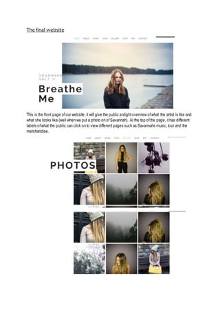
- 1. The final website This is the front page ofour website; it will give the public a slightoverview ofwhat the artist is like and what she looks like (well when we put a photo on ofSavannah). At the top ofthe page, ithas different labels ofwhat the public can click on to view different pages such as Savannahs music, tour and the merchandise.
- 2. This part ofthe website contains various photos ofSavannah in different locations, giving you guys indication into what the music website will look like. We wanted to add photos in which would relate to one another, that’s why the dark trees and black roses are in within the photos. This label is where the public click when they want to view the contact details ofSavannah, her manager and the booking team ofher company. The social media apps are also attached to her website resulting in the public having an easier way of viewing Savannah and following her updates. The merchandise is also attached to the website as we believe the public will want to view and even buy the products related to Savannah. We have created a bags, a couple ofjumpers, phone cases, makeup and other products. These will be available to buy when the website is up and running.
- 3. Tour dates is also attached onto our website as we believe this is valuable information the public need to know when being a fan ofSavannah. The artist will be touring in various cities allowing the public to buy tickets directly ofthe website or other websites such as TicketMaster.