
Recommended
More Related Content
What's hot
What's hot (20)
Viewers also liked
Similar to Website Draft
Similar to Website Draft (20)
More from ameerahmed123
Recently uploaded
Recently uploaded (20)
Website Draft
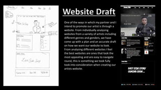
- 1. One of the ways in which my partner and I intend to promote our artist is through a website. From individually analysing websites from a variety of artists including different genres and genders, we have come up with a plan and an accurate draft on how we want our website to look. From analysing different websites I feel the best websites are ones that look the most appealing and are easy to navigate round, this is something we took fully took into consideration when creating our artists website. Website Draft
- 2. Colour • As you may notice we have chosen to go for a black and white theme, this is not only because we feel the two colours make an attractive mix, but because of the underline meanings conveyed by both colours. For example the colour black has connotations to the idea of the unknown and mystery, this is something I feel is portrays a powerful message as our audience is unknown of our artists tough upbringing and are only aware of his current situations as an artist. While, the colour white connotes with the idea of purity and innocence, as this is how we are trying to portray our artist- as a person who done wrong in his past, but is changing his life round and is becoming a better person. In my opinion and the approval from a few peers suggests the mix of black and white is effective and attractive, this is an inspiration we picked up from the Grime artist ‘Ghetts’, as the mix of the two colours also create intimidation and suspense, which are conventional Grime connotations. • My partner and I have chosen to use the same type of font for the whole website. This is because we feel this font looks very slick, attractive and eye-catching for are audience. Font
- 3. Tabs • In terms of the navigation of our website my partner and I have tried to make the website very accessible by giving clear tabs and indications to other pages and links. The tabs you will see on the home page are ‘Home, News, Media, Shop and Bio’, each tab directs the user to a page based on the tab (like a conventional website). From analysing different websites, there were loads of tabs my partner and I could have included, but we did not want to confuse our audience or drag out their experience on our website. Therefore, we have included 5, and 5 in which we feel are best suitable for our website. At the bottom of our home page you will see different social networking tabs, which is you click on, it will redirect you to the different social platforms our artists is on, for example Twitter. I feel this is a very slick and technological touch to our website, as it allows the user to immediately be directed to the social networking of Danny Billz in order to get information on DB quicker.
- 4. Home picture • This is the main piece of imagery on our homepage, this same picture is also the front cover of our Digipak. I really like this picture as our artist is dressed in black with white effects, which correlates with the theme of our ancillary products. Also, DB is staring into the camera, which I feel is very powerful as its as if his in directing at our audience, but also ironic as it allows the audience to stare at him, as if they are looking into his soul. • On our home picture, we have also included the title of our song and the album it is being released on. • To make our advertising look professional and believable, we have included platforms that our tack is being distributed on ,as well as putting a record label we believe Danny Billz could be signed to if he was not fictional. • Slyly we have also tried to advertise our clothing brand, by photo shopping our logo onto Danny Billz’ jacket.
- 5. Rest of the homepage • In terms of the rest of the homepage, we have decided to have little news stories about the activities of Danny Billz, with a link at the bottom that will direct the user to the news page. • We have also decided to have a playlist section, informing our fans what music Danny Billz is listening to. This something that was included on numerous of our website inspirations, and as a fan myself I found this effective as not only does it tell me what my favourite artist is listening to, but also opens me up to new music. • At the bottom of our page we have got a space for our music video when it is released.
- 6. News • Like expected on the news page we have allowed our audience to keep up to date with DB’s activities. One of these ways include a live Twitter feed, I think this looks attractive and is very stylish, as the user does not always have to switch to Twitter to see what DB tweets- to conclude it is just convenient. • We have also conducted an interview with Danny Billz, asking him questions about his new projects and collaborations. To make this look realistic we have created a fictional London based music channel called ‘Underground Heat TV’.
- 7. Media • On this page we have inserted pictures of Danny Billz, from a photo shoot we did. The photos are of DB in the area he grew up in. Shop • For our shop section we have created a fictional clothing range called ‘I GET £’. We have labelled our products with reasonable prices, so therefore our fans can dress like DB and support the movement.
- 8. About • Many artists have an about page on their website, but the format of ours is something that was inspired by a fellow Grime artist called Ghetts. On our about page we have written a brief paragraph about Danny Billz, as well as having a fan message section, where users can get into touch with DB by filling out some details and a message of their enquiry. (this actually works!) *Where you see a digipak blank cover, this is where we will put the front cover of our digipak.