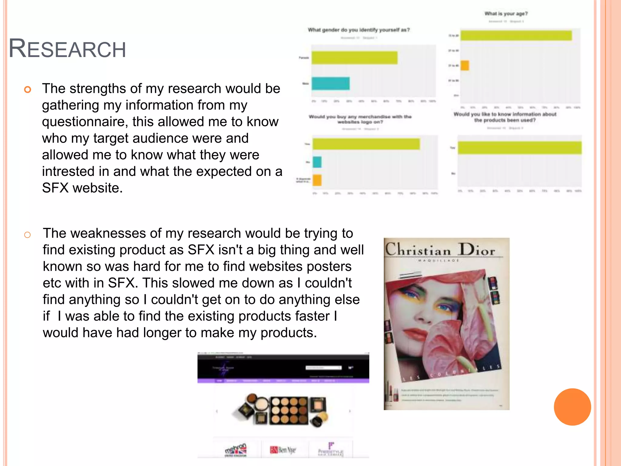
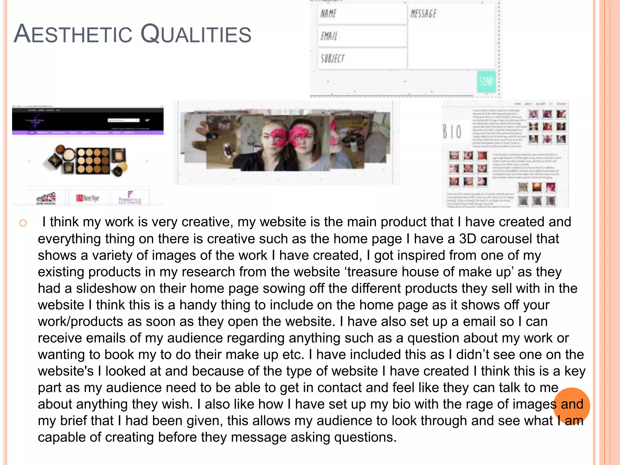
FMP EVALUATION
Jordanne kay
RESEARCH
 The strengths of my research would be
gathering my information from my
questionnaire, this allowed me to know
who my target audience were and
allowed me to know what they were
intrested in and what the expected on a
SFX website.
o The weaknesses of my research would be trying to
find existing product as SFX isn't a big thing and well
known so was hard for me to find websites posters
etc with in SFX. This slowed me down as I couldn't
find anything so I couldn't get on to do anything else
if I was able to find the existing products faster I
would have had longer to make my products.
PLANNING
 My strengths for planning would
be creating my layouts this then
gave me an idea of how I
wanted everything to look on my
website.From this I then had a
rough idea and changed things
when making my website for
example the layouts of my
gallery.
 My weakness for planning
would be filling in the tables for
Health and Safety and
Contingency Planning I looked
back at my previous work to
help me fill them out, if I knew
what to put in them it wouldnt
have took so long so i would
have been able to start
production faster.
TIME MANAGEMENT
 I think I managed my time very well as I managed to finish everything I had planned to
do before the dead lines and managed to create more product such as a backward
tutorial video. I think if I had more time I would have been able to create more tutorial
videos to add to my website but because of the camera equipment and it not recording
when I thought it was, I only managed to get one video as the card was full and I had no
more time to record. I think if I did managed to record more it would have made my
website a lot better as it allows my audience to visually see how I create the different
looks.
 A few things went wrong along the way of creating my products, such as for my website
some one the images were in the wrong format and I was unable to use them until I
turned them in to jpegs this was a long process and put me behind a little this took me
around a hour to change the format of the images but once I had changed the format I
was able to import them into my website and carry on building my website. Another thing
that went wrong was with my videos, I had pressed record are I started creating the SFXs
look, I had finished recording and went over to re-watch the video to see what it was like
to find out it only recorded 10 minute of what I was doing because of the type of camera
and SD card I was using, I didn’t have enough time to re-record anything so I had to
make do with what I had and I just added in images of the final look at the end. When I
cam to editing the video and I put it in to reverse it would not render putting me behind as
I didn’t know what the problem was in the end I just exported the video with out rendering
it and it worked fine.
 If I had more time I would have created a poster advertising my website launch or any
competitions I was doing such as a free make over. This would then have got me well
known and advertised what I do if I did this more people would have known about my
website and not just a selection of people I know and have told.
TECHNICAL QUALITIES
Similarities
One similarity of these two
websites would have to be
the name of the brand
identities, as I have ‘MIX, FIX
& GO’ and as they are a multi
purpose website they have a
few well known brands such
as ‘Mehron’ and ‘Ben Nye’
this then allows the audience
to see straight away what the
website is about and what
information is on the website.
Another similarity would be
they both have some sort of
slideshow/3D carousel on the
home page to show off the
images of either work or the
products they are selling.
Differences
One difference with these two
websites are mines has social
media logos this is advertising
that I am all over the internet
and in anyway you can get in
contact or see my work,
although I know that the other
website is on Facebook,
twitter etc. it doesn't show the
audience anything on the
website saying they are.
Another difference would be
that the other website doesn't
just have one colour scheme
unlike mine, the other website
has a variety because of the
different brands they have on
one website where as I just
have a set colour scheme,
white grey and turquoise
AESTHETIC QUALITIES
o I think my work is very creative, my website is the main product that I have created and
everything thing on there is creative such as the home page I have a 3D carousel that
shows a variety of images of the work I have created, I got inspired from one of my
existing products in my research from the website ‘treasure house of make up’ as they
had a slideshow on their home page sowing off the different products they sell with in the
website I think this is a handy thing to include on the home page as it shows off your
work/products as soon as they open the website. I have also set up a email so I can
receive emails of my audience regarding anything such as a question about my work or
wanting to book my to do their make up etc. I have included this as I didn’t see one on the
website's I looked at and because of the type of website I have created I think this is a key
part as my audience need to be able to get in contact and feel like they can talk to me
about anything they wish. I also like how I have set up my bio with the rage of images and
my brief that I had been given, this allows my audience to look through and see what I am
capable of creating before they message asking questions.
AESTHETIC QUALITIES
 The thing I like the most about my tutorial
videos is how well I have managed to cut
them but they still run smooth as I have used
different effects to go from one part to the next
where I have cut them. The video that I have
turned in to a tutorial video didn’t record the
hole thing leaving me with half a video from
this I have just edited the video as best as I
could then when it had finished I just added in
images of the look I created so my audience
can see what it looked like once I had
finished. From the existing tutorial videos I
have looked at all of them include backing
music which is what I have done however they
also add in a voice over telling the audience
what they have done where as I have added
in title slides telling my audience steps as it
was faster to do so rather then a voice over.
 With the video that I turned backwards I
should have add in a still image of the look I
had created before the video started where it
looks like I am taking the make up off.
o This is the forwards tutorial video I have created,
this is just a screenshot of one title page
transferring into another by using a effect in
Abode Premier.
AESTHETIC QUALITIES
 I think my leaflet is very creative as when you unfold the leaflet it reveilles a little bit more
about me and what I do bit by bit showing images and text to explain what I do and so you
can see some of my work. I really like the outcome of this leaflet as its not like any normal
leaflet that you get it is different and unique.
 To create this I used the same layout as my creative CV this then game me the outline
making it a little bit easier to start, I then went on to collecting a few of the best images on
my work showing a variety of what I am capable of creating this then shows my audience
what I can do. I then used the information from my website to include in my leaflet such as
about my self and what I do and all the contacts so they can get in touch if they wish this is
handy to have when ever you go to a make up festival or to leave in shops/salons for
people to have so all the information is in one place and is handy for them to find me on
YouTube, Facebook etc. and will always know how to get in contact if they ever want their
make up doing for a party, night out, competition.
AUDIENCE APPEAL
o By creating my questionnaire I was able you find out what my target
audience liked and are interested in, this helped me with creating my
website and everything within. I think I have reached my target
audience I have achieved this by looking at my questionnaire and also
my audience profile I had produced after I had the results from my
questionnaire. From looking at my audience profile I was able to aim
my product and the right audience such as the age and gender this is
the main aspect of reaching my target audience because if I don’t
know these two things I wouldn’t be able to get anything right. I have
used models between the ages of 16-18 females to create the SFX
looks on. I have also added in other pictures of my work on younger
clients from the briefs I had given this then shows my audience that I
can work with any ages and both genders. My products are aimed at
anyone aged between 15-25, female with a Social Status of A,B,C1
but anyone who isn’t aged between 15-24 or female are also more
than welcome to look at my products as they may have a big passion
for SFX.
PEER FEEDBACK
FEEDBACK 1
 What did you like about the products?
 I found the two video tutorials very educational and
entertaining because she gave me clear instructions on
how to achieve the terrifying look through written
instructions, also the music fit the age range of the target
audience Jordanne is targeting.
 I found the leaflet and website very creative and
imaginative because of their layout. I liked the fact that
Jordanne gave her target audience a chance to contact her
about her work.
 What improvements could have been made to the products?
 A good improvement for the video tutorials would be is
to increase the volume of the music as it is very quiet.
Another improvement would be to add a still framed
image to the beginning of the backwards tutorial to allow
the audience to see the final product.
FEEDBACK 2
 What did you like about the products?
 I like the 3D carousel on the website and the
leaflet, I like how you have made the layout of
your leaflet and how it unfolds little bit of
information each time you open it up bigger.
 What improvements could have been made
to the products?
 You could maybe make the icons on the home
page of the website link to the different social
medias for when the audience clicks on them it
takes it straight to your information.
FEEDBACK 3
 What did you like about the products?
 The thing I like most about your products would be the
layouts of everything and how all your fonts are very
simular linking everything together and making it yours.
 What improvements could have been made to the
products?
 You could add in images of your work a logo on to one
of your tutorial videos showing all the audeince what its
meant to look like and from seeing your logo they will
recognise your work anywhere.
PEER FEEDBACK SUMMARY
 What do you agree with from your peer feedback?
 I agree with everything everyone has said I could easily
improve little things that would make my products better.
Such as making the music louder and linking the icons
to the different social media pages, by doing this it
allows my audience to access them easier then trying to
find them.
 What do you disagree with from your peer
feedback?
 They isn’t anything to disagree with as everything they
have said could do with improving and its only little
things with out them everything still runs fine and is still
acceptable for the audience to view.
PEER FEEDBACK SUMMARY
o Based upon my feedback the main this I would change/improve would be; Making the music
louder on my tutorial video, add still frames of my end product and logo to my tutorial video,
make the icons of social media interactive. These are only tiny adjustments to my website and
tutorial videos but by doing this I think it would improve everything and make it easier for the
audience to hear, see and access the different social media.
o From adding still images to my tutorial videos it will allow my audience to see what I have create
as it looks like I am taking the make up off the model on the ‘backwards’ video so you don’t see
what I was actually taking off the model. I did plan on adding in image on the video but because
it wouldn’t render I just had to export the video not allowing me to add any images if it had
rendered and worked for my I would have added in images like I did on the ‘forwards’ video.
o The music on the tutorial video sounded loud on the Adobe Premier and I didn’t want it to be too
loud as it would take over the tutorial video and distract the audience but when I exported the
video and I listen backed to it the music was quitter then I thought but this is just a little
adjustment that can be done easily. Not having the music loud doesn’t effect the tutorial video so
I'm not that concerned about it as the tutorial video it perfectly fine.
o I think connecting the icons to the different social media websites is a good idea as I just have
the logos on there but they don’t do anything if they could be linked to the different sites it would
make it easier for my audience to access them with no troubles going on the wrong page etc.
o Also I would add tutorial videos on to my website then my audience can also access them as
well as on YouTube so they don’t have to go to and from different sites to look at my work.

7. fmp evaluation 2

  • 1.
  • 2.
    RESEARCH  The strengthsof my research would be gathering my information from my questionnaire, this allowed me to know who my target audience were and allowed me to know what they were intrested in and what the expected on a SFX website. o The weaknesses of my research would be trying to find existing product as SFX isn't a big thing and well known so was hard for me to find websites posters etc with in SFX. This slowed me down as I couldn't find anything so I couldn't get on to do anything else if I was able to find the existing products faster I would have had longer to make my products.
  • 3.
    PLANNING  My strengthsfor planning would be creating my layouts this then gave me an idea of how I wanted everything to look on my website.From this I then had a rough idea and changed things when making my website for example the layouts of my gallery.  My weakness for planning would be filling in the tables for Health and Safety and Contingency Planning I looked back at my previous work to help me fill them out, if I knew what to put in them it wouldnt have took so long so i would have been able to start production faster.
  • 4.
    TIME MANAGEMENT  Ithink I managed my time very well as I managed to finish everything I had planned to do before the dead lines and managed to create more product such as a backward tutorial video. I think if I had more time I would have been able to create more tutorial videos to add to my website but because of the camera equipment and it not recording when I thought it was, I only managed to get one video as the card was full and I had no more time to record. I think if I did managed to record more it would have made my website a lot better as it allows my audience to visually see how I create the different looks.  A few things went wrong along the way of creating my products, such as for my website some one the images were in the wrong format and I was unable to use them until I turned them in to jpegs this was a long process and put me behind a little this took me around a hour to change the format of the images but once I had changed the format I was able to import them into my website and carry on building my website. Another thing that went wrong was with my videos, I had pressed record are I started creating the SFXs look, I had finished recording and went over to re-watch the video to see what it was like to find out it only recorded 10 minute of what I was doing because of the type of camera and SD card I was using, I didn’t have enough time to re-record anything so I had to make do with what I had and I just added in images of the final look at the end. When I cam to editing the video and I put it in to reverse it would not render putting me behind as I didn’t know what the problem was in the end I just exported the video with out rendering it and it worked fine.  If I had more time I would have created a poster advertising my website launch or any competitions I was doing such as a free make over. This would then have got me well known and advertised what I do if I did this more people would have known about my website and not just a selection of people I know and have told.
  • 5.
    TECHNICAL QUALITIES Similarities One similarityof these two websites would have to be the name of the brand identities, as I have ‘MIX, FIX & GO’ and as they are a multi purpose website they have a few well known brands such as ‘Mehron’ and ‘Ben Nye’ this then allows the audience to see straight away what the website is about and what information is on the website. Another similarity would be they both have some sort of slideshow/3D carousel on the home page to show off the images of either work or the products they are selling. Differences One difference with these two websites are mines has social media logos this is advertising that I am all over the internet and in anyway you can get in contact or see my work, although I know that the other website is on Facebook, twitter etc. it doesn't show the audience anything on the website saying they are. Another difference would be that the other website doesn't just have one colour scheme unlike mine, the other website has a variety because of the different brands they have on one website where as I just have a set colour scheme, white grey and turquoise
  • 6.
    AESTHETIC QUALITIES o Ithink my work is very creative, my website is the main product that I have created and everything thing on there is creative such as the home page I have a 3D carousel that shows a variety of images of the work I have created, I got inspired from one of my existing products in my research from the website ‘treasure house of make up’ as they had a slideshow on their home page sowing off the different products they sell with in the website I think this is a handy thing to include on the home page as it shows off your work/products as soon as they open the website. I have also set up a email so I can receive emails of my audience regarding anything such as a question about my work or wanting to book my to do their make up etc. I have included this as I didn’t see one on the website's I looked at and because of the type of website I have created I think this is a key part as my audience need to be able to get in contact and feel like they can talk to me about anything they wish. I also like how I have set up my bio with the rage of images and my brief that I had been given, this allows my audience to look through and see what I am capable of creating before they message asking questions.
  • 7.
    AESTHETIC QUALITIES  Thething I like the most about my tutorial videos is how well I have managed to cut them but they still run smooth as I have used different effects to go from one part to the next where I have cut them. The video that I have turned in to a tutorial video didn’t record the hole thing leaving me with half a video from this I have just edited the video as best as I could then when it had finished I just added in images of the look I created so my audience can see what it looked like once I had finished. From the existing tutorial videos I have looked at all of them include backing music which is what I have done however they also add in a voice over telling the audience what they have done where as I have added in title slides telling my audience steps as it was faster to do so rather then a voice over.  With the video that I turned backwards I should have add in a still image of the look I had created before the video started where it looks like I am taking the make up off. o This is the forwards tutorial video I have created, this is just a screenshot of one title page transferring into another by using a effect in Abode Premier.
  • 8.
    AESTHETIC QUALITIES  Ithink my leaflet is very creative as when you unfold the leaflet it reveilles a little bit more about me and what I do bit by bit showing images and text to explain what I do and so you can see some of my work. I really like the outcome of this leaflet as its not like any normal leaflet that you get it is different and unique.  To create this I used the same layout as my creative CV this then game me the outline making it a little bit easier to start, I then went on to collecting a few of the best images on my work showing a variety of what I am capable of creating this then shows my audience what I can do. I then used the information from my website to include in my leaflet such as about my self and what I do and all the contacts so they can get in touch if they wish this is handy to have when ever you go to a make up festival or to leave in shops/salons for people to have so all the information is in one place and is handy for them to find me on YouTube, Facebook etc. and will always know how to get in contact if they ever want their make up doing for a party, night out, competition.
  • 9.
    AUDIENCE APPEAL o Bycreating my questionnaire I was able you find out what my target audience liked and are interested in, this helped me with creating my website and everything within. I think I have reached my target audience I have achieved this by looking at my questionnaire and also my audience profile I had produced after I had the results from my questionnaire. From looking at my audience profile I was able to aim my product and the right audience such as the age and gender this is the main aspect of reaching my target audience because if I don’t know these two things I wouldn’t be able to get anything right. I have used models between the ages of 16-18 females to create the SFX looks on. I have also added in other pictures of my work on younger clients from the briefs I had given this then shows my audience that I can work with any ages and both genders. My products are aimed at anyone aged between 15-25, female with a Social Status of A,B,C1 but anyone who isn’t aged between 15-24 or female are also more than welcome to look at my products as they may have a big passion for SFX.
  • 10.
  • 11.
    FEEDBACK 1  Whatdid you like about the products?  I found the two video tutorials very educational and entertaining because she gave me clear instructions on how to achieve the terrifying look through written instructions, also the music fit the age range of the target audience Jordanne is targeting.  I found the leaflet and website very creative and imaginative because of their layout. I liked the fact that Jordanne gave her target audience a chance to contact her about her work.  What improvements could have been made to the products?  A good improvement for the video tutorials would be is to increase the volume of the music as it is very quiet. Another improvement would be to add a still framed image to the beginning of the backwards tutorial to allow the audience to see the final product.
  • 12.
    FEEDBACK 2  Whatdid you like about the products?  I like the 3D carousel on the website and the leaflet, I like how you have made the layout of your leaflet and how it unfolds little bit of information each time you open it up bigger.  What improvements could have been made to the products?  You could maybe make the icons on the home page of the website link to the different social medias for when the audience clicks on them it takes it straight to your information.
  • 13.
    FEEDBACK 3  Whatdid you like about the products?  The thing I like most about your products would be the layouts of everything and how all your fonts are very simular linking everything together and making it yours.  What improvements could have been made to the products?  You could add in images of your work a logo on to one of your tutorial videos showing all the audeince what its meant to look like and from seeing your logo they will recognise your work anywhere.
  • 14.
    PEER FEEDBACK SUMMARY What do you agree with from your peer feedback?  I agree with everything everyone has said I could easily improve little things that would make my products better. Such as making the music louder and linking the icons to the different social media pages, by doing this it allows my audience to access them easier then trying to find them.  What do you disagree with from your peer feedback?  They isn’t anything to disagree with as everything they have said could do with improving and its only little things with out them everything still runs fine and is still acceptable for the audience to view.
  • 15.
    PEER FEEDBACK SUMMARY oBased upon my feedback the main this I would change/improve would be; Making the music louder on my tutorial video, add still frames of my end product and logo to my tutorial video, make the icons of social media interactive. These are only tiny adjustments to my website and tutorial videos but by doing this I think it would improve everything and make it easier for the audience to hear, see and access the different social media. o From adding still images to my tutorial videos it will allow my audience to see what I have create as it looks like I am taking the make up off the model on the ‘backwards’ video so you don’t see what I was actually taking off the model. I did plan on adding in image on the video but because it wouldn’t render I just had to export the video not allowing me to add any images if it had rendered and worked for my I would have added in images like I did on the ‘forwards’ video. o The music on the tutorial video sounded loud on the Adobe Premier and I didn’t want it to be too loud as it would take over the tutorial video and distract the audience but when I exported the video and I listen backed to it the music was quitter then I thought but this is just a little adjustment that can be done easily. Not having the music loud doesn’t effect the tutorial video so I'm not that concerned about it as the tutorial video it perfectly fine. o I think connecting the icons to the different social media websites is a good idea as I just have the logos on there but they don’t do anything if they could be linked to the different sites it would make it easier for my audience to access them with no troubles going on the wrong page etc. o Also I would add tutorial videos on to my website then my audience can also access them as well as on YouTube so they don’t have to go to and from different sites to look at my work.

Editor's Notes

  • #3 What were the strengths of your research? How did your research help your product? What were the weaknesses of your research? What could you have done better/improve? What effect would this have had on your product?
  • #4 What were the strengths of your planning? How did your planning help your product? What were the weaknesses of your planning? What could you have done better/improve? What effect would this have had on your product?
  • #5 Did you manage your time well? Did you complete your project on time or would your products have improved with additional time? What would you have done if you had more time to produce your work?
  • #6 Compare your work to similar existing products and discuss the similarities and differences Put your final piece(s) in the centre of a page alongside an existing product Use text boxes and arrows
  • #7 Does your work look good? Was it creative? What aspects of your game’s visuals do you like? What would you improve? How would you improve it? Discuss the strengths and weaknesses Put your final piece(s) in the centre of a page and analyse them Use text boxes and arrows
  • #9 Does your work look good? Was it creative? What aspects of your game’s visuals do you like? What would you improve? How would you improve it? Discuss the strengths and weaknesses Put your final piece(s) in the centre of a page and analyse them Use text boxes and arrows
  • #10 How have you appealed to your target audience? What specific bits of content would appeal to your target audience. Refer to your findings from your questionnaire. Put your final piece(s) in the centre of a page and analyse them Use text boxes and arrows
  • #16 What changes would you make to your product based upon your peer feedback and why?