Research
Existing Products – Future Self (Website)
For my research, I am looking at the website for a brand called ‘Future Self’ which is a clothing brand about self
development as your future self will be grateful.
Firstly, I am looking at the website design and layout to get some inspiration for my brand.
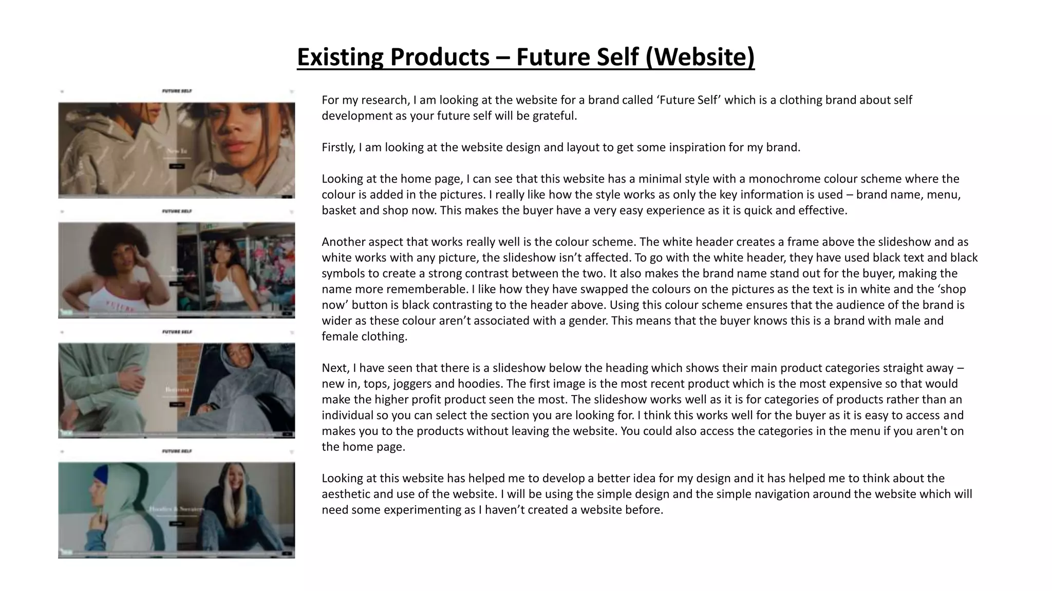
Looking at the home page, I can see that this website has a minimal style with a monochrome colour scheme where the
colour is added in the pictures. I really like how the style works as only the key information is used – brand name, menu,
basket and shop now. This makes the buyer have a very easy experience as it is quick and effective.
Another aspect that works really well is the colour scheme. The white header creates a frame above the slideshow and as
white works with any picture, the slideshow isn’t affected. To go with the white header, they have used black text and black
symbols to create a strong contrast between the two. It also makes the brand name stand out for the buyer, making the
name more rememberable. I like how they have swapped the colours on the pictures as the text is in white and the ‘shop
now’ button is black contrasting to the header above. Using this colour scheme ensures that the audience of the brand is
wider as these colour aren’t associated with a gender. This means that the buyer knows this is a brand with male and
female clothing.
Next, I have seen that there is a slideshow below the heading which shows their main product categories straight away –
new in, tops, joggers and hoodies. The first image is the most recent product which is the most expensive so that would
make the higher profit product seen the most. The slideshow works well as it is for categories of products rather than an
individual so you can select the section you are looking for. I think this works well for the buyer as it is easy to access and
makes you to the products without leaving the website. You could also access the categories in the menu if you aren't on
the home page.
Looking at this website has helped me to develop a better idea for my design and it has helped me to think about the
aesthetic and use of the website. I will be using the simple design and the simple navigation around the website which will
need some experimenting as I haven’t created a website before.
Existing Products – Future Self (Website)
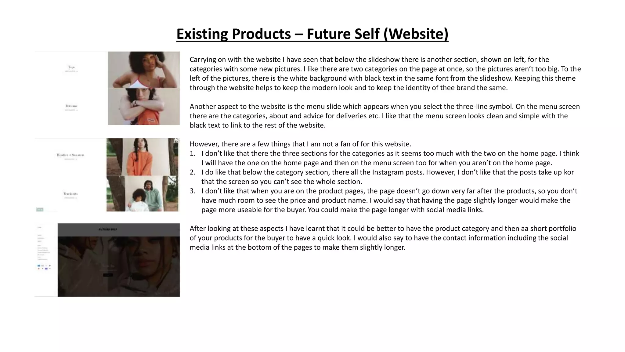
Carrying on with the website I have seen that below the slideshow there is another section, shown on left, for the
categories with some new pictures. I like there are two categories on the page at once, so the pictures aren’t too big. To the
left of the pictures, there is the white background with black text in the same font from the slideshow. Keeping this theme
through the website helps to keep the modern look and to keep the identity of thee brand the same.
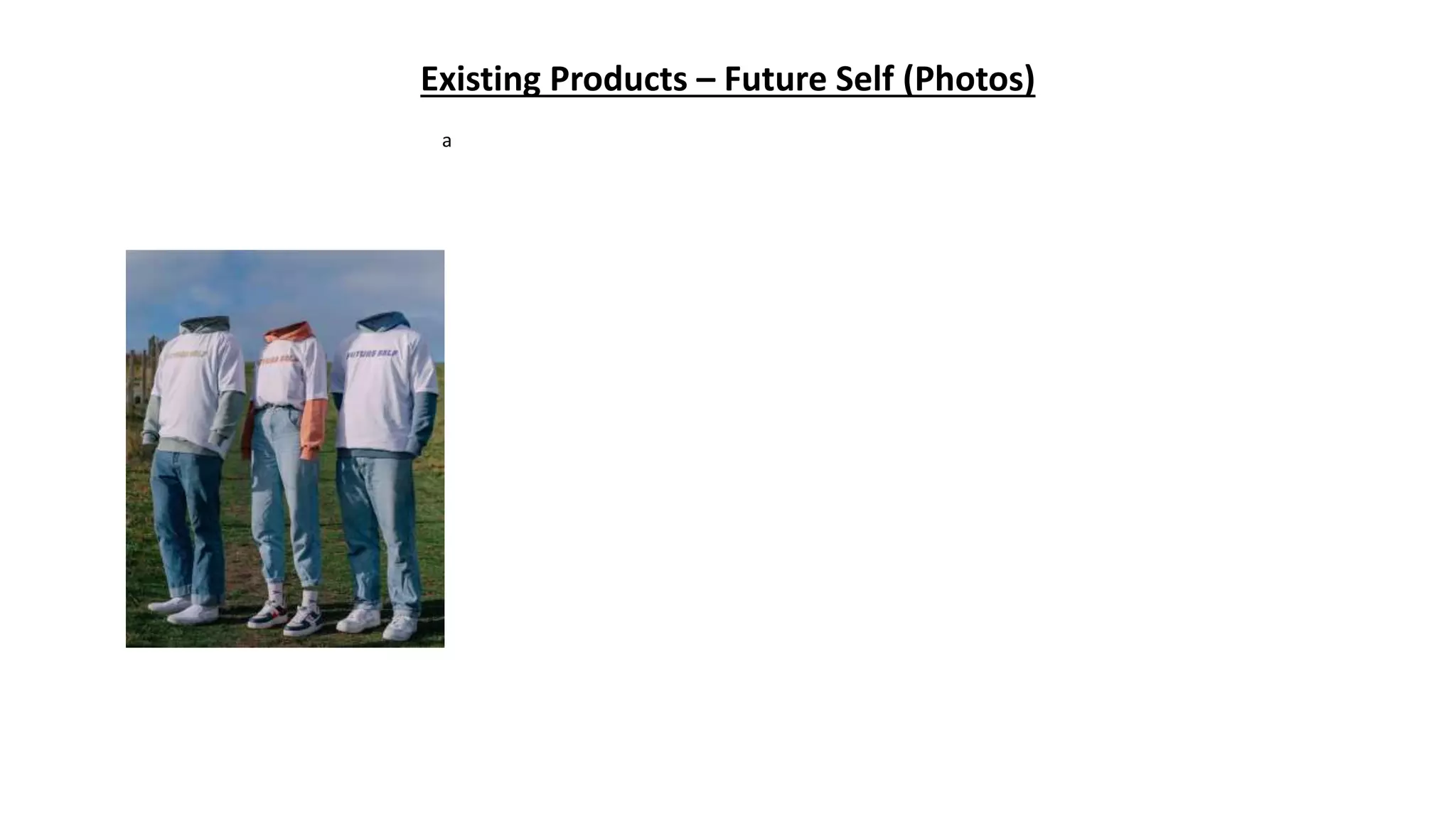
Another aspect to the website is the menu slide which appears when you select the three-line symbol. On the menu screen
there are the categories, about and advice for deliveries etc. I like that the menu screen looks clean and simple with the
black text to link to the rest of the website.
However, there are a few things that I am not a fan of for this website.
1. I don’t like that there the three sections for the categories as it seems too much with the two on the home page. I think
I will have the one on the home page and then on the menu screen too for when you aren’t on the home page.
2. I do like that below the category section, there all the Instagram posts. However, I don’t like that the posts take up kor
that the screen so you can’t see the whole section.
3. I don’t like that when you are on the product pages, the page doesn’t go down very far after the products, so you don’t
have much room to see the price and product name. I would say that having the page slightly longer would make the
page more useable for the buyer. You could make the page longer with social media links.
After looking at these aspects I have learnt that it could be better to have the product category and then aa short portfolio
of your products for the buyer to have a quick look. I would also say to have the contact information including the social
media links at the bottom of the pages to make them slightly longer.
Existing Products – Future Self (Photos)
a
Existing Products – Future Self (Products)
a
Existing Products – Future Self (Advert)
a
Existing Products – Future Self (Social Media)
a
Questionnaire Analysis
Audience Research
Observation:
What this says about my audience:
How will your product appeal to this audience:
Audience Research
Observation:
What this says about my audience:
How will your product appeal to this audience:
Audience Research
Observation:
What this says about my audience:
How will your product appeal to this audience:
Audience Research
Observation:
What this says about my audience:
How will your product appeal to this audience:
Audience Research
Observation:
What this says about my audience:
How will your product appeal to this audience:
Audience Research
Observation:
What this says about my audience:
How will your product appeal to this audience:
Audience Research
Observation:
What this says about my audience:
How will your product appeal to this audience:
Audience Research
Observation:
What this says about my audience:
How will your product appeal to this audience:
Audience Research
Observation:
What this says about my audience:
How will your product appeal to this audience:
Audience Research
Observation:
What this says about my audience:
How will your product appeal to this audience:
Audience Research
Observation:
What this says about my audience:
How will your product appeal to this audience:
Interviews
Interview 1
Interview 1
Observation:
What this says about my audience:
How will your product appeal to this audience:
Interview 2
Interview 2
Observation:
What this says about my audience:
How will your product appeal to this audience:
Bilbography
Biblography
1. Your, Name. (2018) Target Audience Research Survey (conducted on DATE)
2. Interviewees, Name. (2018) Target Audience Interviews (conducted on DATE)

Research

  • 1.
  • 2.
    Existing Products –Future Self (Website) For my research, I am looking at the website for a brand called ‘Future Self’ which is a clothing brand about self development as your future self will be grateful. Firstly, I am looking at the website design and layout to get some inspiration for my brand. Looking at the home page, I can see that this website has a minimal style with a monochrome colour scheme where the colour is added in the pictures. I really like how the style works as only the key information is used – brand name, menu, basket and shop now. This makes the buyer have a very easy experience as it is quick and effective. Another aspect that works really well is the colour scheme. The white header creates a frame above the slideshow and as white works with any picture, the slideshow isn’t affected. To go with the white header, they have used black text and black symbols to create a strong contrast between the two. It also makes the brand name stand out for the buyer, making the name more rememberable. I like how they have swapped the colours on the pictures as the text is in white and the ‘shop now’ button is black contrasting to the header above. Using this colour scheme ensures that the audience of the brand is wider as these colour aren’t associated with a gender. This means that the buyer knows this is a brand with male and female clothing. Next, I have seen that there is a slideshow below the heading which shows their main product categories straight away – new in, tops, joggers and hoodies. The first image is the most recent product which is the most expensive so that would make the higher profit product seen the most. The slideshow works well as it is for categories of products rather than an individual so you can select the section you are looking for. I think this works well for the buyer as it is easy to access and makes you to the products without leaving the website. You could also access the categories in the menu if you aren't on the home page. Looking at this website has helped me to develop a better idea for my design and it has helped me to think about the aesthetic and use of the website. I will be using the simple design and the simple navigation around the website which will need some experimenting as I haven’t created a website before.
  • 3.
    Existing Products –Future Self (Website) Carrying on with the website I have seen that below the slideshow there is another section, shown on left, for the categories with some new pictures. I like there are two categories on the page at once, so the pictures aren’t too big. To the left of the pictures, there is the white background with black text in the same font from the slideshow. Keeping this theme through the website helps to keep the modern look and to keep the identity of thee brand the same. Another aspect to the website is the menu slide which appears when you select the three-line symbol. On the menu screen there are the categories, about and advice for deliveries etc. I like that the menu screen looks clean and simple with the black text to link to the rest of the website. However, there are a few things that I am not a fan of for this website. 1. I don’t like that there the three sections for the categories as it seems too much with the two on the home page. I think I will have the one on the home page and then on the menu screen too for when you aren’t on the home page. 2. I do like that below the category section, there all the Instagram posts. However, I don’t like that the posts take up kor that the screen so you can’t see the whole section. 3. I don’t like that when you are on the product pages, the page doesn’t go down very far after the products, so you don’t have much room to see the price and product name. I would say that having the page slightly longer would make the page more useable for the buyer. You could make the page longer with social media links. After looking at these aspects I have learnt that it could be better to have the product category and then aa short portfolio of your products for the buyer to have a quick look. I would also say to have the contact information including the social media links at the bottom of the pages to make them slightly longer.
  • 4.
    Existing Products –Future Self (Photos) a
  • 5.
    Existing Products –Future Self (Products) a
  • 6.
    Existing Products –Future Self (Advert) a
  • 7.
    Existing Products –Future Self (Social Media) a
  • 8.
  • 9.
    Audience Research Observation: What thissays about my audience: How will your product appeal to this audience:
  • 10.
    Audience Research Observation: What thissays about my audience: How will your product appeal to this audience:
  • 11.
    Audience Research Observation: What thissays about my audience: How will your product appeal to this audience:
  • 12.
    Audience Research Observation: What thissays about my audience: How will your product appeal to this audience:
  • 13.
    Audience Research Observation: What thissays about my audience: How will your product appeal to this audience:
  • 14.
    Audience Research Observation: What thissays about my audience: How will your product appeal to this audience:
  • 15.
    Audience Research Observation: What thissays about my audience: How will your product appeal to this audience:
  • 16.
    Audience Research Observation: What thissays about my audience: How will your product appeal to this audience:
  • 17.
    Audience Research Observation: What thissays about my audience: How will your product appeal to this audience:
  • 18.
    Audience Research Observation: What thissays about my audience: How will your product appeal to this audience:
  • 19.
    Audience Research Observation: What thissays about my audience: How will your product appeal to this audience:
  • 20.
  • 21.
  • 22.
    Interview 1 Observation: What thissays about my audience: How will your product appeal to this audience:
  • 23.
  • 24.
    Interview 2 Observation: What thissays about my audience: How will your product appeal to this audience:
  • 25.
  • 26.
    Biblography 1. Your, Name.(2018) Target Audience Research Survey (conducted on DATE) 2. Interviewees, Name. (2018) Target Audience Interviews (conducted on DATE)

Editor's Notes

  • #3 Choose a recent product similar to your own and annotate it Type of image- studio/location, angle, effects, post-production Use of lighting/composition/mise en scene/costume/props/location/colours/fonts etc. Audience appeal- how does it make its audience want to buy/watch/play it?
  • #4 Choose a recent product similar to your own and annotate it Type of image- studio/location, angle, effects, post-production Use of lighting/composition/mise en scene/costume/props/location/colours/fonts etc. Audience appeal- how does it make its audience want to buy/watch/play it?
  • #5 Choose a recent product similar to your own and annotate it Type of image- studio/location, angle, effects, post-production Use of lighting/composition/mise en scene/costume/props/location/colours/fonts etc. Audience appeal- how does it make its audience want to buy/watch/play it?
  • #6 Choose a recent product similar to your own and annotate it Type of image- studio/location, angle, effects, post-production Use of lighting/composition/mise en scene/costume/props/location/colours/fonts etc. Audience appeal- how does it make its audience want to buy/watch/play it?
  • #7 Choose a recent product similar to your own and annotate it Type of image- studio/location, angle, effects, post-production Use of lighting/composition/mise en scene/costume/props/location/colours/fonts etc. Audience appeal- how does it make its audience want to buy/watch/play it?
  • #8 Choose a recent product similar to your own and annotate it Type of image- studio/location, angle, effects, post-production Use of lighting/composition/mise en scene/costume/props/location/colours/fonts etc. Audience appeal- how does it make its audience want to buy/watch/play it?