The document summarizes key elements of a website evaluation, including:
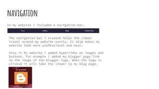
1) The navigation bar helps viewers easily navigate around the website and makes it look more professional. Hyperlinks were also added to images and buttons.
2) The layout is plain and simple with short writing and many pictures to avoid long essays.
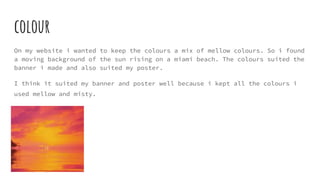
3) Mellow and misty colors from a moving beach background suit the banner and poster.
4) The website contains interactive buttons, images, and a slideshow gallery of class posters. A moving background also engages viewers.
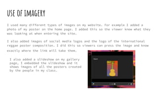
5) Different types of images are used, including the poster, social media logos, and a class poster slideshow.