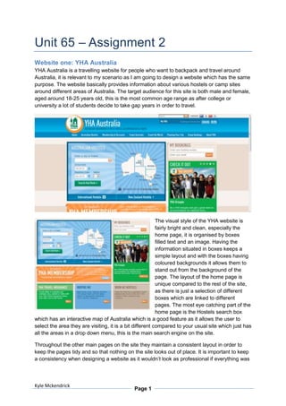
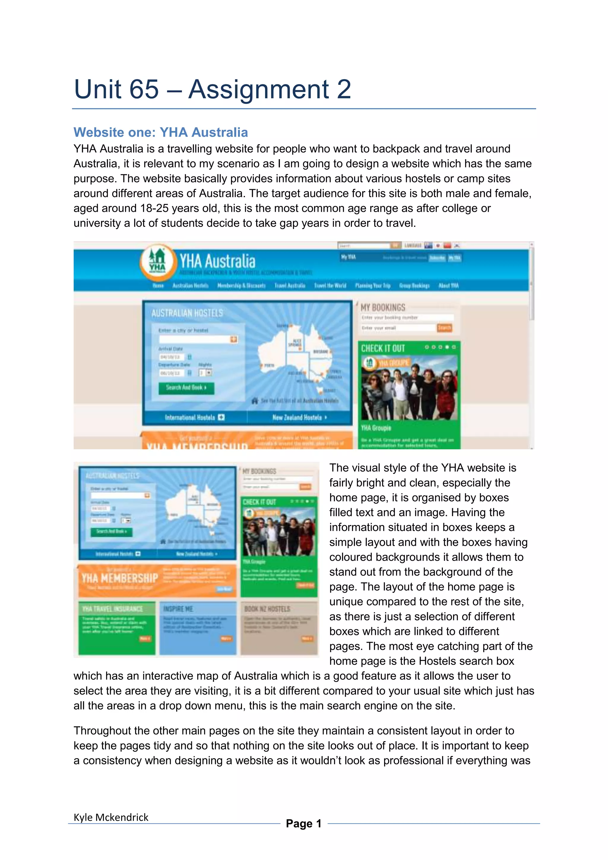
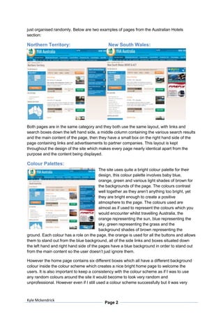
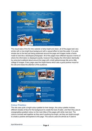
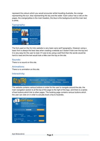
YHA Australia and Oz Intro are websites that provide information for backpackers and travelers in Australia. Both sites target 18-25 year olds and provide information on hostels, campsites, and jobs around the country. They use bright, clean designs with blue, orange, and yellow colors to create a sunny, beach atmosphere. Navigation is primarily through buttons and drop down menus to browse accommodation and employment opportunities. The layouts are consistent across pages to maintain a simple, organized user experience.
This document analyzes and summarizes the layout, design, and content of several charity websites. It finds that effective designs generally include clear navigation at the top of pages, a balanced use of images and text, and colors that match the nature of the charity. Navigation is kept consistent across pages to help users easily move around sites. Donation pages specifically provide clear, easy-to-follow instructions for contributing funds. Overall, the best designs make important information readily accessible while creating an appealing user experience.
The document discusses six design principles - balance, emphasis, rhythm, scale and proportion, simplicity, and unity - as exhibited on various websites. It provides examples of how the Apple, Jing, Pittstate, Maccosmetics, Google, Pearsonified, and Apple websites respectively demonstrate balance, emphasis, rhythm, scale and proportion, simplicity, unity, and variety through their use of colors, spacing, sizing of elements, and organization of content.
The document provides an analysis of the September 2009 edition of NME magazine featuring Dizzee Rascal. It analyzes various design elements of the front cover including the masthead, images, headlines, and footer. It also analyzes the contents page layout and band index. Finally, it examines a double page article spread analyzing the images, captions, bylines, headings, and four column text layout. The target audience is identified as 66% male, 34% female, with a median age of 23. Students make up 35% of readers. The magazine aims to engage this music obsessed audience through music news, reviews, and connections to upcoming tours and artists.
This document describes several concepts for social experiences around football games and fantasy football on Facebook.
The first concept is a "Game Day Emoti-Cam" application that allows fans to upload photos expressing their emotions throughout a game. Another concept is a "Football Predictor" application where fans predict game outcomes and compete by buying each other Bud Lights. A third concept involves granting fantasy football champions' dreams, such as meeting an NFL player. The concepts aim to drive fan engagement and conversations on Facebook.
The document outlines the process of creating a Hong Kong tourism website. It discusses selecting themes, editing photos, creating individual pages for different shopping categories, and including key information like maps, directions, and user comments. The creator aimed to present helpful information in an organized and visually appealing way based on client feedback.
The document is a production log detailing the process of designing a contents page for a magazine. It describes choosing colors, fonts, and layouts for different sections. Boxes are created and filled with headings. Images are selected and inserted. The only significant change from the initial plan is using a lighter grey background color instead of red and dark grey, to improve readability. By the end, the contents page design is completed as outlined except for the changed background shade.
The document is a production log for a magazine contents page. It describes the process of designing and laying out the various elements on the page, including:
1) Choosing colors of red, grey, and black for boxes and text.
2) Creating boxes and columns using drawing tools and separating them with lines.
3) Adding headings like "Contents", "What's to Come", "Features", and "Reviews" to the boxes.
4) Filling in listings of articles, images, and folios under the headings.
5) Choosing fonts consistently to suit the target audience and match the cover page.
The document is a production log that describes the process of designing a contents page for a magazine. It discusses choosing colors of grey, black and red, creating boxes and headings, selecting fonts, and filling the boxes with content like features, cover stories, and reviews. The final contents page includes boxes with headings in impact font, lists of features in Arial rounded font, and folios in red to draw attention.
This document discusses elements of design on the web through examples of various company websites. It analyzes how Google represents simplicity through minimal design focused on search. Mumford and Sons emphasizes key visual elements. HBO Go uses scale and proportion with a large banner and smaller icons. Tumblr creates rhythm through repeated white blurbs. NBC balances elements in the center and sides. MountainDew.com uses variety in textures, icons, and pop-ups. Netflix shows unity through similarity, proximity, and alignment of tiles.
This document discusses elements of design on the web through examples of various company websites. It analyzes how Google represents simplicity through minimal design focused on search. Mumford and Sons emphasizes key visual elements. HBO Go uses scale and proportion with a large banner and smaller icons. Tumblr creates rhythm through repeated white blurbs. NBC balances elements in the center and sides. MountainDew.com engages users with variety in textures, icons and pop-ups. Netflix shows unity through similarity, proximity and alignment of tiles.
This document outlines key web design principles including unity, variety, balance, scale and proportion, rhythm, emphasis, and simplicity. It discusses how unity can be achieved through consistent school colors, variety through different typography, and balance through offsetting pictures and text. Scale and proportion are created through different photo sizes, rhythm through moving widgets, emphasis through clean water, and simplicity through Twitter's minimal main page.
Creating a colour scheme for a room can transform it quickly and cheaply. It is important to consider factors like the amount of natural light a room receives and how colours can affect mood. Warm colours like red and yellow make small, dark rooms feel cozier while cool colours like blue and green are relaxing and make rooms feel more airy. When choosing colours, consider how they may look different in artificial light compared to natural light. Patterns can also be used to make optical illusions and change how a room appears. Texture adds visual interest and different textures like wood or brick feel warmer while shiny surfaces seem more sophisticated. Accessories should be updated to match a new colour scheme for a polished look.
1) The document summarizes a promotional video created by Kyle Mckendrick for a college course. It discusses meeting the client's requirements, exporting the video in different formats, and conducting research on suitable file formats.
2) Details are provided about the target audience for the video and techniques used to keep them engaged, such as fast pacing and a catchy song. Feedback was obtained through student questionnaires.
3) The summary discusses editing software used, effects like transitions, and adding titles. Considerations were made for importing music and exporting quality. Meetings with the client and team were conducted throughout the project.
The document promotes a system that claims to have paid out over $25 million to its members. It encourages readers to join for $25 for instant access to training that will show them how to make money online through both immediate and residual income streams. It asserts that if readers want the best chance at online success and to be part of a positive movement, they should sign up as over 100,000 members have already joined.
Kyle began editing his promotional video by importing footage and dragging clips onto the timeline in Adobe Elements. He added transitions like dissolves between clips and used pan and zoom tools to create effects. Some clips were too long so Kyle cut them on the timeline. Kyle also cut interviews into clips and added text overlays. After adding the soundtrack, Kyle exported the finished video in different formats for web, DVD, and presentations. The exporting process involved selecting format and file options to save the video.
Original Web presentation in:
WebPage
http://www.seacareapp.com/
Slides
http://www.seacareapp.com/slides/
Sea Care
Proof of concept application developed during the Space App Camp hosted by ESA at ESTEC (Noordwijk, Netherlands). The aim of the mobile app developed is to retrieve reports and data from users about illegal unreported fishing and other behaviours. Users get notifications based on the real time analysis of vessel traffic retrieved from the Automatic Identification System (AIS). Finally, accessing ESA Copernicus Sentinel 1 satellite radar images to confirm the data reported by users and AIS, it would be possible to join then three independent evidency sources to have a strong argument at court.
The document discusses different types of client briefs:
- Contractual briefs establish the duties and expectations between a company and employee, including payment terms.
- Negotiated briefs are used when two parties have differing ideas and must compromise.
- Formal briefs contain specific details about targets but no unnecessary information.
- Informal briefs are more relaxed conversations between a client and employer to track progress.
- Commission briefs pay clients for their ideas rather than work. Competition and tender briefs involve clients submitting proposals for review. Cooperative briefs outline collaboration roles and payments between businesses.
The document proposes creating a promotional video for an A-Level ICT course at Cheadle and Marple Sixth Form College. The video needs to engage and persuade audiences to take the course. Existing promotional videos from local colleges will be reviewed for techniques to make the video exciting using fast cuts, bright colors, and possibly a song. The video will be distributed on the college website, social media sites like YouTube, and may also be included on a CD-ROM.
The document outlines the storyboards and layouts for the home, accommodation, sightseeing, and contact pages of a tourism website. The home page includes a navigation bar and an interactive map of Australia that links to accommodation and attractions. Accommodation and sightseeing pages feature slideshows of images for different locations. The contact page has the interactive map and fields to leave name, email, and message.
This document provides tips on how to start and grow a successful blog. It recommends deciding on clear outcomes or goals for your blog to stay motivated. Choosing a topic you're passionate about and writing consistently are also important. The document suggests blogging daily, marketing your blog as much as you write it, using videos and social media to drive traffic, and joining an authority site like Empower Network for training and increased reach. Consistency is key to building an audience and income over time through blogging.
Dokumen tersebut merupakan skema jawapan untuk soalan-soalan bahasa Melayu dalam peperiksaan akhir tahun tingkatan 4. Skema tersebut memberikan panduan ringkas mengenai format dan isi kandungan yang perlu dimasukkan dalam jawapan untuk setiap soalan.
The document discusses plant maintenance procedures. It defines maintenance as finding faults in equipment before or after breakdown to maintain operational efficiency. The objectives of maintenance are to increase reliability, maximize equipment life, maximize production capacity, and minimize costs and interruptions. Maintenance types include planned (preventive, corrective, predictive), and unplanned. Key steps in preventive maintenance procedures are identifying equipment, creating schedules, history cards, job specifications, programming, inspections, and applying feedback.
The document summarizes the development of a website for Australian youth hostels. It discusses analyzing existing hostel websites, creating a proposal, developing storyboards, and compiling assets needed like photos, colors, and fonts. Key aspects are analyzing other sites, creating a proposal addressing target audience and content, and planning assets and layout through storyboards before building the site.
The document analyzes and summarizes the effectiveness of the VisitPhoenix.com website in attracting visitors to Phoenix, Arizona. It notes that the website uses vibrant pictures, bright colors, and strategic placement of elements to catch the viewer's attention. Large, wide-spanning photos showcasing the diverse landscapes are prominently featured on the homepage. A dark background emphasizes the photos and draws the eye to the primary-colored menu options. The placement, colors, and transparent backgrounds create visual harmony across the site. The goal of enticing visitors to spend money and visit Phoenix is achieved through an appealing visual design.
The document provides details about creating an interactive website for Oz Backpackers. It will include pages for home, booking, contact, and about. The home page will feature information about Oz Backpackers and a slideshow of Australian destinations. The booking page will allow users to select accommodation packages, enter personal and contact details, and agree to terms and conditions. The target audience is males and females aged 18-25 who enjoy backpacking. Considerations around security, legal issues, and ethics are also discussed. The design aims to appeal to younger travelers through colors, themes, and simple text styles.
The document discusses the layout of a magazine double page spread. It summarizes that the layout is well organized and avoids text crossing the centerfold. Images and articles are placed around the centerfold to be clearly visible and readable. The four black and white images contrast well with red text and are action shots that will appeal to the target audience. The color scheme and large central image attract readers' attention while columns of text make the content easy to read.
The document discusses six design principles - balance, emphasis, rhythm, scale and proportion, simplicity, and unity - as exhibited on various websites. It provides examples of how the Apple, Jing, Pittstate, Maccosmetics, Google, Pearsonified, and Apple websites respectively demonstrate balance, emphasis, rhythm, scale and proportion, simplicity, unity, and variety through their use of colors, spacing, sizing of elements, and organization of content.
Digital graphics evaluation pro forma 1joel simpson
The document provides templates and prompts for evaluating a graphic narrative project. It instructs the user to provide specific written and visual details about their work, including areas to praise and areas for improvement. It suggests adding additional slides as needed and deleting any blank slides before submission. The templates ask the user to reflect on how well their final product achieved their original intentions, the construction of images, use of text, suitability for their intended audience, techniques used, the final look, and their choices of content.
The website uses consistent colors, fonts, and layout to appear professional and user-friendly. Headings are bold and capitalized while body text is smaller and easier to read. Links are surrounded by colored boxes with the same font as headings but not capitalized. The only animation is a simple fade between user-submitted photos on the right side. Interactivity includes drop-down menus for navigation headings and a color change on a booking map when the mouse hovers over states.
The document provides guidance on designing websites, including using grids, whitespace, and color. It discusses how grids can help achieve balance and compartmentalize content. Whitespace is described as the space between elements and how too little can make a page appear cluttered while clever use of whitespace can make a page look elegant. Different colors are then examined, with explanations of how each color can be used and perceived in design.
The site uses bright colors like blue, white and orange that are consistent throughout to look professional. Navigation is easy with drop down menus and interactive maps. The site provides information about hostels in Australia and why to visit the country. Users can book hostels, plan trips, and search by location or hostel. Interactive maps change as the mouse moves and allow quick bookings. The colors complement each other without straining the eyes, and text stands out against backgrounds. The color scheme reflects aspects of Australia like the outback, forests, and ocean. All pages maintain consistent colors and a universal sans serif text.
The document provides 10 tips for effective yearbook design including telling compelling stories with photos and words, using framing margins, displaying content in modules with varied sizes anchored to a grid, creating a dominant visual centerpiece, employing three levels of spacing, incorporating contrasting elements, using legible typography, making verbal and visual connections between headlines and photos, incorporating repeating design elements, and using graphics purposefully to unify, separate or highlight content without being distracting. The tips are illustrated with examples from award-winning yearbook spreads that demonstrate strong graphic design principles.
The document provides 10 tips for effective yearbook design including telling compelling stories with photos and words, using framing margins, displaying content in modules with varied sizes anchored to a grid, creating a dominant visual centerpiece, employing three levels of spacing, incorporating contrasting elements, using legible typography, making verbal and visual connections between headlines and photos, incorporating repeating design elements, and using graphics purposefully to unify, separate, and highlight content without distraction. The tips are illustrated with examples from award-winning yearbook spreads that demonstrate strong graphic design principles.
The NorthernLife website targets people aged 30 and above who live in or want to visit northern England. The colors used are neutral whites, blacks and oranges to represent northern England generally without focusing on one specific region. Images on the homepage represent articles and draw attention to the featured piece, while their lack of bright colors suggest calm, relaxing content. The fonts, layout and content are simple and easy to read, targeting older audiences and encouraging readers to explore featured articles. Overall, the website effectively conveys its content and audience through design elements like color, images and fonts.
This document summarizes and compares the layout, typography, and design of 5 different informational documents: a vehicle manual, instruction guide, leaflet, dialog, and newspaper article. Some key findings are:
- Bold typography is used prominently in the manual and guide to draw attention to headings and main points. Diagrams also aid clarity.
- The guide emphasizes typography, clarity through diagrams, and uses a simple color scheme for ease of use.
- The leaflet uses solid colors and minimal images but could improve contrast between text and background colors.
- The dialog uses simple, clear language seemingly aimed at children through its use of a cartoon character.
- The newspaper layout
The document discusses key elements that make a good website, including layout, navigation, and text. For layout, it recommends using only a few colors, proper alignment, and reasonable page sizes. Navigation menus should be easy to read, user-friendly, attractive, and not cluttered. Text fonts should be readable, limited in number, and sized appropriately while avoiding clashes with the background.
The YHA website uses a calming color scheme with pastel shades and rounded edges to provide an upbeat feel. The typography clearly distinguishes headings, links, and body text. Navigation headings deploy drop-down menus on mouse hover, and the map changes color on mouseover of different states. The only animation is a simple fade transition between user-submitted photos on the right side of the page. Overall, the layout and design create a professional, easy-to-use user experience.
The document discusses four principles of design - balance, alignment, repetition, and contrast. It provides examples of how to apply each principle and the effects they can have on a design, such as creating order, emphasis, and visual interest. Symmetry, asymmetry, radial balance and uneven placement are discussed in the context of balance. Horizontal, vertical, edge and center alignment are covered. Consistency through repetition and contrast using size, value, color and type are also explained.
The client meeting minutes discussed two items. For the first item, the client was shown the finished product and approved of it, praising the camera angles and effects used. The project was deemed successful for meeting client needs. For the second item, the different editing steps were discussed with the client, including the various effects and tools used to piece footage together per the project diary.
The agenda is for a media studies team meeting on April 16th at 11:45 in room C03. Kyle Mckendrick will chair the meeting and show the client his end product video for approval. He will also discuss the different steps taken to produce the outcome of the video.
Kyle Mckendrick created a video to advertise a college course and gathered feedback through a questionnaire. Most respondents said the video successfully advertised the college as intended. Many liked the variety of camera angles used. Two suggested smoother panning movements. One would spread interviews throughout for more variation. Most felt interviews from current students were reassuring for prospective students. Overall, Kyle was happy with the positive feedback received.
The document is a 5 question survey asking for feedback on a college promotional video, inquiring about whether it successfully advertises the college, what was liked best about the video, if anything would be done differently, if a good variety of camera angles were used, and if the interviews provided enough opinions on the college/course.
Kyle Mckendrick created a log of tasks completed for a project analyzing and creating a storyboard for websites. The log documents analyzing websites on different dates, writing a proposal, and creating storyboards for homepage, accommodation, sightseeing, and contact pages. On the final date listed, another website analysis was started and finished.
Sydney offers a variety of hotel and rental accommodation options to suit any budget, from cheap hotels to luxury resorts. As the Harbour City, Sydney is known for its beaches, unique art, dining, and shopping alongside its indigenous and colonial history. Tourists can expect comfortable Sydney accommodations across price points, and popular hotel choices are listed alongside rental apartment options that are well-located and suitable for longer stays.
This document summarizes an assets folder containing images for a website project. The folder contains labeled images grouped by their purpose and section on the website, such as images for the accommodation, home or sightseeing pages. Gathering assets like images before starting a project saves time and makes adding the assets to the project easier. Any materials needed to create the site, such as images, videos or text, are considered assets.
The document outlines a proposal to create an interactive website for Oz Backpackers that advertises hostel accommodation around Australia. Key details include:
- The website will use animation to engage students considering a gap year and promote backpacking in Australia.
- Pages will include areas of Australia with accommodation and attraction information, as well as contact details.
- Content will vary by page but maintain a consistent layout, with the home page featuring an interactive map and information sections.
- The deadline for completion is November 26th, and the creator will set mini-deadlines to track progress.
- Copyright, confidentiality, and avoiding offensive content will be ensured throughout the project.
1. Unit 65 – Assignment 2
Website one: YHA Australia
YHA Australia is a travelling website for people who want to backpack and travel around
Australia, it is relevant to my scenario as I am going to design a website which has the same
purpose. The website basically provides information about various hostels or camp sites
around different areas of Australia. The target audience for this site is both male and female,
aged around 18-25 years old, this is the most common age range as after college or
university a lot of students decide to take gap years in order to travel.
The visual style of the YHA website is
fairly bright and clean, especially the
home page, it is organised by boxes
filled text and an image. Having the
information situated in boxes keeps a
simple layout and with the boxes having
coloured backgrounds it allows them to
stand out from the background of the
page. The layout of the home page is
unique compared to the rest of the site,
as there is just a selection of different
boxes which are linked to different
pages. The most eye catching part of the
home page is the Hostels search box
which has an interactive map of Australia which is a good feature as it allows the user to
select the area they are visiting, it is a bit different compared to your usual site which just has
all the areas in a drop down menu, this is the main search engine on the site.
Throughout the other main pages on the site they maintain a consistent layout in order to
keep the pages tidy and so that nothing on the site looks out of place. It is important to keep
a consistency when designing a website as it wouldn’t look as professional if everything was
Kyle Mckendrick
Page 1
2. just organised randomly. Below are two examples of pages from the Australian Hotels
section:
Northern Territory: New South Wales:
Both pages are in the same category and they both use the same layout, with links and
search boxes down the left hand side, a middle column containing the various search results
and the main content of the page, then they have a small box on the right hand side of the
page containing links and advertisements to partner companies. This layout is kept
throughout the design of the site which makes every page nearly identical apart from the
purpose and the content being displayed.
Colour Palettes:
The site uses quite a bright colour palette for their
design, this colour palette involves baby blue,
orange, green and various light shades of brown for
the backgrounds of the page. The colours contrast
well together as they aren’t anything too bright, yet
they are bright enough to create a positive
atmosphere to the page. The colours used are
almost as if used to represent the colours which you
would encounter whilst travelling Australia, the
orange representing the sun, blue representing the
sky, green representing the grass and the
background shades of brown representing the
ground. Each colour has a role on the page, the orange is used for all the buttons and allows
them to stand out from the blue background, all of the side links and boxes situated down
the left hand and right hand side of the pages have a blue background in order to stand out
from the main content so the user doesn’t just ignore them.
However the home page contains six different boxes which all have a different background
colour inside the colour scheme which creates a nice bright home page to welcome the
users. It is also important to keep a consistency with the colour scheme as if I was to use
any random colours around the site it would become to look very random and
unprofessional. However even if I still used a colour scheme successfully but it was very
Kyle Mckendrick
Page 2
3. dark colours such as black, dark brown and red, it wouldn’t really suite the purpose of the
site as them colours don’t really represent a country which is very hot and sunny, they also
set a really dull atmosphere to the site which doesn’t really persuade the user to want to visit
Australia.
Typography:
The font used on the YHA website is very basic sans serif
typography. However using a basic font is always the best
idea when creating a website as it doesn’t look over the top
and it is very easy for the user to read. If I was to be using a
serif font then the words would be hard to read and the text
would look a little over the top on the site.
Sounds:
There is no sound on this site.
Animations:
On the home page there is an animated section that works as a
slide show consisting of five pages, each page contains an image,
text and a link to navigate to the specific page. Whilst the screen
transitions a fade in and fade out effect is used. The animation is
non linear as it does run automatically however the user can select
which page to look at by clicking on one of the buttons.
Interactivity:
There are various interactivity elements
throughout the site with the use of buttons and
drop down menus. Using a series of drop down
menus is a good idea as it saves space on the
page and looks professional compared to having a
panel full of links to pages taking up unnecessary
space. Another quite unique interactive element
on the site is the map of Australia on the home
page, it is broken up into sections of the different
parts of the country and when rolled over the name of the area appears, also when clicked
on it navigates to a page listing all the accommodation there.
Website two: Oz Intro
Oz Intro is a travelling website for people who want to work, backpack and travel around
Australia, it is relevant to my scenario as I am going to design a website which has the same
purpose. The website basically provides information about various hostels or camp sites
around different areas of Australia; also it provides information on any jobs available in the
different areas. The target audience for this site is both male and female, aged around 18-25
years old, this is the most common age range as after college or university a lot of students
decide to take gap years in order to travel.
Kyle Mckendrick
Page 3
4. The visual style of the Oz Intro website is fairly bright and clean, all of the pages look very
similar with a nice bright blue background with a waved effect to look like water. It is quite
simple due to the text just being positioned around the page and images inside a frame
made to look like a developed photograph. All of the pages have different layouts in terms of
where the information is displayed exactly; however they display the information identically
by using text scattered about around the page with a bold yellow/orange title and a little
collage of images. Every page uses this bright theme which sets a good positive mood for
the site and draws the attention of the audience.
Colour Palettes:
The site uses quite a bright colour palette for their design, this colour palette involves
different shades of blue for the background to create the look of water, and then they use an
orange/yellow gradient colour on the main titles of the pages with white main text. The
colours contrast well together as they aren’t anything too bright, yet they are bright enough
to create a positive atmosphere to the page. The colours used are almost as if used to
Kyle Mckendrick
Page 4
5. represent the colours which you would encounter whilst travelling Australia, the orange
representing the sun, blue representing the sky and the water. Each colour has a role on the
pages, the orange/yellow is the main headers, the blue is the background and the main text
is white.
Typography:
The font used on the Oz Intro website is very basic sans serif typography. However using a
basic font is always the best idea when creating a website as it doesn’t look over the top and
it is very easy for the user to read. If I was to be using a serif font then the words would be
hard to read and the text would look a little over the top on the site.
Sounds:
There is no sound on this site.
Animations:
There is no animation on this site.
Interactivity:
The website contains various buttons in order for the user to navigate around the site, the
main navigation section is at the top of the page to the right of the logo, and there is a series
of text buttons which link to other pages. The booking page contains various buttons which
the user can click on in order to actually book a trip to Australia.
Kyle Mckendrick
Page 5