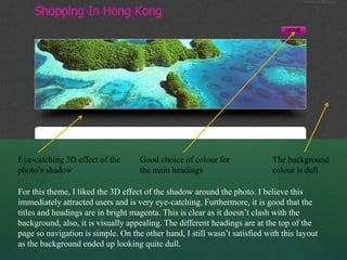
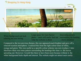
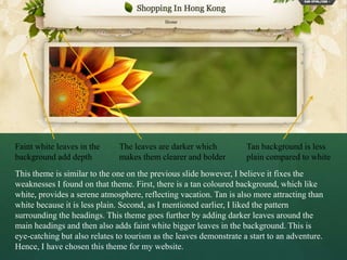
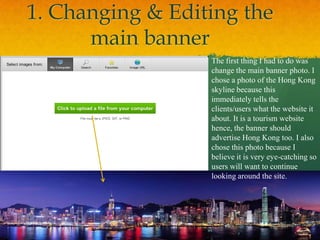
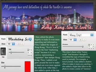
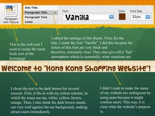
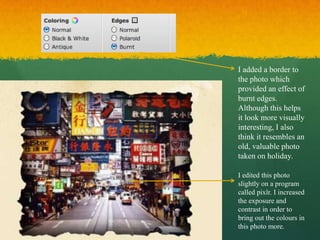
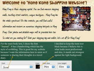
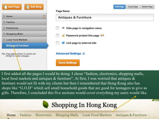
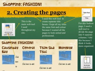
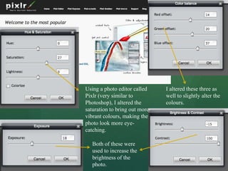
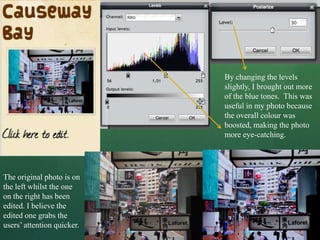
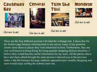
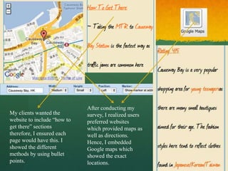
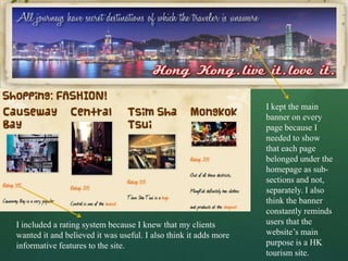
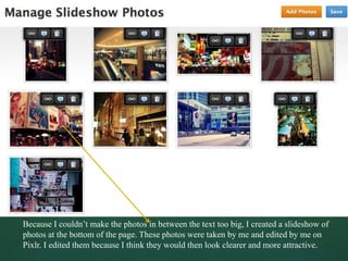
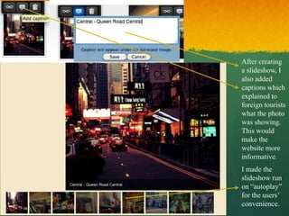
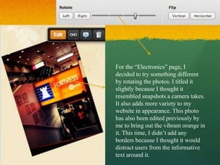
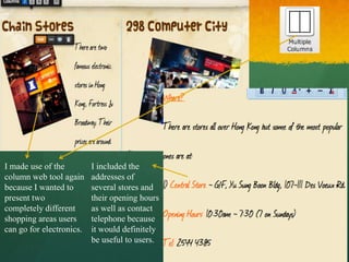
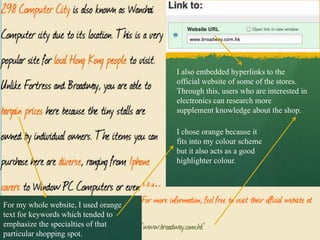
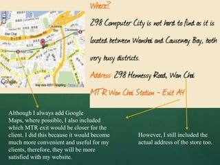
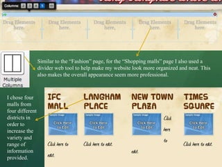
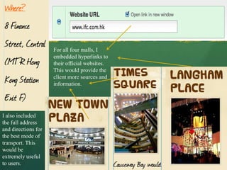
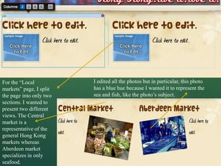
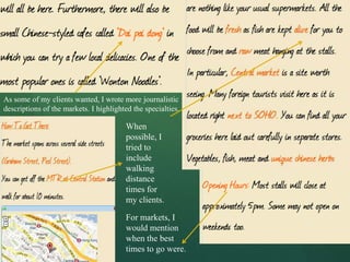
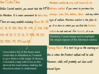
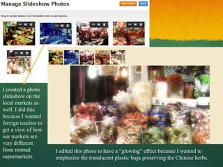
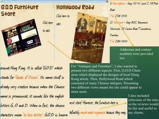
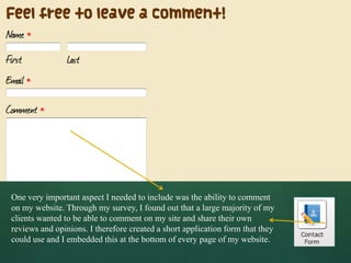
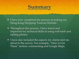
3. 1. Selecting an appropriate
theme/layout
Photo of HK
– Suitable for
my website
Too many
colours in the
background
distracting
Clear Title
This was my first experiment with the themes as I showed in my “Analysis & Research on
Website Creators” PowerPoint. I had already changed the main photo to the Hong Kong
skyline. However, as my users wanted a specific colour scheme, I believe the rainbow
spectrum in the background would affect this too much. For that reason, I decided to
choose another layout.
4. Eye-catching 3D effect of the Good choice of colour for The background
photo’s shadow the main headings colour is dull
For this theme, I liked the 3D effect of the shadow around the photo. I believe this
immediately attracted users and is very eye-catching. Furthermore, it is good that the
titles and headings are in bright magenta. This is clear as it doesn’t clash with the
background, also, it is visually appealing. The different headings are at the top of the
page so navigation is simple. On the other hand, I still wasn’t satisfied with this layout
as the background ended up looking quite dull.
5. Large space for main banner Interesting pattern
White background can look
photo – users will easily find out surrounding the heading
relaxing but also boring
what the website is about – draws attention
Compared to the two previous themes, this one appeared much brighter and gave off a
relaxed/vacation atmosphere. I realized this from the light colour tones of white,
orange and green. This was useful as a specific colour scheme was now in place. I also
liked how there was some pattern surrounding the headings this time i.e. the leaves
sprouting out. However, I would like there to have been more because without it, the
white background lacks depth and interest. The website might not attract users easily.
6. Faint white leaves in the The leaves are darker which Tan background is less
background add depth makes them clearer and bolder plain compared to white
This theme is similar to the one on the previous slide however, I believe it fixes the
weaknesses I found on that theme. First, there is a tan coloured background, which like
white, provides a serene atmosphere, reflecting vacation. Tan is also more attracting than
white because it is less plain. Second, as I mentioned earlier, I liked the pattern
surrounding the headings. This theme goes further by adding darker leaves around the
main headings and then also adds faint white bigger leaves in the background. This is
eye-catching but also relates to tourism as the leaves demonstrate a start to an adventure.
Hence, I have chosen this theme for my website.
7. 1. Changing & Editing the
main banner
The first thing I had to do was
change the main banner photo. I
chose a photo of the Hong Kong
skyline because this
immediately tells the
clients/users what the website it
about. It is a tourism website
hence, the banner should
advertise Hong Kong too. I also
chose this photo because I
believe it is very eye-catching so
users will want to continue
looking around the site.
8. I then edited the photo
slightly to make it even more
appealing and informative.
First, I added the slogan of
Hong Kong, “live it. love it.”
I chose the font “marketing
script” because it is very This time I chose white “honey
cursive, representing a script” font because I thought it
“signature” that stamps Hong resembled the type of handwriting
Kong. Then, I added a red used in journals. For example, a
travel journal. I also added a shadow
glow around the text to make
effect to make it more eye-catching. I
it stand out even more against
also added a slight fade effect to the
the white text. After that, I photo to create a sense of “memory”.
also added a quote at the top.
9. I edited the settings of this theme. First, for the
This is the web tool I title, I made the font “Vanilla”. I did this because the
used to create the main letters of this font are very thick and
body text of the therefore, extremely clear. They also give off a “fun”
homepage atmosphere which is essentially, what vacations are
about.
I chose the text to be dark brown for several I didn’t want to make the name
reasons. First, it fits in with my colour scheme, in of my website too ambiguous by
which the tones are tan, white, yellow, brown, using puns because it might
orange. Then, I also think the dark brown stands confuse users. This way, it is
out very well against the tan background, making clear what the website’s purpose
attract users immediately. is.
10. I added a border to
the photo which
provided an effect of
burnt edges.
Although this helps
it look more visually
interesting, I also
think it resembles an
old, valuable photo
taken on holiday.
I edited this photo
slightly on a program
called pixlr. I increased
the exposure and
contrast in order to
bring out the colours in
this photo more.
11. For the main body text, I chose the font I decided to keep the main text
“Journal”. It has a handwriting which has the black because I believe this is
style of scribbling. This is good for my website what looks most professional
because I want the information here to seem as if and also, it stands out strongest
someone is sharing their thoughts in a travel against the light background.
diary.
12. I first added all the pages I would be doing. I chose “fashion, electronics, shopping malls,
local food markets and antiques & furniture”. At first, I was worried that antiques &
furniture would not fit with my clients but then I remembered that Hong Kong also has
shops like “G.O.D” which sell small household goods that are good for teenagers to give as
gifts. Therefore, I concluded this five sections would cover everything my users would like.
13. 2. Creating the pages
I used this web tool to
This is the create separate title
main web tool boxes. I kept all my titles For this fashion
I used the same font and colour page, I used a
throughout my because I wanted all the web tool to
site. pages to look united and divide the page
professional. into 4 separate
columns. I did
this because I
think it looks
more organized.
14. Using a photo editor called I altered these three as
Pixlr (very similar to well to slightly alter the
Photoshop), I altered the colours.
saturation to bring out more
vibrant colours, making the
photo look more eye-
catching.
Both of these were
used to increase the
brightness of the
photo.
15. By changing the levels
slightly, I brought out more
of the blue tones. This was
useful in my photo because
the overall colour was
boosted, making the photo
more eye-catching.
The original photo is on
the left whilst the one
on the right has been
edited. I believe the
edited one grabs the
users’ attention quicker.
16. These are the four different sections I divided the webpage into. I chose this for
the fashion page because referring back to my survey, many of my potential
clients chose these as places they were interested in most. Furthermore, they are
very well known in Hong Kong for being popular shopping districts therefore, I
believe they would become useful information for my users. All the photos above
have also been edited through the same process I showed you in the previous
slides. I did this because the page suddenly appeared more visually intriguing and
users would enjoy surfing the website more too.
17. After conducting my
My clients wanted the survey, I realized users
website to include “how to preferred websites
get there” sections which provided maps as
therefore, I ensured each well as directions.
page would have this. I Hence, I embedded
showed the different Google maps which
methods by using bullet showed the exact
points. locations.
18. I kept the main
banner on every
page because I
needed to show
that each page
belonged under the
homepage as sub-
sections and not,
separately. I also
think the banner
constantly reminds
I included a rating system because I knew that my clients users that the
wanted it and believed it was useful. I also think it adds more website’s main
informative features to the site. purpose is a HK
tourism site.
19. Because I couldn’t make the photos in between the text too big, I created a slideshow of
photos at the bottom of the page. These photos were taken by me and edited by me on
Pixlr. I edited them because I think they would then look clearer and more attractive.
20. After creating
a slideshow, I
also added
captions which
explained to
foreign tourists
what the photo
was showing.
This would
make the
website more
informative.
I made the
slideshow run
on “autoplay”
for the users’
convenience.
21. For the “Electronics” page, I
decided to try something different
by rotating the photos. I titled it
slightly because I thought it
resembled snapshots a camera takes.
It also adds more variety to my
website in appearance. This photo
has also been edited previously by
me to bring out the vibrant orange in
it. This time, I didn’t add any
borders because I thought it would
distract users from the informative
text around it.
22. I made use of the I included the
column web tool again addresses of
because I wanted to several stores and
present two their opening hours
completely different as well as contact
shopping areas users telephone because
can go for electronics. it would definitely
be useful to users.
23. I also embedded hyperlinks to the
official website of some of the stores.
Through this, users who are interested in
electronics can research more
supplement knowledge about the shop.
I chose orange because it
fits into my colour scheme
but it also acts as a good
highlighter colour.
For my whole website, I used orange
text for keywords which tended to
emphasize the specialties of that
particular shopping spot.
24. Although I always add Google
Maps, where possible, I also included
which MTR exit would be closer for the
client. I did this because it would become However, I still included the
much more convenient and useful for my actual address of the store too.
clients, therefore, they will be more
satisfied with my website.
25. Similar to the “Fashion” page, for the “Shopping malls” page I also used a
divider web tool to help make my website look more organized and neat. This
also makes the overall appearance seem more professional.
I chose four
malls from
four different
districts in
order to
increase the
variety and
range of
information
provided.
26. For all four malls, I
embedded hyperlinks to
their official websites.
This would provide the
client more sources and
information.
I also included
the full address
and directions for
the best mode of
transport. This
would be
extremely useful
to users.
27. For the “Local I edited all the photos but in particular, this photo
markets” page, I split has a blue hue because I wanted it to represent the
the page into only two sea and fish, like the photo’s subject.
sections. I wanted to
present two different
views. The Central
market is a
representative of the
general Hong Kong
markets whereas
Aberdeen market
specializes in only
seafood.
28. As some of my clients wanted, I wrote more journalistic
descriptions of the markets. I highlighted the specialties.
When
possible, I
tried to
include
walking
distance
times for
my clients.
For markets, I
would mention
when the best
times to go were.
29. Similarly, I used orange text to highlight
the unique aspects of the Aberdeen market.
I provided a list of the buses users
could take to Aberdeen as I wanted
to give them a wide range of choices.
I included a map with it too as this
showed the road names, making the
directions easier to understand.
30. I created a photo
slideshow on the
local markets as
well. I did this
because I wanted
foreign tourists to
get a view of how
our markets are
very different
from normal I edited this photo to have a “glowing” effect because I wanted to
supermarkets. emphasize the translucent plastic bags preserving the Chinese herbs.
31. Addresses and contact
numbers were provided
too.
For “Antiques and Furniture”, I also wanted to
present two different aspects. First, G.O.D Chain
store which displayed the designs of local Hong
Kong artists. Then, Hollywood Road which
consisted of many Chinese antiques. Presenting
two different views meant the site could appeal to
more users.
I also included
criticisms of the sites
so the reviews would
be fair and useful to
my clients.
32. One very important aspect I needed to include was the ability to comment
on my website. Through my survey, I found out that a large majority of my
clients wanted to be able to comment on my site and share their own
reviews and opinions. I therefore created a short application form that they
could use and I embedded this at the bottom of every page of my website.
33. Summary
I have now completed the process of making my
Hong Kong Shopping Tourism Website.
Throughout this process, I have learnt and
improved my technical skills in using web tools and
editing photos.
I have also included the aspects my clients told me
about in the survey. For example, “How to Get
There” section, commenting and Google Maps.