VISUAL
HIERARCHY UX
Commonly referred to as hierarchy in the Principles of Design, visual hierarchy is a way to
visually rank your design elements. It’s based on the order of visual importance, rather
than aesthetics or design styles. A good design leads the eye through each area in a
specific order that influences how objects are perceived by using contrast, balance,
emphasis, and/or scale within the objects in a design. A good rule of thumb is that your
most important elements should be the most prominent.
At a glance, visual hierarchy ranks your objects. Without an obvious hierarchy, a user’s
eye will follow a predictable path that could easily skip over the most important objects.
These predictable paths are influenced culturally; while all cultures read from top to
bottom, some read from left to right and some read right to left.
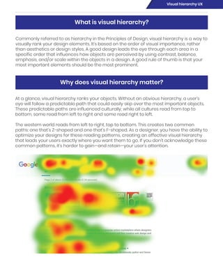
The western world reads from left to right, top to bottom. This creates two common
paths: one that’s Z-shaped and one that’s F-shaped. As a designer, you have the ability to
optimize your designs for these reading patterns, creating an effective visual hierarchy
that leads your users exactly where you want them to go. If you don’t acknowledge these
common patterns, it’s harder to gain—and retain—your user’s attention.
What is visual hierarchy?
Why does visual hierarchy matter?
Visual hierarchy UX
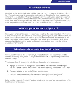
Identified by the Nielsen Norman Group in 2006, the F-shaped pattern is most common
for information-dense web content. Sometimes it manifests itself in heat mapping as
either an F or an E, but the F “brand” has caught on. Generally, users read in a horizontal
direction, usually across the top of the content, which forms the top bar of the F. Then
they move down the page vertically, then horizontally again, creating the second bar of
the F. They continue scanning vertically down, forming the last part of the F.
When you’re aware of this bias, you can make sure that the most important information
is bold and aligned to the left side of your design, grabbing your users’ attention. Also, the
first lines of text often get more cursory glances than elements on the right side of the
page. This means that copy and important information like CTAs could have a better
opportunity of being read or acted on if there’s a compelling lead-in on the left that
drives them to the right.
When users first look at the content on your website, they’re not sure if they want to
commit to reading every word. So they’ll skim or browse it. As explained by the Nielsen
Norman Group:
“People scan in an F-shape when all of these three elements are present:
1. A page or a section of a page includes text that has little or no formatting for
the web. For example, it has a ‘wall of text’ but no bolding, bullets, or subheadings.
2. The user is trying to be most efficient on that page.
3. The user is not so committed or interested enough to read every word.”
By leveraging your users’ natural F-pattern reading tendencies, you can create an effec-
tive hierarchy and design.
The F-shaped pattern
What’s important about the F pattern?
Why do users browse content in an F pattern?
Visual hierarchy UX
In websites with less-dense content—think product pages, check-out pages, a homep-
age, etc.—a Z pattern is more common. A user’s eye will travel across the top of the page,
then diagonally back to the opposite side of the screen and horizontally across again. To
draw a user in, web designs are commonly constructed with navigation across the top,
the headline on the left, and a CTA mid-page.
Similar to the F-shaped pattern, users are scanning the content before they commit to
reading it fully. The reason for the difference between the two is determined by the con-
tent, not by the user. The main reasons for a Z pattern instead of an F pattern are that:
The Z-shaped pattern
Why do users browse in a Z pattern?
Visual hierarchy UX
Scale is the sizing of elements or a standard of measurement. It can be used with other
design principles, like emphasis, to draw the viewer into a focal point. If something is
drawn to scale, it shows an object with accurate sizing (though it could be reduced or
enlarged from its actual size). You can depict objects as larger than life, or bring it down
to fit on a piece of paper.
Size and scale
1. The page has less content with a more engaging design.
2. The user is not so committed or interested enough to read every word.
3. The design imposes its will to make the user follow the Z pattern.
Designing for the Z-shaped pattern is extremely effective, which is why it’s more or less
turned into a best practice.
Combinations for cohesive visual hierarchy
In addition to leveraging common browsing patterns, you can create a strong visual
hierarchy with your elements. The below pairings are particularly effective, but any com-
bination can be used to create a cohesive design.
Visual hierarchy UX
Even though visual hierarchy is more about prioritizing content instead of aesthetics,
adding texture or design style to your work can influence hierarchy.
Like size or scale, texture and style can help draw the user’s attention to certain parts of
the design. Textures create depth and interesting shapes, but can quickly become too
much—so tread lightly. An over-textured design can be distracting and make it taxing to
read and understand.
Style, or the aesthetic of your design, can help enforce your theme and engage users.
Style can include everything from the typography and colors to spacing. Some popular
styles are flat, organic, minimal, skeuomorphic, retro, or illustrated. A good way to make
your content even more effective is by matching the style of your design to the content.
For example, if the content is for a retro-themed event, you could use a retro style to
connect your content and design.
Texture and style
Visual hierarchy UX
The difference between two or more objects in a design is referred to as contrast. The
difference in objects could be light and dark, thin and thick, small and large, bright and
dull, colorful and black-and-white; the list is endless. With the use of bold or contrasting
colors, you can create a design where your elements stand out. A great example is a
bright purple button on a white-grey background: You’re using color and contrast to
make that element the most noticeable one on the page.
Objects in design carry weight just like in the physical world: It’s called visual weight. The
alignment of an object in relation to other objects can change its weight. If the object is
by itself or aligned to the left, that element will draw a user’s eye in; at first glance, the
other objects will blend together.
Color and contrast
Balance and alignment
Visual hierarchy UX
The visual weight of a design needs to have balance. Balance can be implied by size,
shape, or even contrast. While it can utilize symmetry or equality, balance can also be
achieved through asymmetry. Think of asymmetry as the opposite of mirroring: Instead
of seeing the reflection, you see something that evenly distributes the elements.
White space, or the proximity of elements, is also a great way to establish an effective
hierarchy. If elements are given enough breathing room, it allows the user to read and
digest them more easily. Large areas of space can also make objects appear more
dramatic and feel more important. On the flip side, not enough white space can make
elements harder to read and digest.
Proximity and whitespace
Visual hierarchy UX

Visual hierarchy

  • 1.
  • 2.
    Commonly referred toas hierarchy in the Principles of Design, visual hierarchy is a way to visually rank your design elements. It’s based on the order of visual importance, rather than aesthetics or design styles. A good design leads the eye through each area in a specific order that influences how objects are perceived by using contrast, balance, emphasis, and/or scale within the objects in a design. A good rule of thumb is that your most important elements should be the most prominent. At a glance, visual hierarchy ranks your objects. Without an obvious hierarchy, a user’s eye will follow a predictable path that could easily skip over the most important objects. These predictable paths are influenced culturally; while all cultures read from top to bottom, some read from left to right and some read right to left. The western world reads from left to right, top to bottom. This creates two common paths: one that’s Z-shaped and one that’s F-shaped. As a designer, you have the ability to optimize your designs for these reading patterns, creating an effective visual hierarchy that leads your users exactly where you want them to go. If you don’t acknowledge these common patterns, it’s harder to gain—and retain—your user’s attention. What is visual hierarchy? Why does visual hierarchy matter? Visual hierarchy UX
  • 3.
    Identified by theNielsen Norman Group in 2006, the F-shaped pattern is most common for information-dense web content. Sometimes it manifests itself in heat mapping as either an F or an E, but the F “brand” has caught on. Generally, users read in a horizontal direction, usually across the top of the content, which forms the top bar of the F. Then they move down the page vertically, then horizontally again, creating the second bar of the F. They continue scanning vertically down, forming the last part of the F. When you’re aware of this bias, you can make sure that the most important information is bold and aligned to the left side of your design, grabbing your users’ attention. Also, the first lines of text often get more cursory glances than elements on the right side of the page. This means that copy and important information like CTAs could have a better opportunity of being read or acted on if there’s a compelling lead-in on the left that drives them to the right. When users first look at the content on your website, they’re not sure if they want to commit to reading every word. So they’ll skim or browse it. As explained by the Nielsen Norman Group: “People scan in an F-shape when all of these three elements are present: 1. A page or a section of a page includes text that has little or no formatting for the web. For example, it has a ‘wall of text’ but no bolding, bullets, or subheadings. 2. The user is trying to be most efficient on that page. 3. The user is not so committed or interested enough to read every word.” By leveraging your users’ natural F-pattern reading tendencies, you can create an effec- tive hierarchy and design. The F-shaped pattern What’s important about the F pattern? Why do users browse content in an F pattern? Visual hierarchy UX
  • 4.
    In websites withless-dense content—think product pages, check-out pages, a homep- age, etc.—a Z pattern is more common. A user’s eye will travel across the top of the page, then diagonally back to the opposite side of the screen and horizontally across again. To draw a user in, web designs are commonly constructed with navigation across the top, the headline on the left, and a CTA mid-page. Similar to the F-shaped pattern, users are scanning the content before they commit to reading it fully. The reason for the difference between the two is determined by the con- tent, not by the user. The main reasons for a Z pattern instead of an F pattern are that: The Z-shaped pattern Why do users browse in a Z pattern? Visual hierarchy UX
  • 5.
    Scale is thesizing of elements or a standard of measurement. It can be used with other design principles, like emphasis, to draw the viewer into a focal point. If something is drawn to scale, it shows an object with accurate sizing (though it could be reduced or enlarged from its actual size). You can depict objects as larger than life, or bring it down to fit on a piece of paper. Size and scale 1. The page has less content with a more engaging design. 2. The user is not so committed or interested enough to read every word. 3. The design imposes its will to make the user follow the Z pattern. Designing for the Z-shaped pattern is extremely effective, which is why it’s more or less turned into a best practice. Combinations for cohesive visual hierarchy In addition to leveraging common browsing patterns, you can create a strong visual hierarchy with your elements. The below pairings are particularly effective, but any com- bination can be used to create a cohesive design. Visual hierarchy UX
  • 6.
    Even though visualhierarchy is more about prioritizing content instead of aesthetics, adding texture or design style to your work can influence hierarchy. Like size or scale, texture and style can help draw the user’s attention to certain parts of the design. Textures create depth and interesting shapes, but can quickly become too much—so tread lightly. An over-textured design can be distracting and make it taxing to read and understand. Style, or the aesthetic of your design, can help enforce your theme and engage users. Style can include everything from the typography and colors to spacing. Some popular styles are flat, organic, minimal, skeuomorphic, retro, or illustrated. A good way to make your content even more effective is by matching the style of your design to the content. For example, if the content is for a retro-themed event, you could use a retro style to connect your content and design. Texture and style Visual hierarchy UX
  • 7.
    The difference betweentwo or more objects in a design is referred to as contrast. The difference in objects could be light and dark, thin and thick, small and large, bright and dull, colorful and black-and-white; the list is endless. With the use of bold or contrasting colors, you can create a design where your elements stand out. A great example is a bright purple button on a white-grey background: You’re using color and contrast to make that element the most noticeable one on the page. Objects in design carry weight just like in the physical world: It’s called visual weight. The alignment of an object in relation to other objects can change its weight. If the object is by itself or aligned to the left, that element will draw a user’s eye in; at first glance, the other objects will blend together. Color and contrast Balance and alignment Visual hierarchy UX
  • 8.
    The visual weightof a design needs to have balance. Balance can be implied by size, shape, or even contrast. While it can utilize symmetry or equality, balance can also be achieved through asymmetry. Think of asymmetry as the opposite of mirroring: Instead of seeing the reflection, you see something that evenly distributes the elements. White space, or the proximity of elements, is also a great way to establish an effective hierarchy. If elements are given enough breathing room, it allows the user to read and digest them more easily. Large areas of space can also make objects appear more dramatic and feel more important. On the flip side, not enough white space can make elements harder to read and digest. Proximity and whitespace Visual hierarchy UX