Download as PDF, PPTX


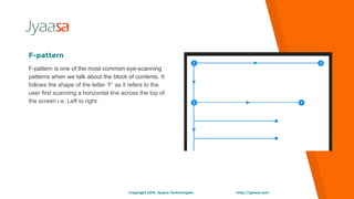


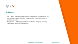


The document discusses visual hierarchy and layout patterns in web design. It describes the F-pattern and Z-pattern layouts. The F-pattern follows the shape of the letter F as users first scan horizontally across the top of the page from left to right. The Z-pattern aims to anticipate the user's needs by presenting key information like branding, calls-to-action, and structure up front. Both patterns aim to create a natural reading flow that guides users efficiently through content.