Web Interface Design
•Designing Web Interfaces – Drag and Drop, Direct Selection, Contextual Tools, Overlays, Inlays
and Virtual Pages, Process Flow – Using Motion for UX - Design Pattern: Z-Pattern - F-Pattern -
Visual Hierarchy - Lookup patterns – Feedback patterns.
2
3.
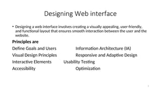
Designing Web interface
•Designing a web interface involves creating a visually appealing, user-friendly,
and functional layout that ensures smooth interaction between the user and the
website.
Principles are
Define Goals and Users Information Architecture (IA)
Visual Design Principles Responsive and Adaptive Design
Interactive Elements Usability Testing
Accessibility Optimization
3
4.
Example of Web
InterfaceFeatures:
1.Header: Logo, navigation
menu, search bar.
2.Hero Section: Prominent
banner with a Call-to-Action
(CTA).
3.Content Area: Organized
using grids or cards.
4.Sidebar: Additional
navigation, filters, or
advertisements.
5.Footer: Links, con
6.tact info, and copyright details.
4
What Is aDesign Pattern?
• When many designers have the same challenge and someone solves it in an elegant way, and many
designers use that solution, it is called a design pattern
• A design is not necessarily good just because it’s common. To be a “good” design pattern, a
solution must be common and usable.
• Some design ideas become popular because they allow lazy UI designers to ignore a challenging
feature. It’s like putting a bag over someone’s head because they are ugly.
• For example: Facebook’s “hamburger” button—which represents the hidden menu in many mobile
apps—has started appearing on full-size websites that have plenty of space for a menu. It’s common
because hiding the menu is easier than designing a nice one, not because the results are better.
• In real life, many users don’t notice the hidden “hamburger” menu button at all, and they leave the
site or get lost.
• That’s bad.
• And lazy.
• “Don’t do it, bitch.”—Jesse Pinkman
• Now, there are hundreds of design patterns, and they are changing all the time as devices and
technologies evolve, so I can’t really make you a full list. But if you google “UI design patterns,” you
will find many sites that collect common solutions (whether they are good or not).
39
40.
Z-Pattern, F-Pattern, Visual
Hierarchy
•It is easy to imagine every user excitedly reading every letter you
write and every pixel you make. Get over it, because real users won’t.
They scan.
• “Scanning” means the user only stops to read when something
catches their eye. This lesson is about scanning patterns.
• Using a website or an app may feel like a different experience every
time, but in fact, the way people look at any design is fairly
predictable.
• The Z-Pattern
• Let’s start with the most boring design I can imagine: an entire
newspaper page of solid text. All one story. No headlines. No images.
No breaks or pull quotes; just text, in even columns, from corner to
corner.
• In a design like that—which I hope you never create—users will
generally scan it in a pattern something like a “Z,” starting in the
upper left and ending in the lower right. Anything in the layout that
isn’t near the Z probably won’t be noticed.
• The reason I spent so much time teaching you visual design
principles is so you would know how you can make this layout better.
• Aha!
• If we add a bigger headline (visual weight), create one column to
follow (line tension), and use smaller sections (repetition), we can get
people closer to the famous F-Pattern 40
41.
F-Pattern
• Similar layouts= similar scanning pattern. Google results make a
great F-Pattern if you track the eye movements of users.
• The F-Pattern made the founders of the Nielsen Norman Group
famous a while back. They still maintain a very good blog and
publish many reports worth reading.
• The F-Pattern works like this:
• Start in the upper-left corner, like the Z-Pattern.
• Read/scan the first (head)line of the text.
• Scan down the left side of the column until you find something
interesting.
• Read the interesting thing more carefully.
• Continue scanning down.
• By repeating that method over and over, the scanning pattern
starts to look like an “E” or an “F,” hence the name.
41
42.
Why Is ThisImportant?
• You might notice that some parts of the page
get lots of attention “naturally,” whereas other
parts of the page are overlooked most of the
time. This is what is meant by “strong” and
“weak” spots in a layout.
• A button in the upper left will get more clicks
than a button in the upper right, which will get
more clicks than a button in the lower left,
which will get more clicks than a button in the
lower right. And all of those will get more
clicks than something randomly stuck in the
middle, unless you do something about it.
• It might also be good to know that each
“block” of content and each column can have
their own F-Pattern. It doesn’t have to be one-
F-Pattern-per-page, but that is a more
advanced conversation for another day.
• Create a Visual Hierarchy
• When you consistently use typography to
indicate the importance of text, and certain
colors to highlight buttons, and when you
give more visual weight to things that
matter, it creates a visual hierarchy (i.e.,a
design that people can scan easily). Our
eyes jump from important thing to
important thing rather than scanning like a
robot.
• Some designers think visual hierarchy is
good because it looks better, but the truth
is that it feels better because it is easier to
scan.
42