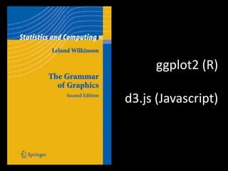
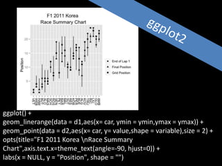
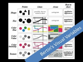
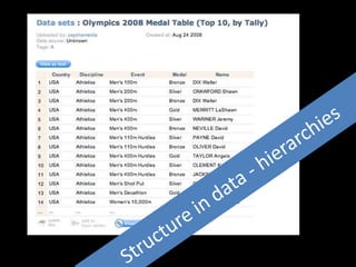
This document discusses visual conversations with data through explanatory and exploratory data visualizations. It provides examples of visualization tools like ggplot2 and d3.js and techniques like exploiting hierarchical structure with treemaps, using pivot tables, and creating macroscopes. The document advocates having visual conversations with one's own data to discover patterns and differences in an emergent and interactive way.
Nagios Conference 2013 - Andy Brist - Data Visualizations and Nagios XINagios
Andy Brist's presentation on Data Visualizations and Nagios XI.
The presentation was given during the Nagios World Conference North America held Sept 20-Oct 2nd, 2013 in Saint Paul, MN. For more information on the conference (including photos and videos), visit: http://go.nagios.com/nwcna
Storyboarding for Data Visualization Designspatialhistory
This is derived from a lecture given by Frederico Freitas at the Spatial History Project / Center for Spatial and Textual Analysis at Stanford University. It describes how the process of storyboarding helps clarify design intent and facilitates design decision-making.
The Future of Business Intelligence: Data VisualizationKristen Sosulski
Kristen Sosulski
The future of business intelligence: Data Visualization
How can data visualization be used as a platform to reveal intelligent insights and help business analysts make timely decisions? In this talk, Kristen Sosulski will discuss the opportunities for personalized, location aware, context relevant, and platform independent information visualizations as a toolkit for business analysts.
The Future Of Data Visualization
with Gert Franke
OVERVIEW
Data visualization has become increasingly popular over the last few years. Many tools nowadays include some kind of data visualization which gives you insight in usage, the best possible way to travel, the best product offering, etc. Data visualization seems to be a powerful solution for summarising information in a world where the amount of information targeted towards us is increasing every day. But is this the holy grail for processing information? What new possibilities does visualising data provide us? What is the best possible way to present and interact with these data visualizations?
In this talk Gert Franke will briefly show where data visualization comes from, how it now influences our daily life, what the potential of data visualization is and what the future of data visualization might look like.
OBJECTIVE
Show the history, potential and future of data visualization.
TARGET AUDIENCE
People that want to understand the possibilities of interactive data visualizations.
FIVE THINGS AUDIENCE MEMBERS WILL LEARN
The history of data visualization
The reasons why data visualization became so hot the last few years
The potential of data visualization
The things we have to be aware of when creating (interactive) data visualizations
What might the future look like with the use of data visualization
This slide deck gives a general overview of Data Visualization, with inspiring examples, the strength and weaknesses of the human visual system, a few technical frameworks that may be used for creating your own visualizations and some design concepts from the data visualization field.
CEN4722 HUMAN COMPUTER INTERACTIONS:
Please read Box 8.1: Use and abuse of numbers on Page 277 view the video on Data visualization. Will data visualization help us make better decisions? What are the downsides?
Delivered as plenary at USENIX LISA 2013. video here: https://www.youtube.com/watch?v=nZfNehCzGdw and https://www.usenix.org/conference/lisa13/technical-sessions/plenary/gregg . "How did we ever analyze performance before Flame Graphs?" This new visualization invented by Brendan can help you quickly understand application and kernel performance, especially CPU usage, where stacks (call graphs) can be sampled and then visualized as an interactive flame graph. Flame Graphs are now used for a growing variety of targets: for applications and kernels on Linux, SmartOS, Mac OS X, and Windows; for languages including C, C++, node.js, ruby, and Lua; and in WebKit Web Inspector. This talk will explain them and provide use cases and new visualizations for other event types, including I/O, memory usage, and latency.
There are a number of examples throughout history where visualisations have been used to explore or explain problems. Notable examples include Florence Nightingale's 'Mortality of the British Army' and John Snow's Cholera Map of London. Recently the increased availability of data and software for analyzing and generating various views on this data has made it easier to generate data visualisations. In this presentation Martin Hawksey, advisor at the Jisc Centre for Educational, Technology and Interoperability Standards (Cetis), will demonstrate simple techniques for generating data visualisations: using tools (including MS Excel and Google Spreadsheets), drawing packages (including Illustrator and Inkscape) and software libraries (including d3.js and timeline.js). As part of this participants will be introduced to basic visual theories and the concepts of exploratory and explanatory analytics. The presentation will also highlight some of the skills required for discovering and reshaping data sources.
The presentation was live-blogged by Nicola Osborne (EDINA) http://nicolaosborne.blogs.edina.ac.uk/2013/06/19/data-visualisation-talk-by-martin-hawksey/
The slides contain links to source (when you get to the data/vis matrix some of the thumbnails are live links), here’s also the bundle of top level links http://bitly.com/bundles/mhawksey/l
[Note: Only images/text after slide 13 Making Data Visualisation (unless attributed to other authors is CC-BY Martin Hawksey]
Held at the 2nd European Summer School "Cultures & Technologies" (ESU-CT) in Leipzig, Germany, on July 28th, 2010. Thanks to everyone at the summer school for their feedback and many interesting discussions!
Understanding Data Science: Unveiling the Basics
What is Data Science?
Data science is an interdisciplinary field that combines techniques from statistics, mathematics, computer science, and domain knowledge to extract insights and knowledge from data. It involves collecting, processing, analyzing, and interpreting large and complex datasets to solve real-world problems.
Importance of Data Science
In today's data-driven world, organizations are inundated with data from various sources. Data science allows them to convert this raw data into actionable insights, enabling informed decision-making, improved efficiency, and innovation.
Intersection of Data Science, Statistics, and Computer Science
Data science borrows heavily from statistics and computer science. Statistical methods help in understanding data patterns, while computer science provides the tools to process and analyze large datasets efficiently.
Key Components of Data Science
Data Collection and Storage
The first step in data science is gathering relevant data from various sources. This data is then stored in databases or data warehouses for further processing.
Data Cleaning and Preprocessing
Raw data is often messy and inconsistent. Data cleaning involves removing errors, duplicates, and irrelevant information. Preprocessing includes transforming data into a usable format.
Exploratory Data Analysis (EDA)
EDA involves visualizing and summarizing data to uncover patterns, trends, and anomalies. It helps in forming hypotheses and guiding further analysis.
Machine Learning and Predictive Modeling
Machine learning algorithms are used to build predictive models from data. These models can make predictions and decisions based on new, unseen data.
Data Visualization
Visual representations of data, such as graphs and charts, help in understanding complex information quickly. Data visualization aids in conveying insights effectively.
The Data Science Process
Problem Definition
The data science process begins with understanding the problem you want to solve and defining clear objectives.
Data Collection and Understanding
Collect relevant data and understand its context. This step is crucial as the quality of the analysis depends on the quality of the data.
Data Preparation
Clean, preprocess, and transform the data into a suitable format for analysis. This step ensures that the data is accurate and ready for modeling.
Model Building
Select appropriate algorithms and build predictive models using machine learning techniques. This step involves training and fine-tuning the models.
Model Evaluation and Deployment
Evaluate the model's performance using metrics and test datasets. If the model performs well, deploy it for making predictions on new data.
Technologies Driving Data Science
Programming Languages
Languages like Python and R are widely used in data science due to their extensive libraries and versatility.
Machine Learning Libraries
Libraries like Scikit-Learn and TensorFlow prov
"Illustrating" Digital Learning Objects (DLOs) and Learning ResourcesShalin Hai-Jew
Words are still often the core basis for the building of digital learning objects, to structure shared communications. Think slideshows, articles, electronic books, and others. Less common are visuals or the conceptualization of visuals for learning contents. Perhaps what visuals are used is what is on hand from a Creative Commons search or whatever project-based visuals may be on hand. This session discusses how visual thinking comes into play in some instructional designs to inform on which visuals are used, whether born-digital or digitized (scanned or photographed from analog form). This presentation argues for a more purpose-minded approach in thinking of visuals (from teaching and learning foci, data, maps, human groups, fieldwork, lab imagery, and others) when creating learning contents.
This is the lecture delivered at Jadavpur University for the engineering students. The lecture was organised by the JU Entrepreneurship Cell and Alumni Association, Singapore Chapter.
Unlock the power of Python for Data Science with this comprehensive guide tailored for both analysts and developers. Whether you're diving into data analysis or building robust data-driven applications, this book provides hands-on examples and real-world scenarios to help you navigate the complexities of the data science landscape.
Whether you're an analyst seeking to enhance your data analysis skills or a developer looking to integrate data science into your applications, this guide equips you with the knowledge and tools needed to excel in the dynamic field of Python for Data Science. Stay ahead of the curve and harness the full potential of Python's rich ecosystem for data-driven decision-making.
Slides (currently unannotated) to support the "Preparing for the Future: Technological Challenges and Beyond" workshop presented with Brian Kelly - http://ukwebfocus.com/events/ili-2015-preparing-for-the-future/
Note - slideshare seems to have messed up the conversion - some slides are (unintentionally) blank....
The French Revolution, which began in 1789, was a period of radical social and political upheaval in France. It marked the decline of absolute monarchies, the rise of secular and democratic republics, and the eventual rise of Napoleon Bonaparte. This revolutionary period is crucial in understanding the transition from feudalism to modernity in Europe.
For more information, visit-www.vavaclasses.com
Operation “Blue Star” is the only event in the history of Independent India where the state went into war with its own people. Even after about 40 years it is not clear if it was culmination of states anger over people of the region, a political game of power or start of dictatorial chapter in the democratic setup.
The people of Punjab felt alienated from main stream due to denial of their just demands during a long democratic struggle since independence. As it happen all over the word, it led to militant struggle with great loss of lives of military, police and civilian personnel. Killing of Indira Gandhi and massacre of innocent Sikhs in Delhi and other India cities was also associated with this movement.
Synthetic Fiber Construction in lab .pptxPavel ( NSTU)
Synthetic fiber production is a fascinating and complex field that blends chemistry, engineering, and environmental science. By understanding these aspects, students can gain a comprehensive view of synthetic fiber production, its impact on society and the environment, and the potential for future innovations. Synthetic fibers play a crucial role in modern society, impacting various aspects of daily life, industry, and the environment. ynthetic fibers are integral to modern life, offering a range of benefits from cost-effectiveness and versatility to innovative applications and performance characteristics. While they pose environmental challenges, ongoing research and development aim to create more sustainable and eco-friendly alternatives. Understanding the importance of synthetic fibers helps in appreciating their role in the economy, industry, and daily life, while also emphasizing the need for sustainable practices and innovation.
Francesca Gottschalk - How can education support child empowerment.pptxEduSkills OECD
Francesca Gottschalk from the OECD’s Centre for Educational Research and Innovation presents at the Ask an Expert Webinar: How can education support child empowerment?
Unit 8 - Information and Communication Technology (Paper I).pdfThiyagu K
This slides describes the basic concepts of ICT, basics of Email, Emerging Technology and Digital Initiatives in Education. This presentations aligns with the UGC Paper I syllabus.
June 3, 2024 Anti-Semitism Letter Sent to MIT President Kornbluth and MIT Cor...Levi Shapiro
Letter from the Congress of the United States regarding Anti-Semitism sent June 3rd to MIT President Sally Kornbluth, MIT Corp Chair, Mark Gorenberg
Dear Dr. Kornbluth and Mr. Gorenberg,
The US House of Representatives is deeply concerned by ongoing and pervasive acts of antisemitic
harassment and intimidation at the Massachusetts Institute of Technology (MIT). Failing to act decisively to ensure a safe learning environment for all students would be a grave dereliction of your responsibilities as President of MIT and Chair of the MIT Corporation.
This Congress will not stand idly by and allow an environment hostile to Jewish students to persist. The House believes that your institution is in violation of Title VI of the Civil Rights Act, and the inability or
unwillingness to rectify this violation through action requires accountability.
Postsecondary education is a unique opportunity for students to learn and have their ideas and beliefs challenged. However, universities receiving hundreds of millions of federal funds annually have denied
students that opportunity and have been hijacked to become venues for the promotion of terrorism, antisemitic harassment and intimidation, unlawful encampments, and in some cases, assaults and riots.
The House of Representatives will not countenance the use of federal funds to indoctrinate students into hateful, antisemitic, anti-American supporters of terrorism. Investigations into campus antisemitism by the Committee on Education and the Workforce and the Committee on Ways and Means have been expanded into a Congress-wide probe across all relevant jurisdictions to address this national crisis. The undersigned Committees will conduct oversight into the use of federal funds at MIT and its learning environment under authorities granted to each Committee.
• The Committee on Education and the Workforce has been investigating your institution since December 7, 2023. The Committee has broad jurisdiction over postsecondary education, including its compliance with Title VI of the Civil Rights Act, campus safety concerns over disruptions to the learning environment, and the awarding of federal student aid under the Higher Education Act.
• The Committee on Oversight and Accountability is investigating the sources of funding and other support flowing to groups espousing pro-Hamas propaganda and engaged in antisemitic harassment and intimidation of students. The Committee on Oversight and Accountability is the principal oversight committee of the US House of Representatives and has broad authority to investigate “any matter” at “any time” under House Rule X.
• The Committee on Ways and Means has been investigating several universities since November 15, 2023, when the Committee held a hearing entitled From Ivory Towers to Dark Corners: Investigating the Nexus Between Antisemitism, Tax-Exempt Universities, and Terror Financing. The Committee followed the hearing with letters to those institutions on January 10, 202
Model Attribute Check Company Auto PropertyCeline George
In Odoo, the multi-company feature allows you to manage multiple companies within a single Odoo database instance. Each company can have its own configurations while still sharing common resources such as products, customers, and suppliers.
16. Explanatory visualization
Data visualizations that are used to
transmit information or a point of
view from the designer to the
reader. Explanatory visualizations
typically have a specific “story” or
information that they are intended
to transmit.
Exploratory visualization
Data visualizations that are used by
the designer for self-informative
purposes to discover patterns,
trends, or sub-problems in a
dataset. Exploratory visualizations
typically don’t have an already-
known story.
Visual Conversations with Data Datasets often contain amyriad number of stories,but how can we best make sense of them? Maybe avisual conversation can help? 30 mins
Example of data powered storytelling in YXR175/TXR120 robotics activity
Brief explanation of chart and what the labels are.
Wheel diameter, actual distance travelled
Livescribes, process of creation of the rich picture… the diagramming is an active storytelling process that builds on itself amd has potentially many narrative threads
Also how you position marks on a canvas in relation to each other
Collaborative commentary
The top, blue strip shows the gear (1 to 7); the green strip shows the throttle pedal depression (0-100%), and the red strip shows the brake (0-100%). The light blue strip is a composite of the previous three strips. The whiter the pixel, the closer it is to 100% throttle in 7th gear with no braking.The bottom two traces show the longitudinal and lateral g-force respectively. For the longitudinal trace, red shows braking – being forced into the steering wheel; green shows acceleration – being forced back into your seat. You’ll see the greatest g-force under braking occurs when the brakes are slapped full on… (the red bits in the third and fifth traces line up). For the latitudinal g-force, the red shows the driving being flung to the left (i.e. right hand corner), the green shows them being pushed out to the right.
Emergent Social Positioning: origins: 1.5 degree egonet (how followers follow each other, how hashtaggers follow each other)- projection maps from followers to folk they commonly follow;-- projection maps from hashtaggers to folk they commonly follow- projection maps from friends to folk who commonly follow them