Download to read offline

![Data sketches
[ Amanda Cox, New York Times ]](https://image.slidesharecdn.com/iwmw12-120619032034-phpapp02/75/Iwmw12-data-viz-taster-6-2048.jpg)


![Data Application Output
Data [Code] Output](https://image.slidesharecdn.com/iwmw12-120619032034-phpapp02/75/Iwmw12-data-viz-taster-36-2048.jpg)

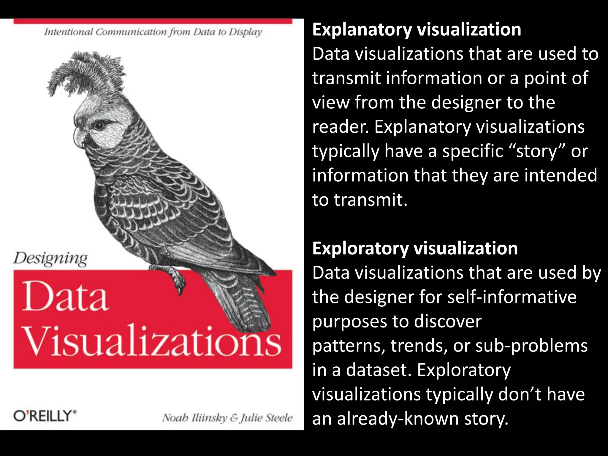
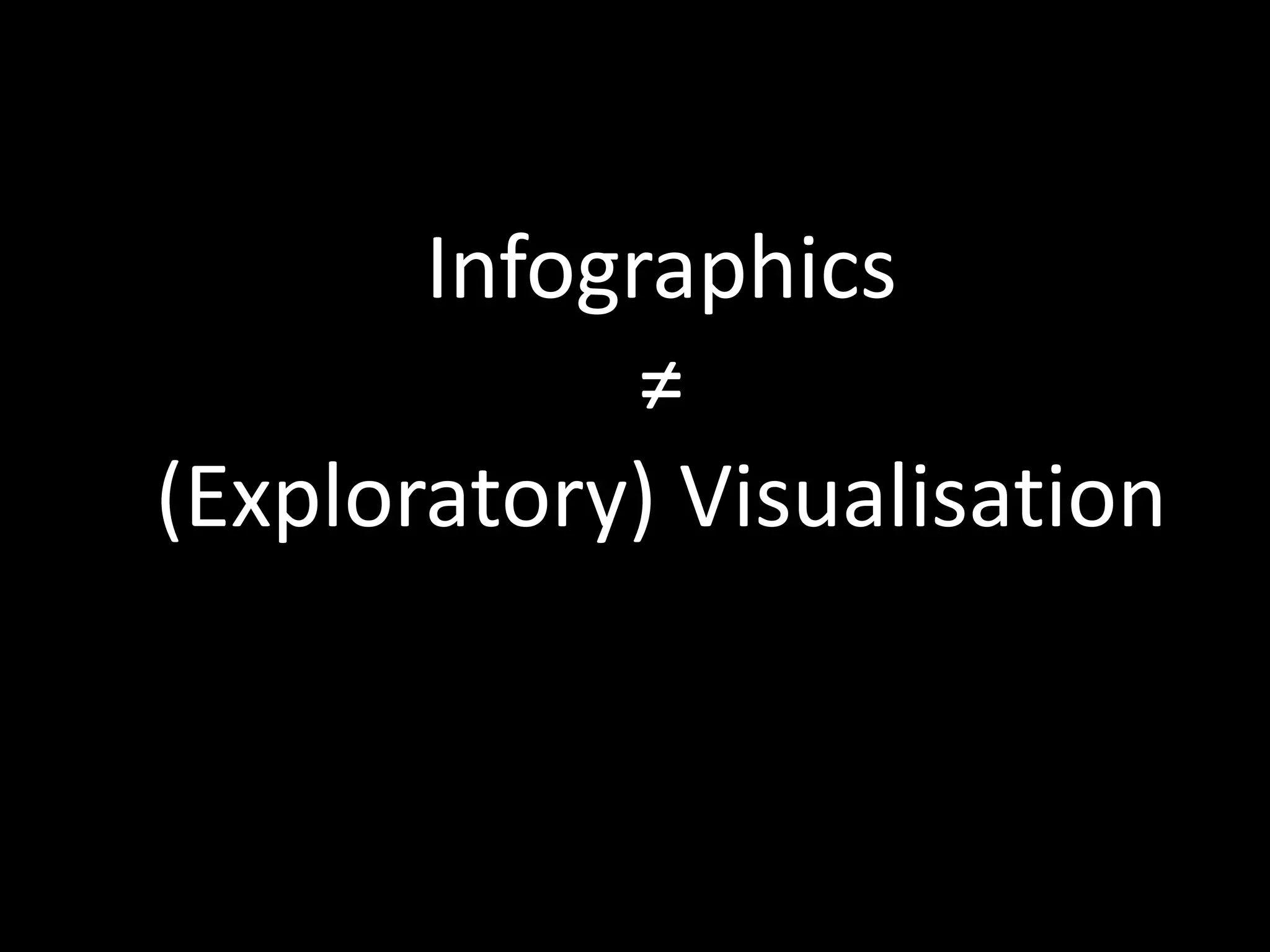
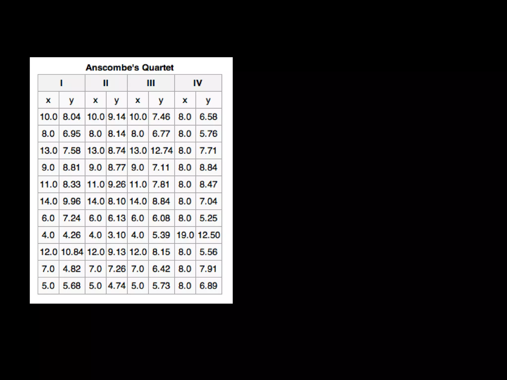
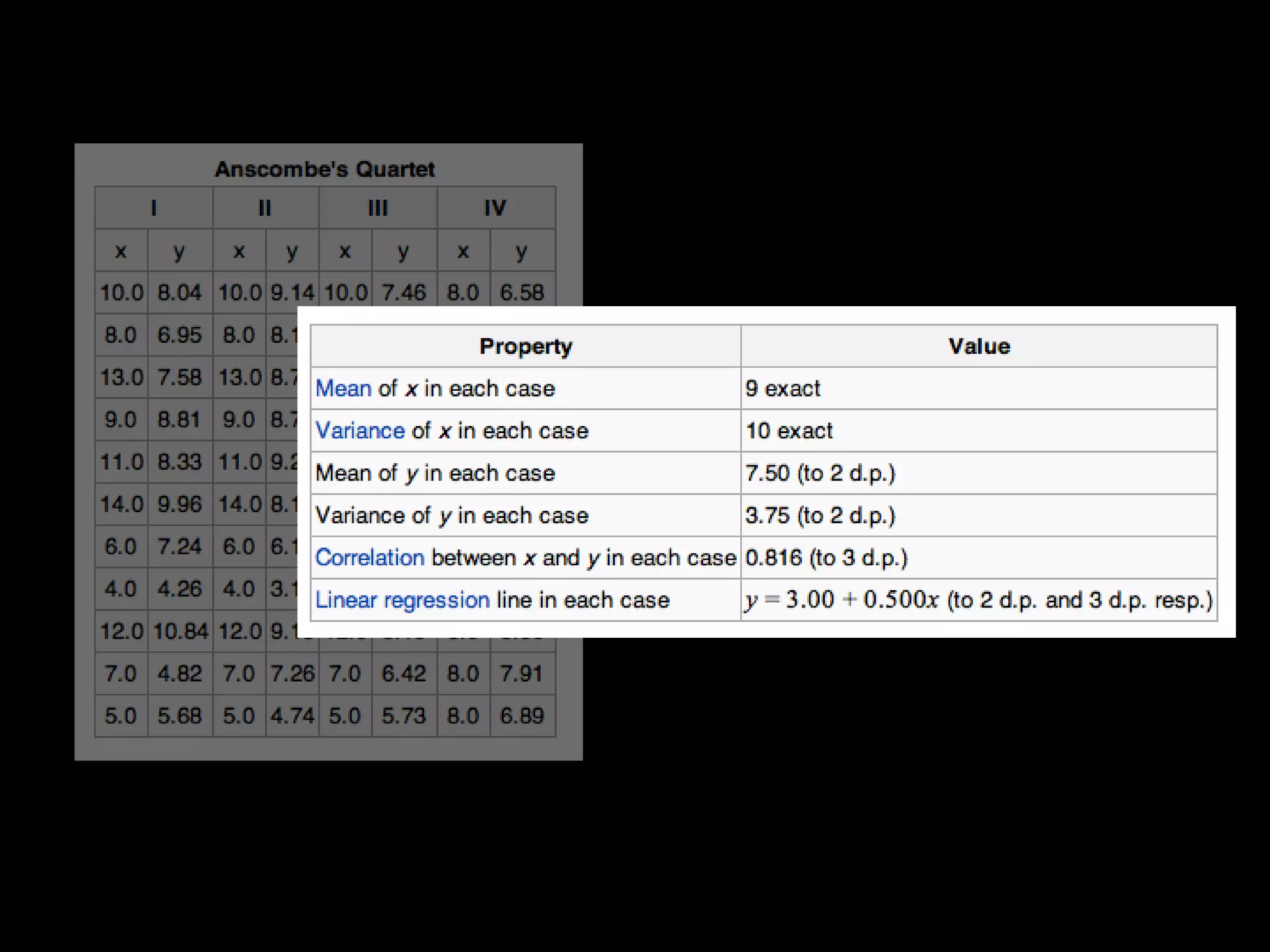
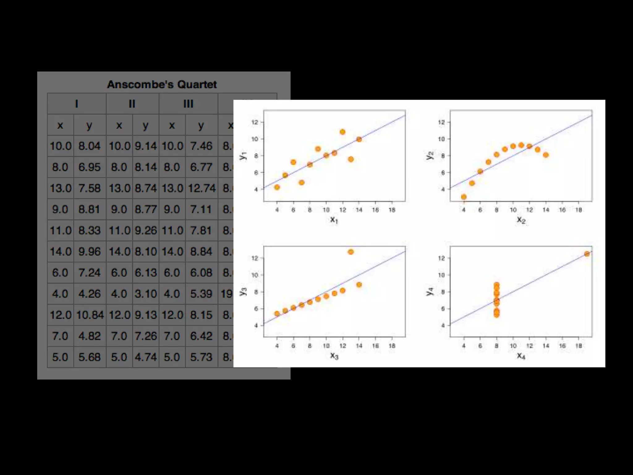
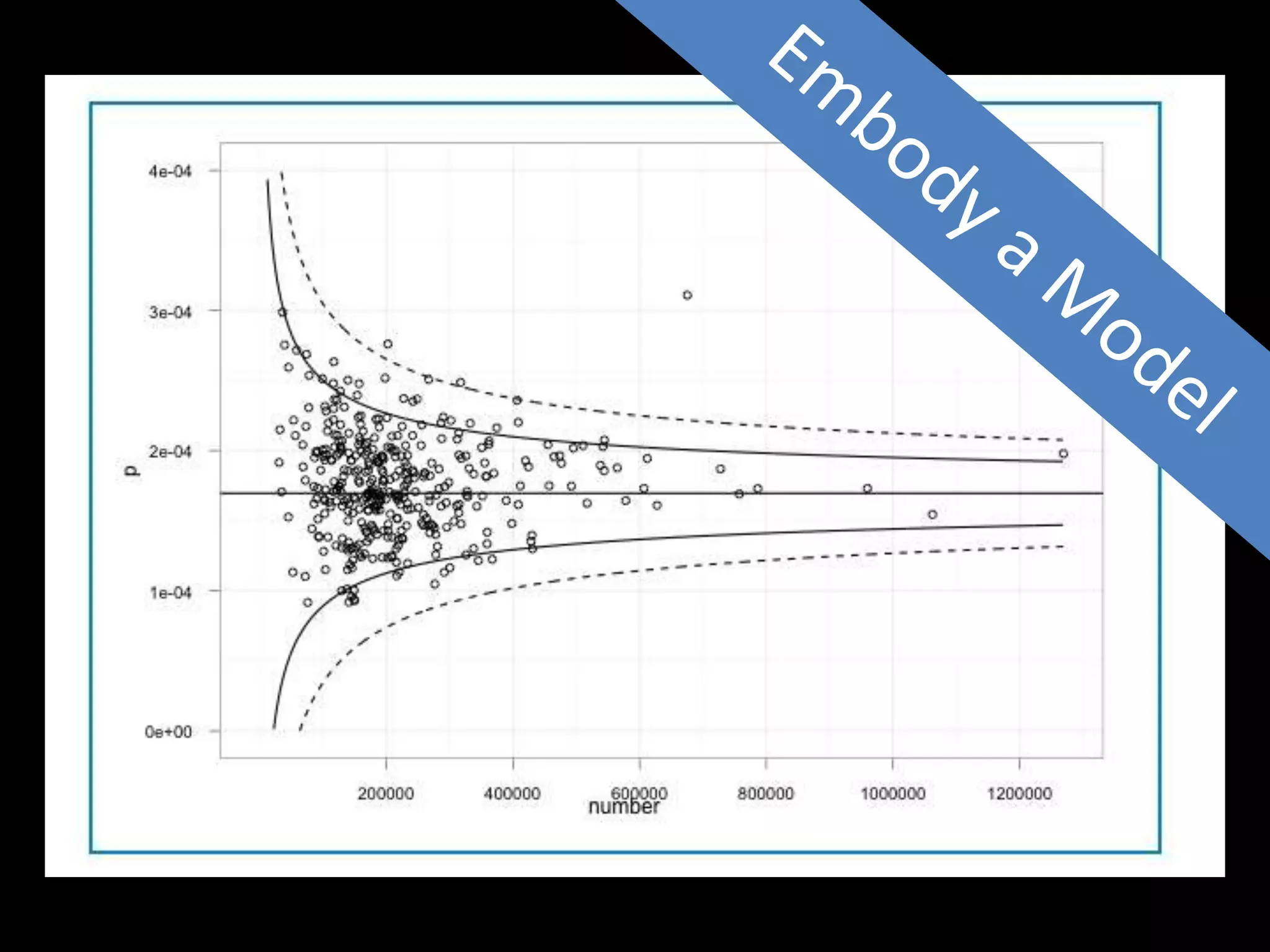
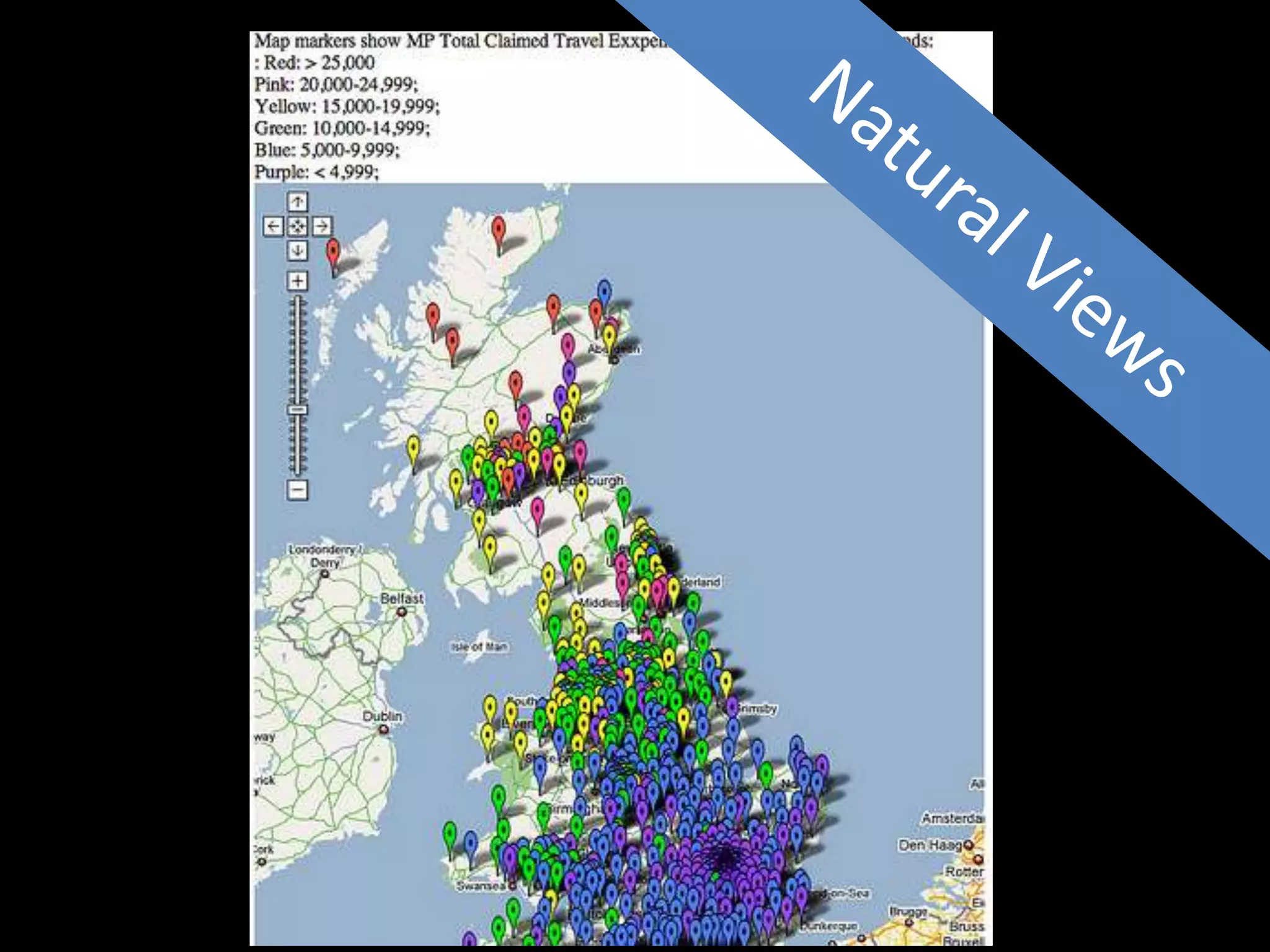
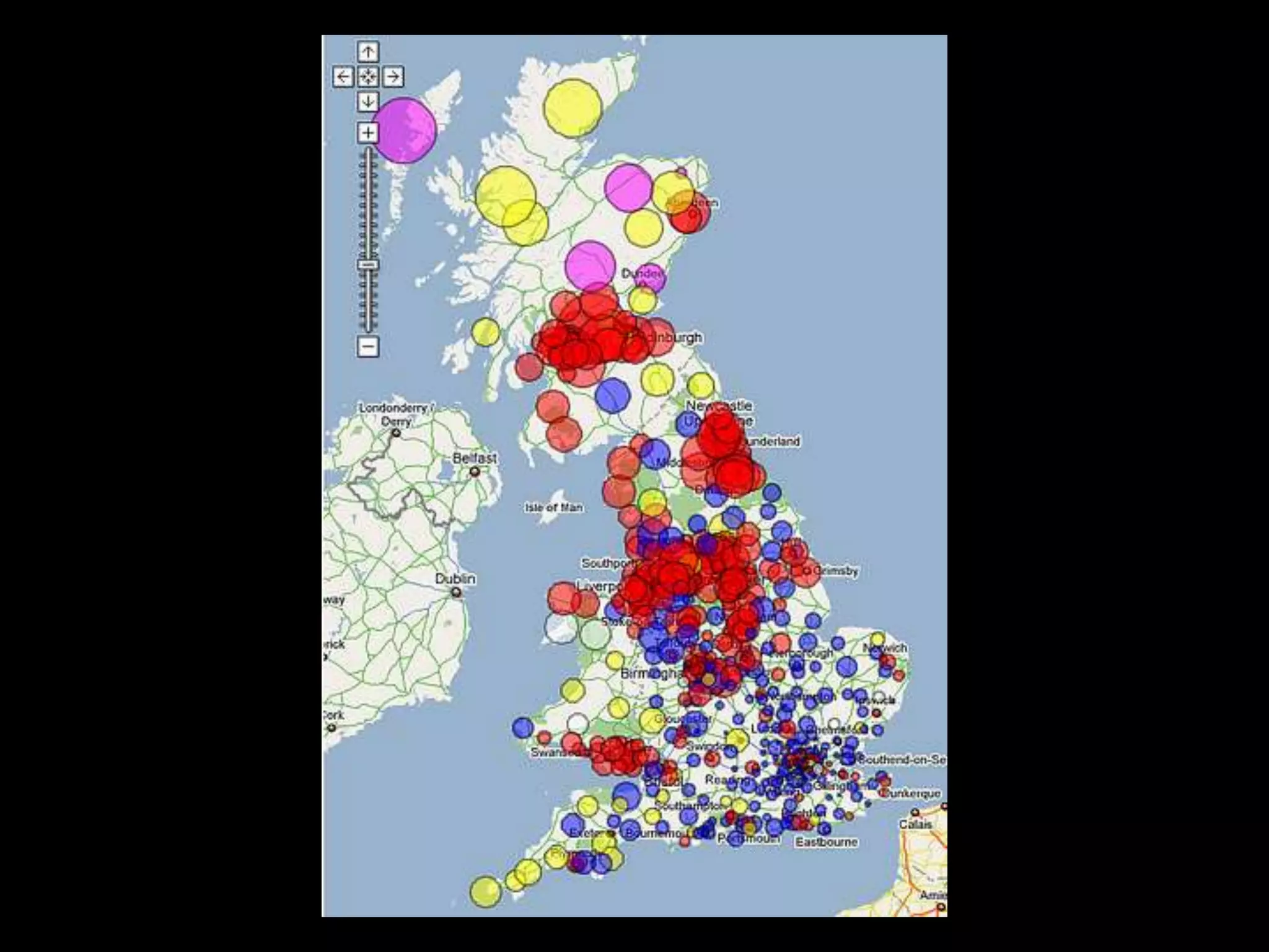
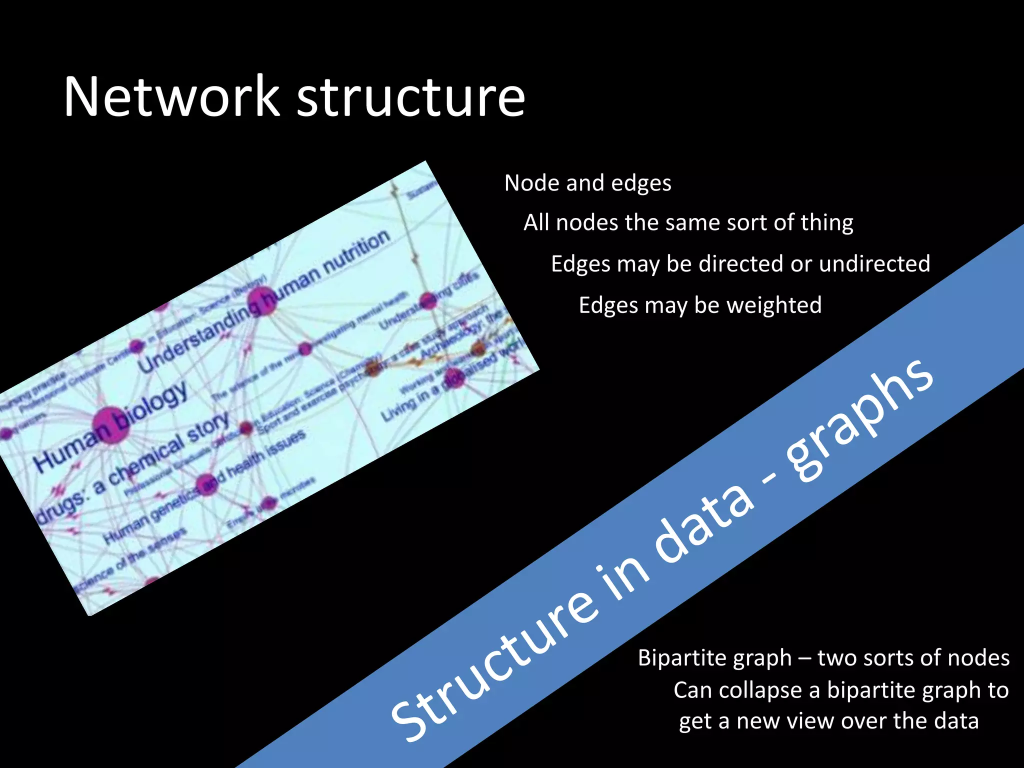
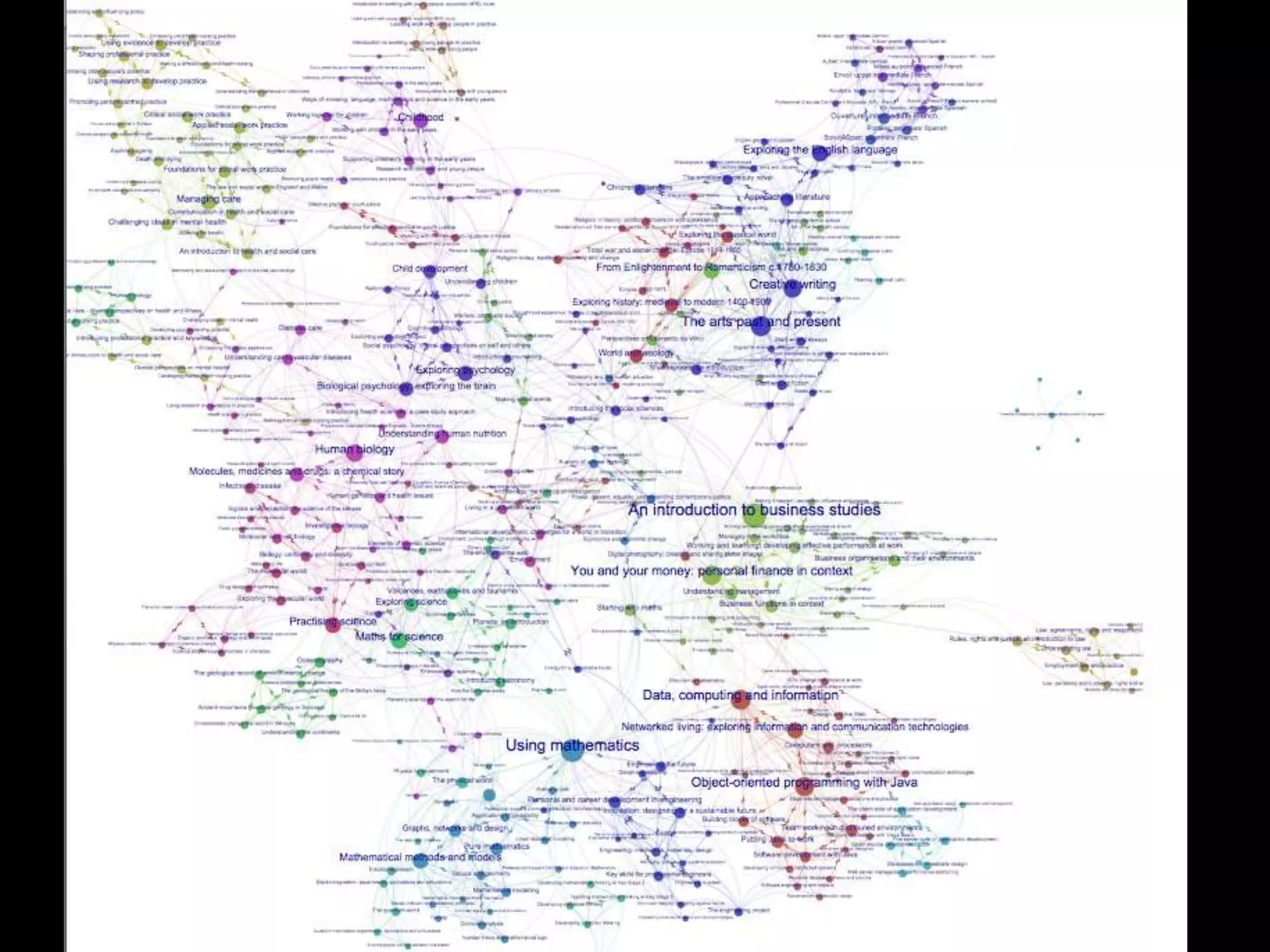
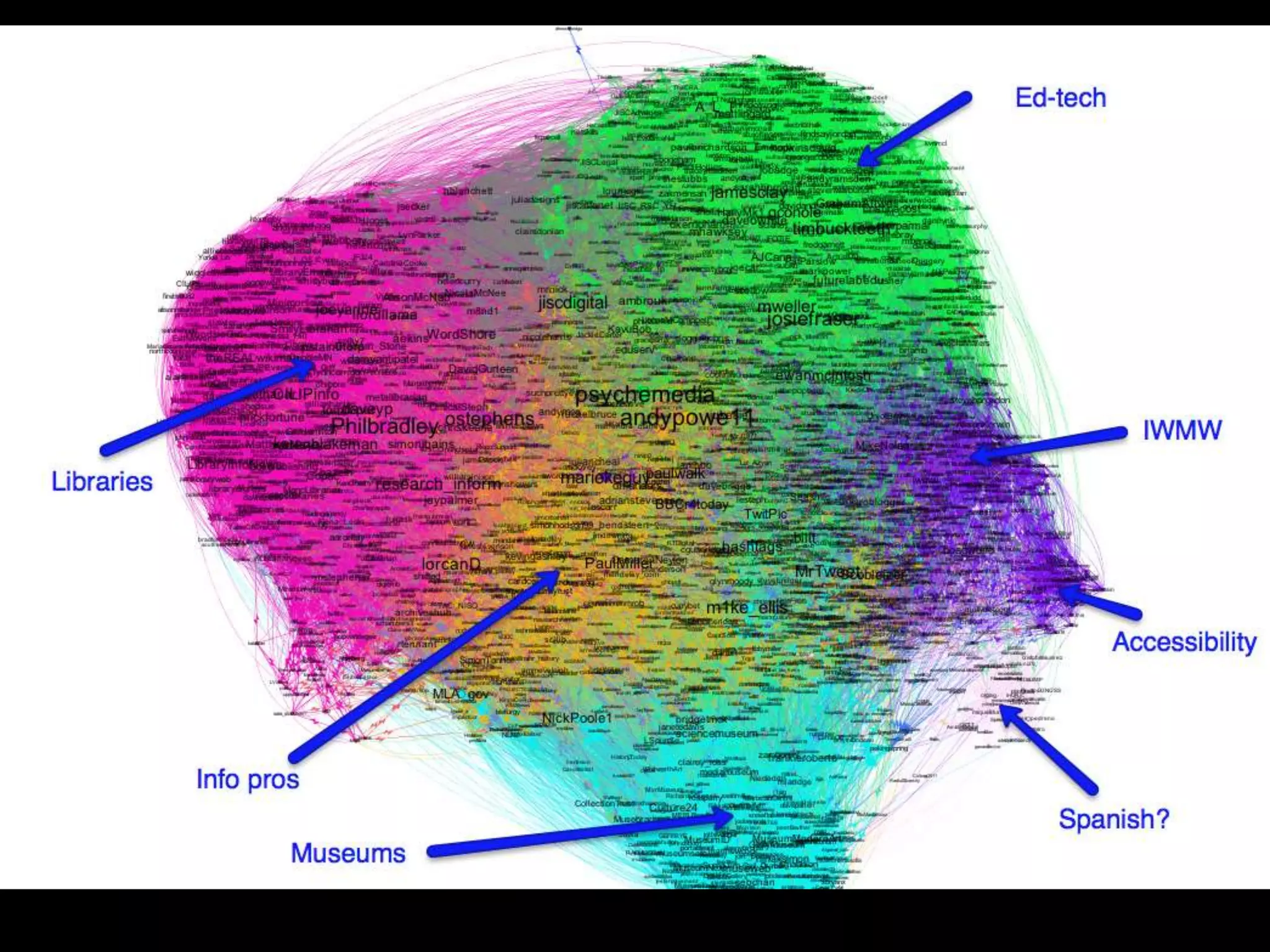
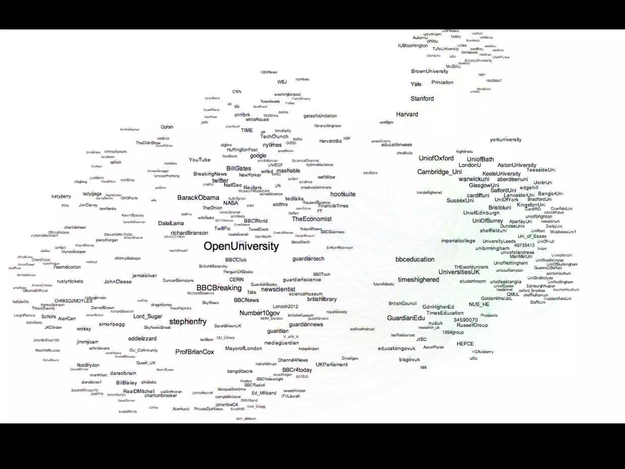
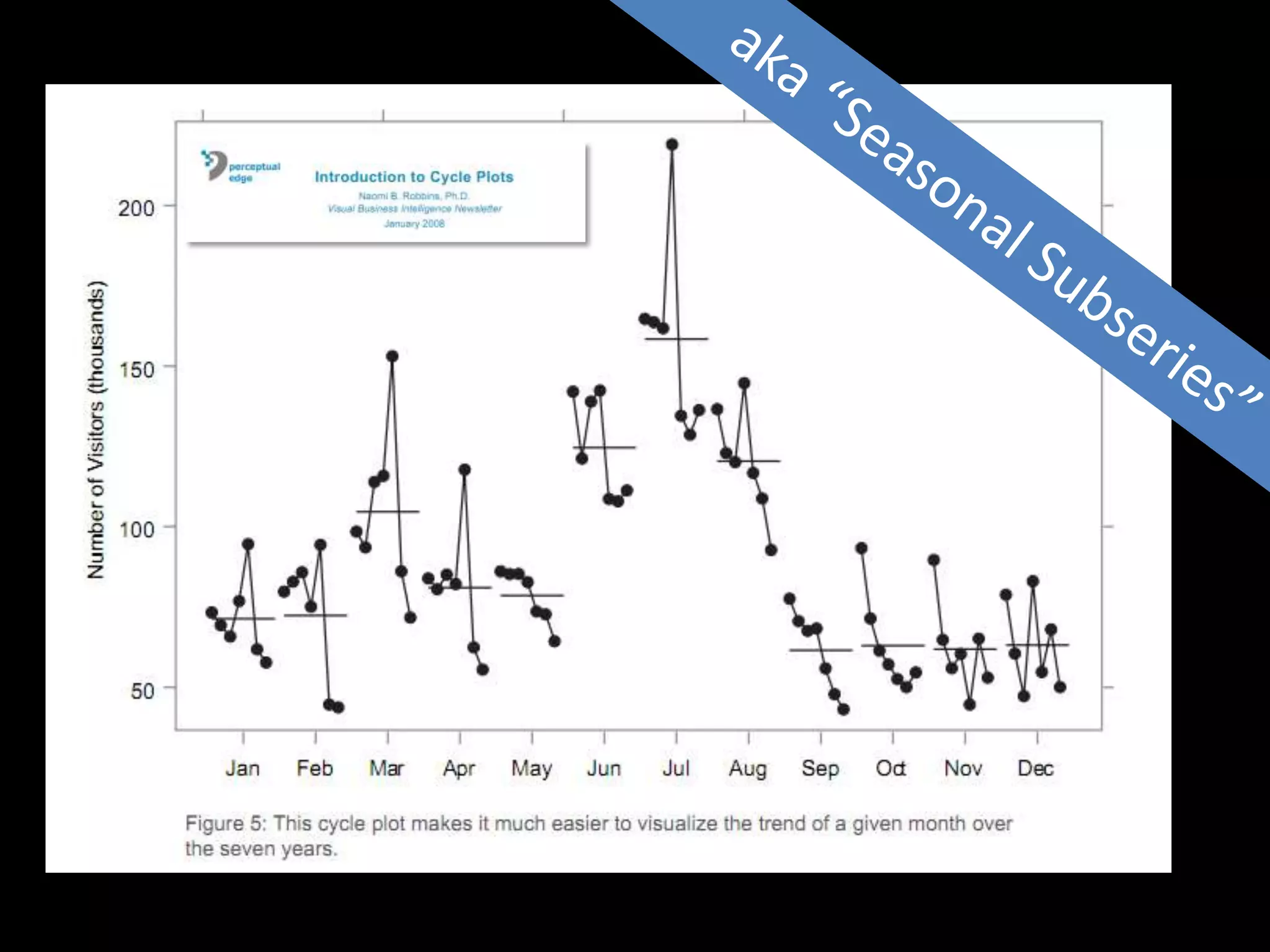
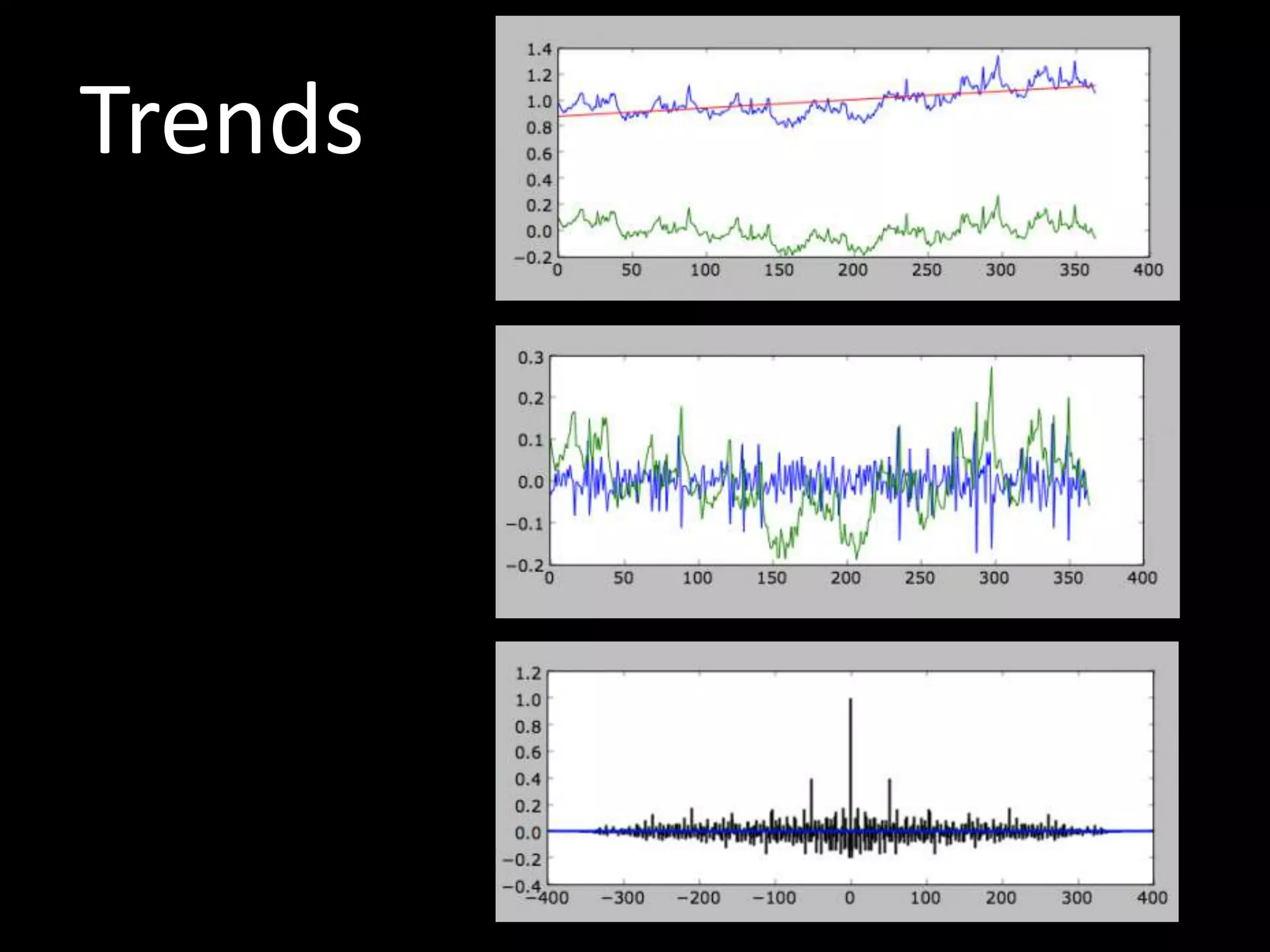
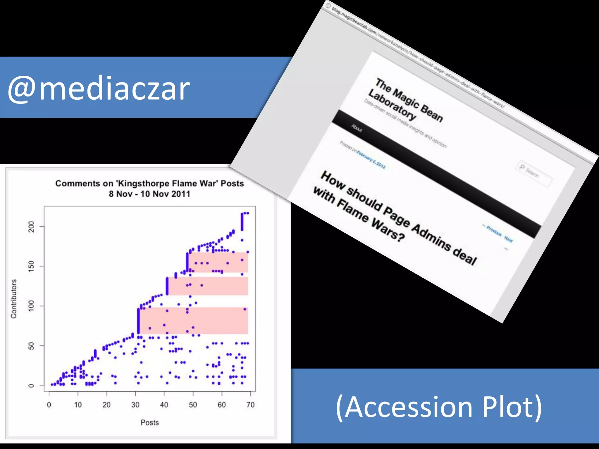
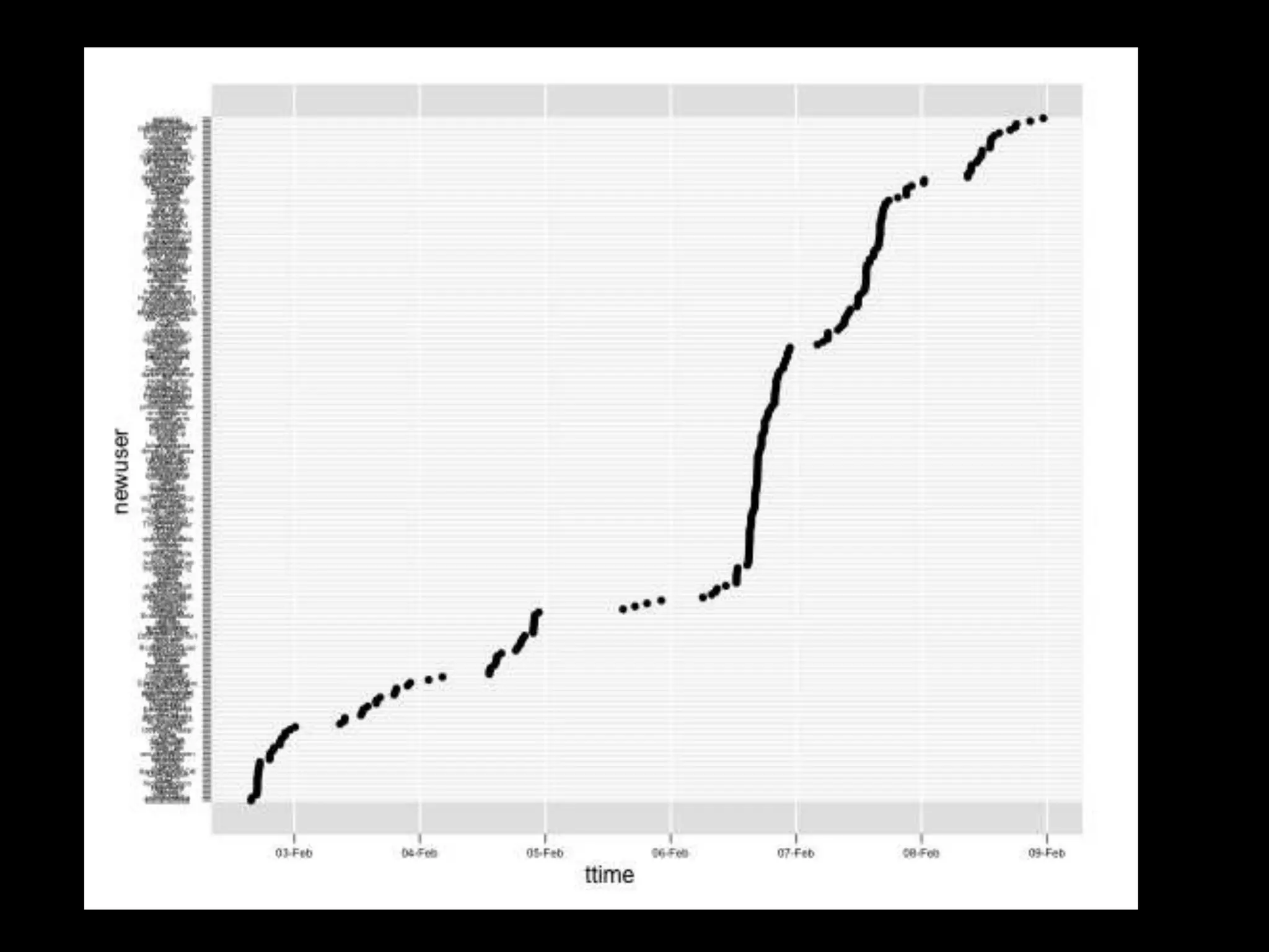
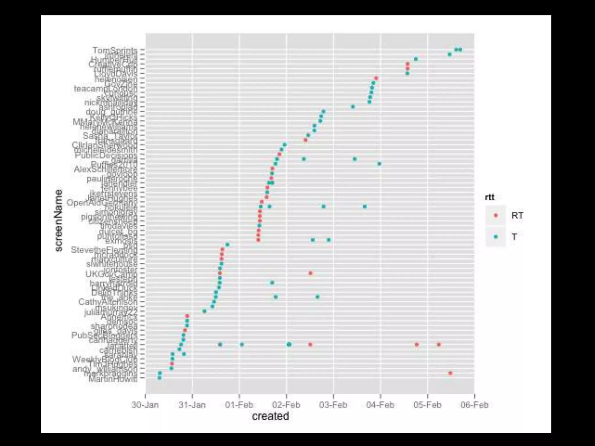
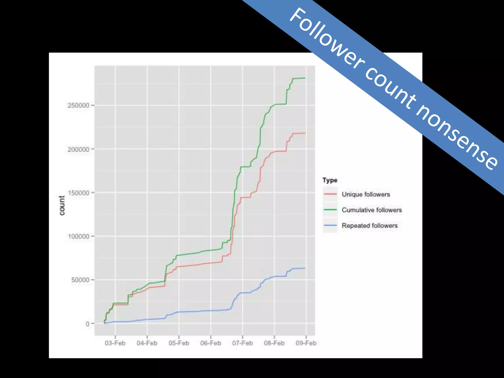
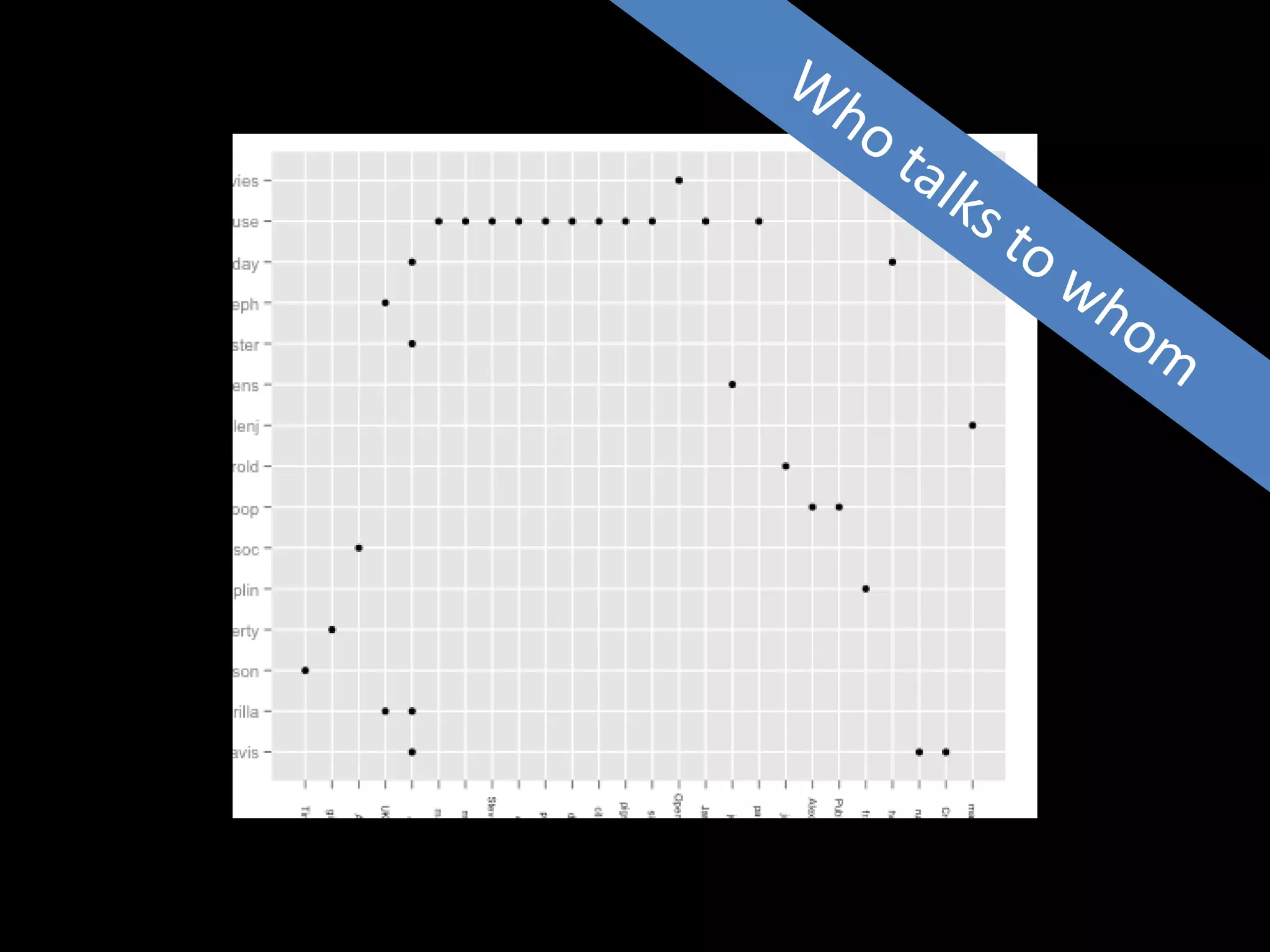
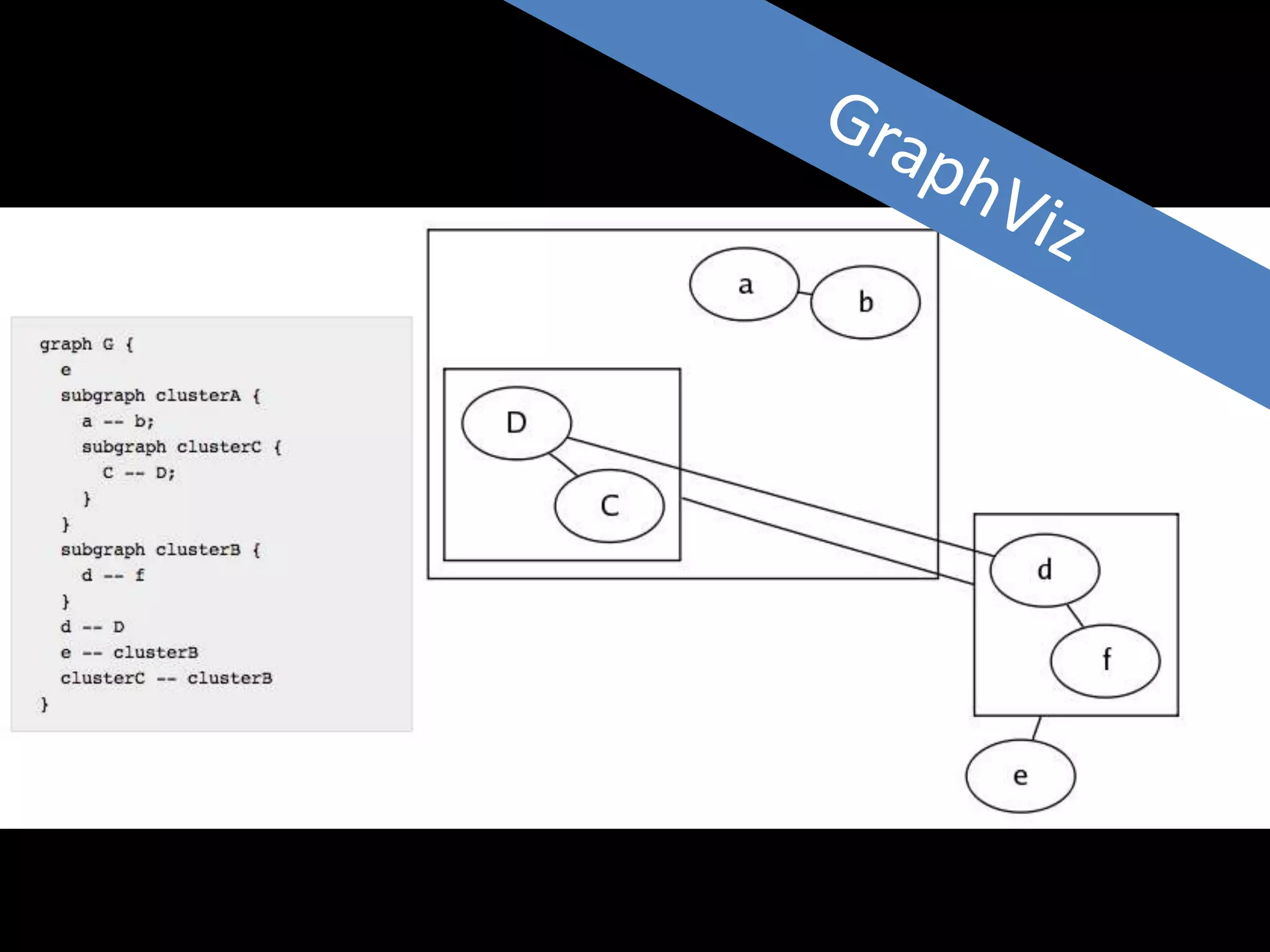
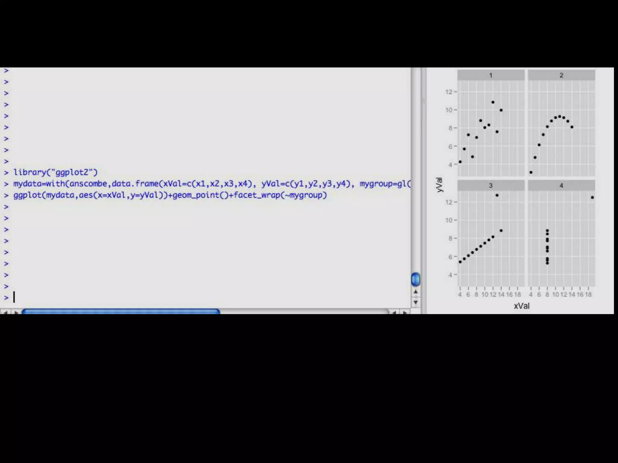
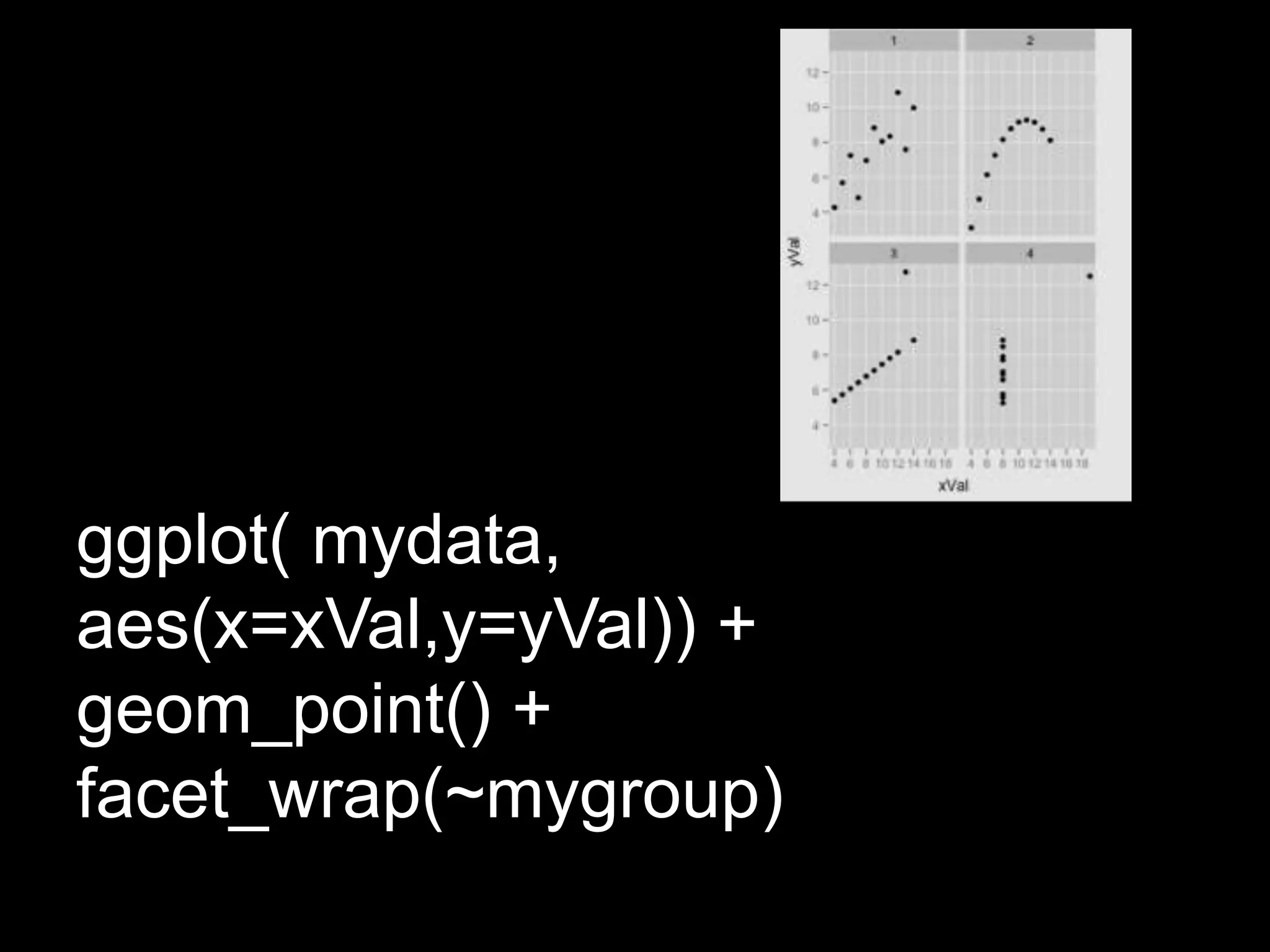
The document discusses different types of data visualization including explanatory visualization which is used to transmit a point of view and exploratory visualization which is used to discover patterns in a dataset. It provides examples of different visualization techniques such as infographics, pivot tables, network structures, and trends. The document also discusses the concept of "literate visualization" which combines writing and diagrams.