Download to read offline


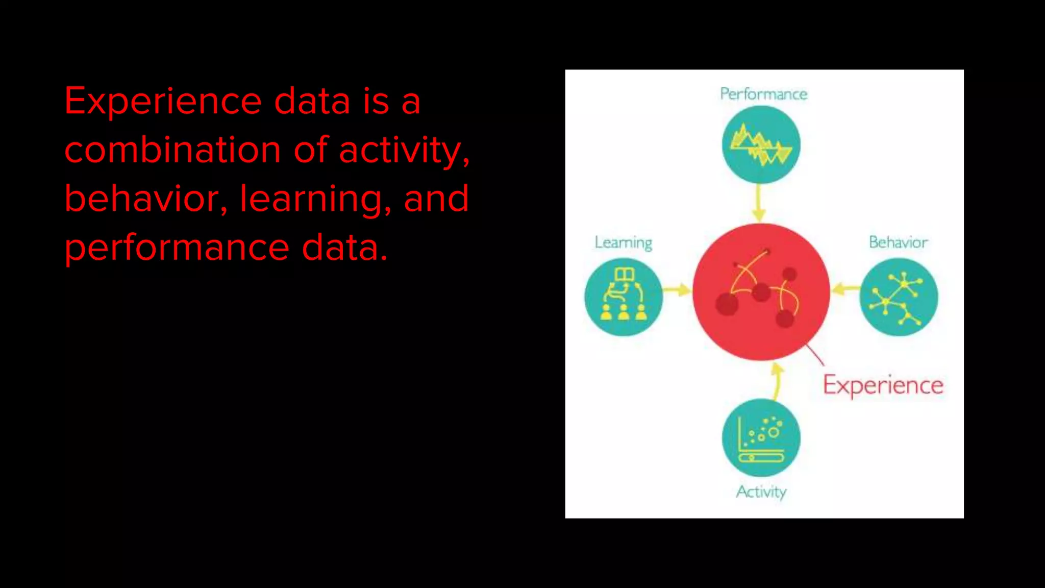
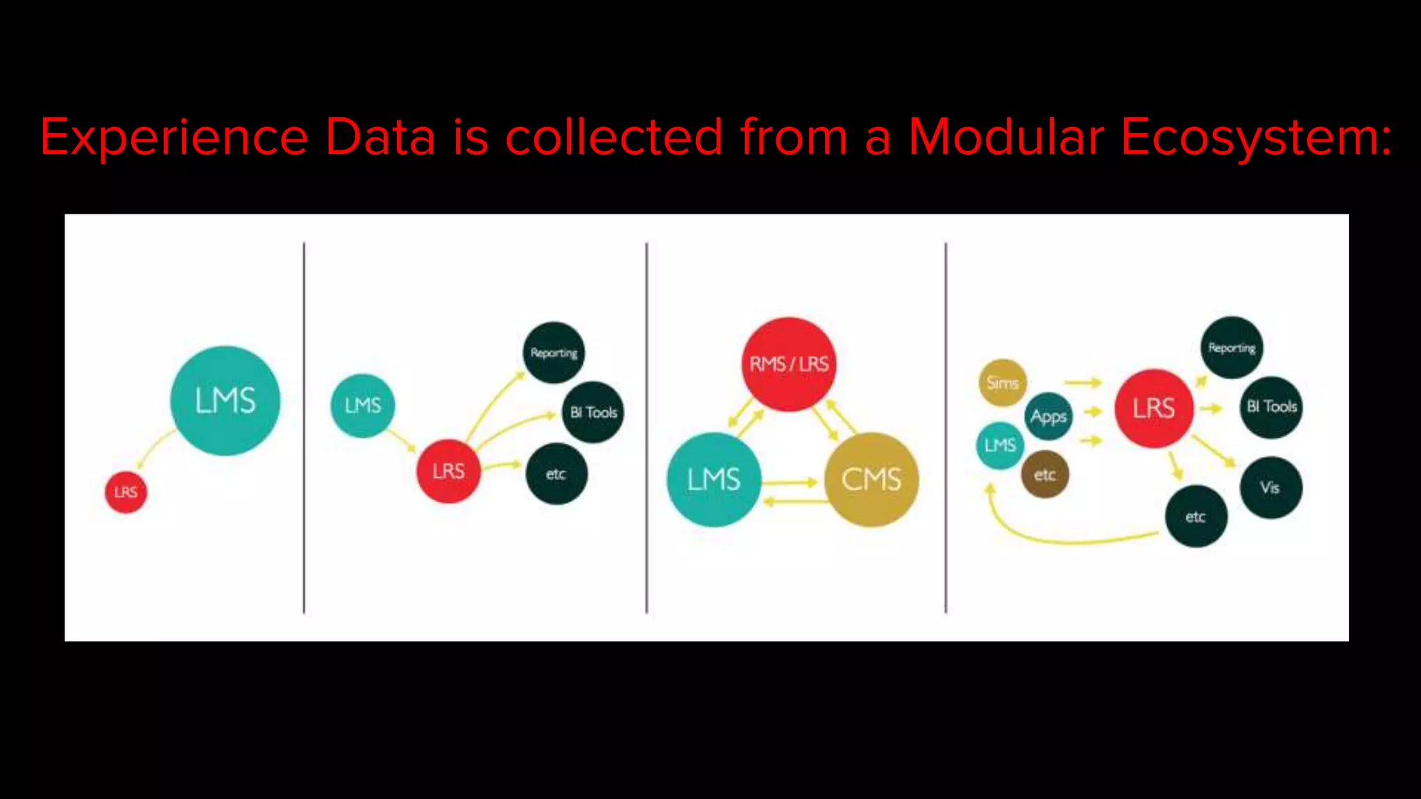


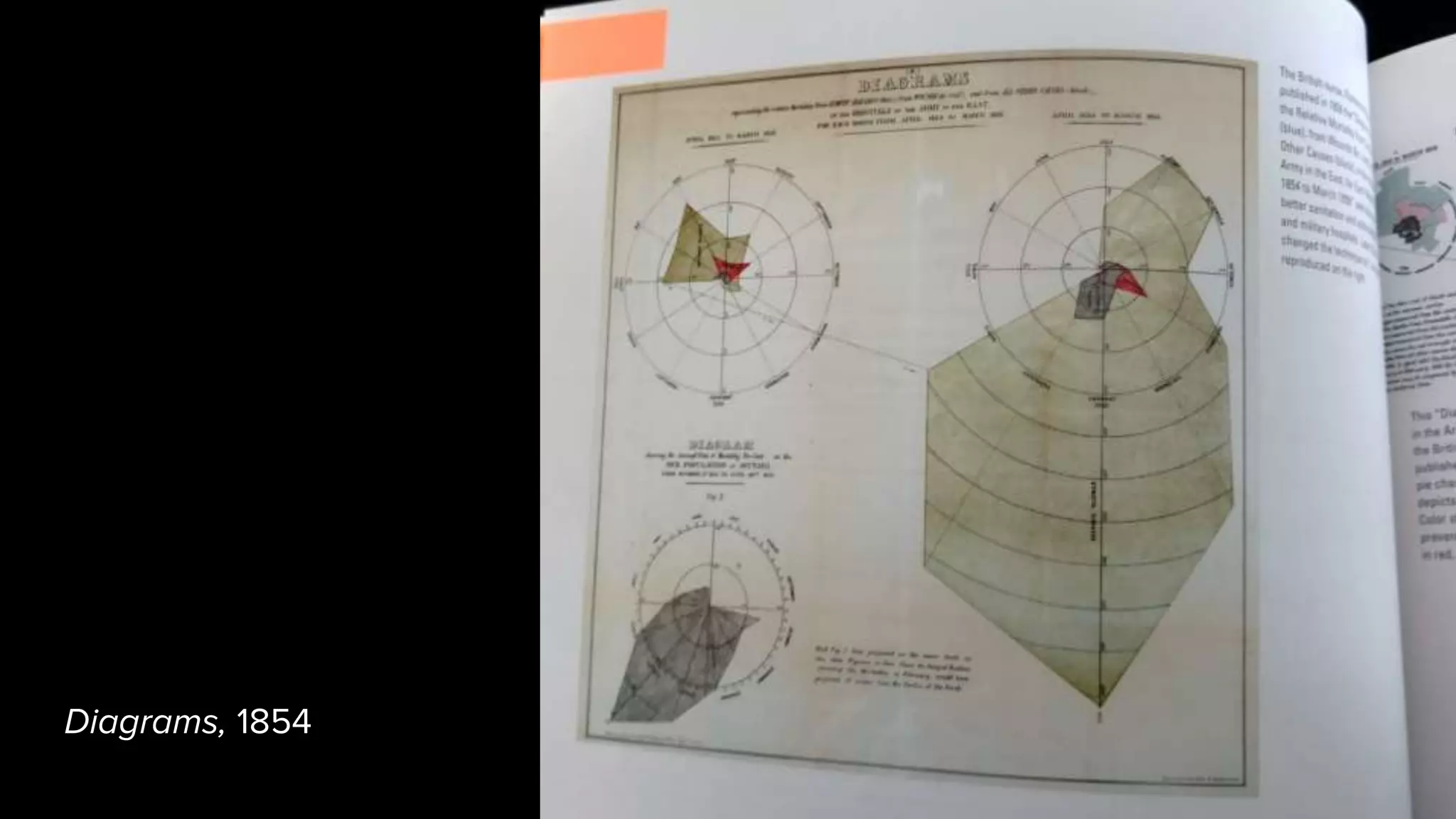


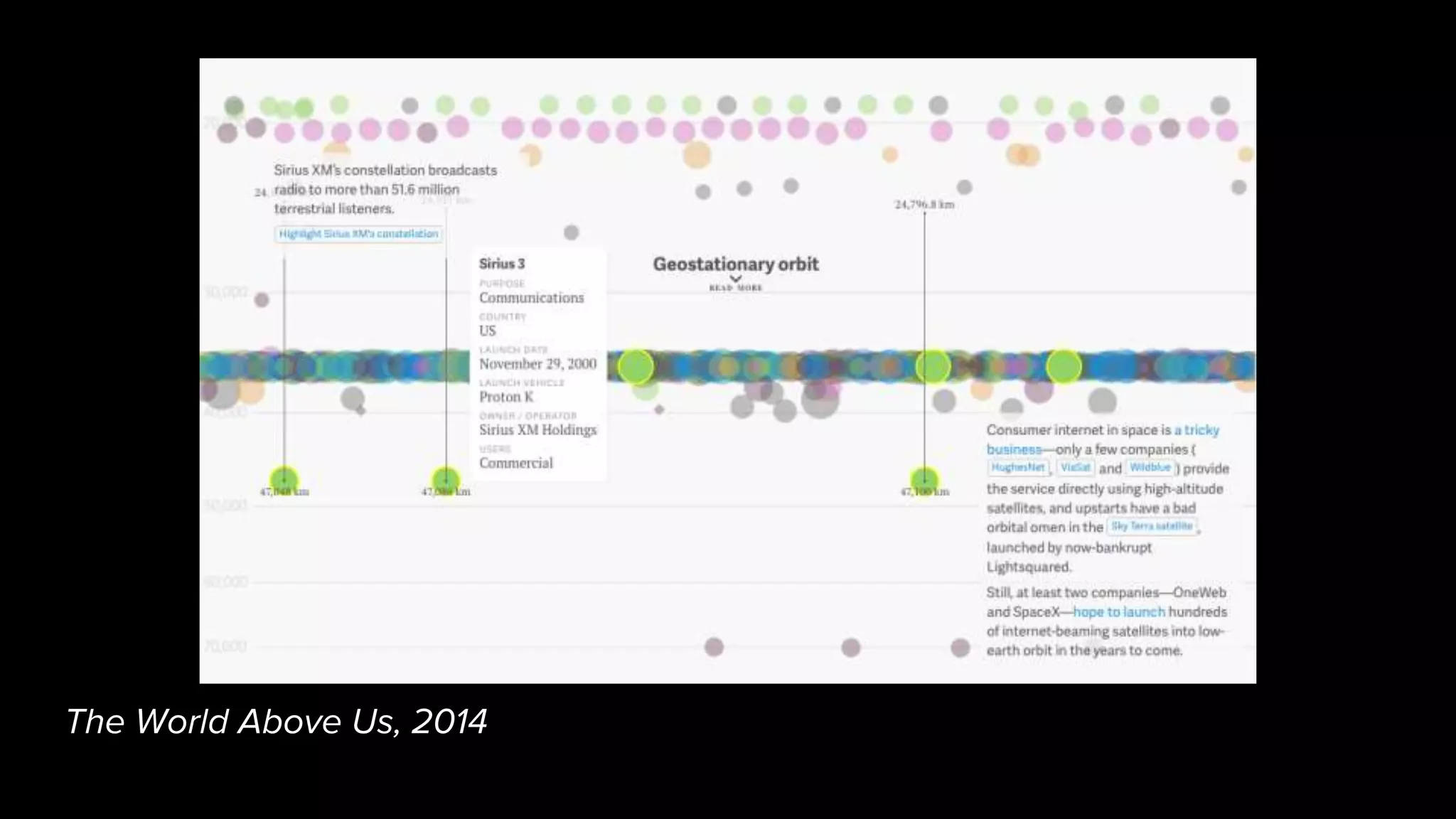
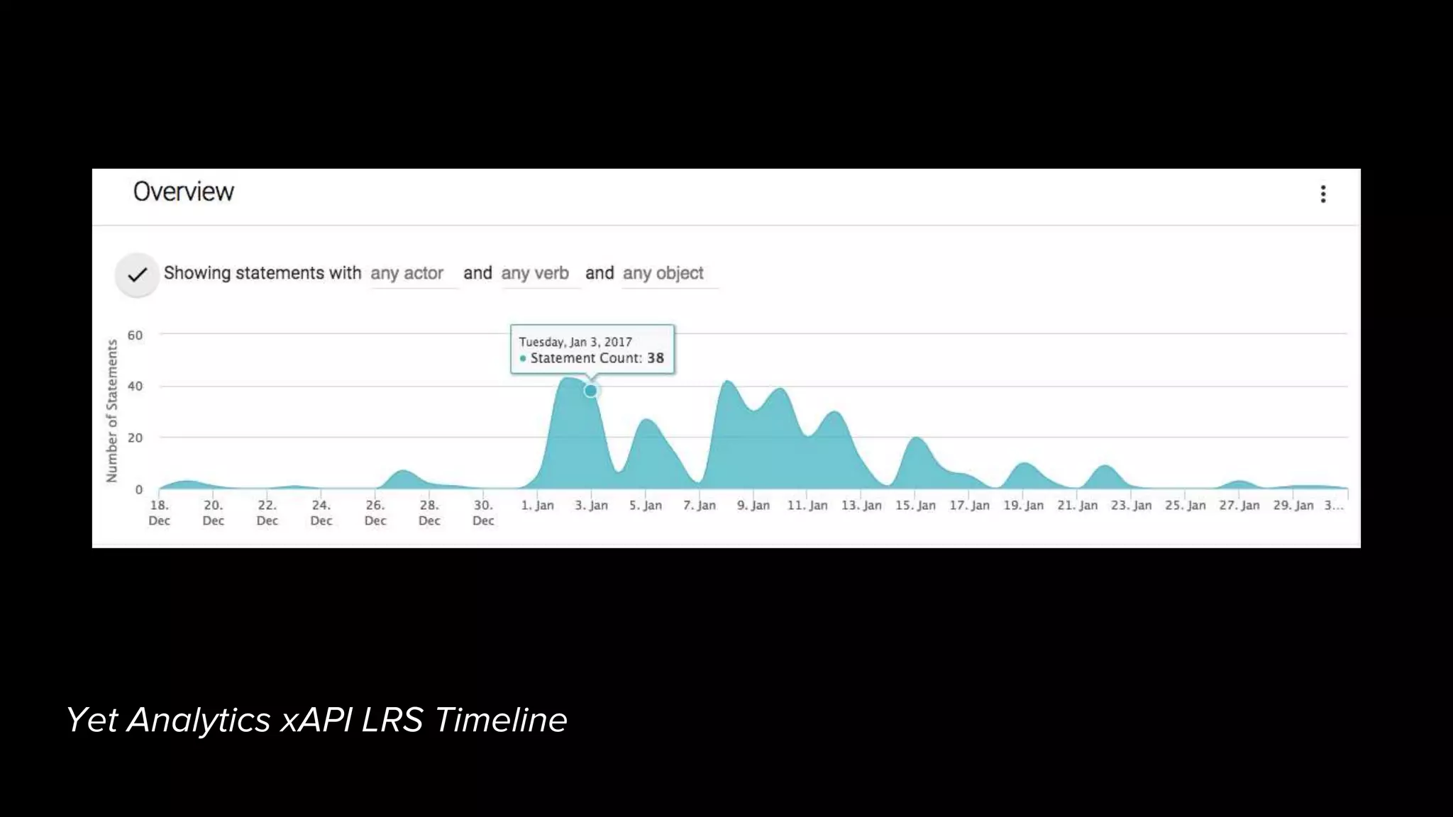

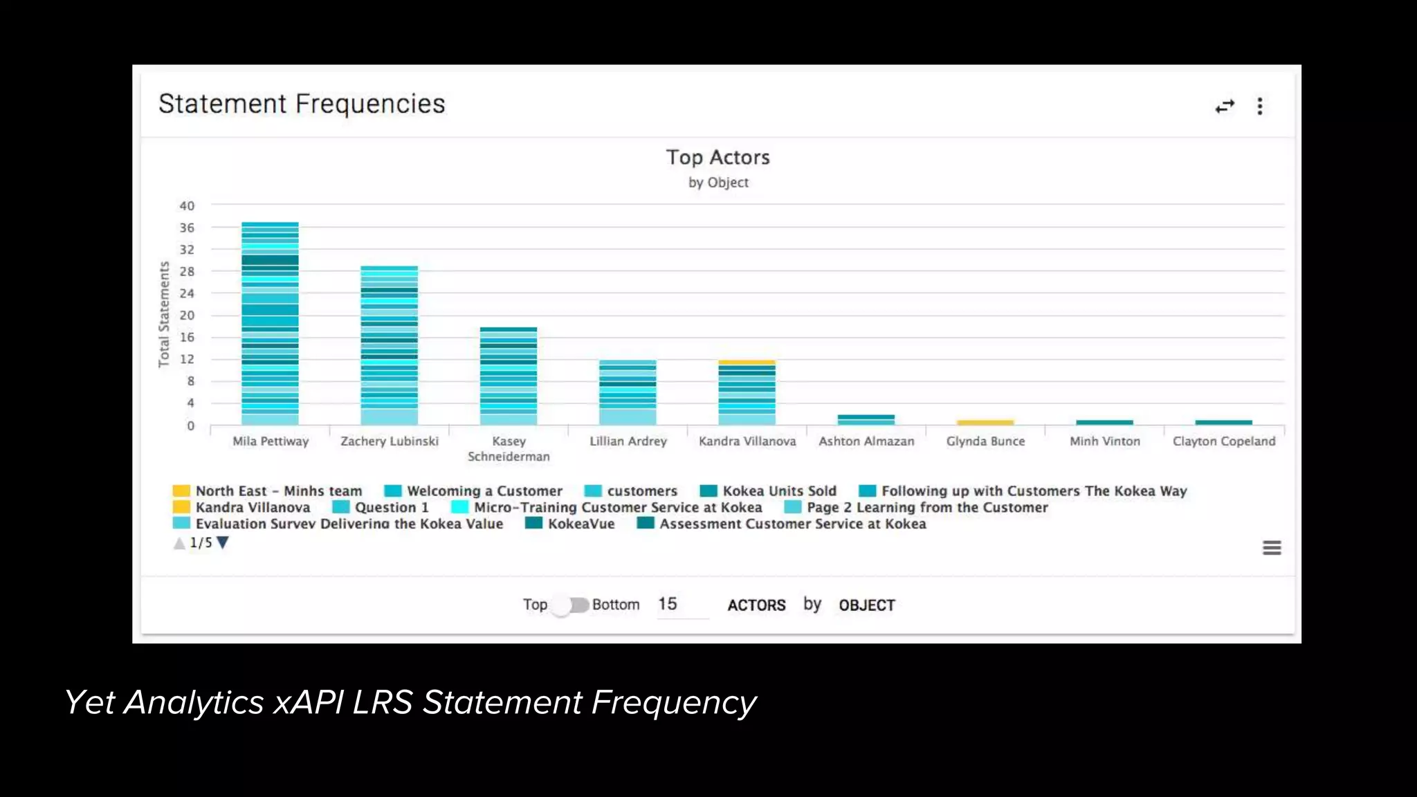
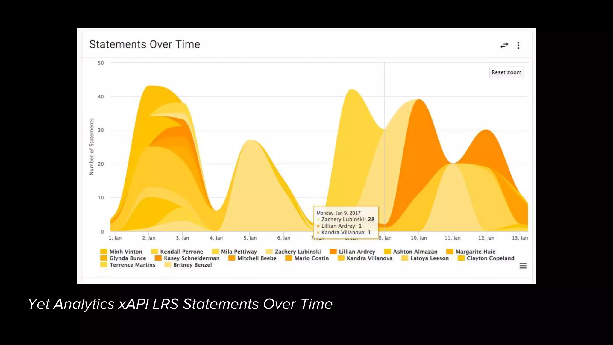
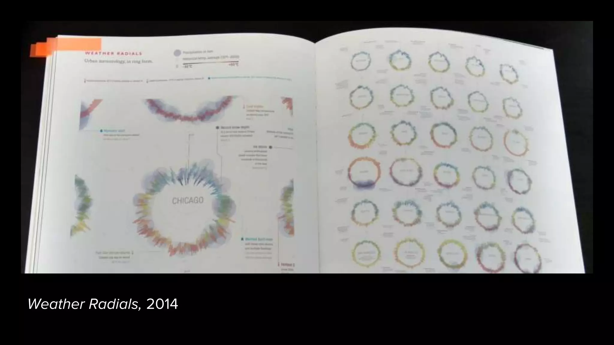
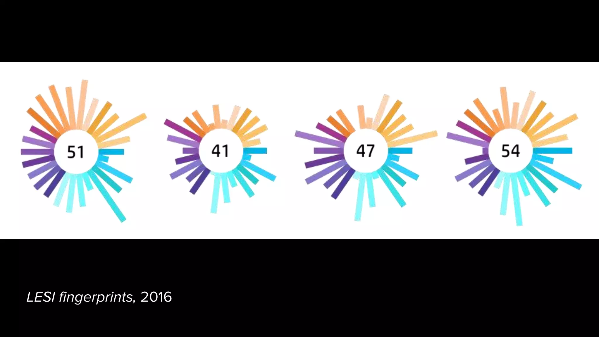
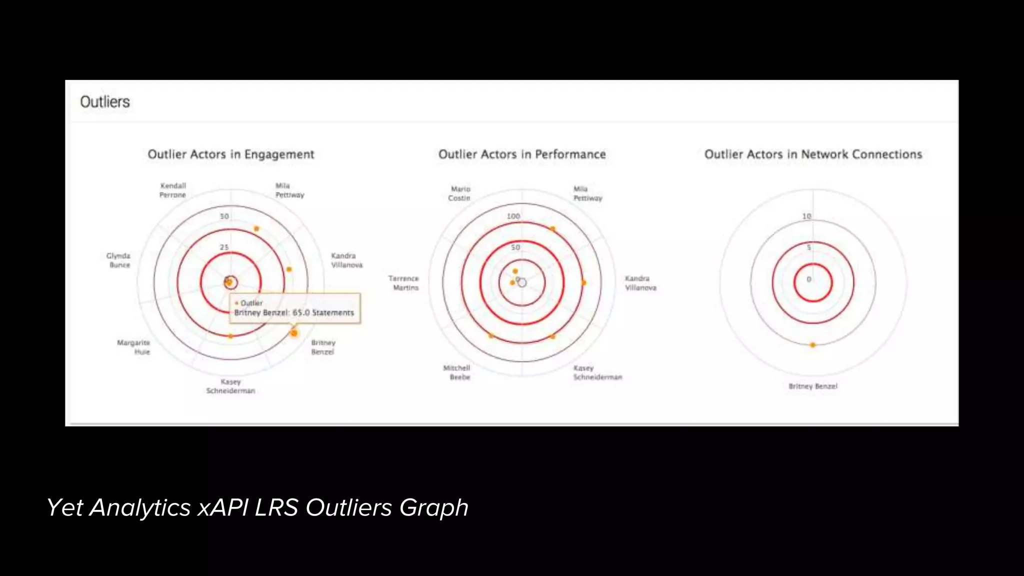
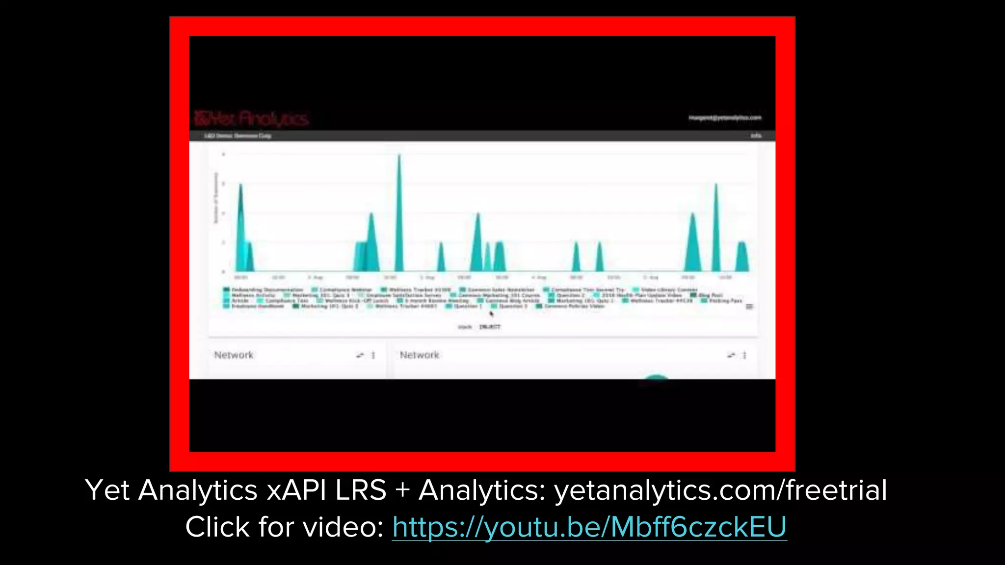


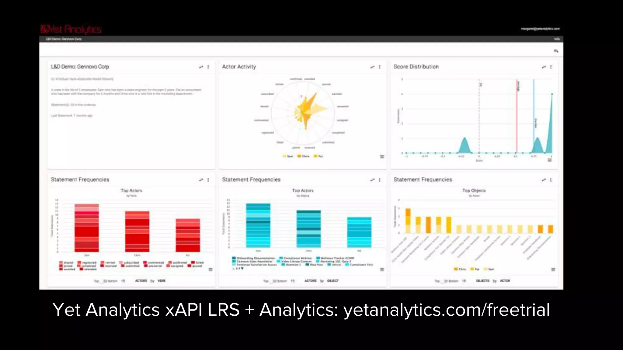
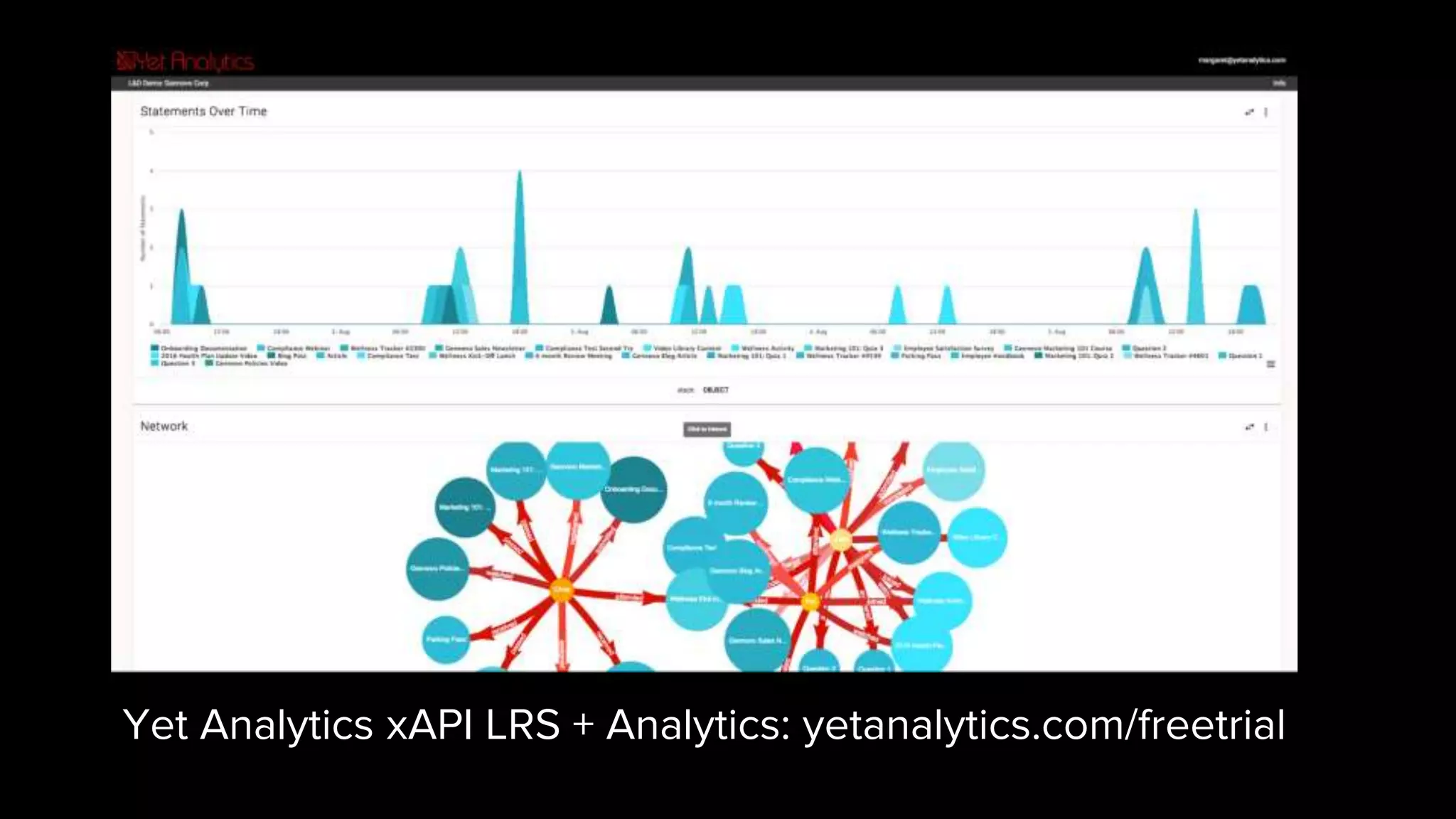
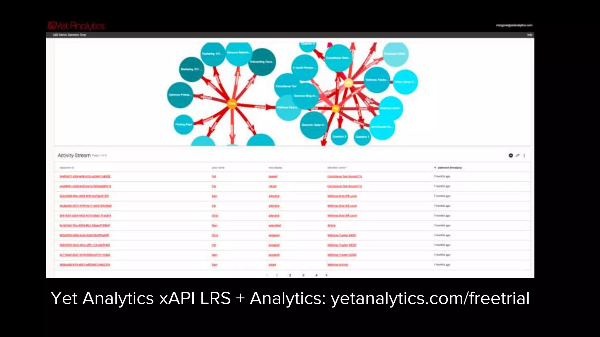

The document discusses using data visualization for data discovery. It provides three qualities that make a visualization good for data discovery: 1) being interactive to allow users to ask questions, 2) being multidimensional to show relationships between variables, and 3) being visually efficient to convey information in a small footprint compared to tabular data. Examples of different visualization types are shown that exemplify these qualities. The document encourages using interactive visualization tools to help users discover patterns in experience data collected from various sources.