Download to read offline

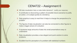

The document discusses an assignment on the use and abuse of data visualization, exploring its benefits such as pattern discovery and aiding decision-making, as well as its downsides like potential data exclusion and manipulation. It emphasizes that while data visualization can simplify complex information, it may also lead to misinterpretations and lack of comprehensive understanding. Students are instructed to create a presentation incorporating these points, while retaining all original slides.