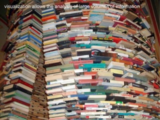
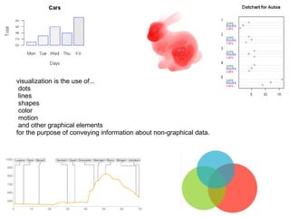
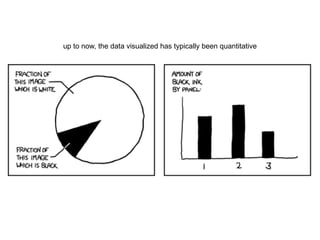
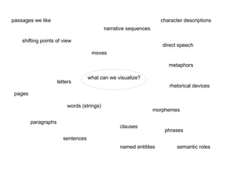
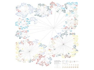
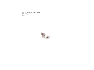
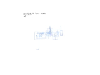
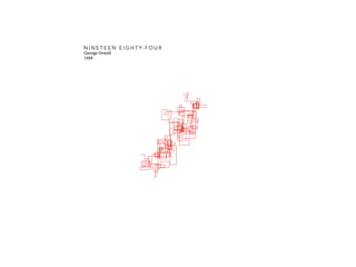
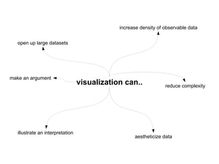
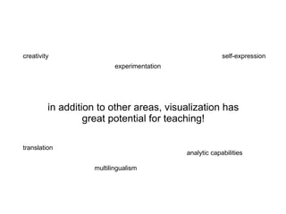
Held at the 2nd European Summer School "Cultures & Technologies" (ESU-CT) in Leipzig, Germany, on July 28th, 2010. Thanks to everyone at the summer school for their feedback and many interesting discussions!
Humanistic and Computational Thinking Through PracticeAarhus University
Creative Media Colloquium @ SCM, City University of Hong Kong, 12 Jan 2018
Abstract: In this talk, I will present some of my artistic works that span the areas of net art, software-based art, and electronic literature. My works examine the materiality of computational processes that underwrite our experiences and realities in digital culture that touch on cultural-social-political topics, such as Internet censorship, the economy of likes, spam and literary culture, politics of APIs, cultural machines and feminist software.
I consider computational practice as a mode of humanistic inquiry to understand the digital culture - a condition that we are highly engaged with, and surrounded by, software and networked systems. I ask how might we understand cultural systems through computational practice? This talk will unfold the importance of computational practice in my thinking and research, examining the infrastructure and implications of cultural systems.
Part of the panel presentation of The Purpose of the Future University Conference, 7-Nov-2017
Ref: http://tdm.au.dk/en/research/research-events/the-purpose-of-the-future-university/
Building artificial intelligence into your node.js apps
The era of machine learning and artificial intelligence is here, and unlike a few years ago you don’t need to be a PhD student at CalTech to do something useful with it. In this talk we’ll walkthrough examples of using advanced computer vision, speech recognition, and intelligent language understanding AIs all from Node.js. We’ll build a bot together that uses and understands emotion and the intents of human language, and we’ll post it online so we can play with it. You’ll leave with some code you can use as a starting point for your next project.
[PhDThesis2021] - Augmenting the knowledge pyramid with unconventional data a...University of Bologna
The volume, variety, and high availability of data backing decision support systems have impacted on business intelligence, the discipline providing strategies to transform raw data into decision-making insights. Such transformation is usually abstracted in the “knowledge pyramid,” where data collected from the real world are processed into meaningful patterns. In this context, volume, variety, and data availability have opened for challenges in augmenting the knowledge pyramid. On the one hand, the volume and variety of unconventional data (i.e., unstructured non-relational data generated by heterogeneous sources such as sensor networks) demand novel and type-specific data management, integration, and analysis techniques. On the other hand, the high availability of unconventional data is increasingly attracting data scientists with high competence in the business domain but low competence in computer science and data engineering; enabling effective participation requires the investigation of new paradigms to drive and ease knowledge extraction. The goal of this thesis is to augment the knowledge pyramid from two points of view, namely, by including unconventional data and by providing advanced analytics. As to unconventional data, we focus on mobility data and on the privacy issues related to them by providing (de-)anonymization models. As to analytics, we introduce a higher abstraction level than writing formal queries. Specifically, we design advanced techniques that allow data scientists to explore data either by expressing intentions or by interacting with smart assistants in hand-free scenarios.
When data journalism meets science | Erice, June 10th, 2014Dataninja
Introductory lesson about data journalism within science journalism and science communication during the International School of Science Journalism 2014 in Erice (June 10th, 2014).
H-Maps: An Efficient Approach for Graphical Visualization and Navigation of T...tmra
Nowadays semantic networks become more important in industry and modern science. For this reason there is a need for an efficient tool allowing preparation and navigation through complex data spaces. We present the novel Topic Map tool H-Maps, which offers a web based navigator providing an enhanced utilization and graphical visualization of semantic networks. Present applications transform existing content to subject-centric Topic Map representations in a one-way fashion. Preserving the advantage of transferring diverse back ends into a unified topic map in existing applications the H-Maps approach goes one step further. The resulting topic map structure can be examined and extended with an iterative procedure. Especially in science this procedure is leading to a considerable improvement of flexibility and performance as can be shown within projects of computational biology.
Contributions to the multidisciplinarity of computer science and ISSaïd Assar
Les diapos de ma présentation HDR en informatique (CNU section 27) à l'université Paris 1 Panthéon Sorbonne le vendredi 20 janvier 2017. L'enregistrement vidéo de la soutenance est visible sur https://www.youtube.com/watch?v=1ro_iaI-roA
--
Slides of my presentation for Habilitation (HDR) defense in computer science (Informatique section 27 CNU) at University Paris 1 Panthéon Sorbonne on Friday January 2017.
Video recording is visible on https://www.youtube.com/watch?v=1ro_iaI-roA
Friday Session #64: Key Recipes For Killer InfographicsCleverwood Belgium
A slidedeck presented at the 64th Cleverwood Friday Session. Feel free to visit our website for various other courses in digital media http://www.cleverwood.be/learning-hub
Creating a Learning-Focused Interactive PDF via Adobe InDesign Shalin Hai-Jew
An initial instructional design query suggested that Adobe InDesign could be used to create an interactive PDF file in which a learner could move visual objects against a kind of background. That initial misunderstanding led to an actual exploration of what an interactive PDF can and cannot do and resulted in a first interactive PDF…with some lightweight interactivity. This session describes the steps to creating an interactive PDF for learning using Adobe InDesign. Some instructional design thinking has been applied around this exploration (misadventure?) even though the created object itself is fairly simple.
Diagrammatic knowledge modeling for managers – ontology-based approachDmitry Kudryavtsev
Diagrams are an effective and popular tool for visual knowledge structuring. Managers also often use them to acquire and transfer business knowledge. There are many currently available diagrams or visual modeling languages for managerial needs, unfortunately the choice between them is frequently error-prone and inconsistent. This situation raises the next questions. What diagrams/ visual modeling languages are the most suitable for the specific type of business content? What domain-specific diagrams are the most suitable for the visualization of the particular elements of organizational ontology? In order to provide the answers, the paper suggests light-weight specification of diagrams and knowledge content types, which is based on the competency questions and ontology design patterns. The proposed approach provides the classification of qualitative business diagrams.
Kudryavtsev, D. V., Gavrilova, T. A. (2011). Diagrammatic knowledge modeling for managers – ontology-based approach. Accepted poster. International Conference on Knowledge engineering and Ontology Development, 26-29 October, 2011, Paris, France. P. 386-389.
The Inquisitive Data Scientist: Facilitating Well-Informed Data Science throu...Cagatay Turkay
Slides for my talk at the VRVis Research Centre in Vienna as part of their VRVIS Forum talk series on November 8th 2018 -- https://www.vrvis.at/newsroom/events/forum/148-invited-talk-by-cagatay-turkay-the-inquisitive-data-scientist/
The talk argues the importance of being "inquisitive" as a data scientist and discusses techniques from visualisation that support this.
Information Visualisation – an introductionAlan Dix
Slides for the Information Visualisation unit of my 2013 online course on HCI
https://hcibook.com/hcicourse/2013/unit/08-infovis
Contents:
* What is Information Visualisation? – making data easier to understand using direct sensory experience – especially visual! ... but can have aural, tactile ‘visualisation’
* Why Information Visualisation? – for the data analyst: scientist, statistician, possibly you; and for the data consumer: audience, client, reader, end-user
* A Brief History of Visualisation – from 2500 BC to 2012
Visualisation in Context Section – how visualisation fits into the decision making process
* Designing Visualisation – choosing representations, managing trade-offs and making them flexible through interaction
* Classic Visualisation – the visualisations that have shaped the area
Talk held at the Royal Statistical Society in London as part of the event series "Blurring the boundaries - New social media, new social science?". I thank Grant Blank from the OII for inviting me to this exciting workshop.
A Tale of Two Platforms: Emerging communicative patterns in two scientific bl...Cornelius Puschmann
Invited talk given as part of the Nuffield/Oxford Internet Institute Social Netowkrs Seminar Series at Nuffield College. I thank Bernie Hogan for inviting me and Ralph Schroeder and Eric Meyer for being my hosts at OII.
More Related Content
Similar to Visualization in the Digital Humanities
[PhDThesis2021] - Augmenting the knowledge pyramid with unconventional data a...University of Bologna
The volume, variety, and high availability of data backing decision support systems have impacted on business intelligence, the discipline providing strategies to transform raw data into decision-making insights. Such transformation is usually abstracted in the “knowledge pyramid,” where data collected from the real world are processed into meaningful patterns. In this context, volume, variety, and data availability have opened for challenges in augmenting the knowledge pyramid. On the one hand, the volume and variety of unconventional data (i.e., unstructured non-relational data generated by heterogeneous sources such as sensor networks) demand novel and type-specific data management, integration, and analysis techniques. On the other hand, the high availability of unconventional data is increasingly attracting data scientists with high competence in the business domain but low competence in computer science and data engineering; enabling effective participation requires the investigation of new paradigms to drive and ease knowledge extraction. The goal of this thesis is to augment the knowledge pyramid from two points of view, namely, by including unconventional data and by providing advanced analytics. As to unconventional data, we focus on mobility data and on the privacy issues related to them by providing (de-)anonymization models. As to analytics, we introduce a higher abstraction level than writing formal queries. Specifically, we design advanced techniques that allow data scientists to explore data either by expressing intentions or by interacting with smart assistants in hand-free scenarios.
When data journalism meets science | Erice, June 10th, 2014Dataninja
Introductory lesson about data journalism within science journalism and science communication during the International School of Science Journalism 2014 in Erice (June 10th, 2014).
H-Maps: An Efficient Approach for Graphical Visualization and Navigation of T...tmra
Nowadays semantic networks become more important in industry and modern science. For this reason there is a need for an efficient tool allowing preparation and navigation through complex data spaces. We present the novel Topic Map tool H-Maps, which offers a web based navigator providing an enhanced utilization and graphical visualization of semantic networks. Present applications transform existing content to subject-centric Topic Map representations in a one-way fashion. Preserving the advantage of transferring diverse back ends into a unified topic map in existing applications the H-Maps approach goes one step further. The resulting topic map structure can be examined and extended with an iterative procedure. Especially in science this procedure is leading to a considerable improvement of flexibility and performance as can be shown within projects of computational biology.
Contributions to the multidisciplinarity of computer science and ISSaïd Assar
Les diapos de ma présentation HDR en informatique (CNU section 27) à l'université Paris 1 Panthéon Sorbonne le vendredi 20 janvier 2017. L'enregistrement vidéo de la soutenance est visible sur https://www.youtube.com/watch?v=1ro_iaI-roA
--
Slides of my presentation for Habilitation (HDR) defense in computer science (Informatique section 27 CNU) at University Paris 1 Panthéon Sorbonne on Friday January 2017.
Video recording is visible on https://www.youtube.com/watch?v=1ro_iaI-roA
Friday Session #64: Key Recipes For Killer InfographicsCleverwood Belgium
A slidedeck presented at the 64th Cleverwood Friday Session. Feel free to visit our website for various other courses in digital media http://www.cleverwood.be/learning-hub
Creating a Learning-Focused Interactive PDF via Adobe InDesign Shalin Hai-Jew
An initial instructional design query suggested that Adobe InDesign could be used to create an interactive PDF file in which a learner could move visual objects against a kind of background. That initial misunderstanding led to an actual exploration of what an interactive PDF can and cannot do and resulted in a first interactive PDF…with some lightweight interactivity. This session describes the steps to creating an interactive PDF for learning using Adobe InDesign. Some instructional design thinking has been applied around this exploration (misadventure?) even though the created object itself is fairly simple.
Diagrammatic knowledge modeling for managers – ontology-based approachDmitry Kudryavtsev
Diagrams are an effective and popular tool for visual knowledge structuring. Managers also often use them to acquire and transfer business knowledge. There are many currently available diagrams or visual modeling languages for managerial needs, unfortunately the choice between them is frequently error-prone and inconsistent. This situation raises the next questions. What diagrams/ visual modeling languages are the most suitable for the specific type of business content? What domain-specific diagrams are the most suitable for the visualization of the particular elements of organizational ontology? In order to provide the answers, the paper suggests light-weight specification of diagrams and knowledge content types, which is based on the competency questions and ontology design patterns. The proposed approach provides the classification of qualitative business diagrams.
Kudryavtsev, D. V., Gavrilova, T. A. (2011). Diagrammatic knowledge modeling for managers – ontology-based approach. Accepted poster. International Conference on Knowledge engineering and Ontology Development, 26-29 October, 2011, Paris, France. P. 386-389.
The Inquisitive Data Scientist: Facilitating Well-Informed Data Science throu...Cagatay Turkay
Slides for my talk at the VRVis Research Centre in Vienna as part of their VRVIS Forum talk series on November 8th 2018 -- https://www.vrvis.at/newsroom/events/forum/148-invited-talk-by-cagatay-turkay-the-inquisitive-data-scientist/
The talk argues the importance of being "inquisitive" as a data scientist and discusses techniques from visualisation that support this.
Information Visualisation – an introductionAlan Dix
Slides for the Information Visualisation unit of my 2013 online course on HCI
https://hcibook.com/hcicourse/2013/unit/08-infovis
Contents:
* What is Information Visualisation? – making data easier to understand using direct sensory experience – especially visual! ... but can have aural, tactile ‘visualisation’
* Why Information Visualisation? – for the data analyst: scientist, statistician, possibly you; and for the data consumer: audience, client, reader, end-user
* A Brief History of Visualisation – from 2500 BC to 2012
Visualisation in Context Section – how visualisation fits into the decision making process
* Designing Visualisation – choosing representations, managing trade-offs and making them flexible through interaction
* Classic Visualisation – the visualisations that have shaped the area
Similar to Visualization in the Digital Humanities (20)
Talk held at the Royal Statistical Society in London as part of the event series "Blurring the boundaries - New social media, new social science?". I thank Grant Blank from the OII for inviting me to this exciting workshop.
A Tale of Two Platforms: Emerging communicative patterns in two scientific bl...Cornelius Puschmann
Invited talk given as part of the Nuffield/Oxford Internet Institute Social Netowkrs Seminar Series at Nuffield College. I thank Bernie Hogan for inviting me and Ralph Schroeder and Eric Meyer for being my hosts at OII.
Digitale Methoden in den Sozial- und Geisteswissenschaften: Chancen und Herau...Cornelius Puschmann
Held on December 17th, 2012, as part of the Göttingen Center for Digital Humanities' lecture series on Internet and society. My thanks to Heidi Hanekop for the kind invitation.
http://www.gcdh.de/en/events/calendar-view/dr.-cornelius-puschmann-digitale-methoden-in-den-sozial-und-geisteswissenschaften-chancen-und-herausforderungen
Talk on the potentials of Twitter data for linguistic research held at the Freiburg Institute for Advanced Study (FRIAS) on invitation from Christian Mair. Thanks for having me!
Data Access, Ownership and Control in Social Web Services: Issues for Twitter...Cornelius Puschmann
Held on May 25th 2012 at the annual meeting of the International Communication Association (ICA) in Phoenix. Thanks to Hallvard Moe (http://hm.uib.no/) and Anders Larsson (http://www.andersoloflarsson.se/) for organizing an excellent session!
Knowledge or Credit? The (Un)changing Face of Academic Publishing from the Ph...Cornelius Puschmann
Held on 12 March 2012 at the event "Social Science and Digital Research: Interdisciplinary Insights", convened by the Oxford Internet Institute's Oxford eSocial Science Project (OeSS). Program: http://www.oii.ox.ac.uk/events/?id=486
Wissenschaftliche Blogs: Schnittstelle zur Öffentlichkeit oder virtueller Elf...Cornelius Puschmann
Präsentation von Merja Mahrt zu unserem gemeinsamen Projekt im Rahmen der Nachwuchsforschergruppe Wissenschaft und Internet bei der Tagung "Wissenschaftssymposium Public Science und Neue Medien", veranstaltet vom ZAK (Zentrum für angewandte Kulturwissenschaft) am Karlsruher Institut für Technologie, 3.-4. Dezember 2011.
Talk given at the 5th Internation Conference on Communities and Technologies (Workshop C: Making Sense of Twitter). Thanks to Axel Bruns and Jean Burgess who organized a great session!
Gehalten an der Universität Gießen als Teil der Konferenz "Narrative Genres im Internet und in anderen Neuen Medien" (http://www.kulturtechniken.info/?p=3069).
Studying Twitter conversations as (dynamic) graphs: visualization and structu...
Visualization in the Digital Humanities
1. Visualization in the Digital Humanities A survey Cornelius Puschmann English Department Heinrich-Heine-Universität Düsseldorf
2. all sources, tools and methods described in this presentation can be googled and wikipediad!
3. Franco Moretti Graphs, Maps, Trees (2005) Information and ideas on visualization Edwar Tufte The Visual Display of Quantitative Informantion (1983) Ben Fry Visualizing Data (2008) Aditi Muralidharan's blog Twitter Processing.org
11. is visualization... … a tool for research („cultural analytics“)? … a means of aestheticizing data? … a form of info-democratization? … just a fad? should we as digital humanists care? what forms of visualizations are being used and for what communicative purposes?
20. Dimension 1: word length Dimension 2: number of unique letters Dimesion 3: overall frequency of the word (size of the dot) Dimension 4: is the word of Anglo-Saxon (red) or Latin (blue) origin? ...and ask if a relationship exists between them
21. up to now, the data visualized has typically been quantitative
23. scientific visualization traditionally works with quantitative data (statistics) consequence: visualization must be adjusted for DH use non-numerical data multivariate data subjectively quantified data
24. R NLTK Processing.org programming/scripting GUI Many Eyes MALLET Wordle Google Charts tools
31. what can we visualize? letters words (strings) morphemes phrases clauses narrative sequences named entitites direct speech paragraphs sentences semantic roles rhetorical devices metaphors moves character descriptions pages passages we like shifting points of view
38. visualization can.. reduce complexity increase density of observable data illustrate an interpretation aestheticize data open up large datasets make an argument
39. in addition to other areas, visualization has great potential for teaching! creativity experimentation self-expression translation multilingualism analytic capabilities
difference forms of reading: - close reading - distance reading - not-reading or scanning (Matt Kirschenbaum “The Remaking of Reading: Data Mining and the Digital Humanities“)